Yoga Subscription Box Landing Page Template
Flow is a scroll-reveal landing page template built for yoga mat and accessories subscription box brands. It guides visitors through a tiered unboxing experience using before/after comparisons, a live tier selector, and a persistent upgrade call to action. The warm sunset gradient palette and device mockup header create an atmosphere that feels as intentional as the practice it supports.
by Rocket studio
Quick summary
Flow is a single-page, scroll-reveal landing page template designed for yoga accessories subscription box businesses. It combines a device mockup header, draggable before/after tier comparisons, and a sticky upgrade call to action into one cohesive layout. The template is built to move visitors from casual curiosity to a confident subscription upgrade.
Who this template is for
This template suits any brand selling a curated, recurring yoga or wellness subscription box. It works especially well for brands that offer multiple tiers and need visitors to feel the value difference before they commit.
- Subscription box founders selling yoga mats, cork blocks, resistance bands, or botanical sprays
- Studio owners or wellness entrepreneurs offering tiered monthly membership boxes
- Direct-to-consumer brands wanting a polished upgrade path without a custom build
What problem this template solves
Many subscription box pages list features without helping visitors feel the difference between tiers. Visitors leave without upgrading because the value gap never becomes tangible. Flow closes that gap with visual storytelling and progressive reveals that make the premium choice feel obvious.
- Visitors cannot visualise what each tier actually ships, so they default to the cheapest option
- There is no clear upgrade moment on most subscription pages, leaving revenue on the table
- Generic product pages fail to match the aspirational, sensory identity that yoga subscribers expect
What you get with this template
Flow delivers a fully structured, single-page scroll experience with every section pre-designed and ready to customise. Every layout decision reflects the brief: warm gradients, real product photography contexts, and copy architecture that earns the upgrade click.
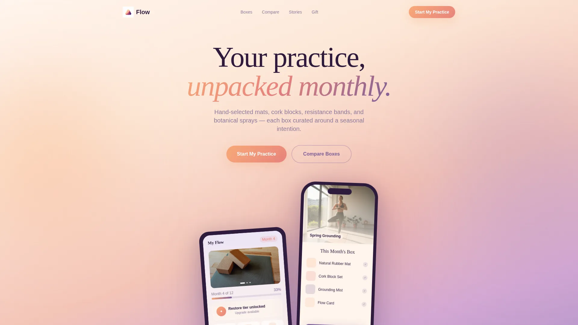
- A device mockup header section showing a subscription dashboard on iPhone and iPad
- A draggable before/after slider that contrasts subscription tiers side by side
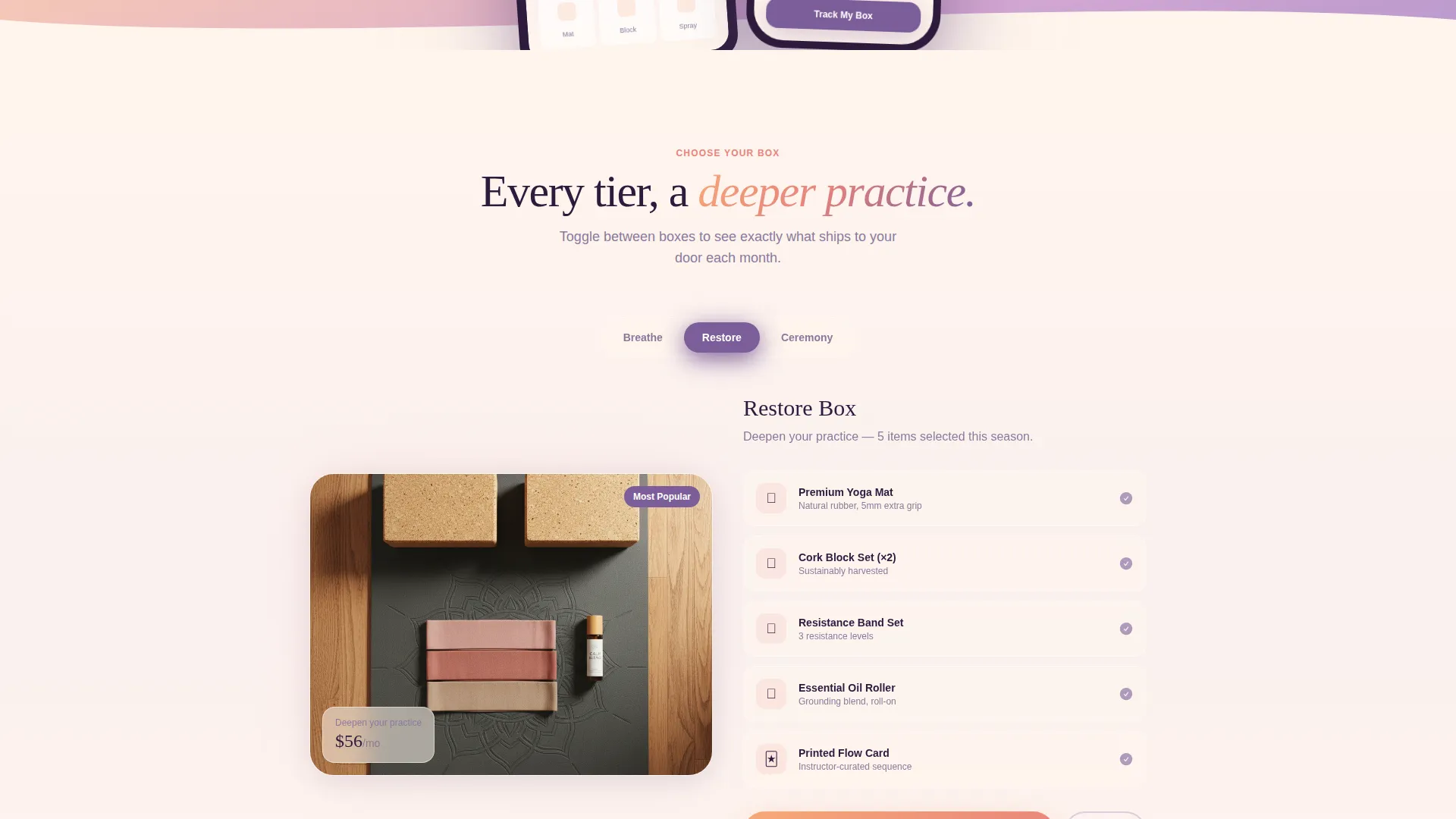
- A three-tier selector with live box preview, a sticky upgrade call to action button, and a secondary gift upgrade path
Feature list
Flow includes purpose-built features drawn directly from its brief. Each one serves the subscriber journey from first impression to confident upgrade.
Scroll-Reveal Progressive Layout
Each section animates into view as the visitor scrolls deeper. The progressive reveal structure builds aspiration gradually, introducing each subscription tier as a new layer of value rather than a flat list.
Draggable Before/After Slider
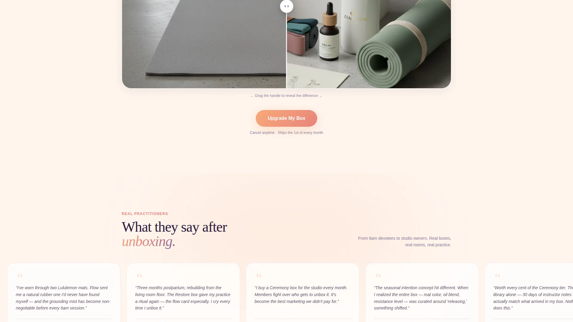
A gradient slider lets visitors drag between the Basic and Premium tier views within the same section. The contrast is immediate and tactile, showing exactly what ships at each level without requiring a page reload.
Three-Tier Interactive Selector
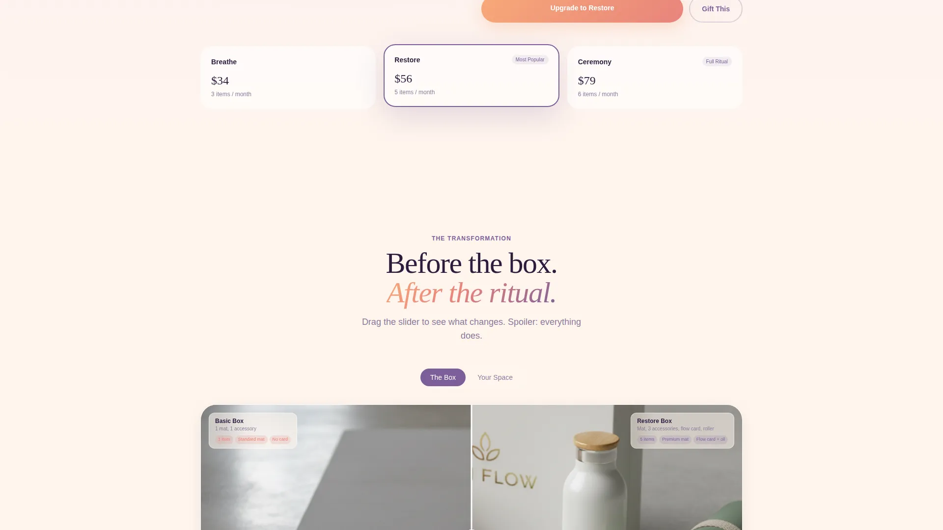
A toggle lets visitors switch between the Breathe ($34/month), Restore ($56/month), and Ceremony ($79/month) tiers. Each click refreshes a visual box preview showing photographed items on a real mat in a real room.
Sticky Upgrade Call to Action
The primary "Upgrade My Box" button appears first after the second tier comparison. From midpage onward it stays fixed to the bottom of the viewport, keeping the conversion action always within reach.
Device Mockup Header
An iPhone and iPad float at a gentle angle against a peach-to-violet gradient. The screens display an active subscription dashboard with a photo carousel, a progress bar reading "Month 4 of 12," and a tier upgrade badge.
Gift an Upgrade Path
A secondary call to action allows existing subscribers to purchase a tier upgrade as a gift for someone else. This path sits alongside the primary upgrade button without disrupting the main conversion flow.
Page sections overview
| Section | Purpose |
|---|---|
| Device Mockup Header | Introduce the brand and subscription dashboard with aspirational visual framing |
| Tier Comparison Reveal | Show the Basic-to-Premium transformation through a draggable gradient slider |
| Home Practice Reveal | Contrast a cluttered practice corner with a curated ritual space via before/after |
| Class Library Reveal | Compare a basic digital class list with a full video library and instructor notes |
| Tier Selector Block | Let visitors toggle between Breathe, Restore, and Ceremony with live box preview |
| Sticky Upgrade call to action | Keep the "Upgrade My Box" button fixed at the bottom of the viewport from midpage |
| Gift Upgrade Path | Offer a secondary conversion route for subscribers buying on behalf of others |
Design & branding system
Flow uses a Soft Gradient visual theme built around a Sunset Gradient color system. Every color transition is intentional, moving from warmth to depth the way natural light shifts during a late-afternoon practice.
- Cream (#FFF5ED) dominates backgrounds; warm peach (#F8A978) bleeds into dusty rose (#E8837C) across section breaks; meditation violet (#7C5E99) anchors headlines and call to action buttons
- Hover states bloom from rose into violet, giving interactive elements a slow, breath-like transition that matches the brand's sensory language
- The palette, gradient washes, and device shadows all work together to create a cohesive atmosphere without relying on heavy imagery
Mobile & speed optimization
Flow is built as a single-page scroll layout, which keeps the structure lightweight and focused. The progressive reveal approach means content loads contextually as visitors move down the page.
- The device mockup header and tier selector are sized and positioned to display clearly on smaller viewports
- The sticky call to action adapts to mobile screen heights so the upgrade button remains visible without blocking content
- Real product photography contexts replace abstract silhouettes, keeping visual weight intentional rather than decorative
How this template helps you convert
Flow earns the upgrade click through a sequence of intentional design decisions. Each scroll section adds a layer of desire before the primary call to action appears.
- The before/after slider makes the tier value difference visual and interactive, so visitors feel the gap rather than read about it.
- The tier selector with live box preview lets visitors mentally commit to specific items before they click, reducing hesitation at the moment of decision.
- The sticky "Upgrade My Box" button stays in view from midpage onward, so the conversion action is never more than one tap away once a visitor is ready.
Other information about this template
Flow sits within the Retail and E-Commerce category, specifically aligned with yoga mats and accessories subscription businesses. It is designed as a marketplace-ready template with a Card Grid modular template style and a multi-directional layout approach that supports both direct subscriber acquisition and gift purchase flows.
- The template style follows a Card Grid modular structure, making individual sections easy to reorder or update independently
- The creative direction is Before/After Reveal, a visual storytelling approach well suited to subscription tiers, product comparisons, and lifestyle transformation narratives
- Flow is built for brands whose subscribers include early-morning practitioners, postpartum mothers rebuilding a home practice, and studio owners looking to add a curated unboxing experience for their members
Theme
Soft Gradient
Creative direction
Before/After Reveal
Color system
Cloud Canvas
Style
Card Grid (Modular)
Direction
Marketplace/Multi
Page Sections
Scroll-reveal Progressive Layout
Draggable Before/after Slider
Three-tier Interactive Selector
Sticky Upgrade Call to Action
Device Mockup Header
Gift an Upgrade Path
Related questions
Can I customise the tier names and prices shown in the selector?
Does the before/after slider work on touch devices?
Can I add more than three tiers to the selector?
Is the sticky upgrade button easy to restyle?
Who is this template best suited for?



