Dependable Septic Landing Page Template
Underwrite is a comparison table landing page built for insurance management consultants who work directly with independent agency principals, mid-market brokers, and managing general agents. It pairs real client testimonials with hard before-and-after data tables, anchors to a qualifying lead form, and opens with a press credibility bar that earns trust before the first scroll.
by Rocket studio
Quick summary
Underwrite is a single-page template designed for insurance consulting practices that need to turn skeptical agency owners into qualified leads. A press mentions bar opens the page, a testimonial mosaic carries the scroll, and comparison tables do the persuasion. The primary call to action, "Get Your Agency Audit," anchors to a short qualifying form.
Who this template is for
This template suits insurance consulting professionals who advise agency owners on improving retention, loss ratios, and carrier relationships. It is built for practices with real client results to show and a need to convert those results into inbound inquiries.
- Independent insurance consulting practices targeting agency principals
- Insurance management consultants working with mid-market brokers or managing general agents (MGAs)
- Consulting firms ready to lead with third-party press credibility and verified client outcomes
What problem this template solves
Most consulting landing pages rely on generic service descriptions that fail to close skeptical buyers. Agency principals and brokers need to see proof before they pick up the phone, not promises.
- Prospective clients scroll past vague value propositions because there is no hard data to anchor trust
- A single case study rarely convinces; visitors need a pattern of repeated results across peer profiles
- The not-yet-ready visitor leaves with nothing, making follow-up impossible
What you get with this template
This template delivers a fully structured, single-page layout that moves a visitor from cold introduction to qualified form submission. Every section is designed to carry weight on its own while building a cumulative argument.
- A press mentions bar featuring publication logos, a bold editorial headline, and three newspaper-clipping-style pull-quotes
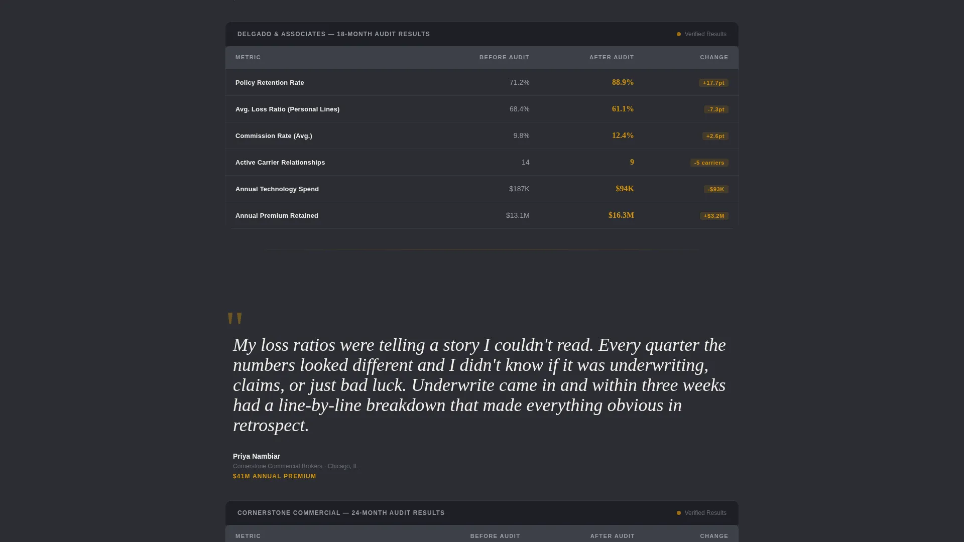
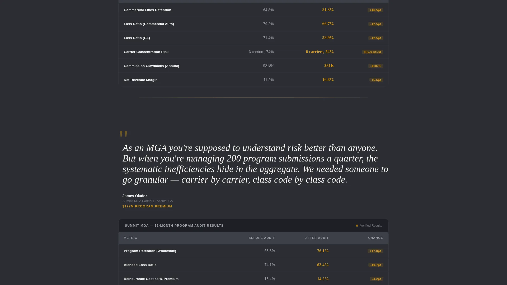
- Three testimonial-table pairs, each opening with a client quote and immediately followed by a five-metric comparison table
- Two lead capture paths: a qualifying audit form and a gated benchmarking PDF download for earlier-stage visitors
Feature list
This template combines editorial credibility, structured data display, and dual-path lead capture into one focused layout.
Press Credibility Header
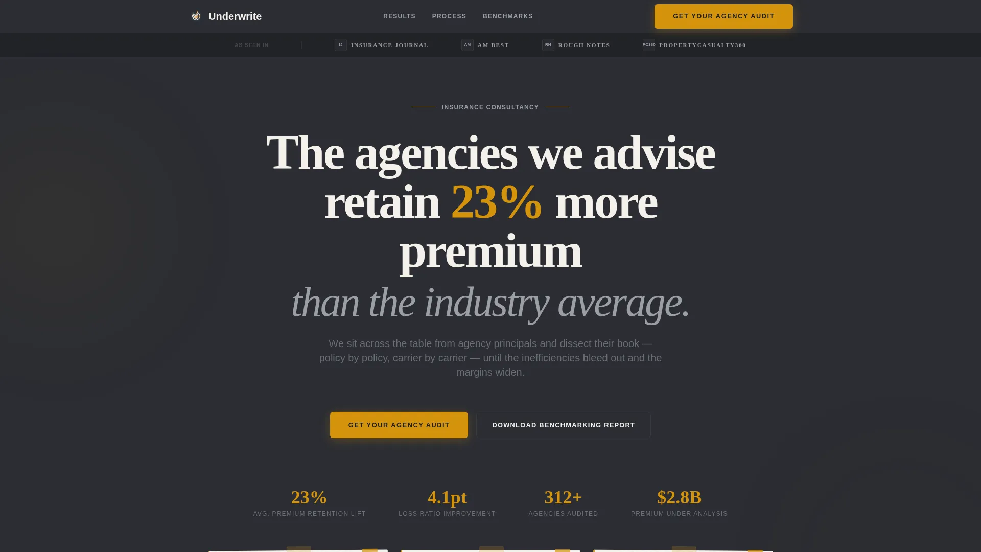
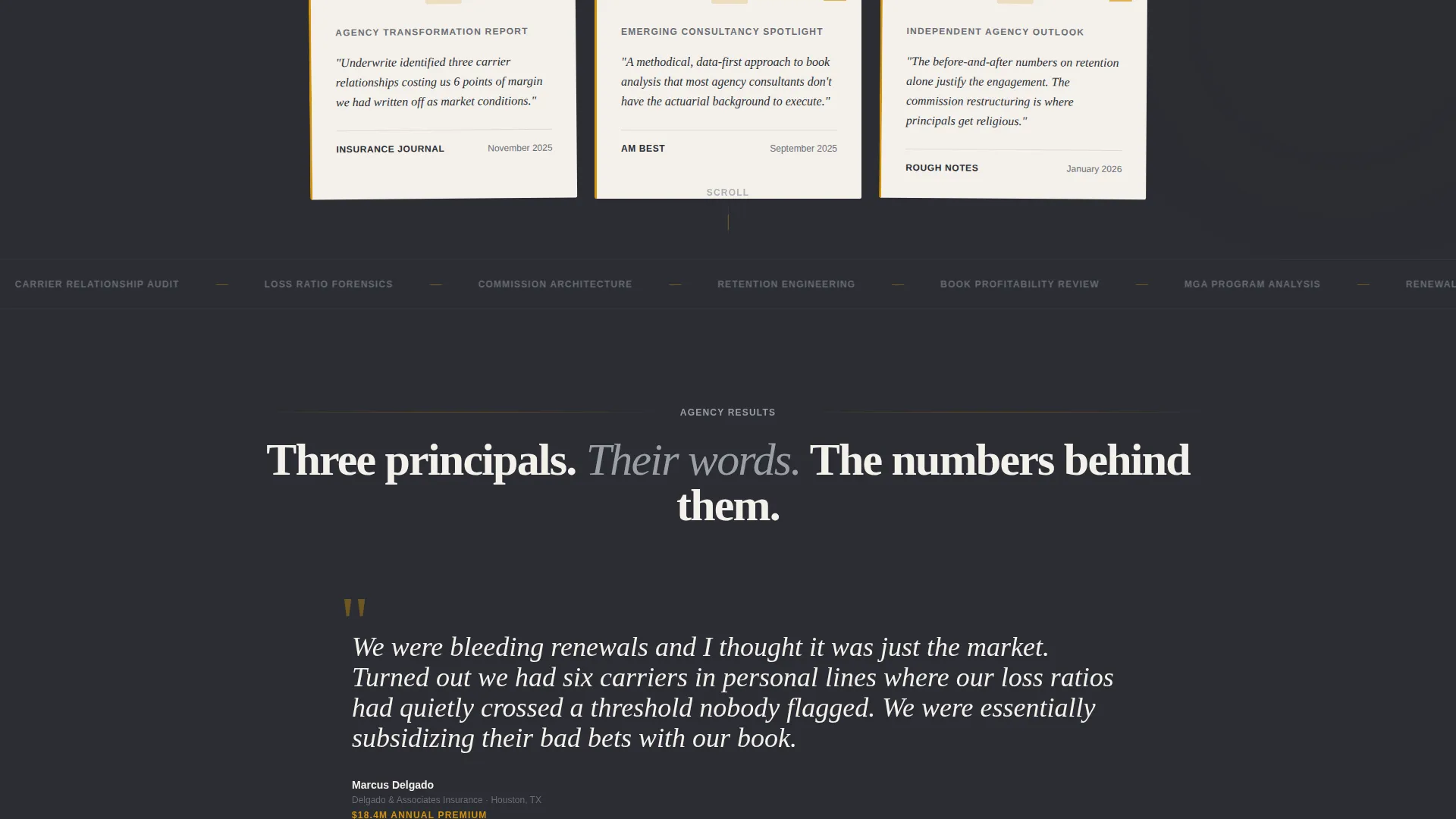
The header opens with a row of publication logos above a bold serif headline citing a specific retention statistic. Below it, three pull-quotes styled as newspaper clippings fill the viewport with third-party authority before the visitor reads a single word of marketing copy.
Testimonial Mosaic Layout
Each scroll section leads with a real client problem stated in their own words, set large and in quotation marks. A before-and-after comparison table follows immediately, covering retention rate, loss ratio, commission structure, carrier count, and technology spend.
Before-and-After Comparison Tables
Five-metric tables appear after each client testimonial, giving every claim a measurable anchor. By the third table, the repeated data structure builds a cumulative case that a single case study cannot replicate.
Dual-Path Lead Capture
The primary form asks for agency name, approximate annual premium volume via a range selector, primary lines of business via checkboxes, and an email address. A secondary path offers a downloadable benchmarking PDF gated behind only an email field, capturing visitors who are not yet ready to book an audit.
Educational Guide Visual Theme
The Charcoal and Amber color system, serif editorial typography, and zero stock photography give the page the visual weight of an annotated industry report. Every design choice signals expertise rather than salesmanship.
No-Photography Editorial Design
The template deliberately avoids faces and stock images. Credibility comes entirely from publication names, quoted client voices, and structured data, which keeps the focus on the argument being made rather than visual decoration.
Page sections overview
| Section | Purpose |
|---|---|
| Press Mentions Bar | Opens with publication logos and a retention-rate headline |
| Editorial Pull-Quotes | Three newspaper-clipping quotes build third-party credibility |
| Testimonial One | Client problem quote introduces the first agency story |
| Comparison Table One | Before-and-after metrics for the first agency case |
| Testimonial Two | Second client voice shifts the pattern from single case to trend |
| Comparison Table Two | Five-metric breakdown reinforces the second agency result |
| Testimonial Three | Third quote completes the mosaic and closes the argument |
| Comparison Table Three | Final data table makes the cumulative case undeniable |
| Primary Audit Form | Qualifying form with premium range selector and line checkboxes |
| PDF Download Gate | Email-only capture for the benchmarking PDF secondary path |
Design & branding system
The visual identity follows an Educational Guide theme rooted in the feeling of a well-used actuarial desk: dark surfaces, warm signal color, and chalk-white content panels. Typography leans on a serif typeface for headlines to reinforce editorial authority.
- Deep charcoal (#2B2D33) for primary backgrounds, warm amber (#D4930D) for data points and call-to-action elements, chalk white (#F4F1EC) for content panels, and muted graphite (#6B6E75) for secondary text and table borders
- No stock photography or faces; credibility is carried entirely by publication logos, client quotes, and structured comparison data
- Newspaper-clipping styled pull-quotes and annotated-report visual language reinforce the consultancy's positioning as an industry authority
Mobile & speed optimization
The layout is structured for clean rendering across screen sizes, keeping the data-heavy comparison tables readable on smaller viewports without losing the editorial weight of the desktop experience.
- Comparison tables are built to remain scannable on mobile, preserving the five-metric structure that makes the before-and-after argument clear
- The dual-path lead capture forms are kept short by design, reducing friction for visitors completing them on a phone or tablet
How this template helps you convert
The page is engineered so that persuasion happens before the form appears. By the time a principal reaches the call-to-action, three rounds of peer data have already made the case.
- The press mentions bar and editorial headline establish authority in the first viewport, giving the visitor a reason to keep reading before any selling begins.
- The alternating testimonial-table mosaic prevents decision fatigue by breaking the argument into digestible pairs, so the visitor moves through emotion and analysis in short, manageable cycles.
- The dual-path capture ensures both ready buyers and early-stage researchers are collected, widening the top of the consulting pipeline without complicating the primary form.
Other information about this template
This template is purpose-built for the insurance consulting niche and reflects the specific information needs of agency principals evaluating a practice-level engagement.
- The qualifying form's premium volume range selector (under $5 million, $5 to $20 million, $20 million and above) is designed to pre-qualify leads before the first conversation
- The benchmarking PDF secondary path is a deliberate strategy for capturing mid-funnel visitors who need more evidence before committing to an audit inquiry
- The template's Charcoal and Amber palette and serif editorial style can be adapted to match a firm's existing brand guidelines without restructuring the layout
- This template is well suited to insurance management consulting practices that operate in the independent agency, MGA, or mid-market broker segments
Theme
Educational Guide
Creative direction
Testimonial Mosaic
Color system
Charcoal & Amber
Style
Comparison Table
Direction
Lead Generation
Page Sections
Press Credibility Header with Pull-quotes
Alternating Testimonial Mosaic
Five-metric Comparison Tables
Qualifying Lead Capture Form
Gated Benchmarking PDF Path
No-photography Editorial Design
Related questions
Who is this landing page template designed for?
What metrics do the comparison tables cover?
What does the primary lead capture form collect?
Can I adapt the color scheme to match my firm's branding?
Do I need three client cases to use this template effectively?



