Calisthenics Certification Landing Page Template
Flow is a scroll-reveal landing page template built for calisthenics certification programs. It pairs an Organic Flow visual identity with a sensory-led content strategy, guiding visitors from a cinematic lifestyle header through progressive movement breakdowns to a frictionless freemium email capture. The result is a single page that earns trust before it asks for anything.
by Rocket studio
Quick summary
Flow is a single-page, scroll-reveal landing page template designed for a calisthenics certification course. It uses an Organic Flow theme, a Soft Mist color palette, and a sensory appeal creative direction to make visitors feel the teaching quality before they commit. Every section reveals on scroll like a slow exhale, building from a lifestyle header to two inline movement breakdowns and a clean email capture.
Who this template is for
This template is built for coaches and movement educators who sell certification programs or structured training courses online. It speaks directly to an audience that values body-first learning over gym machines and wants to reach professionals ready to deepen their practice.
- Personal trainers who want to expand beyond equipment-based coaching
- Yoga instructors ready to add bodyweight strength to their sequencing
- Physiotherapists looking to prescribe movement that does not require a gym
What problem this template solves
Most course landing pages lead with credentials and bullet-pointed curricula. They ask for trust before they offer any experience. For a calisthenics certification, that approach misses the point entirely. The body learns through sensation, not specification.
- Visitors leave before understanding the teaching style or the physical feeling the program delivers
- Generic course page layouts fail to communicate the quality of movement instruction
- There is no low-friction entry point that lets prospects sample the course before committing
What you get with this template
You get a fully structured, single-page scroll-reveal layout with every section pre-built and copy-ready. The design system, conversion paths, and visual hierarchy are already in place so you can focus on your content.
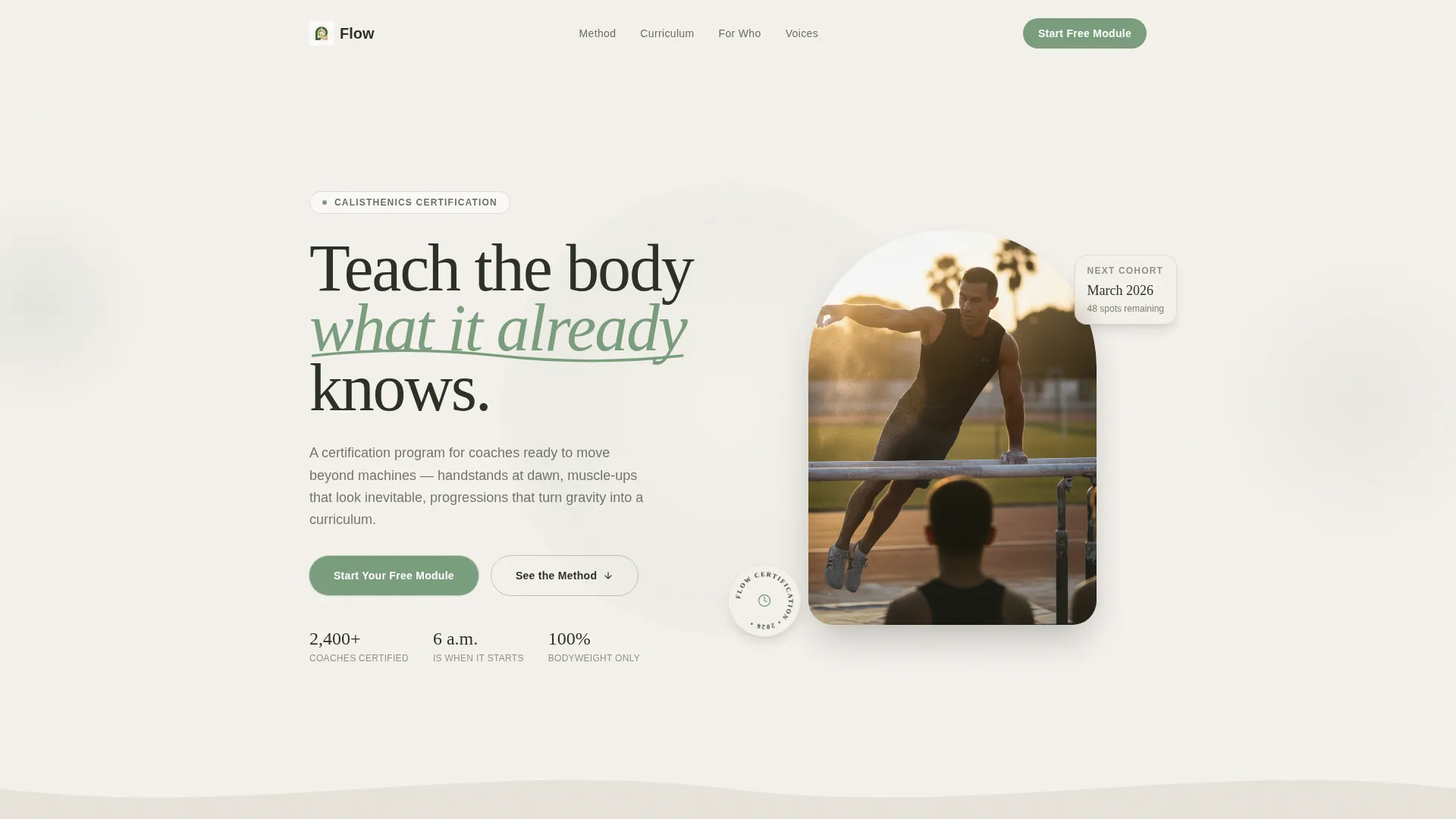
- A cinematic lifestyle hero section with a fade-in headline and golden-hour visual direction
- Two embedded inline movement breakdown players that prove instruction quality before any ask
- A dual conversion path: a primary freemium email capture and a secondary PDF lead magnet
Feature list
This template ships with a considered set of purpose-built features. Each one serves the sensory appeal strategy and the freemium conversion model described in the brief.
Scroll Reveal Progressive Layout
Each section enters the viewport like a slow exhale. Content reveals on entry rather than all at once, keeping the visitor's attention focused on one idea at a time. The progression feels intentional, moving from close-up detail to wide, expansive views as the page unfolds.
Lifestyle Hero with Fade-In Headline
The header is built around a low-angle, wide lifestyle shot of a coach mid-flow on outdoor parallel bars. Golden-hour backlight and chalk dust set the scene. A single headline fades up after a beat, letting the image land before the words arrive.
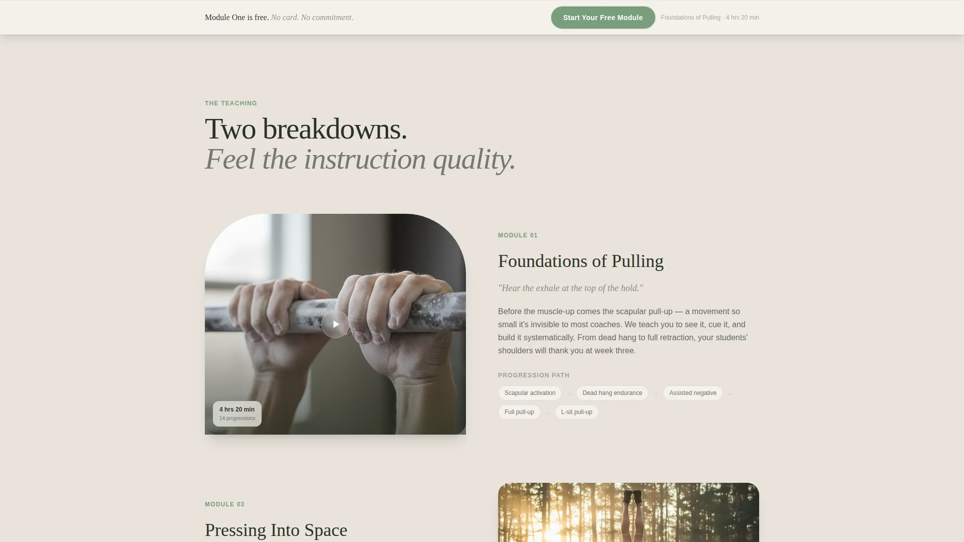
Inline Movement Breakdown Players
Two movement breakdown videos play inline within the page. Visitors watch slow-motion loops of skin, tendon, and breath before any commitment is requested. This section carries the weight of the sales argument by showing, not telling.
Dual Freemium Conversion Path
The primary call to action, "Start Your Free Module," appears after the second scroll reveal and then anchors to a sticky bottom bar. A single-field email capture follows. A secondary path lower on the page offers a downloadable Movement Library for visitors not yet ready for video.
Self-Building Progression Chart
A visual progression chart builds itself ring by ring as the visitor scrolls into the section. It maps the curriculum from single movements to full bodyweight flows, giving prospective students a clear sense of structure and journey.
Soft Mist Color System
The entire page lives inside a four-tone palette of morning fog white, birch bark gray, deep forest floor, and a living green accent. Green appears only on calls to action and progress indicators, so every moment of color signals intent without noise.
Page sections overview
| Section | Purpose |
|---|---|
| Hero lifestyle header | Opens the page with a cinematic outdoor coaching shot and a fade-in headline |
| First scroll reveal | Introduces the program feeling with a close-up of hands gripping a bar |
| Primary call to action block | Places the "Start Your Free Module" email capture after the second reveal |
| Movement breakdown one | Plays the first inline slow-motion video to demonstrate instruction quality |
| Progression chart | Builds the curriculum map ring by ring as the visitor scrolls |
| Movement breakdown two | Plays the second inline video, deepening trust before the next ask |
| PDF lead magnet | Offers the Movement Library download for visitors not ready to commit |
| Sticky bottom bar | Keeps the primary call to action anchored as visitors scroll through lower sections |
Design & branding system
The Soft Mist color system was chosen to evoke a forest clearing at six in the morning. Every tone serves a role, and nothing competes with the living green accent reserved for action.
- Backgrounds cycle between morning fog white (#F4F1EC) and birch bark gray (#C4BFB6) to create soft section separation
- Body text sits in deep forest floor (#2C3227) for maximum contrast without harshness
- Living green (#7A9E7E) appears exclusively on call-to-action buttons and progress indicators, making every prompt for action feel purposeful and calm
Mobile & speed optimization
The scroll-reveal layout is designed to remain coherent and visually intentional on smaller screens. Progressive section entry works as well on a phone as it does on a wide monitor.
- Inline video sections are structured to display cleanly within mobile viewport widths
- The sticky bottom bar is positioned to remain accessible without obscuring content on touch devices
How this template helps you convert
The page earns the click by letting visitors experience the teaching style before any commitment is requested. Conversion happens through a sequence of trust-building moments, not a single hard ask.
- Two inline movement breakdowns demonstrate instruction quality early, so visitors feel the program's value before they see a price or a form
- The "Start Your Free Module" email capture arrives after the visitor has already scrolled through two reveals, making the ask feel natural rather than premature
- The secondary PDF lead magnet catches visitors who are not ready for video, giving a second path to capture interest and begin the relationship
Other information about this template
This template was designed specifically for the calisthenics certification course niche within the broader wellness and fitness category. It operates at the intersection of bodyweight strength coaching and professional development for movement educators.
- The Organic Flow theme and sensory appeal direction make it well suited to outdoor, nature-aligned fitness brands
- The freemium and trial landing page model used here is a natural fit for educators who want prospects to sample before subscribing
- The template's visual identity is built to support course creators working in bodyweight fitness, movement coaching, and related wellness disciplines
- It can support any certification program where physical sensation and teaching quality are central to the sales story


Theme
Organic Flow
Creative direction
Sensory Appeal
Color system
Soft Mist
Style
Scroll Reveal (Progressive)
Direction
Freemium/Trial
Page Sections
Scroll Reveal Progressive Layout
Lifestyle Hero with Fade-in Headline
Inline Movement Breakdown Players
Dual Freemium Conversion Path
Self-building Progression Chart
Soft Mist Color System
Related questions
Can I use this template without video content?
Is this template suitable for a paid course, not just a free module?
Can I adjust the color palette to match my existing brand?
How does the sticky bottom bar work?
Who writes the copy for the email capture and lead magnet sections?


