Flow — Intuitive Payment Platform Landing Page Template
Ledger is a transaction management landing page template built for real estate professionals. It uses a cinematic full-screen video header, a modular card grid with escalating case study narratives, and a warm stone color palette. The design guides visitors from compelling social proof straight into a two-step inline booking scheduler, making every element work toward one outcome: a confirmed demo.
by Rocket studio
Quick summary
Ledger is a single-page landing page template designed for real estate transaction management platforms. It opens with a cinematic full-screen video header and flows into a modular card grid of escalating case study stories. A warm stone and muted gold palette reinforces trust, while every section builds toward one clear action: booking a walkthrough demo.
Who this template is for
This template is built for real estate technology platforms that need to speak to serious, high-volume professionals. It assumes a product audience that ranges from solo agents to large brokerages, and the visual tone matches that ambition precisely.
- Top-producing agents managing thirty or more concurrent deals at once
- Transaction coordinators handling compliance across multiple brokerages
- Team leads and broker-owners who need file visibility without chasing emails
What problem this template solves
Real estate transaction platforms often struggle to communicate their value to busy professionals in a short window of attention. A generic product page fails to earn trust from people who close deals for a living. This template solves that by leading with proof, not promises.
- Professionals skip pages that feel like brochures rather than solutions
- Escalating social proof is missing from most PropTech landing pages
- Demo conversion rates drop when scheduling feels like friction
What you get with this template
You get a fully structured landing page layout ready to represent a high-end transaction management platform. Every section is purposeful, and the visual system is cohesive from header to footer.
- A full-screen cinematic video header with a headline and a pulsing gold call-to-action button
- A modular card grid organized into three narrative rows, each scaling in deal volume and proof weight
- A two-step inline booking scheduler with role selection, a transaction volume slider, and a timezone-aware calendar widget
- A floating single-line stat break between card rows for visual rhythm and credibility
- A secondary interactive simulator path beneath the final card row for visitors not yet ready to book
Feature list
This template includes a carefully considered set of layout and interaction features, all grounded in the source brief.
Full-Screen Video Header
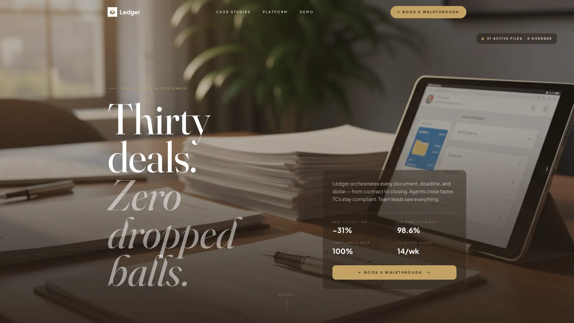
The header uses a slow cinematic tracking shot across a modern closing table. Documents sign, a notary stamp presses down in macro detail, and tablet screens refresh with green checkmarks. A headline fades in over the motion, and a gold button pulses gently beneath it.
Modular Case Study Card Grid
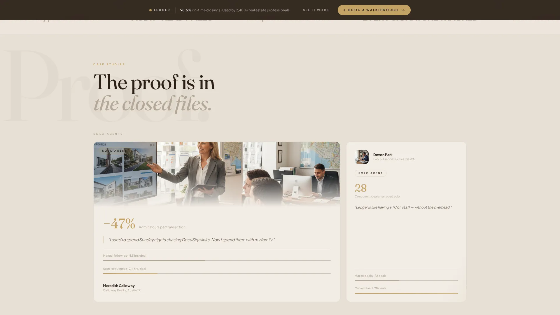
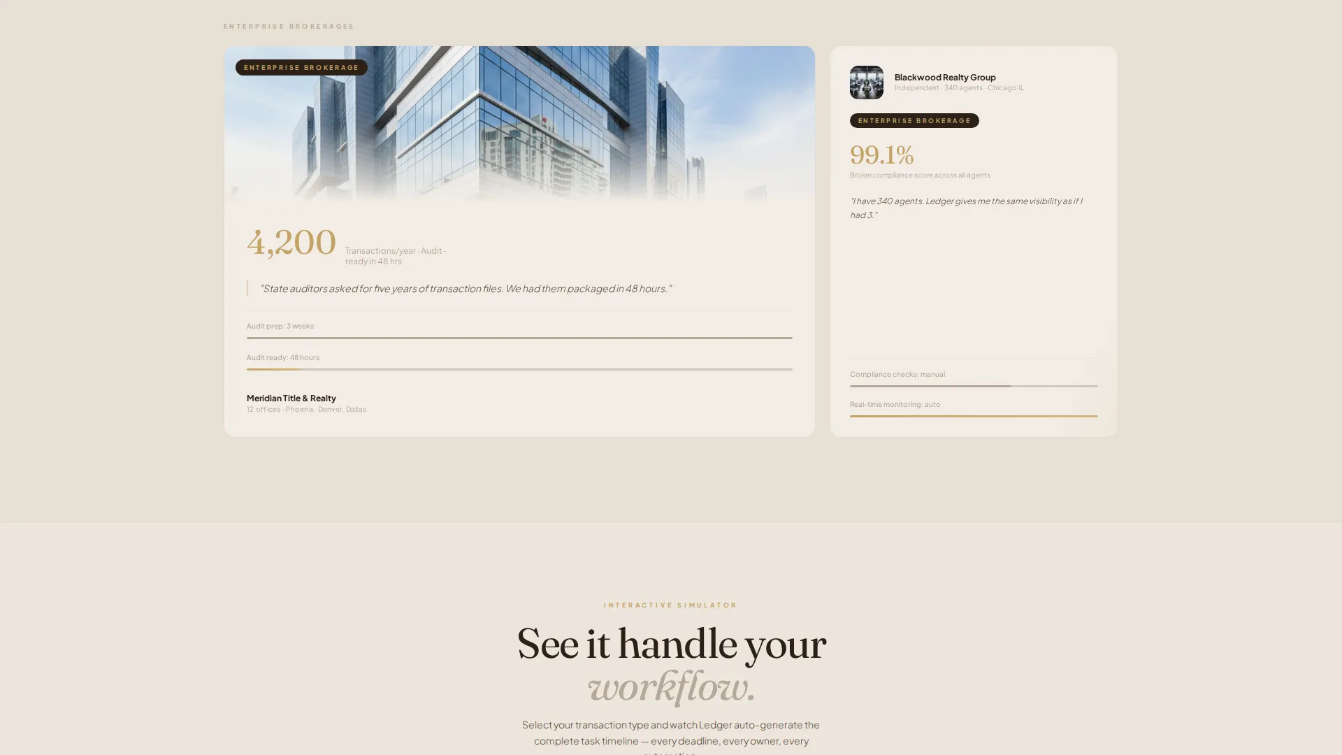
The card grid is the heart of the page. Each card tells a real transaction story with a metric, a quote, and a before-and-after timeline graphic. The grid is organized in three rows of escalating scale, from a solo agent to a brokerage processing four thousand annual transactions.
Floating Stat Interlude
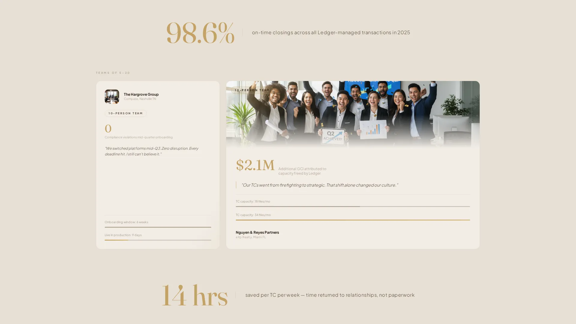
Between card rows, a single-line credibility stat floats on a warm stone background. The line "98.6% on-time closings" gives the eye a visual pause. It reinforces proof without interrupting the narrative momentum.
Two-Step Inline Scheduler
The primary conversion path is a booking flow embedded directly in the page. Step one captures visitor role and monthly transaction volume via a simple slider. Step two reveals a calendar widget pre-filtered to the visitor's timezone and available demo slots.
Persistent Bottom Bar call to action
After the first scroll, a sticky bottom bar keeps "Book a Walkthrough" visible at all times. This ensures the primary call to action is always one tap away without interrupting the reading experience.
Interactive Workflow Simulator
A secondary conversion path beneath the final card row invites visitors to select their transaction type. The simulator then auto-generates a visual task timeline, letting prospects experience the platform's logic before committing to a demo.
Page sections overview
| Section | Purpose |
|---|---|
| Video Header | Cinematic opener with headline and pulsing gold call to action button |
| Hero Headline Block | Introduces the core value proposition over moving footage |
| Solo Agent Card Row | First case study row showing admin time savings for one agent |
| Stat Interlude One | Single-line floating metric for visual breath and credibility |
| Team Story Card Row | Second row scaling to a ten-person team compliance narrative |
| Stat Interlude Two | Second floating proof line reinforcing on-time closing rate |
| Enterprise Card Row | Final row featuring a high-volume brokerage at full scale |
| Inline Scheduler Section | Two-step booking flow with role selector and calendar widget |
| Workflow Simulator Section | Interactive path for visitors to preview the task timeline |
| Persistent Bottom Bar | Sticky call to action bar anchored after first scroll |
Design & branding system
The visual identity follows a Luxe Minimal theme built on a warm stone color system. Every color choice is deliberate, and the palette reads like the lobby of a boutique title company.
- Travertine cream (#E8E0D5) dominates backgrounds; deep espresso (#2C2118) anchors headlines and navigation
- Brushed limestone (#B5A898) carries secondary text and card borders throughout the grid
- Muted gold (#C4A265) appears only on calls to action, progress indicators, and active states, making every flash of it meaningful
Mobile & speed optimization
The template is structured with a mobile-first layout in mind. The card grid stacks cleanly on smaller screens, and the persistent bottom bar is especially effective on touch devices.
- The modular card grid reflows from multi-column rows to single-column stacks on mobile
- The two-step scheduler and interactive simulator are designed as inline components that do not require external redirects
- The sticky bottom bar remains accessible on all screen sizes, keeping the booking action within thumb reach
How this template helps you convert
Conversion is built into the page architecture, not added as an afterthought. The layout earns trust first, then asks for time.
- The escalating case study grid moves visitors from curiosity to confidence by showing proof at every deal scale, solo agent through enterprise brokerage, before a single form appears.
- The two-step inline scheduler reduces friction by collecting role and volume context first, so the calendar step feels personalized and relevant rather than generic.
- The secondary simulator path gives hesitant visitors a hands-on taste of the platform logic, creating a second moment to convert without forcing the booking call to action prematurely.
Other information about this template
This template sits within the Real Estate and Property category, specifically the PropTech and Real Estate Software subcategory. It is purpose-built for transaction management platforms targeting professionals who measure performance in closed files and compliance records.
- The template style is a Card Grid (Modular) layout, making it straightforward to swap in real client stories or platform metrics
- The landing page direction is optimized for booking and scheduling conversions, not click-through to a product detail page
- The creative direction follows a Case Study Narrative approach, meaning social proof is the primary persuasion mechanism
- Color grading and shallow depth-of-field video direction are specified in the brief to maintain the Luxe Minimal theme consistently
- This template can support use cases aligned with lease management and broader real estate workflow platforms where document orchestration is the core value
Theme
Atelier Studio
Creative direction
Stats-First Impact
Color system
Dark Emerald
Style
Card Grid (Modular)
Direction
Click-Through
Page Sections
Full-screen Cinematic Video Header
Escalating Case Study Card Grid
Floating Stat Interlude Breaks
Two-step Inline Booking Scheduler
Persistent Sticky Bottom Bar
Interactive Workflow Simulator
Related questions
Who is this landing page template designed for?
Can I replace the video header with a static image?
How does the two-step inline scheduler work?
What makes the card grid different from a standard testimonial section?
Is the persistent bottom bar always visible?



