Singapore Local Complete Booking Website Template
Soften is an editorial-style landing page template built for Singapore water softening services. It leads with a hard-hitting TDS headline, builds trust through a testimonial mosaic, and drives visitors toward a free water test booking. The design uses deep navy, clinical white, and a teal accent to project the authority of a government report with the readability of a lifestyle magazine.
by Rocket studio
Quick summary
Soften is a single-page template designed for water softening service providers in Singapore. It opens with a stark, data-led headline about municipal water hardness, builds social proof through a scrollable testimonial mosaic, and routes visitors to a scheduling page via a persistent teal call-to-action button. The layout feels authoritative, editorial, and quietly urgent.
Who this template is for
This template is built for service businesses that treat hard water in Singapore homes and commercial kitchens. It suits operators who need a credible, conversion-focused page without building one from scratch.
- Water softening and resin-replacement service crews serving HDB flats and landed properties
- Condo management committees or facilities managers looking to present a professional water-quality solution to residents
- Food and beverage operators and homeowners in Singapore who need to demonstrate the problem clearly before asking for a booking
What problem this template solves
Most water softening businesses rely on generic service pages that bury the problem under product jargon. Visitors leave before they ever feel the relevance. This template leads with a specific, verifiable fact about Singapore's municipal water hardness and builds the case before asking for anything.
- Visitors do not connect abstract hardness numbers to their own showerheads, espresso machines, or hair until the page makes it personal
- Service providers struggle to accumulate social proof in a way that feels credible rather than templated
- The gap between "I have a hard water problem" and "I will book a test" is wide without a low-commitment interactive step in between
What you get with this template
You get a fully structured, ready-to-customise landing page that handles the entire visitor journey from problem awareness to click-through booking. Every section has a clear role and a clear next step.
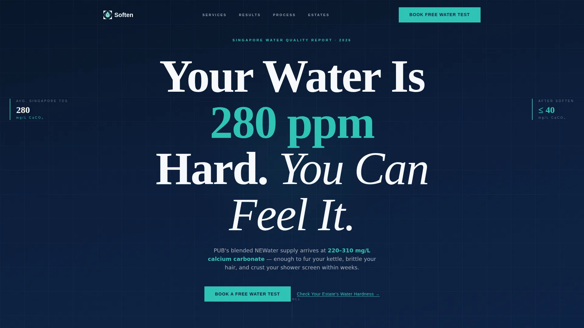
- A giant centered headline section with a teal subline showing Singapore's water hardness range, setting authority immediately
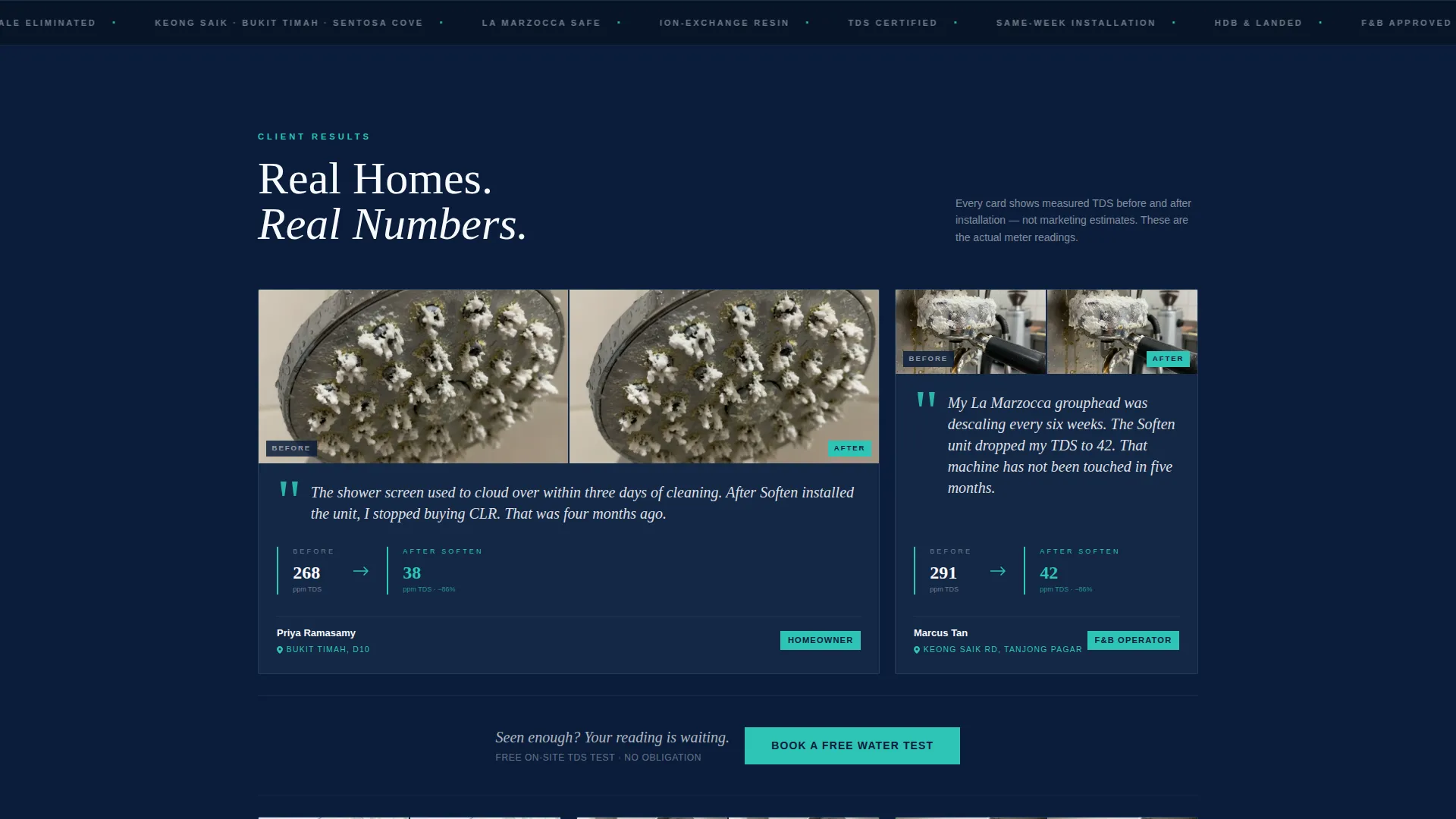
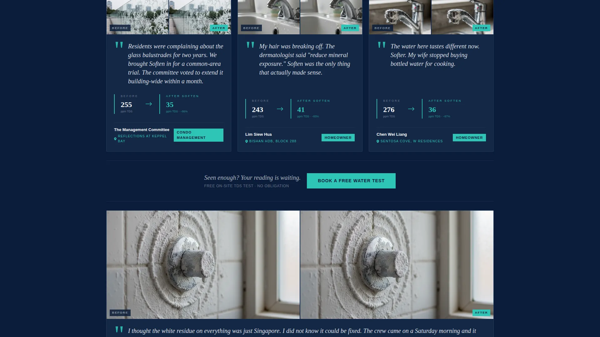
- An asymmetric testimonial mosaic with pull-quotes, before-and-after showerhead photos, TDS drop stats, and estate map pins
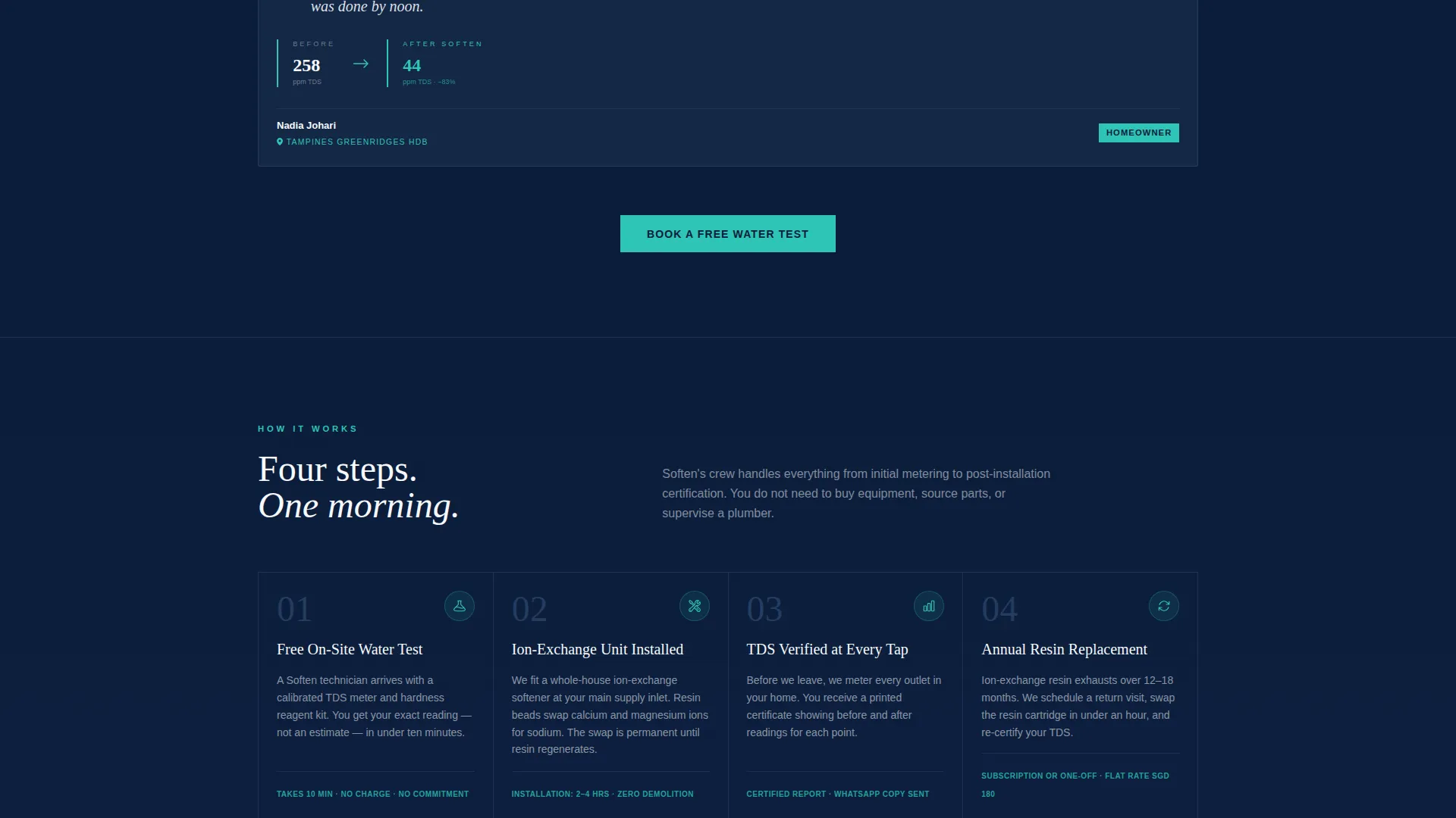
- A persistent "Book a Free Water Test" call-to-action button that reappears after every third testimonial card, plus a postal-code lookup tool for low-commitment engagement
Feature list
This template is built around specific editorial and conversion mechanics drawn directly from its brief. Each feature serves a distinct purpose in moving a skeptical visitor toward action.
Data-Led Hero Headline
The header opens with a stark white editorial serif headline on deep navy, stating Singapore's approximate tap water hardness in parts per million (ppm). A single teal subline specifies the local NEWater blended-supply hardness range. No photography competes for attention. The number does the work.
Asymmetric Testimonial Mosaic
Customer stories are laid out in a magazine-style asymmetric grid. Each card varies in size to create visual rhythm. A pull-quote in large italic sits beside a before-and-after showerhead photo, a sidebar stat shows the TDS drop, and a small map pin identifies the customer's estate. The mosaic grows denser as you scroll, building cumulative social proof.
Persistent Click-Through Call to Action
The primary call-to-action button reads "Book a Free Water Test" and is rendered in the teal accent color. It appears first after the header, then resurfaces after every third testimonial card. Clicking passes the visitor through to a scheduling page. No form is embedded on this page.
Postal-Code Hardness Lookup
A secondary interactive element lets visitors type their postal code to see an estimated TDS level for their estate. This gives undecided visitors a reason to engage before committing to a booking. The tool frames the click-through as a logical next step rather than a cold ask.
Editorial Navy and Teal Visual System
The color system uses deep institutional navy for primary backgrounds, a pressed slate for section dividers and secondary panels, clinical white for content columns, and a single teal accent for buttons, data callouts, and pull-quote marks. The palette is cohesive, legible, and projects the authority of a utility report.
Stats and Metrics Header Concept
The header concept is built around a specific, credible number rather than a lifestyle photograph. This approach aligns with a lead-generation objective by creating immediate personal relevance. Visitors instinctively wonder whether their own water reads the same, which pulls them into the testimonial section.
Page sections overview
| Section | Purpose |
|---|---|
| Hero Headline Block | Anchors authority with a hard TDS number and teal hardness subline |
| Primary call to action Button | Routes visitors to the booking page immediately after the headline |
| Testimonial Mosaic Grid | Builds social proof through accumulating editorial-style customer cards |
| TDS Drop Stat Callouts | Quantifies real customer outcomes with before-and-after ppm figures |
| Recurring call to action Placement | Resurfaces the booking button after every third testimonial card |
| Postal Code Lookup | Gives visitors an interactive low-commitment engagement step |
| Secondary Text Link | Supports undecided visitors with estate-level hardness context |
Design & branding system
The visual identity follows a Service Utility theme that merges institutional authority with editorial clarity. Every color and type choice reinforces trust before a single word is read.
- Color palette: deep navy (#0B1D3A) for backgrounds, pressed-uniform slate (#3D5A80) for dividers, clinical white (#F7F9FC) for content columns, and teal (#2EC4B6) reserved strictly for buttons, data callouts, and pull-quote marks
- Typography: a tight editorial serif dominates the headline, projecting the weight of a government water-quality report while remaining sharp enough to hold a reader's attention
- Layout rhythm: the asymmetric mosaic grid and varied card sizes prevent the page from feeling templated, giving the accumulation of social proof a curated, editorial feel
Mobile & speed optimization
The template is structured to remain legible and functional at smaller screen sizes. The editorial grid adapts so that the testimonial mosaic reads clearly on a phone without losing its visual hierarchy.
- The centered headline and teal subline scale down without losing their typographic authority on mobile viewports
- The persistent call-to-action button remains accessible at every scroll depth, including on touch screens where tap targets matter
- The postal-code lookup tool is designed as a lightweight interactive element that does not require a separate page load to display results
How this template helps you convert
This template is built explicitly around a lead-generation objective. Every structural decision nudges the visitor one step closer to clicking through to a booking.
- The TDS headline creates immediate personal relevance, making visitors curious about their own water quality before any service is mentioned.
- The accumulating testimonial mosaic builds trust progressively, so by the time a visitor reaches the third or fourth call to action button placement, the social proof behind the ask feels overwhelming rather than hollow.
- The postal-code lookup lowers the barrier to engagement, giving hesitant visitors a useful data interaction that reframes the booking click as a natural conclusion rather than a leap of faith.
Other information about this template
This template is categorised under Professional Services and Singapore Local Services. It is designed with the intersection niche of Singapore appliance repair and home maintenance services in mind, making it relevant for operators who also service water heaters, filtration systems, or related plumbing equipment.
- The template style follows a stats and metrics header concept within a lead-generation landing page direction, consistent with service businesses that convert through evidence rather than aspiration
- The design theme draws from an Executive Suite visual direction, which suits the template's goal of projecting the credibility expected by Bukit Timah homeowners, condo management committees, and Keong Saik Road food and beverage operators
- This template can support customisation for related water treatment services, including total dissolved solids (TDS) testing, ion-exchange unit installation, and resin replacement scheduling, wherever those services align with the service provider's actual offering
Theme
Executive Suite
Creative direction
Expert Panel
Color system
Plum Executive
Style
Split Screen (50/50)
Direction
Lead Generation
Page Sections
Data-led Hero Headline
Asymmetric Testimonial Mosaic
Persistent Click-through Call to Action
Postal-code Hardness Lookup
Editorial Navy and Teal Visual System
Related questions
Does this template include a booking form on the page?
How does the postal-code TDS lookup work?
Can this template be adapted for a water softening business outside Singapore?
Is the testimonial mosaic layout flexible enough to add more customer stories?
Who is this landing page template best suited for?



