Smart Student Finance Landing Page Template
The Swipe student credit card landing page template is built for first-time cardholders who have questions before they commit. It uses a zigzag, frequently asked question-driven layout to teach credit basics, build trust, and capture leads through a free guide download. Clean typography, a mobile-first design, and a single conversion goal make it easy to deploy and effective in finance marketing campaigns.
by Rocket studio
Quick summary
This is a single-page, frequently asked question-driven finance landing page template designed for a student credit card. It teaches rather than pitches. Visitors scroll through real student questions answered in alternating zigzag sections, then arrive at an email capture form offering a free Student Credit Starter Guide. The layout is clean, mobile-first, and built to build trust from the first pixel.
Who this template is for
This template fits teams and creators who need a high-quality finance landing page that earns attention through education, not pressure. It works best when the goal is lead generation through a content offer rather than a direct application push.
- Credit card companies, fintech startups, and student finance services targeting first-time cardholders aged 18 to 22.
- Marketing teams running campaigns aimed at parents co-signing accounts or international students building United States credit history from zero.
- Designers and no-code builders who need a finance landing page template they can customize quickly without writing everything from scratch.
What problem this template solves
Most student finance landing pages treat visitors like they already understand how credit works. They don't. The target audience for this template is Googling credit basics at 2 a.m., scared of making a mistake, and quick to leave any page that feels like a bank brochure. That's the core problem this template addresses.
- Visitors landing on generic finance pages find jargon where they expected answers, so they bounce before converting.
- First-time applicants hesitate because they don't know if applying will hurt their credit, whether they need a co-signer, or what happens if they miss a payment.
- Finance teams lose leads because their landing pages focus on product features instead of the real questions their target audience is asking.
What you get with this template
You get a fully structured, section-led finance landing page template with every layout decision already made. Each section has a clear purpose, and the visual hierarchy guides visitors toward one goal: downloading the Student Credit Starter Guide by submitting their email address.
- A trust-signal header strip, three frequently asked question zigzag sections, a guide call-to-action block with chapter preview, and a structured footer following the Vercel Horizontal Flow pattern.
- A Corporate Precision visual identity using the Cloud Canvas color system, with Plus Jakarta Sans headings and DM Sans body text set in ballpoint navy, cloud white, notebook gray, and highlighter periwinkle.
- A mobile-first layout ready to customize for your brand, your copy, and your specific finance offer.
Feature list
This template ships with a focused set of features designed to support a high converting landing page in the student finance niche. Every component earns its place. Nothing is decorative for decoration's sake.
Trust-Signal Logo Bar Header
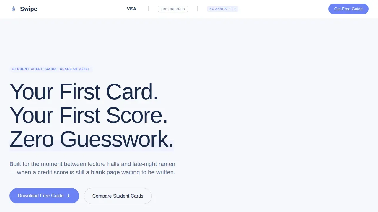
The header is a slim, confidence-building strip that sits at the very top of the page. It displays a network mark placeholder (such as Visa or Mastercard), an FDIC badge, and a "No Annual Fee" lockup, all on a cloud white background. Below it, a single large headline in ballpoint navy sets the tone without a hero image. The emptiness itself communicates simplicity, which is exactly what anxious first-time cardholders need to see. This kind of social proof in the header is one of the key elements that separates high converting landing pages from forgettable ones.
frequently asked question-Driven Zigzag Layout
Three alternating sections pose real questions that students type into search engines: "Will applying hurt my credit score?", "What if I miss a payment?", and "Do I need a co-signer?" Each section places the question on one side and the answer on the other through short paragraphs and expandable accordion blocks. The layout alternates left and right on each section, creating a conversational reading rhythm that feels more like a well-highlighted textbook than a sales page. This approach respects how the target audience actually researches, building confidence section by section rather than rushing visitors toward a form.
Email Capture with Chapter Preview
The call-to-action block is positioned after all three frequently asked question sections, once trust is already established. It previews three chapter titles from the Student Credit Starter Guide directly above the email form, proving the resource has real substance before asking for anything. The form itself is intentionally minimal, collecting only what is needed to deliver the guide. A dot-edu detection hint auto-validates student status, which reduces friction and helps capture leads more effectively. Minimal form fields, ideally limited to three to five inputs, are a proven practice for increasing the conversion rate on education and finance landing pages.
Accordion Answer Reveals
Each zigzag section includes expandable accordion components highlighted in periwinkle (#6C82F5). This lets visitors choose how deep they want to go on each topic. Students who want a quick answer get one. Those who want the full explanation can expand it. The accordion pattern mimics familiar mobile app interactions, which supports more engagement from users arriving on phones rather than desktops.
Mobile-First Single-Column Structure
The entire template is structured mobile-first. Finance landing pages that fail on mobile lose a significant portion of visitors before a single word is read. This template uses a single-column structure on small screens, with sections stacking cleanly for thumb-friendly scrolling. All core actions are accessible within one or two taps, reflecting a navigation experience that matches how students actually move through pages on their phones.
Corporate Precision Branding System
The Cloud Canvas color palette and typographic pairing of Plus Jakarta Sans with DM Sans create a study-desk aesthetic that is bright without being fluorescent and serious without being intimidating. This cohesive design system means every page section feels like part of the same considered experience, which is critical for building trust on a finance landing page where first impressions carry real weight.
Page sections overview
| Section | Purpose |
|---|---|
| Logo Bar Header | Display trust signals and headline |
| frequently asked question Zigzag One | Answer credit score question |
| frequently asked question Zigzag Two | Address missed payment concern |
| frequently asked question Zigzag Three | Clarify co-signer requirement |
| Guide call to action Block | Capture email with chapter preview |
| Footer Strip | Provide navigation links and legal context |
Design & branding system
The visual identity follows a Corporate Precision theme. The Cloud Canvas color system keeps the page feeling organized and calm rather than aggressive, which is the right tone for a finance landing page aimed at first-time credit users.
- Colors: cloud white (#F7F8FC) for backgrounds, ruled-notebook gray (#D2D5DB) for dividers and subtle structure, ballpoint navy (#1B2A4A) for headlines and body text, and highlighter periwinkle (#6C82F5) reserved for interactive elements, accordion triggers, and call-to-action buttons.
- Typography: Plus Jakarta Sans for all headings, DM Sans for all body copy, giving the template a clean textbook feel that is easy to read on both mobile and desktop.
- Layout style: zigzag alternating sections with intentional white space, no hero image, and a visual hierarchy that places the most important information exactly where visitors' eyes land first following a natural F-pattern reading flow.
Mobile & speed optimization
Students are primarily on their phones. A finance landing page that is not optimized for mobile will lose visitors before the first frequently asked question section loads. This template is designed with that priority built in.
- The single-column mobile layout stacks all zigzag sections cleanly, keeping the reading flow intact and making accordion interactions thumb-friendly on small screens. The mobile version of each section preserves the question-and-answer structure without crowding or clipping.
- All core actions, including the email form and accordion triggers, are reachable within one or two taps. This reflects the swipe-based, app-like navigation behavior that students already expect from the tools they use every day.
How this template helps you convert
This template is designed around one goal: turning a curious student into a guide subscriber. Every layout decision supports that goal without adding friction. Understanding the target audience shapes every element of this design, from the questions asked to the colors used.
- The frequently asked question structure addresses the exact doubts that stop visitors from converting. By answering real questions before presenting the call-to-action form, the template removes objections gradually rather than all at once. Most buying decisions happen before anyone fills out a form or talks to a sales team, and this template is built for exactly that reality.
- The chapter preview above the email form shows visitors what they will receive before asking for their email address. This preview acts as a value proof that makes the conversion feel like a fair exchange. A clear, action-oriented call-to-action button in high-contrast periwinkle stands out from the cloud white background and guides visitors toward submitting their details, improving the overall conversion rate of the page.
Other information about this template
This template is a practical starting point for any finance marketing team building a content-led lead generation campaign. It reflects modern digital marketing thinking: content should help buyers think, not pressure them to act. The traditional marketing funnel no longer reflects how buyers actually make decisions. Most buying now happens before anyone fills out a form or talks to sales. This template supports that reality by putting education first and the form last.
- The template is fully customizable. You can update the frequently asked question questions and answers, swap the chapter titles in the guide preview, adjust the color values within the Cloud Canvas system, and replace placeholder trust badges with your actual network marks and certifications without rebuilding the layout.
- The page structure is compatible with standard tracking setups. Teams can add tracking scripts for campaigns, monitor traffic from social media posts, and connect the email form to their preferred email delivery service. For teams using Google Analytics, the page structure is clean enough to support meaningful event tracking on accordion expansions, form submissions, and scroll depth. Adding Google Analytics to any page built from this template follows standard tag implementation steps. Google Analytics data helps teams understand which frequently asked question section drives the most engagement and where visitors drop off, giving the sales team actionable feedback to improve future campaigns.
- Finance companies and fintech teams launching campaigns on a limited ad budget will find this template useful because it is a laser focused, single-purpose page. There are no navigation links pulling visitors off the page toward a full homepage, no pricing tables competing for attention, and no secondary product shots distracting from the guide offer. That laser focused discipline helps stretch every dollar of ad budget further by keeping visitors on the page and moving toward the form.
- Teams managing their digital presence across multiple channels will find the template easy to link from social media posts, email campaigns, and paid search ads. The page does not rely on stock photos, so there is no concern about image licensing when sharing product shots or page previews across social media platforms.
- No-code platforms enable non-technical users to create production-ready landing pages without traditional programming skills. AI-powered no-code tools allow users to build landing pages using natural language prompts, and this template is structured to work within those environments. No-code tools can significantly reduce the time it takes to go from idea to a live landing page, which matters when campaign timelines are tight. The use of no-code tools is growing among product managers and solopreneurs who need to quickly launch pages for specific campaigns without depending on a full development team.
- For teams comparing finance landing page templates, this one is pixel-precise in its layout, with every spacing and typography decision already made. Figma templates for finance landing pages are customizable and pixel perfect, and this template follows that same standard of craftsmanship. Templates for landing pages can simplify the process of creating effective marketing pages, especially in regulated industries like student finance where the copy and layout need to feel trustworthy before visitors will act.
- The seamless integration of trust signals, educational content, and a minimal email form reflects best practices from high converting landing page examples in the student finance category. Landing page success in this niche depends on earning attention before requesting it, and this template is structured to do exactly that. Teams can save significant design and copywriting time by starting from this template rather than building from a blank page.
- The template supports a clear schedule of content additions over time. As the student finance product evolves, new frequently asked question sections can be added, guide chapters can be updated, and the call-to-action copy can be refreshed for each academic semester or enrollment cycle. This makes the template a durable asset for ongoing campaigns, not just a one-time launch page.
- From an search engines visibility standpoint, the clean semantic structure of the page supports good indexing. Each frequently asked question section uses question-based headings that align with the phrases students type into search engines when researching credit for the first time. This supports organic discovery alongside paid campaigns, helping teams generate more leads without increasing ad spend. Good SEO practice starts with clear, honest headings, and this template delivers exactly that.
- The description of each section is clear and consistent. Visitors always know where they are on the page and what comes next. That predictability is a key part of building trust with an audience that may be anxious about finance topics. When visitors feel oriented, they are more likely to reach the form and complete it.


Theme
Corporate Precision
Creative direction
FAQ-Driven
Color system
Cloud Canvas
Direction
Content/Resource
Page Sections
Trust-signal Logo Bar Header
Faq-driven Zigzag Layout
Email Capture with Chapter Preview
Expandable Accordion Answer Blocks
Corporate Precision Branding System
Mobile-first Single-column Structure
Related questions
Can I customize the frequently asked question questions in the zigzag sections?
Does this template work for finance products other than student credit cards?
How do I connect the email form to my mailing list?
Is this template optimized for mobile users?
Can I use this landing page for paid ad campaigns?


