Urology Practice Website Template with Symptom Assessment Quiz
Flow is a urology practice landing page template built around a five-step symptom assessment quiz. It uses an alternating zigzag layout with embedded patient testimonials, warm organic visuals, and a calm color palette to help symptom-aware patients take the first step toward booking a consultation, without the anxiety of a clinical waiting room.
by Rocket studio
Quick summary
Flow is a single-page urology landing page template designed for patient acquisition. It opens with an interactive symptom assessment calculator and guides visitors through alternating content sections that pair clinical information with real patient voices. The design is warm, private, and unhurried, built to convert hesitant patients into booked consultations.
Who this template is for
This template is built for urology practices that serve patients who have been sitting on their symptoms for too long. It speaks directly to people who feel embarrassed, uncertain, or simply unsure where to begin.
- Urologists and urology group practices seeking to reduce the gap between symptom awareness and booked appointments
- Practices treating men over fifty with urinary concerns, women with recurrent infections, and couples navigating fertility workups
- Healthcare providers who want a warm, trust-first digital presence rather than a clinical brochure site
What problem this template solves
Many urology patients delay care because booking feels like a bigger step than their discomfort. They need to feel understood before they feel ready to commit. This template removes that friction by giving something first.
- The symptom quiz delivers a personalized next-step recommendation before asking for any personal details
- Embedded testimonials normalize common conditions and reduce the isolation patients often feel
- The calm visual tone and private framing lower clinical anxiety at every scroll point
What you get with this template
You get a fully structured urology landing page with a high-interactivity symptom assessment at its center. Every section is intentionally sequenced to move a hesitant visitor toward a single clear action.
- A five-step quiz with a slider, checkboxes, a progress bar, and a personalized result screen
- Four zigzag content sections, each pairing a clinical condition explanation with an embedded patient testimonial
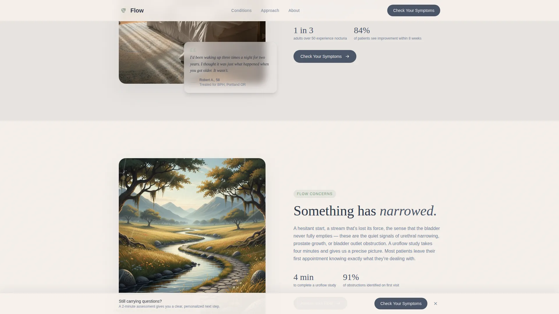
- A sticky bottom call-to-action bar that resurfaces after the second scroll section, keeping the primary action always within reach
Feature list
The template includes a focused set of interactive and visual features, all drawn from the source brief and designed to serve the patient acquisition goal.
Symptom Assessment Calculator
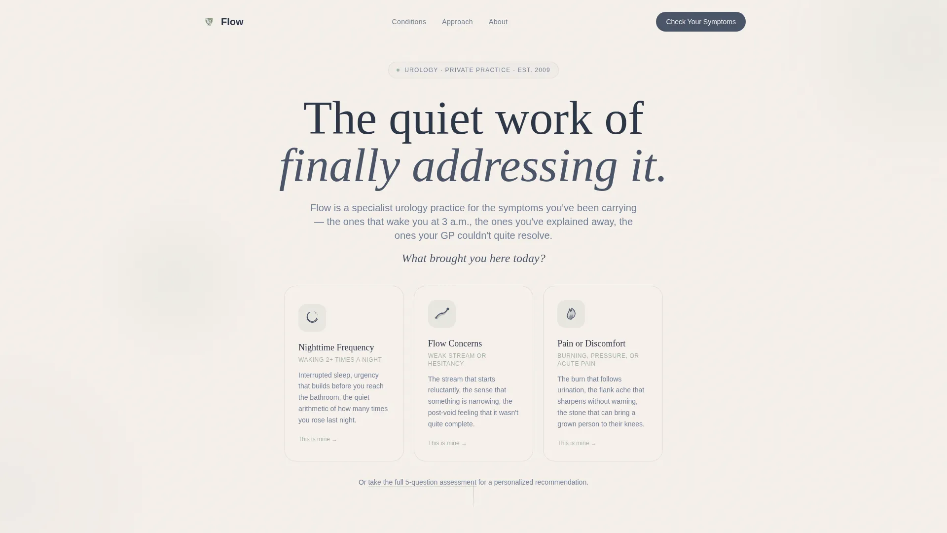
The header opens with a softly rounded calculator interface. Three illustrated doorway cards sit below the opening question: a crescent moon for nighttime frequency, a winding path for flow concerns, and a small flame for pain or discomfort. Each card is clickable and launches a personalized five-question assessment flow.
Five-Step Progressive Quiz
The quiz walks visitors through five questions in sequence: primary concern selection, duration via a week-range slider, severity impact on a one-to-five scale, previous treatments via checkboxes, and preferred appointment type. Results deliver a clear "Based on your answers, a consultation about X would be your best starting point" message, with a booking button that carries the answers forward.
Zigzag Testimonial Mosaic Layout
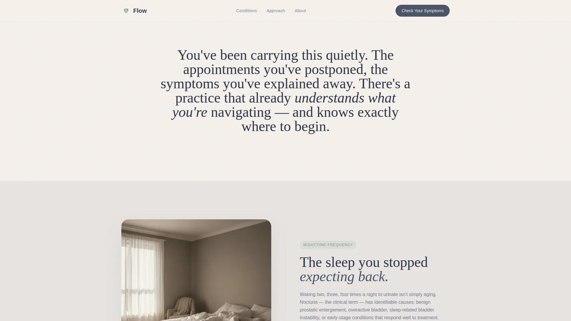
Four alternating sections each place a clinical condition explanation on one side and an embedded patient quote on the other. Testimonials grow progressively longer and more candid as the visitor scrolls, building cumulative emotional weight that makes inaction feel harder than booking.
Sticky Bottom Call-to-Action Bar
After the second scroll section, a persistent "Check Your Symptoms" bar appears at the bottom of the viewport. It stays in place as the visitor reads, offering a low-friction re-entry point into the quiz at any moment.
Organic Flow Visual System
Backgrounds alternate between fog gray and warm linen. Sage appears on icons and progress indicators. River stone carries every button and typographic anchor. Scroll-reveal animations, staggered card entries, and quiz modal transitions add motion without clinical coldness.
Page sections overview
| Section | Purpose |
|---|---|
| Hero Calculator | Opens with the symptom assessment card trio and the primary "Check Your Symptoms" call to action |
| Zigzag A: Nighttime Frequency | Explains nocturia and frequent nighttime urination alongside an embedded patient testimonial |
| Zigzag B: Flow Concerns | Covers urinary flow issues and hesitancy with a paired patient voice on the right panel |
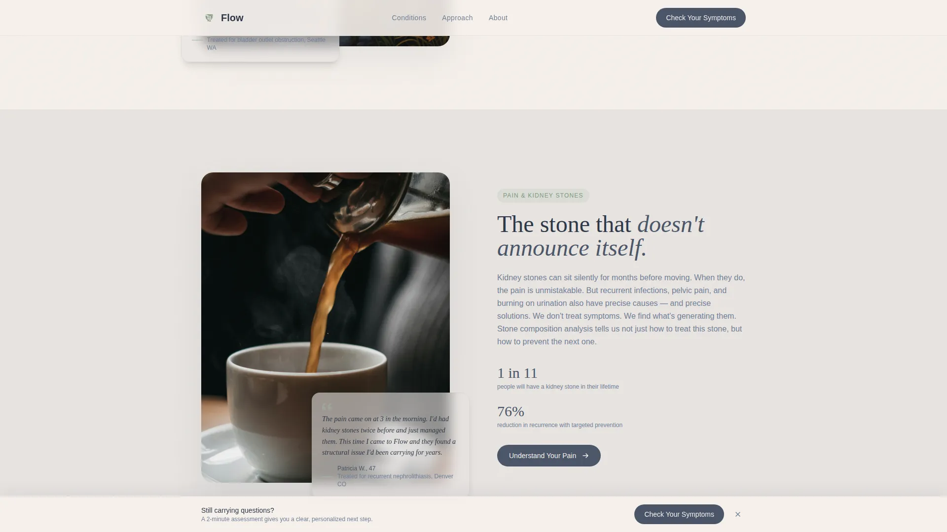
| Zigzag C: Pain and Stones | Addresses kidney stones and pain conditions with a testimonial growing in candor |
| Zigzag D: Fertility and Male Factor | Covers the male fertility workup conversation within a supportive, private framing |
| Footer: Linear Single-Row | Closes the page with a clean, minimal single-row footer |
Design & branding system
The visual identity follows an Organic Flow theme built to dissolve clinical anxiety. Every color, type choice, and spacing decision serves one goal: making a private medical topic feel approachable and human.
- Color palette uses morning fog gray (#E8E4E1) and warm linen (#F5F0EB) for alternating section backgrounds, muted sage (#A3B5A6) for icons and progress indicators, and deep river stone (#4A5568) for all buttons and typographic anchors
- Typography pairs Fraunces as a warm serif display face with DM Sans for clean, readable body text
- No stock photography of smiling doctors or anatomical diagrams; illustration and typography carry the entire visual weight
Mobile & speed optimization
The template is built desktop-first with full mobile responsiveness across all sections. The quiz and sticky bar adapt cleanly to smaller viewports without losing usability.
- Static content sections are server-rendered for fast initial load; the interactive quiz runs as a client component
- Scroll-reveal animations and staggered card entries are set to medium intensity, keeping motion purposeful rather than distracting
- The sticky bottom bar and quiz modal transitions are optimized for touch interaction on mobile devices
How this template helps you convert
The template is structured around a single conversion principle: give value before asking for commitment. Every design and copy decision supports that sequence.
- The symptom quiz opens the visit with a tool that helps the patient first. The result screen names a specific next step and pre-fills the booking form with their answers, reducing friction at the most important moment.
- The testimonial mosaic builds cumulative trust as the visitor scrolls. Each patient voice is slightly longer and more candid than the last, making hesitation feel less comfortable than acting.
- The sticky call-to-action bar ensures the primary conversion point is always visible, so a visitor who is ready to book never has to scroll back up to find it.
Other information about this template
This template is part of a specialized set of healthcare landing page designs focused on patient acquisition for specialty medical practices. It is particularly well-suited to urology niches where patient hesitancy and topic sensitivity require a distinctly non-clinical tone.
- The template falls under the Health and Medical category, specifically the Doctor and Physician Practice subcategory with a urologist niche focus
- Localization is set for English (United States), USD currency display, and twelve-hour time format
- The layout style is Zigzag and Alternating, the theme is Organic Flow, the color system is Soft Mist, the creative direction is Testimonial Mosaic, the header concept is a Calculator and Estimator, and the landing page direction is Quiz and Assessment
- The intersection match score for this template's category, subcategory, and niche alignment is 13 out of a possible range, indicating a highly specific and purpose-built fit
Theme
Organic Flow
Creative direction
Testimonial Mosaic
Color system
Soft Mist
Style
Zigzag/Alternating
Direction
Quiz/Assessment
Page Sections
Interactive Symptom Assessment Calculator
Five-step Progressive Quiz Flow
Zigzag Testimonial Mosaic Layout
Sticky Bottom Call-to-action Bar
Organic Flow Visual Identity
Related questions
Can I customize the quiz questions for my specific practice?
Does the template include the booking form, or do I connect my own?
Is the sticky call-to-action bar visible from the very beginning of the page?
Can this template work for a practice that treats both men and women?
What makes this different from a generic medical website template?



