Yoga Studio Booking Website Template
Asana is a brutalist yoga studio pricing landing page built on a split-screen layout. It combines an iridescent dark color system with spec-sheet clarity to present class plans without marketing fluff. A tabbed header, side-by-side plan comparison, and a frictionless three-field trial form move commitment-averse visitors from curiosity to their first class booking.
by Rocket studio
Quick summary
Asana is a single-page yoga studio pricing template built on a 50/50 split-screen layout. It uses a Bold Brutalist visual theme and an AI Iridescent color system to present class plans with the density of a technical document. The primary call to action is a seven-day free trial requiring only three form fields.
Who this template is for
This template is built for yoga studios that want to sell class packs and memberships without relying on vague lifestyle copy. It suits studio owners who trust numbers to do the persuading.
- Yoga studios targeting busy professionals, new mothers, or active retirees comparing plans on mobile
- Studio operators who want a pricing page that feels premium without being fussy or over-designed
- Independent instructors or small studio teams launching a structured pricing page quickly
What problem this template solves
Most yoga studio pricing pages bury the details inside soft photography and motivational quotes. Visitors leave without understanding what each plan actually includes. This template solves that directly.
- Plan details are presented in tight, scannable rows so visitors compare options without hunting for information
- The commitment barrier is lowered by separating the free trial path from the drop-in path, reducing decision fatigue
- The confirmation screen after sign-up filters the studio schedule to the visitor's chosen time slot, cutting the steps between sign-up and first booking
What you get with this template
You get a fully structured, single-page pricing layout designed to move visitors through a clear decision path. Every section serves the conversion goal without unnecessary decoration.
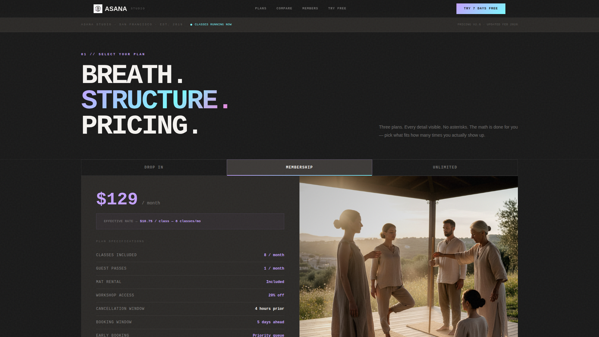
- A Feature Tab Switcher header with three plan tabs, a spec sheet on the left, and a matched photograph on the right
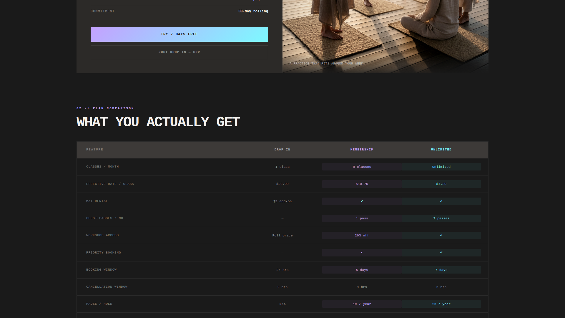
- A side-by-side plan comparison section with iridescent cell highlights on differentiating rows
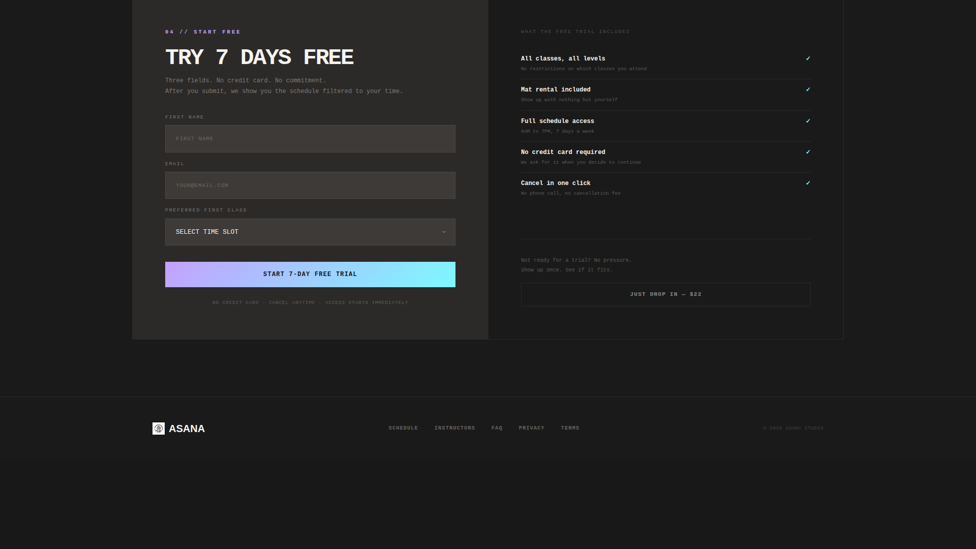
- A pinned "Try 7 Days Free" call-to-action on every plan column, plus a secondary drop-in option for hesitant visitors
- A post-submission confirmation screen that surfaces the studio schedule filtered to the visitor's selected time slot
Feature list
This template is built around a small set of high-impact components. Each one earns its place by moving the visitor one step closer to a decision.
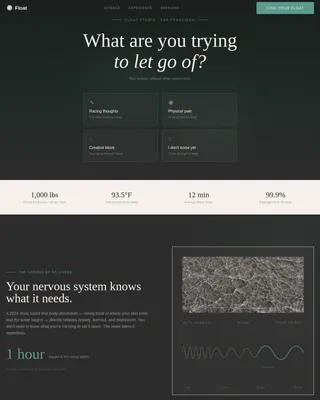
Feature Tab Switcher Header
Three brutalist slab tabs sit side by side at the top of the page, labeled Drop In, Membership, and Unlimited in heavy uppercase monospace type. Clicking a tab replaces both the spec sheet on the left and the matched photograph on the right with a hard cut, no transition fade.
Split-Screen Spec Sheet Layout
The left half of every active tab displays the plan's full detail list: class count, guest passes, mat rental inclusion, workshop access, and cancellation window. Each row is rendered in tight horizontal bands like a product data sheet, keeping information density high without visual clutter.
Iridescent Plan Comparison Table
Scrolling past the header reveals a side-by-side comparison of all three plans. Rows that differ between plans receive iridescent cell fills in holographic lilac or electric opal, so the eye goes directly to the deciding detail without having to read every line.
Pinned Dual Call-to-Action
Every plan column carries a pinned "Try 7 Days Free" button at the bottom. A secondary "Just Drop In" option sits alongside it for visitors who are not ready to commit. Both paths are always visible without scrolling.
Frictionless Three-Field Trial Form
The trial sign-up form asks only for first name, email address, and preferred first-class time slot. No credit card is required. The form is intentionally minimal so the spec sheet carries the persuasion load before the visitor reaches this step.
Post-Submission Schedule Screen
After the form is submitted, a confirmation screen appears showing the studio schedule filtered to the visitor's chosen time slot. A single tap lets the visitor book their first class immediately, closing the gap between intent and action.
Page sections overview
| Section | Purpose |
|---|---|
| Tab Switcher Header | Lets visitors select a plan tier and see its full spec sheet alongside a matched photo |
| Plan Comparison Table | Shows all three plans side by side with iridescent highlights on differentiating rows |
| Per-Class Cost Breakdown | Surfaces the math behind each plan so price-sensitive visitors can compare value directly |
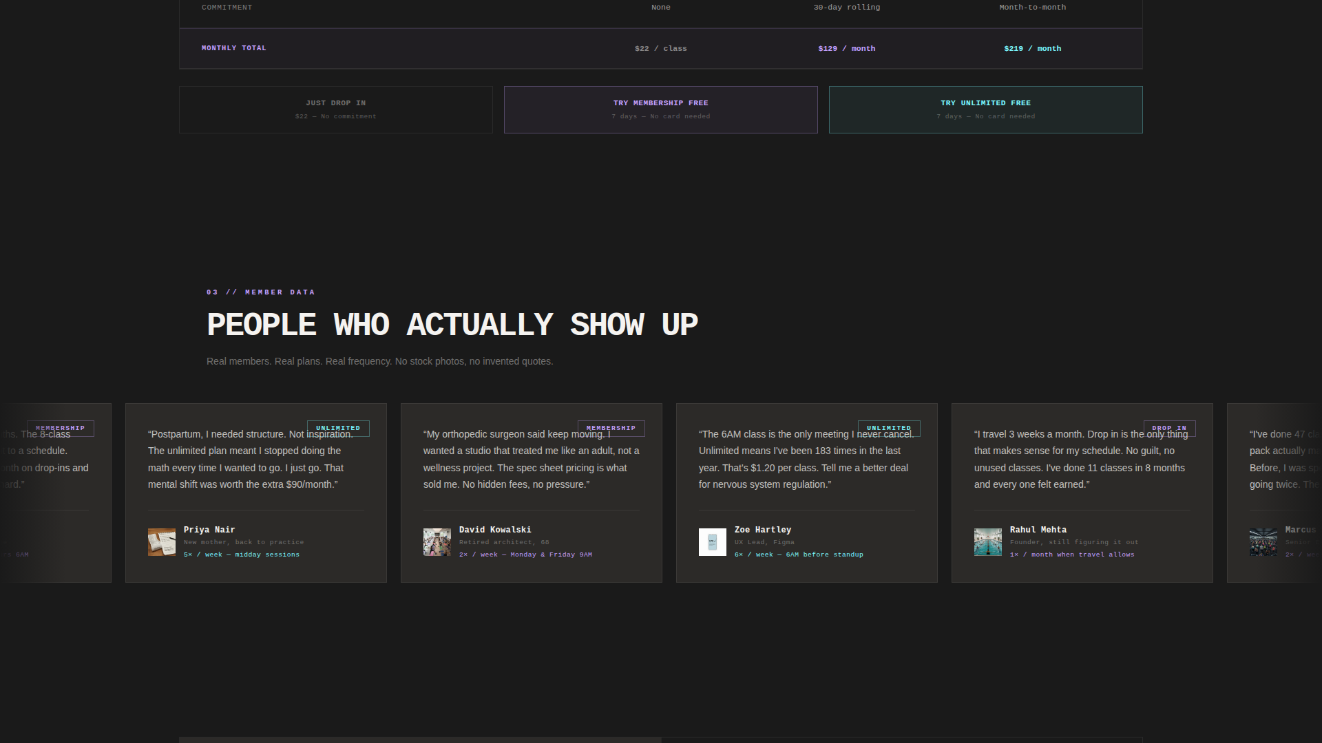
| Member Testimonials | Displays real member quotes that name a specific plan and weekly visit frequency |
| Pinned Plan calls to action | Keeps "Try 7 Days Free" and "Just Drop In" anchored at the bottom of every plan column |
| Trial Sign-Up Form | Collects first name, email, and preferred time slot with no credit card required |
| Post-Submission Confirmation | Shows a filtered schedule view and a single-tap booking button after form submission |
Design & branding system
The visual identity pairs a Bold Brutalist structure with an AI Iridescent color system. Dark, monolithic surfaces carry the layout while prismatic color accents guide every decision point.
- Background tones stay anchored in raw charcoal (#1A1A1A) and exposed-slab warm gray (#3D3A38), keeping the page grounded and readable
- Iridescent accents in holographic lilac (#C4A1FF) and electric opal (#7DF9FF) appear on plan card highlights, toggle switches, and active tab states to direct the eye
- Iridescent rose (#FF6FD8) is reserved for hover states and active plan indicators, ensuring color signals action rather than decoration
- Typography uses heavy uppercase monospace type for plan labels and headers, reinforcing the spec-sheet creative direction throughout
Mobile & speed optimization
The split-screen layout is designed with mobile visitors in mind. Visitors comparing plans between meetings on their phones are a named use case, so the layout handles smaller screens without losing clarity.
- The 50/50 split-screen stack adjusts for narrow viewports so spec sheet details and plan photos remain readable on mobile
- Pinned call-to-action buttons stay anchored at the bottom of each plan column regardless of scroll position or screen size
- The three-field trial form is minimal by design, reducing tap friction for mobile visitors completing sign-up on a small screen
How this template helps you convert
The page is structured as a progressive commitment path. Each section builds on the last, moving the visitor from curiosity to a low-risk first action.
- The tab switcher and spec sheet answer every plan question upfront, so the visitor arrives at the call-to-action already informed rather than uncertain
- The per-class cost breakdown section reframes the plan price as a daily or per-session value, making higher-tier plans easier to justify without extra copy
- The three-field trial form and the post-submission schedule screen reduce the steps between "I want to try this" and "I have a class booked" to an absolute minimum
Other information about this template
This template was designed at the intersection of a yoga studio pricing page use case and a technology-forward template category. A few additional details worth noting:
- The Spec Sheet creative direction means copy discipline is built into the layout; the template resists the urge to pad sections with adjectives
- The Freemium/Trial landing-page direction supports studios offering introductory free trial periods as their primary acquisition offer
- The Bold Brutalist theme makes this template visually distinct from the soft, pastel-heavy aesthetic common in yoga studio website templates
- The AI Iridescent color system is functional, not decorative; every iridescent tone signals a specific interactive state rather than adding ambient style
- This template is suited for yoga studio pricing pages where the goal is reducing drop-off among price-comparing visitors on mobile devices
Theme
Bold Brutalist
Creative direction
Spec Sheet
Color system
AI Iridescent
Style
Split Screen (50/50)
Direction
Freemium/Trial
Page Sections
Feature Tab Switcher with Hard-cut Swap
Split-screen Spec Sheet Layout
Iridescent Plan Comparison Table
Pinned Dual Call-to-action Buttons
Frictionless Three-field Trial Form
Post-submission Schedule Confirmation
Related questions
Can I change the plan names and pricing details?
Does the trial form require a credit card from the visitor?
How does the post-submission confirmation screen work?
Can I use this template if my studio does not offer a free trial?
Is this a single pricing page or a full studio website?