Language School Marketing Booking Website Template
Fluent is a split-screen landing page template built for local language schools. It pairs a Half-Page Photo+Text header with a Testimonial Mosaic layout to earn trust before asking for anything. The primary call to action guides visitors through a three-step inline booking form, no credit card, no friction, making enrollment feel like a natural next step.
by Rocket studio
Quick summary
Fluent is a single-page booking template designed for neighborhood language schools. It uses a 50/50 split-screen structure, an Ink & Paper color palette, and a mosaic of real student stories to build local credibility. The page closes with a three-step inline form that lets new students book a free placement lesson in under two minutes.
Who this template is for
This template fits language schools that serve a mixed local audience and need one page to speak to all of them. It works especially well for schools that rely on neighborhood reputation and word-of-mouth referrals.
- HR coordinators searching for executive language training programs for corporate cohorts
- Graduate students preparing for standardized language exams such as the Test of English as a Foreign Language (TOEFL) or International English Language Testing System (IELTS)
- Parents and adult learners looking for nearby classes and ready to book quickly
What problem this template solves
Most language school pages fail to connect with local searchers. They look generic, skip social proof, and bury the booking step behind too many clicks.
- Visitors arrive without context and leave before they find a reason to trust the school
- The booking process feels uncertain, especially for first-time adult learners or busy professionals
- Local proof points like transit proximity, neighborhood familiarity, and real student outcomes rarely appear on the page
What you get with this template
You get a complete, conversion-focused landing page with every section pre-built and ready to customize. The layout guides a visitor from first impression through to a confirmed booking appointment.
- A Half-Page Photo+Text split header with a star-rating block, district subhead, and primary booking button
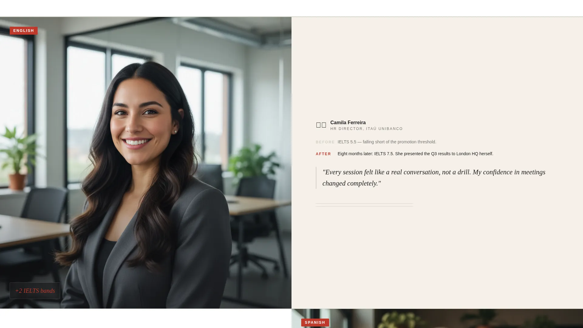
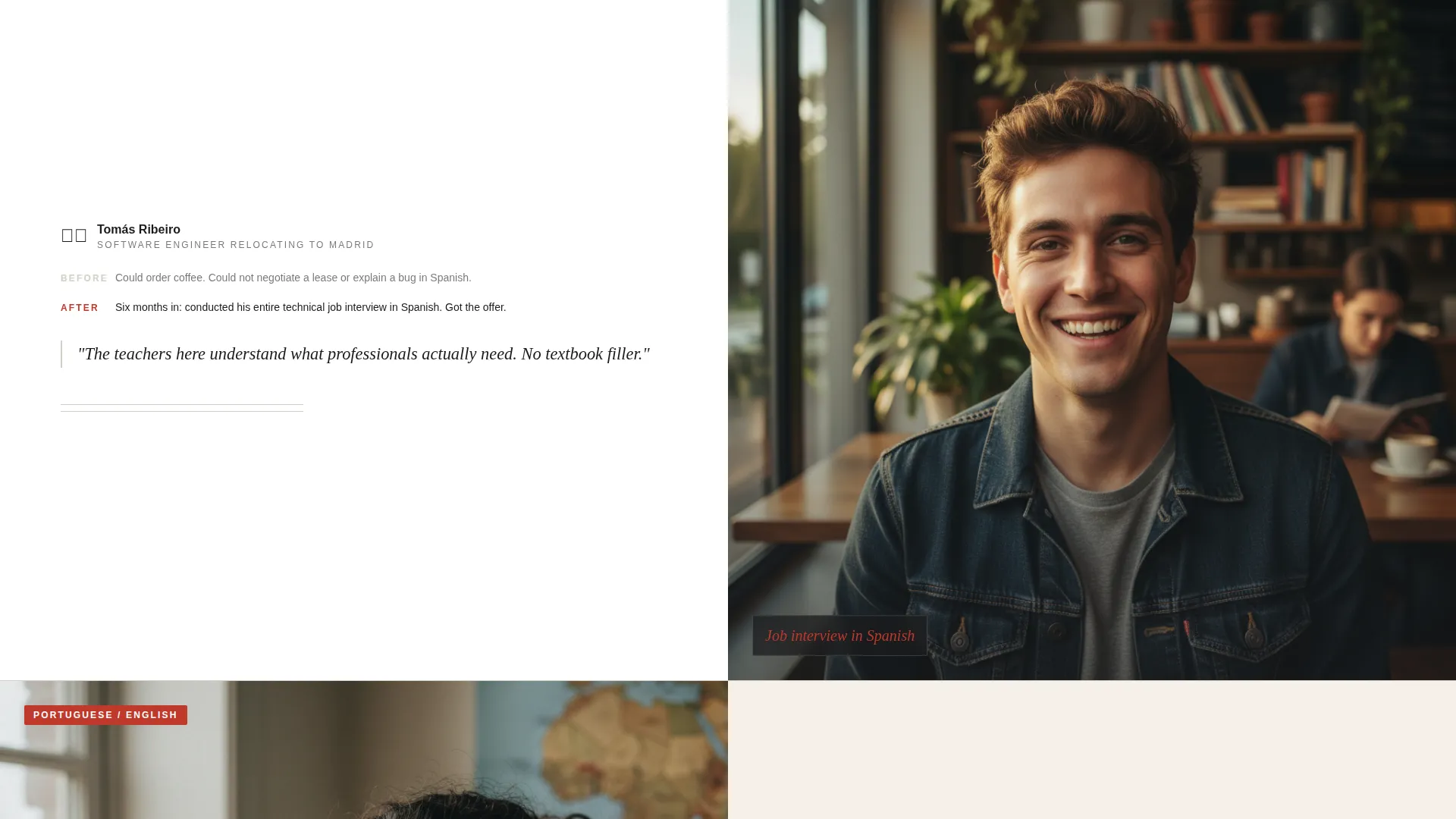
- A Testimonial Mosaic section with alternating photo-left and photo-right rows, each pairing a student portrait with a before-and-after story
- A three-step inline booking form covering language selection, scheduling preferences, and contact details
Feature list
This template is built around a handful of purposeful, well-defined components. Each one is designed to do specific work in the conversion flow.
Split-Screen Header Panel
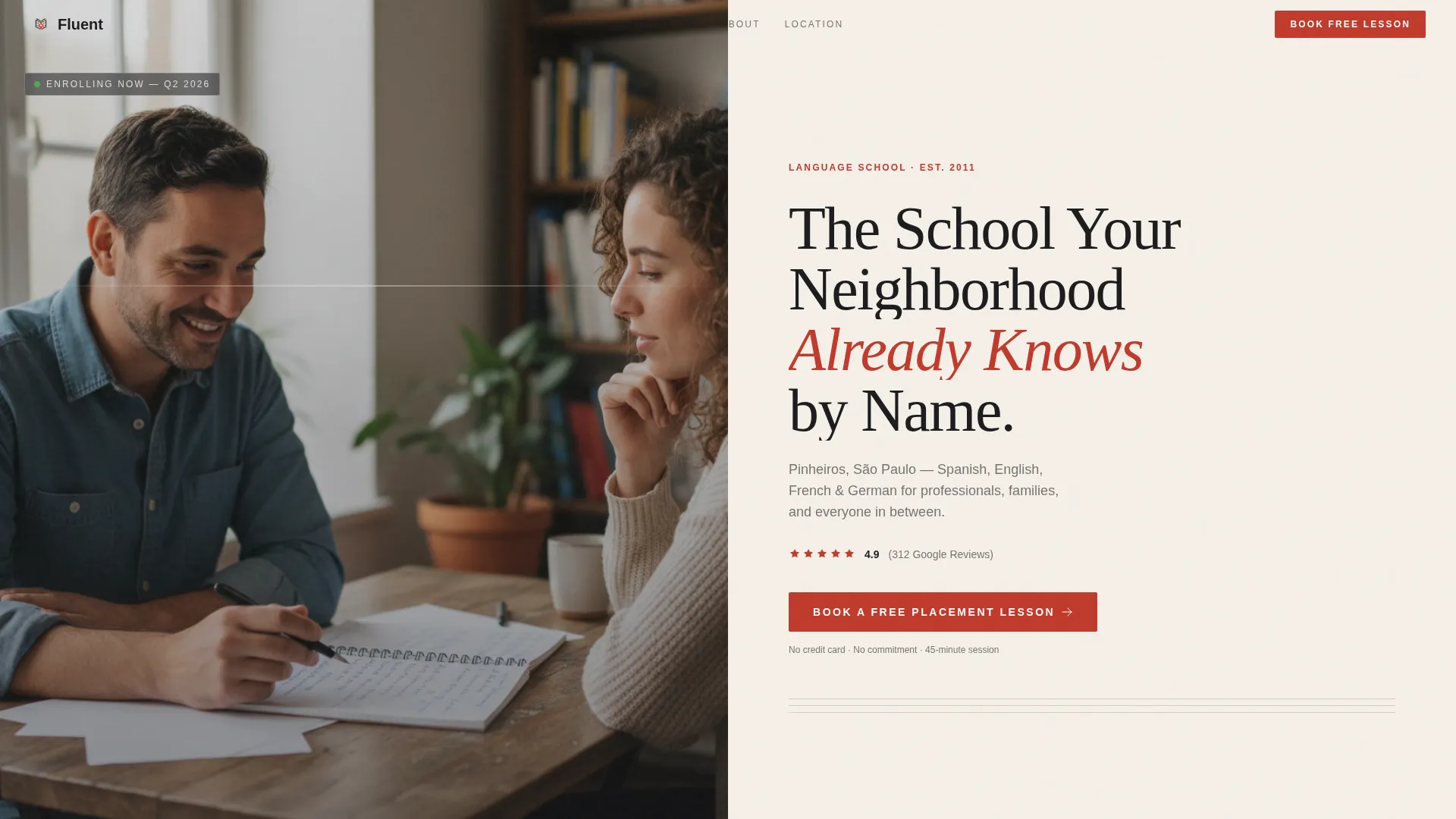
The header divides the viewport evenly. The left panel holds a desk-level photograph of two adults in conversation, with natural window light and a notebook of handwritten conjugations visible. The right panel is pure cream with a bold serif headline, a one-line district subhead, a Google star rating with review count, and a red annotation-style booking button.
Testimonial Mosaic Layout
Student stories are arranged in alternating split rows, photo left, then photo right, creating a page-turning visual rhythm. Each story is structured as a before-and-after narrative: a score improvement, a job interview completed in a new language, a personal milestone reached. This keeps proof specific and believable.
Inline Three-Step Booking Form
The booking form opens inline on the same page. Step one collects the student's target language and current proficiency level via dropdown. Step two offers a checkbox grid for preferred days and times. Step three asks for name, phone, and an email address. No credit card is required.
Location and Transit Map Section
A dedicated map section pins the school's exact address and displays walking-time radii from nearby transit stops. This grounds the page in local geography and answers the practical question every neighborhood searcher has: "How far is it from where I already am?"
Sticky Mobile Booking Bar
On mobile devices, the primary call to action persists as a sticky bottom bar throughout the scroll. Visitors can tap to book at any point in the page without scrolling back to the top.
Annotation Red call to action System
The color reserved for calls to action, active states, and key proof points is a single, deliberate red-ink annotation tone. It appears only where action is expected, so every red element on the page carries clear intent and never competes with the content around it.
Page sections overview
| Section | Purpose |
|---|---|
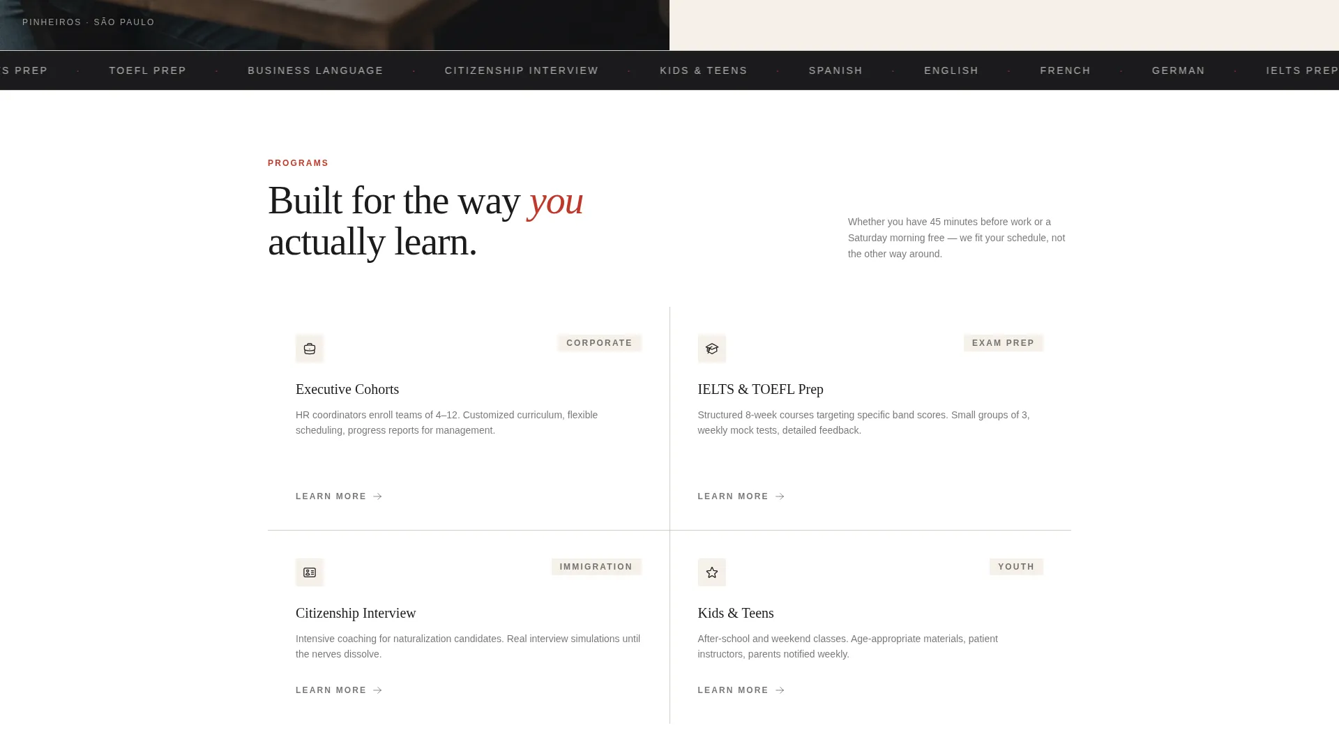
| Split-screen header | Introduce school, location, and rating |
| Headline and subhead | Name city, district, and brand promise |
| Star rating block | Display Google rating and review count |
| Primary booking call to action | Drive first click to inline form |
| Testimonial row one | Share first student before-and-after story |
| Testimonial row two | Share second student milestone narrative |
| Mid-page booking call to action | Re-engage visitors mid-scroll |
| Testimonial row three | Complete third proof-point story |
| Location map section | Show address and transit walking times |
| Three-step inline form | Capture language, schedule, and contact |
| Sticky mobile bar | Keep booking action always accessible |
Design & branding system
The visual identity follows a Corporate Precision theme built around the Ink & Paper color system. Every design decision reinforces the feeling of a leather-bound notebook left open on a well-used desk.
- Deep manuscript black (#1B1B1E) and warm archival cream (#F5F0E8) form the primary contrast pair, with ruled-line gray (#D2CFC4) used for dividers and secondary text
- Red-ink annotation (#C0392B) appears exclusively on calls to action, active states, and key proof points, never as decoration
- Typography is set in a high-contrast serif that signals rigor, precision, and analog authority without feeling cold or academic
Mobile & speed optimization
The template is structured to perform cleanly on small screens. Every interactive element is sized and placed with touch input in mind.
- The sticky bottom booking bar keeps the primary call to action within thumb reach throughout the entire mobile scroll
- The three-step inline form uses dropdown menus and checkbox grids rather than open text fields, reducing typing effort on mobile
- The alternating mosaic layout reflows naturally on narrow viewports, keeping student stories readable without horizontal scrolling
How this template helps you convert
The page is built around a deliberate trust-building sequence. Every section earns the next click before asking for anything.
- The header combines a warm, human photograph with a visible star rating and district name, establishing local credibility in the first viewport without any scrolling required.
- The Testimonial Mosaic stacks specific, outcome-focused student stories in alternating visual rows, so proof accumulates gradually and feels earned rather than curated.
- The three-step inline form removes commitment friction by asking only for scheduling preferences and contact details, framing the booking as joining a conversation already in progress.
Other information about this template
This template is designed for language schools that depend on local search traffic and neighborhood reputation. It is particularly well suited for schools that offer instruction in widely sought languages such as Spanish, French, English, and German.
- The page structure supports local search engine optimization (SEO) naturally through its district subhead, map section, and location-grounded testimonials
- The template style is a 50/50 split screen throughout, which keeps every section visually balanced on both desktop and tablet viewports
- The header concept is a Half-Page Photo+Text layout, and the creative direction is a Testimonial Mosaic, both are pre-built and ready to populate with real student content
- This template can support schools operating in multilingual urban markets where students include recent immigrants, working professionals, and exam-focused learners
Theme
Corporate Precision
Creative direction
Testimonial Mosaic
Color system
Ink & Paper
Style
Split Screen (50/50)
Direction
Booking/Scheduling
Page Sections
Split-screen Header with Star Rating
Alternating Testimonial Mosaic
Three-step Inline Booking Form
Location Map with Transit Radii
Sticky Mobile Booking Bar
Annotation Red Call to Action System
Related questions
Who is this landing page template designed for?
How does the booking form work?
Can I use this template for multiple languages?
Does the template include the map and transit section?
Do I need a developer to customize this template?



