Language School Marketing Reviews & Social Proof Website Template
Fluent is an editorial-style language school landing page built on a split-screen layout. Every section pairs a transparent offer panel with a full reveal of what that price buys. Inline accordion forms, a 72-hour rate-lock mechanic, and a bold testimonial card hero create a landing page that earns trust before it asks for a single click.
by Rocket studio
Quick summary
Fluent is a single-page, split-screen landing page template built for language schools that sell courses through discounts and bundles. It uses an editorial magazine aesthetic to present pricing with complete transparency. Every offer on the page shows the original price, the discounted rate, the savings percentage, and a full course description before asking visitors to do anything.
Who this template is for
This landing page is built for language schools and independent instructors who need to sell courses online with confidence. It is especially well-suited for schools offering introductory discounts, semester bundles, or referral credits.
- Corporate relocation programs that need to sell conversational language courses on a tight timeline
- University students and immigrant parents looking for affordable, structured language instruction online
- Online education providers who want to highlight transparent pricing without overwhelming prospective students
What problem this template solves
Most course landing page designs bury the important details. Visitors land on a page, see a price, and have no idea what they are actually buying. That hesitation kills conversions. This template solves that problem by making radical pricing transparency the entire design concept.
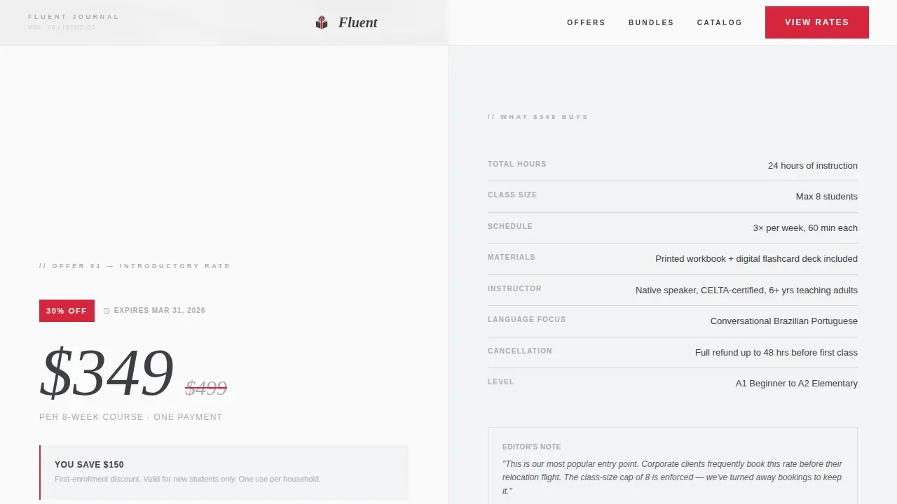
- Each offer section clearly shows hours included, class size cap, instructor background, materials, and cancellation policy
- Discount badges in signal red highlight savings instantly, so visitors can compare value at a glance
- The inline form keeps the enrollment journey friction-free, with only the fields that matter
What you get with this template
This is a complete, single-file landing page built around five core sections. You do not need multiple pages to communicate your full offer. Every relevant section is already structured and ready to customize.
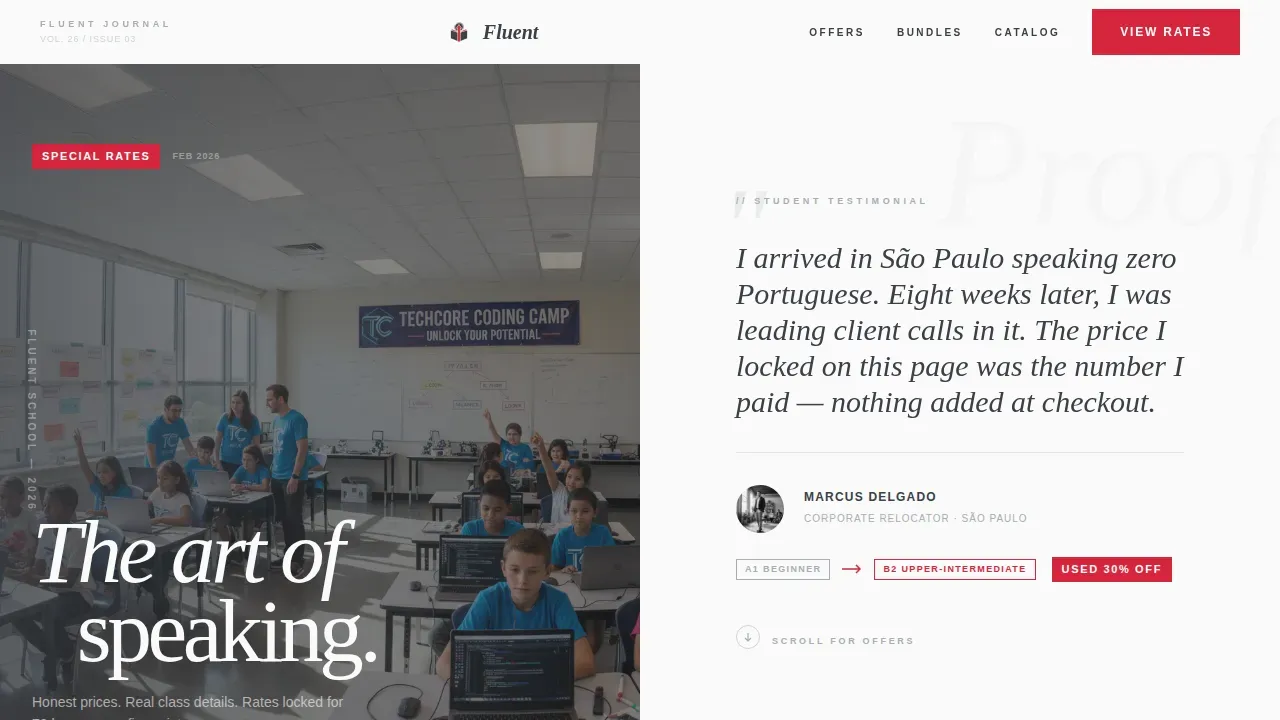
- A hero section with an oversized pull-quote testimonial card and a before-and-after proficiency badge
- Three split-screen offer sections covering introductory discounts, semester bundles, and referral credits
- A footer with a course catalog download form that captures name and email
Feature list
This landing page template ships with a focused set of features built directly from the source design brief. Each one serves the goal of helping language schools convert visitors into enrolled students without friction.
Split-Screen Offer Layout
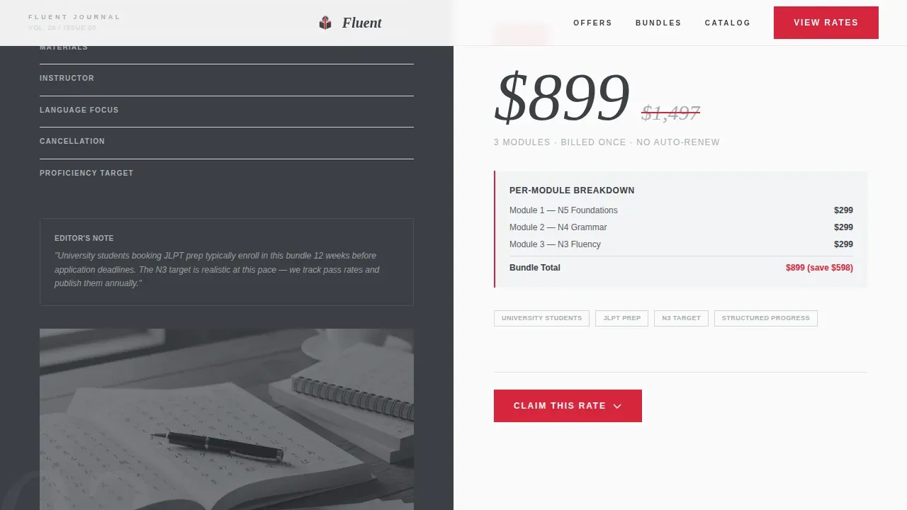
Each section divides into two equal panels. The left panel shows the offer: exact price, original price, percentage saved, and expiration date. The right panel reveals what that price covers: hours, class size, instructor credentials, materials, and cancellation terms. The layout lets users read every detail before they decide.
Inline Accordion Claim Form
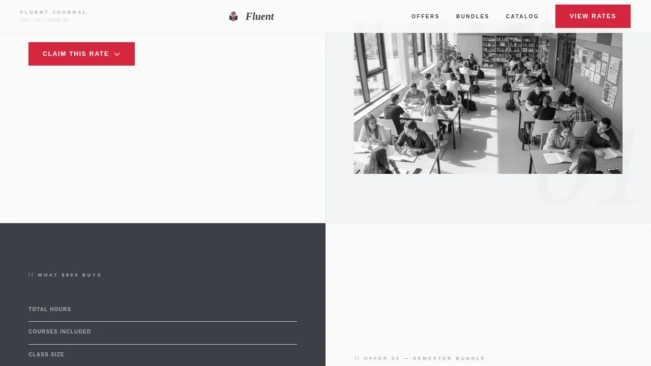
The primary call to action, "Claim This Rate," opens an inline accordion directly beside each offer. The form asks for language of interest, current proficiency level via radio buttons, and an email address. Submitting the form locks the quoted price for 72 hours. This keeps the form simple and the commitment low.
Editorial Testimonial Card Hero
The hero section places a single oversized pull-quote card against a half-screen photographic blur of a classroom in session. The card includes the student name, language studied, discount used, and a before-and-after proficiency badge. This is social proof that reads like editorial copy, not advertising, giving visitors immediate trust.
Transparent Pricing Display
Every offer on this landing page presents before-and-after pricing to emphasize discount value. The signal red accent color highlights the discounted figure. Expiration dates are shown clearly, so visitors understand exactly when the rate expires. This approach treats every course offer like a product review with full disclosure.
Course Catalog Footer Form
The footer invites visitors to download the full course catalog as a designed PDF. A short form captures name and email. This secondary conversion point reaches visitors who want more details before committing to a specific course or bundle.
GSAP ScrollTrigger Animations
The template uses medium-intensity scroll-triggered animations. Sections reveal with staggered fades, and images scale gently on hover. These motion details reinforce the editorial magazine feel without distracting from the offer content.
Page sections overview
| Section | Purpose |
|---|---|
| Hero Testimonial Card | Opens with social proof and establishes trust before scrolling |
| Introductory Discount Split | Sells entry-level courses with full pricing and course details |
| Semester Bundle Split | Highlights multi-course savings with alternating panel layout |
| Referral Credits Split | Explains referral mechanics with transparent reward description |
| Catalog Download Footer | Captures email via PDF download as a secondary conversion form |
Design & branding system
The visual identity follows an Editorial Magazine theme built on a Monochrome Steel color system. Every design choice reinforces the broadsheet newspaper aesthetic: ink-dark columns, cool gray gutters, and a single color that signals action.
- Colors: matte charcoal (#3B3F45) for primary text, brushed aluminum (#A8ADB3) for secondary elements, newsprint white (#FAFAFA) for the page background, and signal red (#D7263D) reserved strictly for discount badges and active call-to-action buttons
- Typography: DM Serif Display for headlines and pull-quotes, Plus Jakarta Sans for body text and form labels, creating a clean and professional design contrast that is visually appealing across all screen sizes
- The logo and brand mark sit within this restrained palette, so any school can swap in its own identity without disrupting the layout
Mobile & speed optimization
This template is designed desktop-first to deliver the magazine spread feel on wide screens. It is also mobile friendly, stacking the split-screen panels vertically on smaller devices so that every detail remains readable.
- The inline accordion form is built to stay easy to use on mobile devices, keeping form fields to the essential minimum
- Server Components handle static sections for faster initial load, while Client Components power the interactive accordion interactions
- The scroll-triggered animation module degrades gracefully so the page remains fully usable even without JavaScript-heavy environments
How this template helps you convert
Language school landing pages must balance high-value educational content with the psychological triggers that drive enrollment. This template is designed to do exactly that, combining persuasive layout with transparent information at every scroll point.
- The testimonial card hero builds trust instantly, so visitors are already engaged before they reach a single offer or call-to-action button
- The split-screen offer format lets visitors self-qualify by reading every detail, which reduces objections and makes the "Claim This Rate" click feel like clipping a coupon rather than signing a contract
- Multiple calls to action appear beside each offer and again at the footer, giving users more than one natural moment to convert without pressure
Other information about this template
This template is a practical starting point for any online education provider who wants to create a modern, well-designed course landing page without building from scratch. Using pre-built templates can streamline the process significantly, letting schools focus on writing strong course descriptions rather than wrestling with layout and coding.
- Fluent Forms allows you to create custom, standalone pages for any new or existing form, making it straightforward to connect or extend the inline claim forms if needed
- Landingi is a platform that offers tools to easily create a stunning education landing page without any coding skills, and this template shares that same no-coding-required philosophy through its structured, ready-to-customize layout
- Page builders and platforms like Webflow offer a variety of landing page templates designed for the education sector, and this template draws inspiration from that ecosystem of well-structured education landing page design patterns
- The blog and post content strategy can link back to this landing page to drive organic visitors toward the discount offers, creating a complete content and conversion loop
- Schools can define their own module structure and add video content, reviews, or additional showcase sections within the existing framework without altering the core design system
- The template is ready to sell courses across multiple languages and proficiency levels, covering the full journey from beginner interest to advanced enrollment
Theme
Editorial Magazine
Creative direction
Transparent Process
Color system
Monochrome Steel
Style
Split Screen (50/50)
Direction
Content/Resource
Page Sections
Split-screen Offer Layout
Inline Accordion Claim Form
Editorial Testimonial Card Hero
Transparent Pricing Display
Course Catalog Footer Form
GSAP Scrolltrigger Animations
Related questions
Can I customize the colors and logo to match my school's brand?
How does the 72-hour rate-lock form work?
Is this template suitable for selling courses in multiple languages?
Does the page include social proof beyond the hero testimonial?
Can I add a video section to this landing page?



