Contemporary Youth Wellness Landing Page Template
Vault is a dashboard and data grid landing page template built for teen and youth investment account platforms. It combines a multi-step onboarding hero, a scroll-driven comparison journey, and a lead magnet hub into one Executive Suite design. Deep charcoal, warm amber, and parchment white give the page the feel of a private wealth office built for the next generation.
by Rocket studio
Quick summary
Vault is a single-page landing page template for teen and youth investment account platforms. It guides financially literate parents, grandparents, and curious teenagers through a scroll-driven experience that makes the cost of waiting feel real. The design pairs dashboard-grade data grids with a warm Executive Suite palette to turn compound interest math into a clear, compelling case for action.
Who this template is for
This template is built for fintech founders and youth finance brands that need to convert families into custodial account signups. It speaks to three distinct audiences at once, and it earns trust from all three.
- Financially literate parents aged 30 to 55 who already maximize their own retirement contributions and want to give their children a head start
- Grandparents who fund custodial accounts and need a clear, credible page to understand what they are opening
- Teenagers aged 13 to 17 with genuine financial curiosity who want to see real portfolio tools, not a classroom simulator
What problem this template solves
Most youth finance pages either oversimplify the product for kids or overwhelm parents with legal language. Neither approach closes the gap between interest and action. This template solves the conversion problem by making the math do the persuading.
- Parents struggle to visualize what a decade of early investing actually produces compared to a savings account sitting idle
- Teens disengage when financial tools feel like homework rather than real-world tools they can own
- Lead generation pages for custodial accounts rarely qualify prospects or build a drip sequence before the first signup
What you get with this template
You get a fully structured, section-led landing page built around one central idea: showing families exactly what they lose by waiting. Every section earns the next click rather than demanding it.
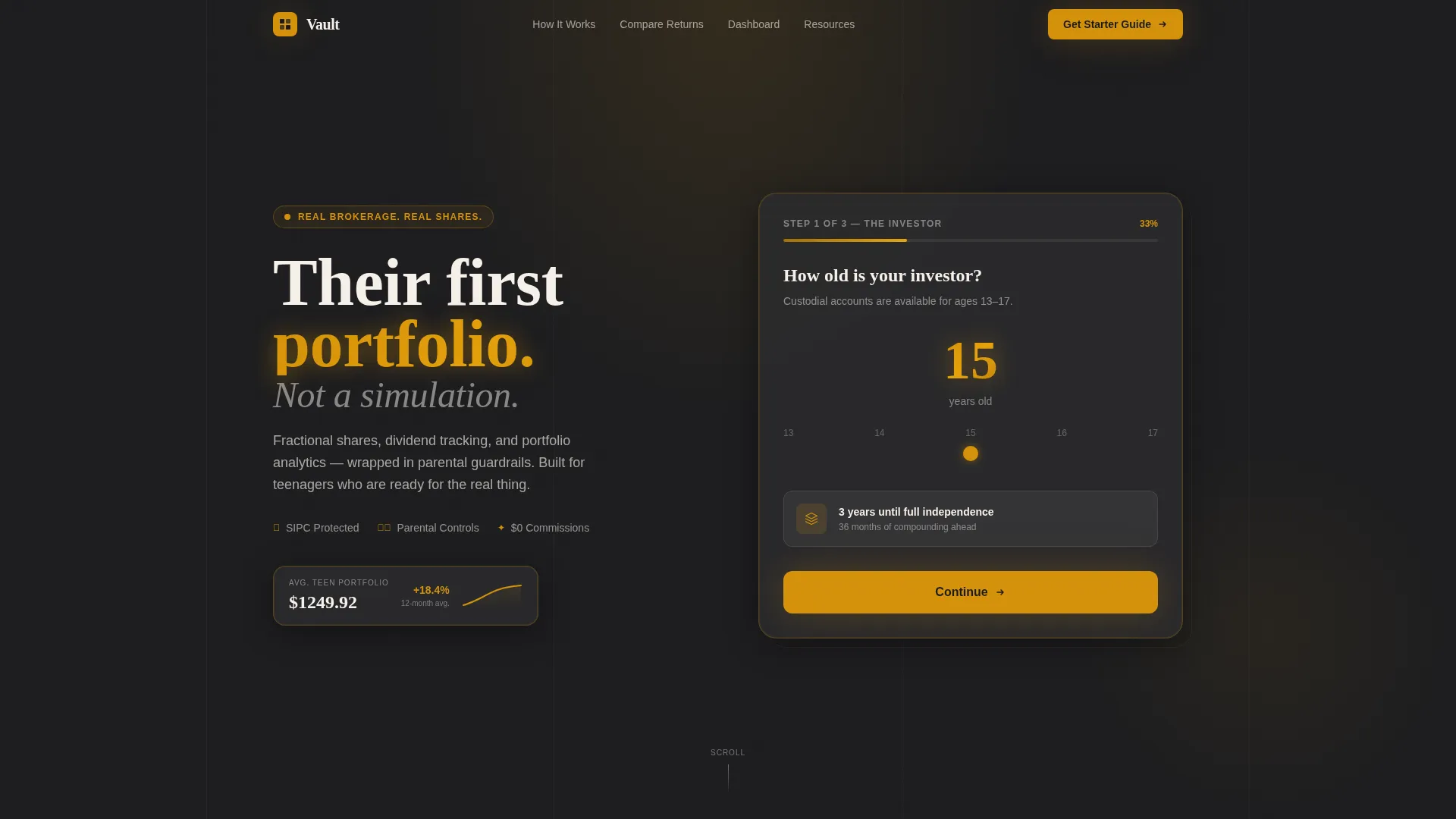
- A three-step hero form that moves from age input to interest selection to a live sample portfolio card, all before the visitor scrolls
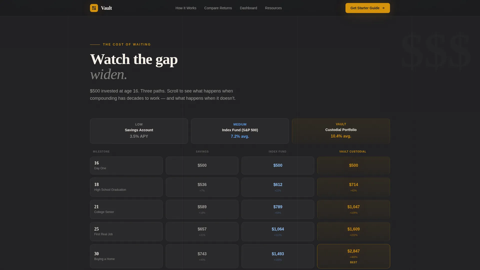
- A scroll-triggered comparison grid that reveals savings versus index fund versus custodial portfolio growth across three age checkpoints
- A lead magnet content hub with a primary download call to action and three secondary gated resources that build a drip email sequence
Feature list
This template packs tightly scoped, prompt-backed features into a single high-converting page. Each component serves a specific audience moment.
Three-Step Onboarding Hero Form
The hero opens with a clean multi-step form disguised as a portfolio-building ritual. Step one uses an age slider from 13 to 17. Step two presents tappable interest tiles covering tech, gaming, sneakers, music, and clean energy. Step three instantly surfaces a sample starter portfolio card showing ticker symbols, allocation percentages, and a projected growth curve. An amber progress bar fills across all three steps, making the experience feel like progress, not paperwork.
Scroll-Triggered Comparison Data Grid
The comparison journey unfolds as the visitor scrolls. Three parallel tracks display what a savings account, a generic index fund, and an actively managed custodial portfolio with reinvested dividends each produce over time. Data grid rows reveal at age 16, age 21, and age 30, with amber highlighting the custodial column as the numbers diverge. The design lets the math speak before any sales copy has to.
Dashboard Preview with Bento Layout
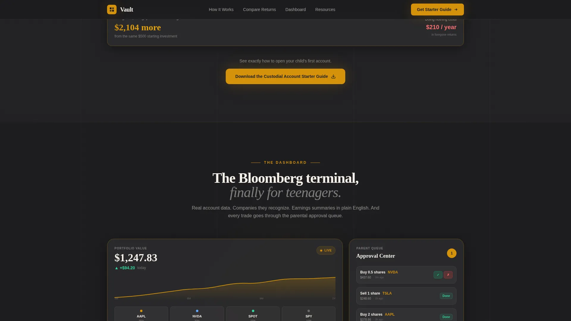
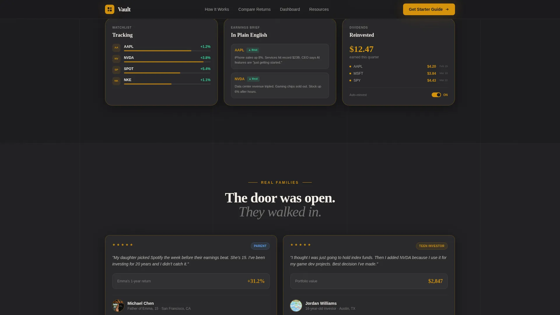
Between comparison grid checkpoints, real account screenshots show a teen's actual dashboard interface. Visitors see watchlists populated with recognizable company names, earnings call summaries written in plain language, and a parental approval queue. The bento layout organizes these panels cleanly so parents and teens can both understand what they are looking at.
Lead Magnet Content Hub
The primary call to action reads "Download the Custodial Account Starter Guide" and is positioned immediately after the first comparison grid, when the gap between saving and investing first feels visceral. The form captures first name, email, and a single qualifying question: "Do you already have a custodial account?" Three secondary resources below the fold, including a compound interest calculator, a First Portfolio worksheet, and a tax implications one-pager, each gate behind the same email capture to build a drip sequence.
Social Proof Testimonial Cards
Testimonial cards represent all three audience segments: a parent, a teen, and a grandparent. Each card includes portfolio growth metrics alongside the person's name and role, grounding the social proof in real-world financial outcomes rather than generic quotes.
Glassmorphism Floating Portfolio Card
The hero section features a glassmorphism-styled floating card that displays the generated sample portfolio. It sits above the dark charcoal background with a soft amber glow, giving the page an immediate sense of live financial data and polish without requiring any backend connection from the template itself.
Page sections overview
| Section | Purpose |
|---|---|
| Hero Onboarding Form | Engages visitors with a three-step age, interest, and portfolio ritual before the first scroll |
| Comparison Data Grid | Reveals compound growth divergence across savings, index fund, and custodial tracks at three age milestones |
| Dashboard Preview Bento | Shows real-feeling account screenshots including watchlists, earnings summaries, and the parental approval queue |
| Social Proof Cards | Builds trust with parent, teen, and grandparent testimonials anchored to portfolio metrics |
| Lead Magnet Call to Action | Captures email with the starter guide download form and qualifying toggle question |
| Secondary Resource Hub | Gates three additional tools behind the same email to initiate a drip sequence |
| Linear Footer | Closes the page with a single-row footer pattern for clean, minimal navigation |
Design & branding system
The visual identity follows an Executive Suite theme. The palette feels like a private wealth office where someone left the door open for a teenager. Charcoal dominates the backgrounds and navigation, amber marks every interactive element and live data point, graphite separates grid rows, and parchment holds the numbers so they breathe.
- Colors: deep boardroom charcoal (#1C1C1E) for backgrounds, brushed graphite (#2C2C2E) for grid row separators, warm amber (#D4920B) for all interactive elements and data highlights, and parchment white (#F5F0E8) for data cells and readable surfaces
- Typography: DM Sans handles all interface and body text for clean on-screen readability, while Fraunces provides editorial serif weight for major headlines and section titles
- Animation and interactivity are set to high, with scroll-triggered grid reveals, staggered number animations, shimmer effects on cards, and a live amber progress bar in the hero form
Mobile & speed optimization
The template is designed desktop-first to honor the Bloomberg terminal aesthetic that drives its visual identity. Full mobile responsiveness ensures the experience translates cleanly to any screen size without losing the data grid structure.
- The age slider, interest tiles, and portfolio card in the hero form are all built for touch interaction on mobile devices
- Scroll-triggered grid animations and staggered number reveals adapt to mobile viewport behavior so the comparison journey reads clearly on smaller screens
How this template helps you convert
Every section of this landing page is engineered to move a hesitant parent or curious teen one step closer to submitting their email or opening an account.
- The multi-step hero form qualifies visitors by interest and age before they see a single sales message, creating buy-in through participation rather than persuasion
- The comparison data grid makes the financial cost of inaction concrete at three real life-stage snapshots, turning abstract compound interest into a felt urgency that no headline could replicate
- The lead magnet call to action captures a qualified email at the exact moment emotional readiness peaks, and the three gated secondary resources extend engagement through a structured drip sequence
Other information about this template
This template is categorized under Finance and Insurance, specifically in the Teen and Youth Finance subcategory with a niche focus on teen and youth investment accounts. It is localized for United States audiences, using USD currency, MM/DD/YYYY date formatting, and standard US financial terminology including terms like 401(k), custodial account, and brokerage account.
- The template style is Dashboard and Data Grid, making it well suited for fintech products that need to present numerical data in a credible, structured visual format
- The creative direction is a Comparison Journey, a scroll-paced narrative structure that reveals data progressively rather than dumping it all above the fold
- The header concept is a Multi-Step Form, and the landing page direction is a Content and Resource hub, meaning the page earns its conversion through education and gated tools rather than a hard sell
- The footer uses Pattern 1, a linear single-row layout that keeps the close of the page clean and uncluttered
- Animation and interactivity levels are both set to high in the build spec, covering scroll-triggered reveals, shimmer card effects, the amber progress bar, and client-side interactive components including the age slider and interest tile selector
Theme
Executive Suite
Creative direction
Comparison Journey
Color system
Charcoal & Amber
Style
Dashboard/Data Grid
Direction
Content/Resource
Page Sections
Three-step Hero Onboarding Form
Scroll-triggered Comparison Data Grid
Dashboard Preview Bento Layout
Lead Magnet Content Hub
Social Proof Testimonial Cards
Glassmorphism Floating Portfolio Card
Related questions
Who is the primary audience this landing page template is designed for?
Does the template include real financial data or live market feeds?
Can I use this template to capture leads before launching a full platform?
What makes the comparison grid section effective for conversion?
Is this template suitable for audiences who are new to investing?



