Exercise Program Landing page Template
Focus is a single-page booking landing page built for ADHD exercise programs. It uses a zigzag checklist layout to mirror the visitor's experience, validate gym failures as system problems, and guide them toward a movement assessment booking. The warm Healing Space aesthetic and scroll-linked progress design make the page feel like a conversation, not a sales pitch.
by Rocket studio
Quick summary
Focus is a booking-oriented landing page template for ADHD movement programs. It pairs a Checklist and Audit zigzag layout with a Healing Space visual identity to turn reader recognition into booked assessments. The page validates gym failures, reframes quitting as a design flaw, and earns the click before the call to action ever appears.
Who this template is for
This template is built for coaches, practitioners, and wellness professionals who serve adults recently diagnosed with Attention Deficit Hyperactivity Disorder (ADHD). It suits anyone offering structured movement, exercise circuits, or fitness assessments to clients who have burned out on conventional gym programs.
- Movement coaches and personal trainers specializing in ADHD clients
- Wellness practitioners and therapists recommending exercise resources to adults in their thirties and forties
- Health and wellness brands launching an ADHD-specific movement program online
What problem this template solves
Most fitness landing pages assume the visitor is already motivated. For adults with ADHD, that assumption erases them before they even read past the hero. This template fixes that by leading with recognition instead of persuasion.
- Conventional fitness pages trigger guilt by celebrating consistency the ADHD brain struggles to sustain
- Generic booking pages offer no emotional entry point for visitors who have already failed at gyms, yoga, and running plans
- Standard call-to-action placement pressures visitors before trust is established
What you get with this template
You get a complete, single-page landing page built around a specific emotional arc: from recognition to relief to booking. Every section is purposefully sequenced.
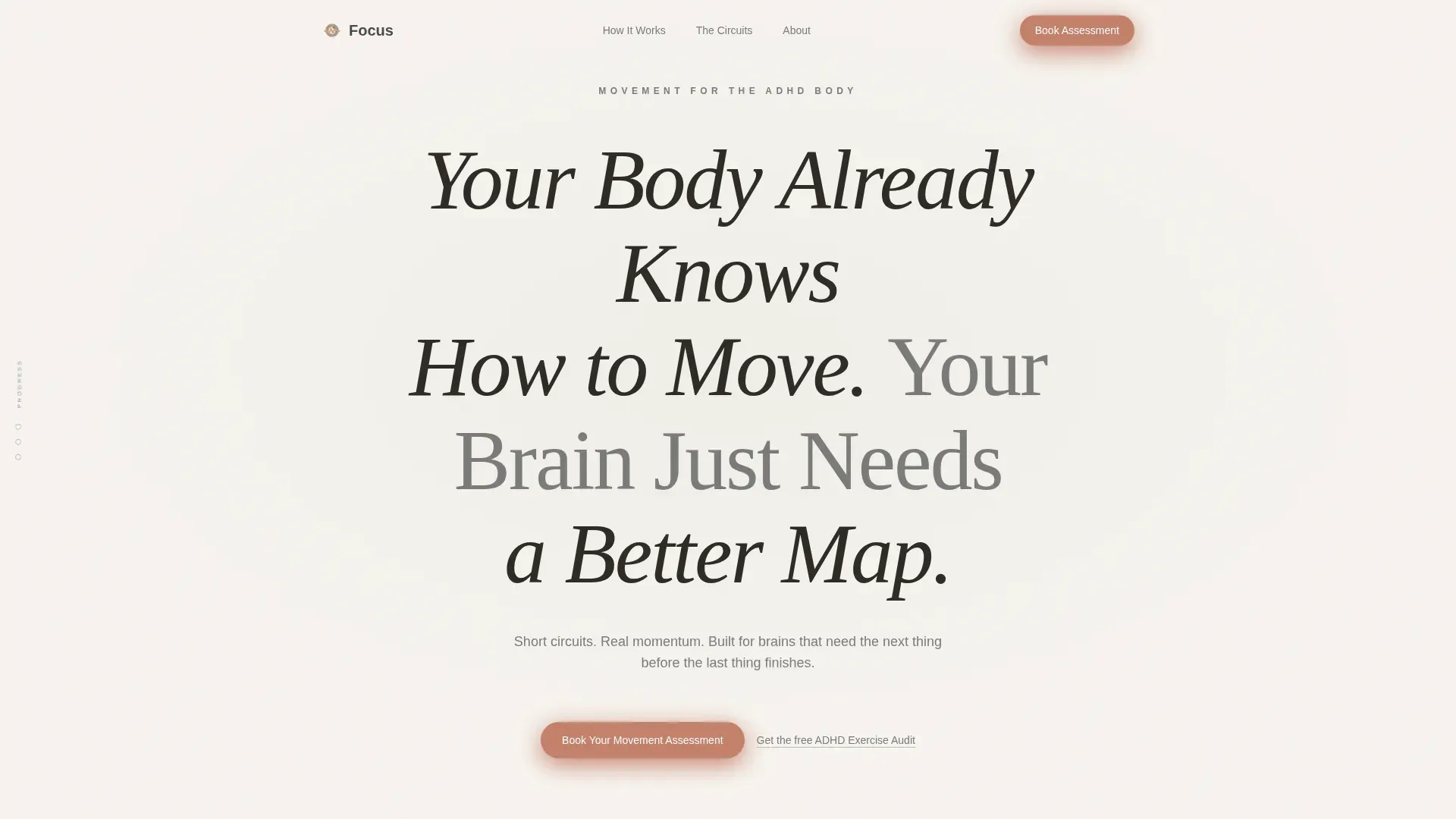
- A giant centered headline hero with a pulsing terracotta scroll arrow and warm white space as the primary design element
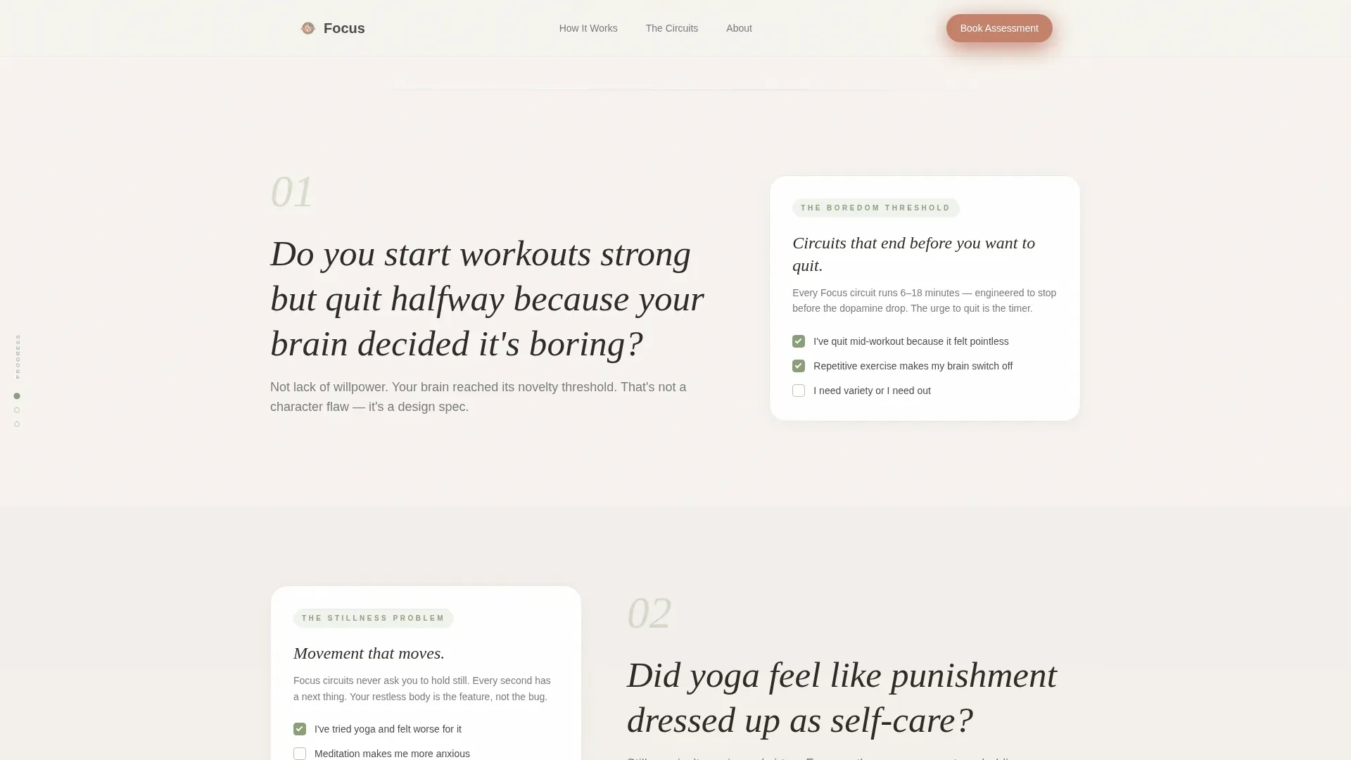
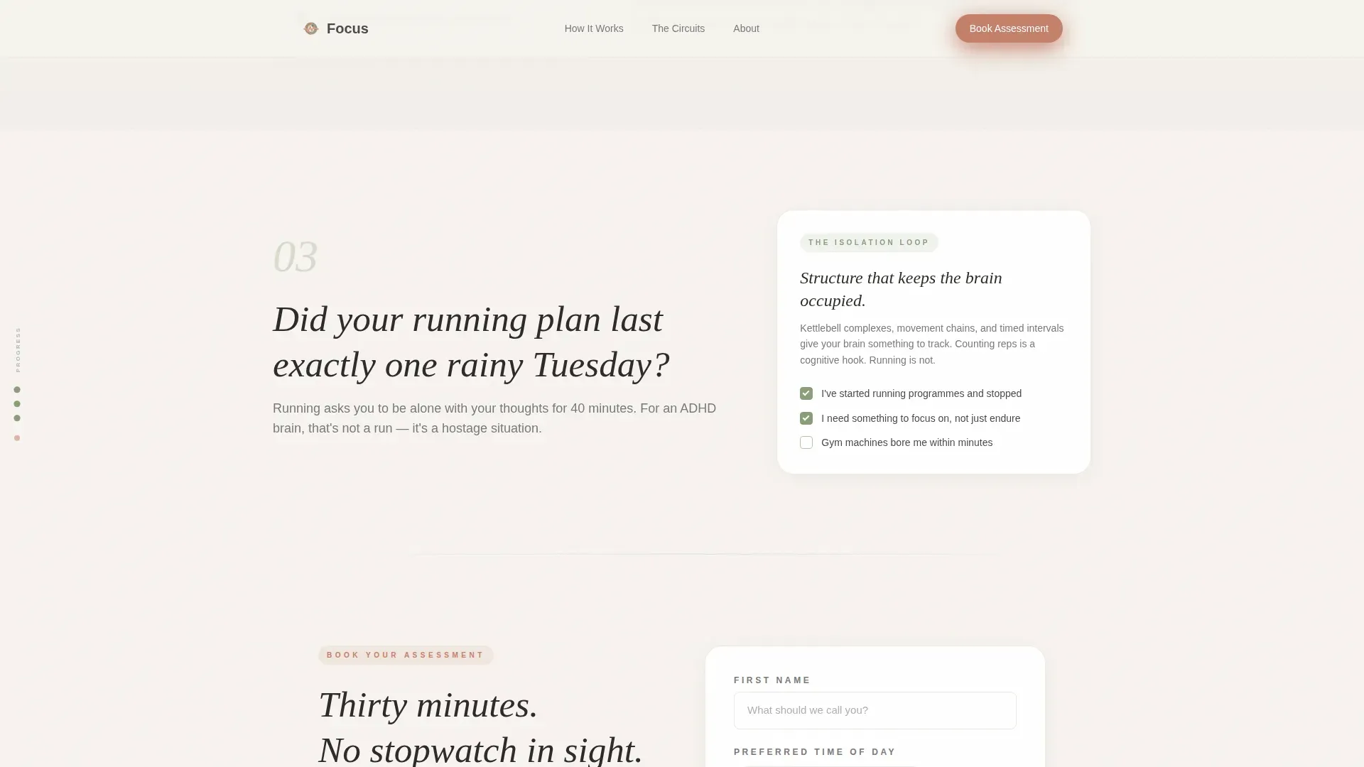
- Three alternating zigzag mirror sections, each pairing a diagnostic question with a compact insight card that reframes the symptom as a solvable problem
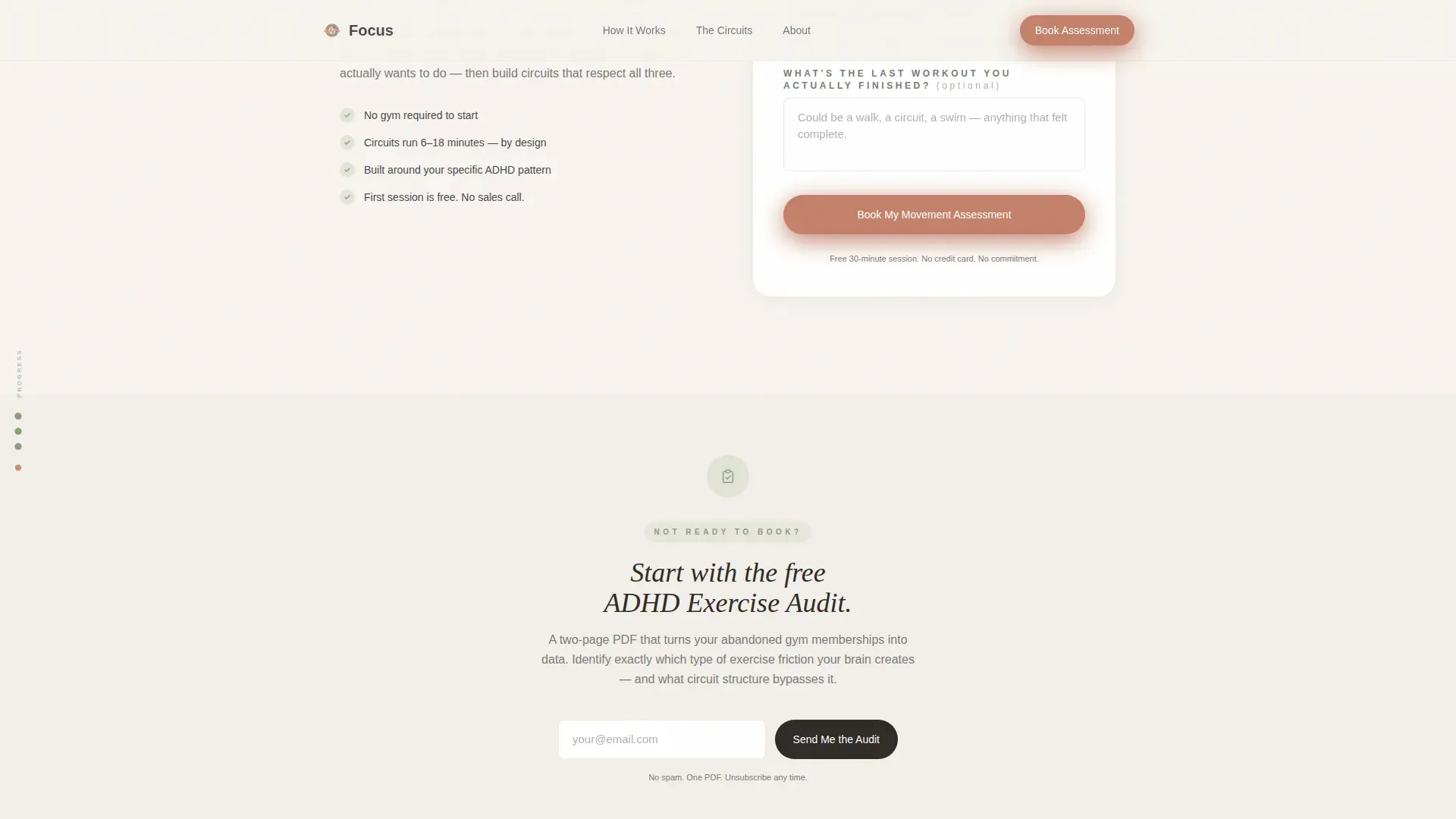
- A dual call-to-action section with a movement assessment booking form and a secondary free audit email capture path
Feature list
This template covers each functional and design layer described in the source brief.
Zigzag Mirror Section Layout
Each alternating section places a diagnostic question on the wide side and a checkable insight card on the narrow side. The layout builds scroll momentum by escalating recognition with every section the visitor passes.
Scroll-Linked Progress Dots
Progress dots run along the left edge of the page. They fill with sage green as the visitor scrolls, turning the page itself into a visual checklist being completed in real time.
Dual Booking and Lead Capture
The primary call-to-action is a movement assessment booking form. It asks for first name, a preferred time-of-day toggle (morning, afternoon, or evening), and one optional free-text field. A secondary path captures email in exchange for a free downloadable ADHD Exercise Audit.
Giant Headline Centered Hero
The hero section uses large, soft-weight serif typography on warm white space. No image or illustration competes with the words. A single terracotta down-arrow pulses gently beneath the headline to invite the scroll.
Testimonial-Style Social Proof
Client quotes with specific, named outcomes appear in the page flow to support credibility at the right moment before the call to action.
Program Proof Section
A dedicated section shows what the exercise circuits actually look like. It provides specificity and credibility by describing the short, dopamine-rich movement structure before the visitor is asked to book.
Page sections overview
| Section | Purpose |
|---|---|
| Hero Headline | Open with giant centered headline and pulsing scroll arrow |
| Zigzag Mirror One | "Start strong, quit halfway" recognition moment |
| Zigzag Mirror Two | Stillness-as-punishment yoga failure validation |
| Zigzag Mirror Three | Running plan system failure reframe |
| First Booking call to action | Assessment form plus free audit secondary capture |
| Program Proof | Show circuit structure for credibility |
| Final Booking call to action | Anchored bottom booking call to action |
| Footer | Linear single-row footer pattern |
Design & branding system
The visual identity follows a Healing Space theme. Every design decision reduces stimulation so the content itself can hold attention without competing with the frame.
- Color palette: warm white (#F7F4F0) as the base, muted sage (#B7C4A8) for progress and accents, gentle graphite (#4A4A4A) for body text, and terracotta (#C4816B) reserved strictly for buttons and progress markers
- Typography: Fraunces serif for headlines paired with DM Sans for body text, creating a warm and readable contrast
- Motion approach: medium animation with scroll-linked reveals, a gentle pulse on the hero arrow, and staggered section entries; no aggressive or distracting motion
Mobile & speed optimization
The template is built mobile-first. ADHD users are more likely to discover and engage with the page on a phone, often impulsively, so the layout prioritizes thumb-friendly interactions and fast visual payoff.
- The time-of-day toggle on the booking form is designed for tap interaction, respecting that ADHD scheduling needs flexibility over precision
- Static sections use Server Components to minimize JavaScript load and keep the page responsive
- Staggered scroll reveals are designed to feel natural on smaller screens without causing layout shifts
How this template helps you convert
The page earns the click by doing the emotional work before the form ever appears. Conversion is built into the scroll sequence, not bolted on at the end.
- The zigzag mirror sections create layered recognition. Each diagnostic question reflects a real experience the visitor has had, moving them from "that's me" to "someone finally understands this" before the first call to action appears.
- The dual call-to-action design removes the binary pressure of "book or leave." The free ADHD Exercise Audit gives hesitant visitors a low-commitment entry point while still capturing their contact information.
- The booking form is intentionally minimal. First name, a time-of-day preference, and one optional question reduce friction and make the act of booking feel like a relief rather than a commitment.
Other information about this template
This template is designed for the United States market, presented in English, and built for service-based offers with no pricing shown on the page. It sits within the Health and Medical category under the ADHD Care subcategory.
- The landing page targets adults aged roughly thirty to forty-five who are recently diagnosed with ADHD and have prior negative experiences with conventional fitness programs
- A secondary audience includes partners and therapists seeking structured movement resources to recommend to ADHD clients
- The footer follows a linear single-row pattern, keeping the page exit clean and uncluttered
- The intersection match between the ADHD Exercise Program niche and the Booking and Scheduling landing page direction is what makes the emotional sequencing of this template particularly effective for this audience
Theme
Healing Space
Creative direction
Checklist & Audit
Color system
Cloud Canvas
Style
Zigzag/Alternating
Direction
Booking/Scheduling
Page Sections
Zigzag Mirror Section Layout
Scroll-linked Progress Dots
Dual Call-to-action Design
Giant Headline Centered Hero
Program Proof Section
Healing Space Visual System
Related questions
Who is the primary audience this landing page targets?
Can I use this template for a general fitness program?
What does the booking form collect from visitors?
Is there a way to capture leads who are not ready to book?
What makes the scroll experience different from a standard landing page?



