Pastoral Cloud Kitchen Landing Page Template
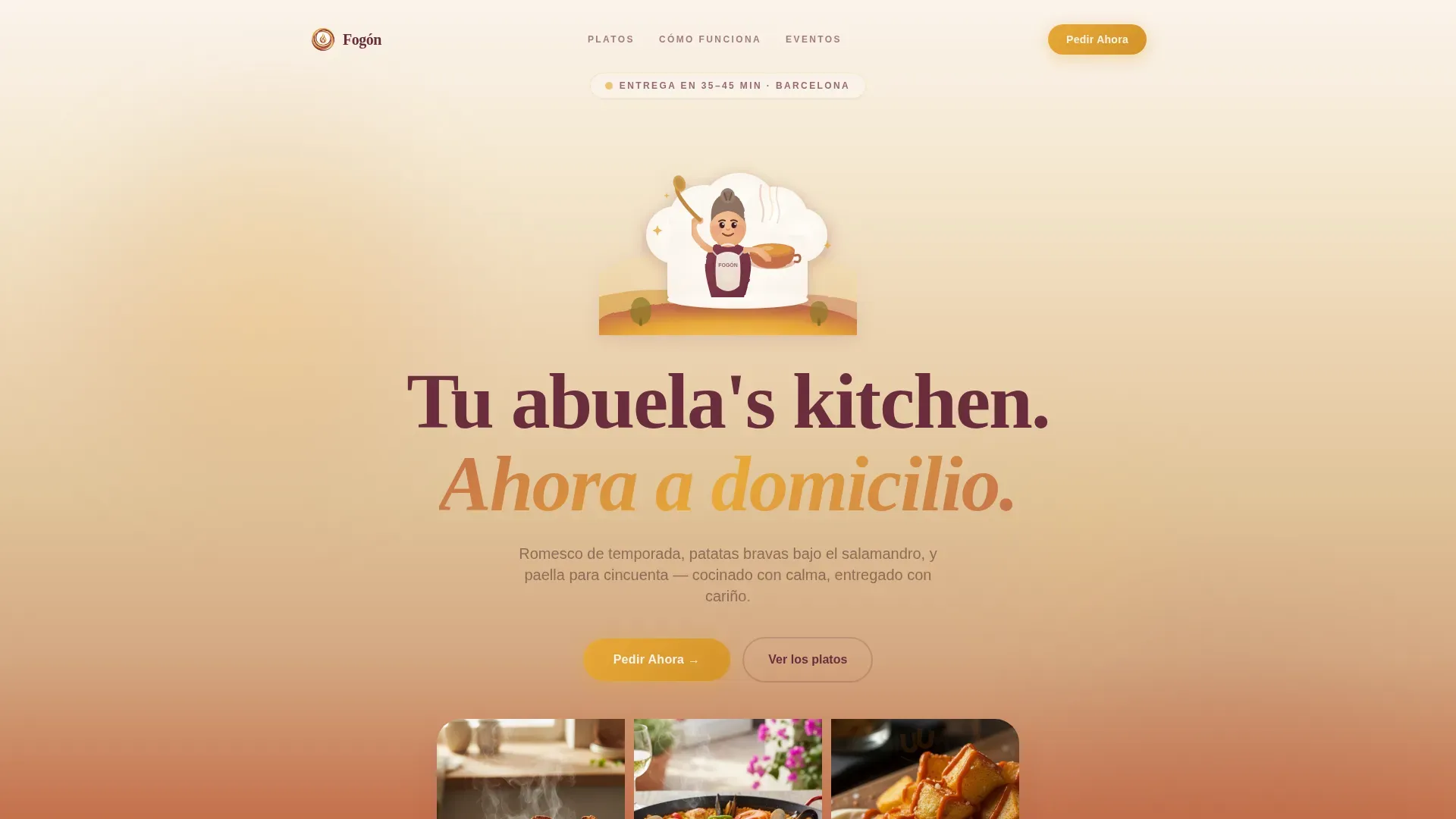
Fogn is a single-column cloud kitchen landing page built for a Spanish-Catalan food delivery business. It pairs a painterly pastoral design with interactive Before/After dish reveal sliders, a cheerful abuela mascot, and a click-through order flow. The sunset gradient palette and scroll-linked animations ensure every visitor feels the warmth of the kitchen before they ever reach the menu.
by Rocket studio
Quick summary
Fogn is a pastoral cloud kitchen landing page template designed to turn appetite into online orders. It uses a warm sunset gradient, a hand-illustrated abuela mascot, and interactive ingredient-to-dish reveal sliders to build food desire one scroll at a time. The single-column flow ends at one clear goal: the order platform.
Who this template is for
This template is built for food delivery businesses that want their website to feel as good as the food tastes. It suits operators who run a cloud kitchen with no physical dining room and need a landing page that does the persuading for them.
- Cloud kitchen owners offering Catalan or Spanish cuisine to urban customers
- Event planners and catering services needing a dedicated order path for large-format food orders
- Food entrepreneurs launching or promoting a ghost kitchen brand for the first time
What problem this template solves
A cloud kitchen lives or dies by its website. Customers cannot walk past the window, smell the garlic, or watch the cazuela bubble. Without a physical storefront, the landing page must carry all of that sensory weight. Most food delivery templates feel transactional and cold, which kills the craving before the menu even loads.
- No physical presence means customers judge food quality entirely by design and photography
- Generic templates fail to showcase a distinct kitchen identity or build genuine appetite
- A weak order flow loses customers right before they commit to buying
What you get with this template
You get a fully designed, single-column landing page built specifically for cloud kitchen operations. Every section is structured to move a visitor from curiosity to confirmed order, step by step, with no friction along the way.
- A hero section with the abuela mascot illustration, headline, and primary call-to-action button
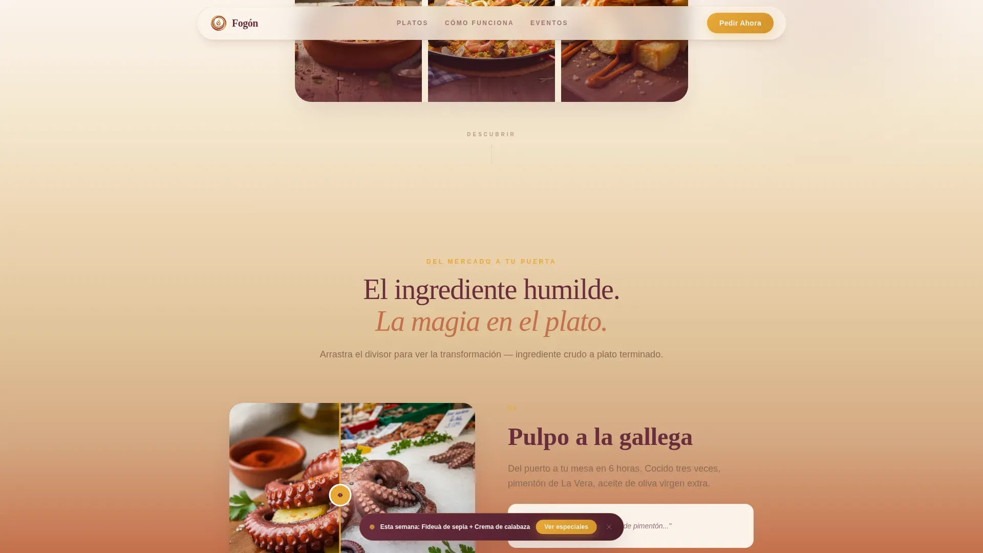
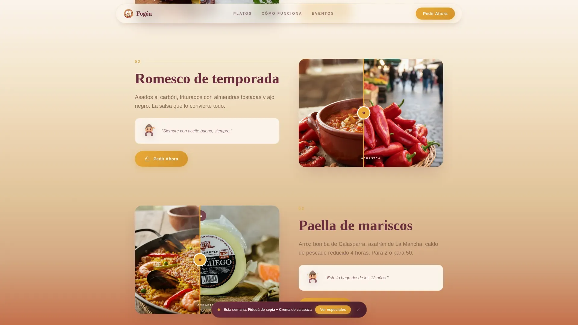
- Three interactive Before/After ingredient-to-dish sliders to showcase signature food visually
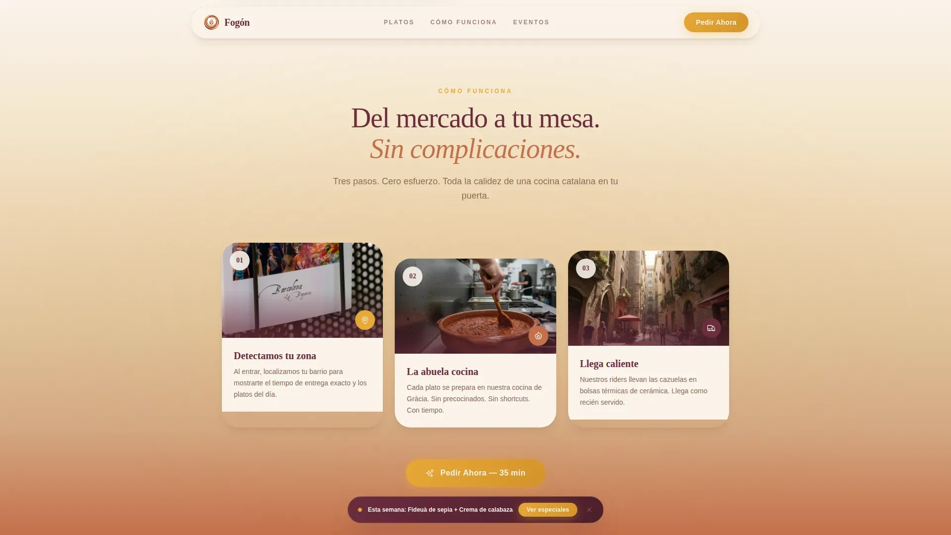
- A How It Works section, social proof testimonial cards, an event order path, and a structured footer
Feature list
A well-structured landing page can improve conversion rates and support stronger cloud kitchen operations. This template includes purpose-built design components across every section to ensure the visitor journey stays focused on the order.
Abuela Mascot Hero Section
The header opens with a hand-illustrated abuela character set inside a cloud-shaped kitchen above a golden Spanish hillside. The illustration is textured and painterly, giving the cloud kitchen a warm, trustworthy identity from the very first scroll.
Before/After Dish Reveal Sliders
Three interactive drag sliders pair raw ingredients with finished plated dishes. This design approach lets visitors experience the kitchen's craft visually, which is essential for food delivery businesses where customers cannot see the food in person.
Scroll-Linked Sunset Gradient
As the visitor scrolls, the background drifts from aged linen white through terracotta blush to deep Rioja wine. The deepening palette mirrors the progression of a long Catalan evening, keeping the visual identity consistent and immersive across every section.
Sticky Specials Banner
A secondary call-to-action banner floats persistently during scroll, promoting the week's specials. This creates gentle urgency and helps attract more customers to the menu without interrupting the main page flow.
Social Proof Testimonial Cards
Customer review cards include names, dish ordered, and star ratings. Social proof is especially valuable for cloud kitchen and virtual restaurant businesses that lack a physical storefront to build trust naturally.
Event Order Section
A dedicated catering section targets event planners ordering paella trays for large groups. This section provides a clear order path for high-value bulk food orders, helping the business capture a distinct segment of customers.
Page sections overview
| Section | Purpose |
|---|---|
| Hero with Mascot | Introduce brand warmth and primary order call-to-action |
| Before/After Sliders | Showcase ingredient-to-dish transformations interactively |
| How It Works | Explain the market-to-kitchen-to-door delivery journey |
| Testimonial Cards | Build trust through real customer social proof |
| Event Orders | Capture bulk catering orders from event planners |
| Footer | Close with navigation, kitchen logo, and brand links |
Design & branding system
The design follows a Pastoral Calm theme expressed through a Sunset Gradient color system. Earth-toned palettes like this reflect nature rather than the bright colors typical of fast food, giving the cloud kitchen a more trusted, artisan identity. Typography pairs Fraunces serif display headings with DM Sans body text for a balance of warmth and clarity.
- Saffron gold (#E8A838), terracotta blush (#C4704B), deep Rioja wine (#6B2D3E), and aged linen white (#FAF3EB) form the full palette
- Gold accents mark interactive elements; Rioja anchors body text with quiet authority
- Painterly illustrated vignettes of the abuela tasting and seasoning thread visual consistency across sections
Mobile & speed optimization
Mobile-first design is essential for food delivery landing pages, since most online orders come from phone browsers. This template is structured with that priority in mind, keeping the single-column layout easy to navigate on smaller screens.
- Single-column flow adapts naturally to mobile viewports without layout shifts
- Static sections use server components while interactive sliders and scroll effects use client components, keeping page weight in check
- Scroll-linked animations and entrance reveals are designed to load and run smoothly on mobile devices
How this template helps you convert
The page is built as a click-through landing page with one destination: the order platform. Every design decision is made to ensure appetite is fully built before the visitor reaches the menu.
- The primary "Pedir Ahora" call-to-action button appears beneath the hero and repeats after every third dish reveal, reducing the steps required between interest and order
- The sticky specials banner maintains soft urgency throughout the scroll, giving visitors a second reason to act without requiring any extra page visits
- Social proof testimonial cards placed after the dish reveals reinforce trust at the moment a visitor is closest to committing to an order
Other information about this template
This template draws inspiration from the broader landscape of food delivery and cloud kitchen design. A landing page for a cloud kitchen should blend modern delivery efficiency with a rustic aesthetic, and that balance is central to Fogn's design approach. Good menu design and strong branding can improve customer experience and increase profits by 10 to 15 percent, making the investment in a well-crafted page worthwhile for any cloud kitchen business.
- The pastoral theme evokes countryside imagery and enhances trust for delivery-only businesses, where no physical space exists to reassure customers
- High-resolution images of plated meals next to fresh produce are a core part of the visual strategy, since high-quality photography is required when customers cannot see the food in person
- Cloud kitchens do not require a dining space, which lowers operating costs and makes the website the primary business-facing product
- To promote a cloud kitchen business effectively, operators should also use social media platforms alongside a strong landing page to reach more customers
- The Fogn pastoral cloud kitchen landing page template is versatile enough to support related virtual restaurants and delivery-only food operations beyond Spanish cuisine
- GourmetGo and the Griddle template are other cloud kitchen design resources available on the platform, offering different approaches for operators who run multi-brand virtual restaurants or need a ghost kitchen website with additional components
Theme
Pastoral Calm
Creative direction
Before/After Reveal
Color system
Sunset Gradient
Style
Single Column Flow
Direction
Click-Through
Page Sections
Abuela Mascot Hero Illustration
Interactive Before/after Sliders
Scroll-linked Sunset Gradient
Sticky Specials Banner
Social Proof Testimonial Cards
Event Order Catering Section
Related questions
Can I customize the colors and typography in this template?
Is this template suitable for a single-brand cloud kitchen?
Does this template include the interactive Before/After sliders?
Can I use this template for event catering orders?
How does the sticky specials banner work?



