Luxe Letterpress Christmas Card Landing Page Template
Foil is a luxe minimal landing page template for a letterpress and hot-foil Christmas card studio. Built around a Comparison Journey scroll, it guides visitors from standard flat printing to full heirloom suites with foil stamping, edge painting, and wax seals. The deep charcoal and tangerine gold palette mirrors the craft itself: restrained, warm, and unmistakably premium.
by Rocket studio
Quick summary
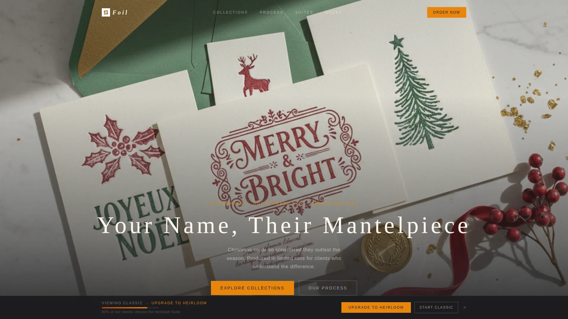
Foil is a single-page template designed for a letterpress Christmas card and stationery studio. It opens with a full-bleed overhead photo, pulls visitors through a Standard-versus-Upgrade comparison journey, and closes with an upsell-optimised order form. The palette of deep charcoal, tangerine gold, blood orange, and cream makes every section feel as considered as the cards it sells.
Who this template is for
This template suits studios and makers who sell premium printed stationery and want their landing page to reflect the craft behind their product. It is built for sellers who need to justify a higher price point through desire, not just description.
- Letterpress and foil-stamping studios taking holiday card orders
- Wedding stationery studios offering first-Christmas keepsake suites
- Independent makers selling corporate holiday card packages to business clients
What problem this template solves
Most stationery studios undersell their work by showing products without context or contrast. Visitors arrive, see a price, and leave before they feel the difference between a flat-printed card and a hand-finished heirloom piece.
- There is no structured path from curiosity to covetability
- The upgrade value is invisible when tiers are listed as plain text options
- Price-sensitive visitors abandon before the upsell is ever presented
What you get with this template
You get a fully structured, single-page layout that takes a visitor from first impression to completed order form. Every section is sequenced to build desire before asking for a decision.
- A full-bleed header with a delayed animated headline over a styled flat-lay photo
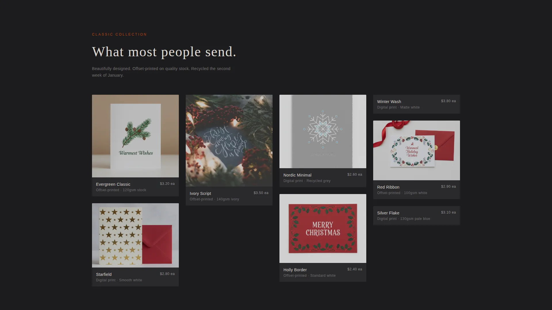
- Two masonry comparison grids showing Standard and Upgrade card tiers side by side
- A sticky bottom bar, "See This in Foil" card toggles, and a tiered order form with upsell logic
Feature list
This template is built around a deliberate set of features drawn directly from the studio brief. Each one serves the goal of moving a visitor from browser to buyer.
Full-Bleed Animated Header
The header fills the screen with a razor-thin depth-of-field overhead photo. After two seconds, the headline "Your Name, Their Mantelpiece" appears letter by letter in a wide-tracked fine serif, giving the visitor a moment to absorb the visual before the copy arrives.
Comparison Journey Masonry Grids
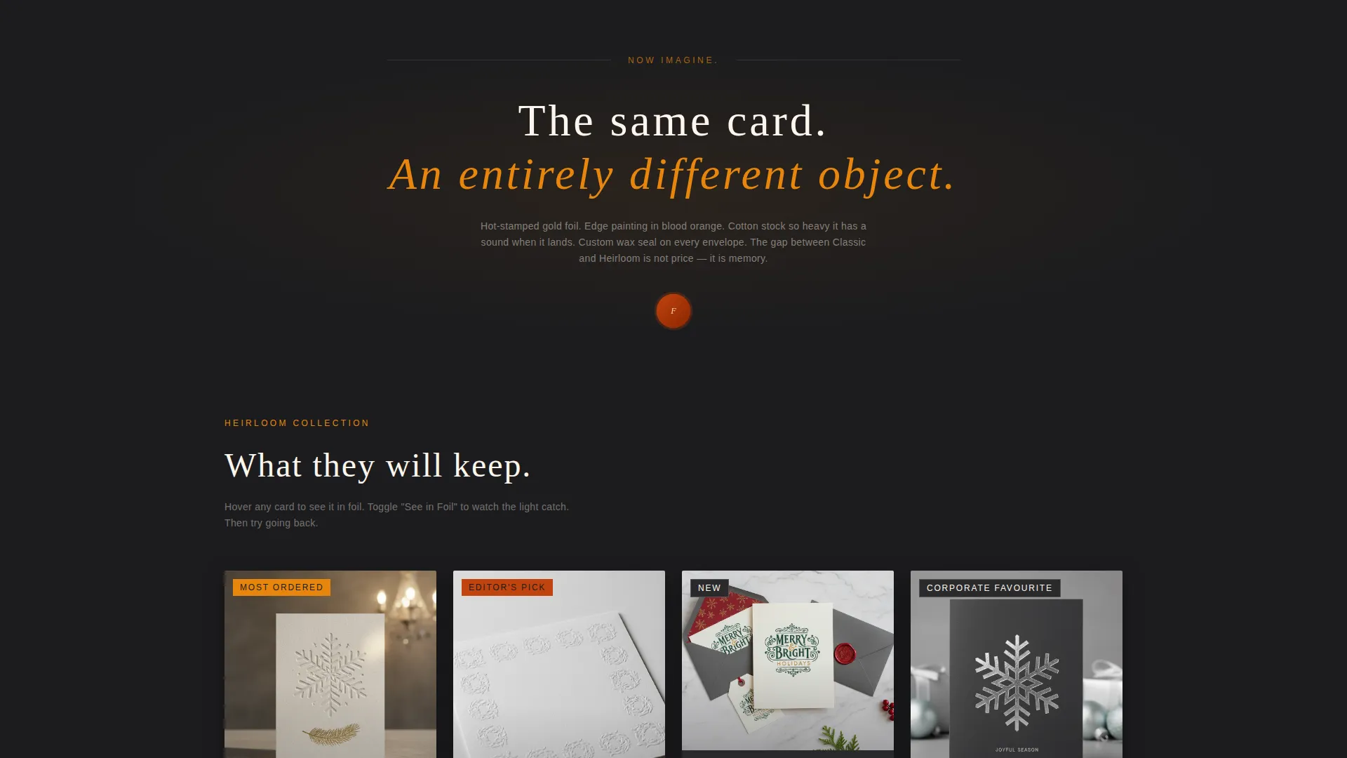
Two masonry grid sections anchor the scroll. The first shows the Standard tier in lifestyle flat photography. A subtle mid-page divider reading "Now imagine." separates it from the Upgrade grid, which presents the same designs with foil stamping, edge painting, patterned tissue liners, and custom wax seals.
Foil Hover Micro-Animation
Each card tile in the Upgrade grid responds to a hover state with a micro-animation that simulates light catching foil. This tactile moment communicates craft in a way that static photography alone cannot.
"See This in Foil" Image Toggle
Every card tile carries a quiet toggle labelled "See This in Foil." Clicking it swaps the card image in place, showing the foil-stamped version without leaving the page. This removes friction from the comparison and makes the upgrade feel like a natural next step.
Sticky Tier Progress Bar
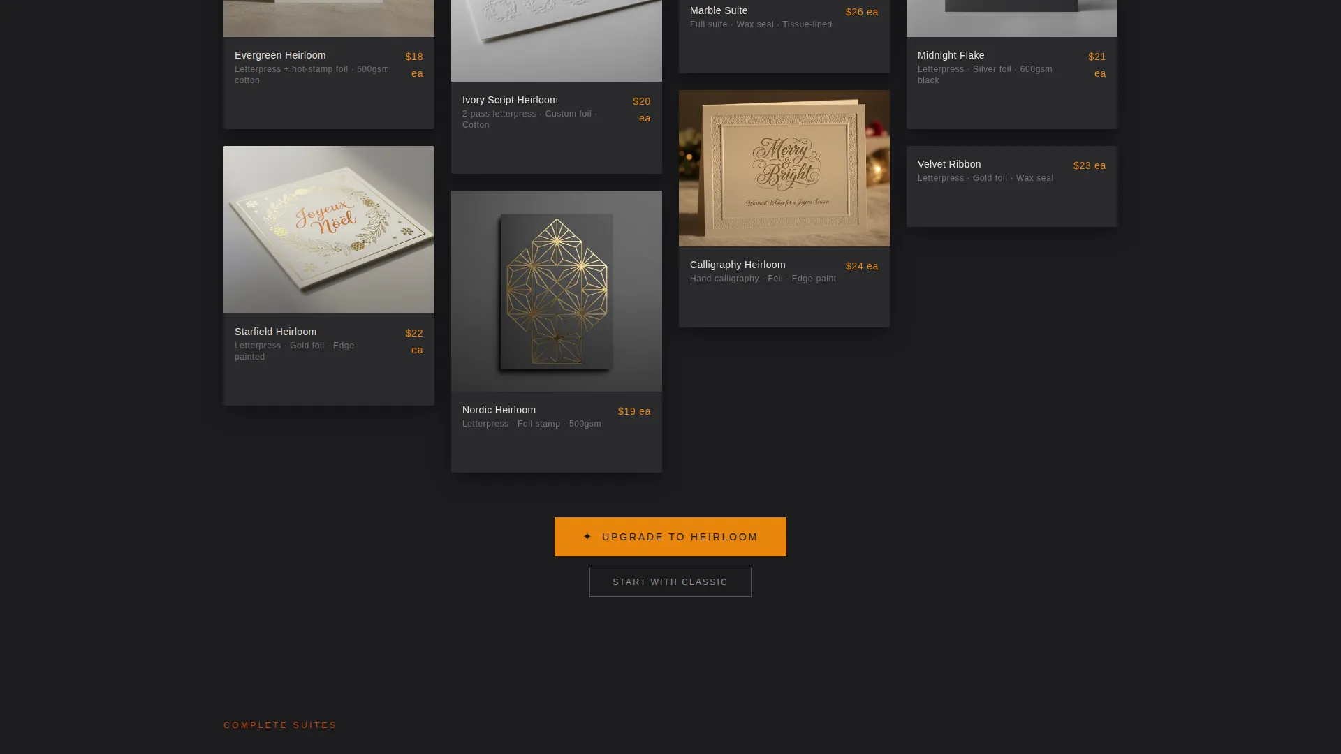
A sticky bottom bar tracks the visitor's currently viewed tier and delivers a social-proof nudge: "You're viewing Classic, 80% of our clients choose the Heirloom Suite." The primary call to action, "Upgrade to Heirloom," appears in tangerine gold on charcoal after the second comparison grid.
Upsell-Optimised Order Form
The form opens with quantity first, making the per-card upgrade cost feel small once a number is committed. It then steps through card design, tier selection with a visual side-by-side, personalisation details, and shipping date, keeping each decision simple and sequential.
Page sections overview
| Section | Purpose |
|---|---|
| Full-Bleed Header | Opens with styled flat-lay and delayed animated headline |
| Animated Headline | Delivers "Your Name, Their Mantelpiece" letter by letter |
| Standard Masonry Grid | Shows Classic tier cards in lifestyle flat photography |
| "Now Imagine" Divider | Marks the transition from Standard to Upgrade comparison |
| Upgrade Masonry Grid | Presents foil, edge-painted, and wax-sealed card suites |
| Suite Escalation Row | Expands from cards to full suites with gift tags and bundles |
| Sticky Tier Bar | Tracks viewer tier and delivers social-proof upgrade nudge |
| Primary call to action Block | "Upgrade to Heirloom" in tangerine gold after second grid |
| Ghost Button Path | "Start with Classic" secondary option for price-conscious buyers |
| Tiered Order Form | Captures quantity, design, tier, personalisation, and ship date |
Design & branding system
The visual identity follows a Luxe Minimal theme built on what the brief calls a Citrus Burst palette. The reference point is not summer fruit but the sharp, wintry bite of a clementine split on a marble countertop at a candlelit holiday party.
- Deep charcoal (#1C1C1E) anchors backgrounds; tangerine gold (#E8860C) carries primary calls to action and headline text
- Blood orange (#C1440E) warms accent moments like section dividers and hover states; cream (#FDF6EC) sits beneath body sections like uncut cotton stock
- Typography uses a fine, wide-tracked serif for display headlines and a clean secondary face for body copy, keeping the page feeling editorial rather than commercial
Mobile & speed optimization
The masonry grid layout and full-bleed photography are structured to reflow cleanly on smaller screens. The sticky bottom bar and image toggles remain functional at mobile viewport widths so the upsell path stays intact on every device.
- Masonry columns reduce to a single or double column on mobile without breaking the comparison flow
- The sticky tier bar condenses to a compact strip, keeping the "Upgrade to Heirloom" call to action visible without blocking card content
- The order form steps are designed to work as a vertical sequence, making each field easy to complete on a touchscreen
How this template helps you convert
The page is designed so that desire builds before the price is ever introduced. Every structural choice prioritises emotional investment over rational evaluation.
- The Comparison Journey places Standard and Upgrade side by side, making the quality gap tangible rather than described. Visitors feel the difference before they read about it.
- The "See This in Foil" toggle and foil hover micro-animation let visitors experience the upgrade interactively. Each interaction deepens commitment before the order form appears.
- The form's quantity-first sequence anchors the visitor to a volume decision early. Once a number is set, the per-card cost of choosing the Heirloom tier feels minor by comparison.
Other information about this template
This template is built for the Christmas stationery and greeting card retail category. It fits studios that sell directly to consumers and corporate buyers in the same session, using different entry points within the same page flow.
- The ghost-button secondary path keeps price-conscious visitors in the funnel rather than losing them entirely
- The suite escalation row, which introduces matching gift tags, return-address embossers, and ribbon-wrapped bundles, increases average order value naturally within the scroll
- The template is suited to seasonal use but the layout structure and design system can be adapted for other premium occasion stationery beyond the Christmas window
Theme
Luxe Minimal
Creative direction
Comparison Journey
Color system
Lavender Dream
Style
Overlap/Layered
Direction
Direct Sales
Page Sections
Full-bleed Animated Header
Comparison Journey Masonry Grids
Foil Hover Micro-animation
See This in Foil Image Toggle
Sticky Tier Progress Bar
Upsell-optimised Order Form
Related questions
Who is this template designed for?
Can I use this template if I only offer one product tier?
What makes the order form different from a standard contact form?
Does the sticky bottom bar appear throughout the whole page?
Is this template only suitable for Christmas card studios?



