Hobby & Passion Supplies Professional Website Template
Fold is a bento grid landing page built for kirigami and paper cutting supply stores. It uses a warm Citrus Burst color system, before-and-after reveal cells, and a craft-inspired device mockup header to guide visitors from curiosity to confident click. Every section is designed to show how better tools transform the work.
by Rocket studio
Quick summary
Fold is a bento grid landing page template for shops selling precision blades, specialty papers, and scoring tools to kirigami artists and paper engineers. The design mirrors the craft itself: flat at first glance, then full of depth. Warm citrus gradients, transformation reveals, and tile-level calls to action make every scroll feel purposeful.
Who this template is for
This template is built for retailers who sell to makers. If your customers hold a blade before they hold a receipt, this page speaks their language.
- Kirigami and paper cutting supply shops launching or refreshing their online storefront
- Craft educators and workshop organizers who need a clear, product-forward entry point
- Specialty paper and tool retailers targeting hobbyists, paper engineers, and commissioned artists
What problem this template solves
Most generic shop landing pages feel like catalogues. They list products without context, and they never show what those products actually make possible. Fold solves the disconnect between flat product photography and the three-dimensional results that passionate customers actually care about.
- Visitors leave before clicking because nothing shows them why the tools matter
- Product quality is invisible when images only show the item, not what it creates
- Category pages get missed when there is no clear, tile-by-tile invitation to explore
What you get with this template
You get a single, fully structured landing page that turns browsing into belief. Every component works together to build a quiet, confident case for your products before the visitor ever reaches the catalog.
- A bento grid layout with product cells, transformation reveal cells, and short video loop cells
- A paper-cut-style device mockup header with a fading headline and a top-right blood orange call-to-action button
- A sticky bottom bar on mobile and tile-level secondary calls to action throughout the grid
Feature list
This template includes a focused set of components, each chosen to match the deliberate, detail-driven mindset of craft supply customers.
Bento Grid Product Layout
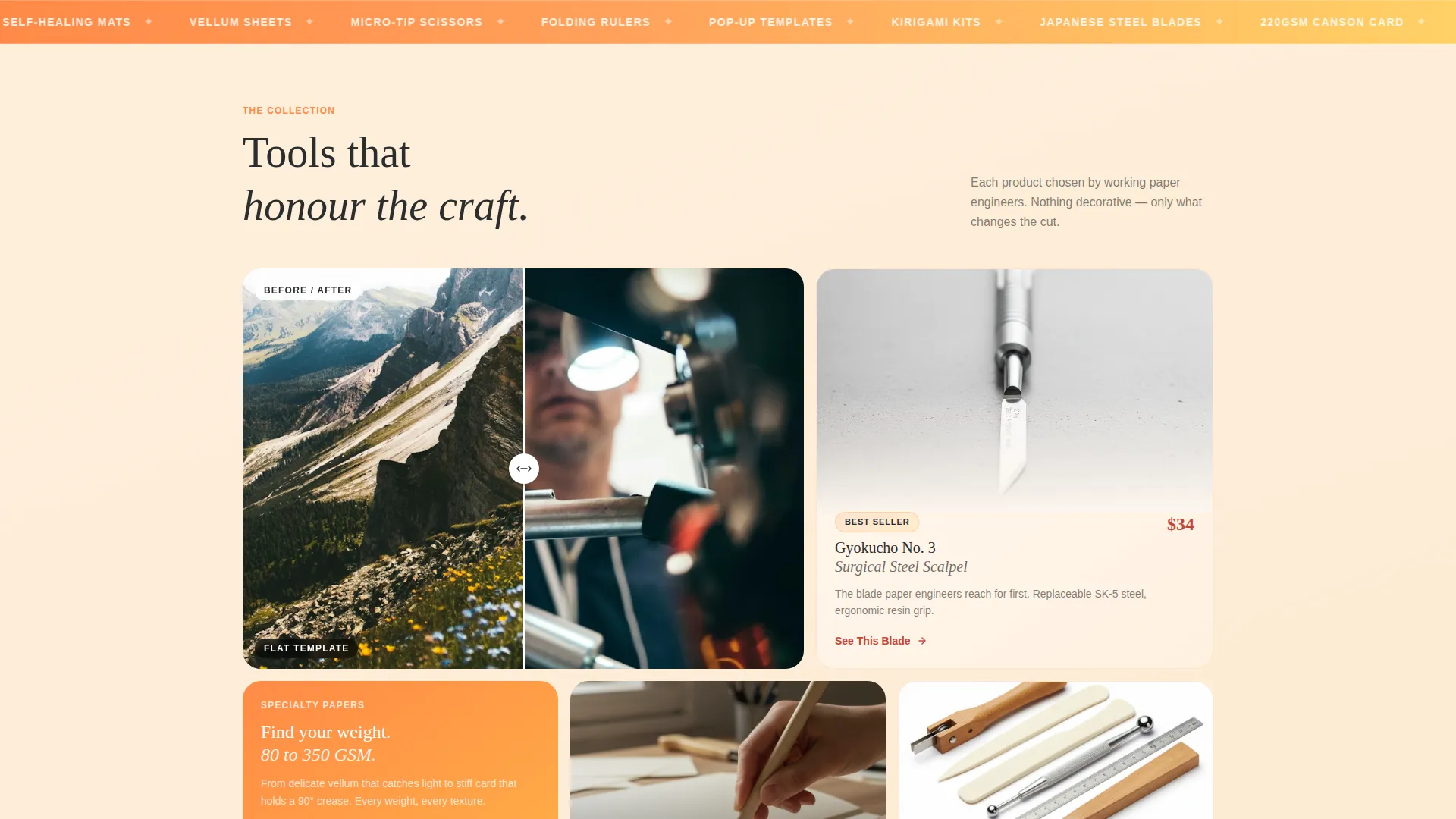
The page is structured as a modular bento grid. Each cell tells its own micro-story, whether that is a product close-up, a transformation pair, or a looping video of hands mid-cut. The rhythm alternates intentionally so the page builds a visual argument as the visitor scrolls.
Before and After Reveal Cells
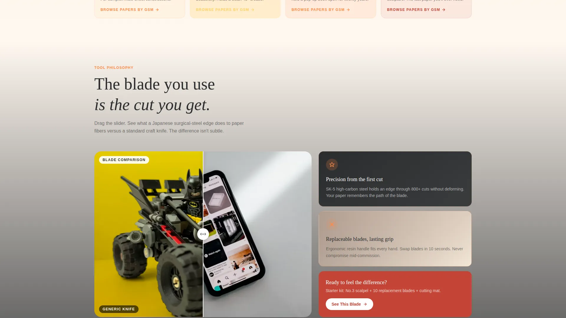
Select bento cells use a slider-driven before-and-after reveal. One cell contrasts a flat printed template with the finished kirigami sculpture. Another pairs a generic craft knife with a Japanese surgical-steel handle to show the difference in cut quality at the fiber level. The mechanic makes product quality visible without a single word of marketing copy.
Paper-Cut Device Mockup Header
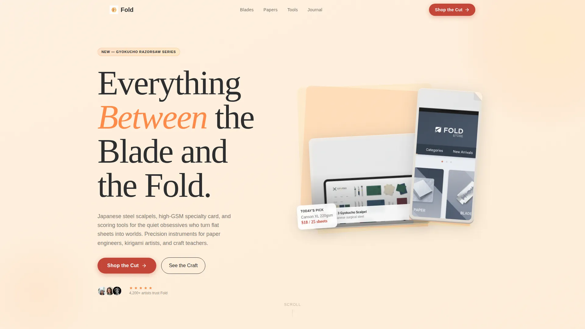
The header features a tablet and phone floating at a slight angle, rendered as if cut from layered card stock with visible shadow layers and folded edges. The store interface shows mid-browse on each screen. Behind the devices, a tangerine-to-yuzu gradient reinforces the brand warmth. A headline fades in below the mockup.
Tile-Level Calls to Action
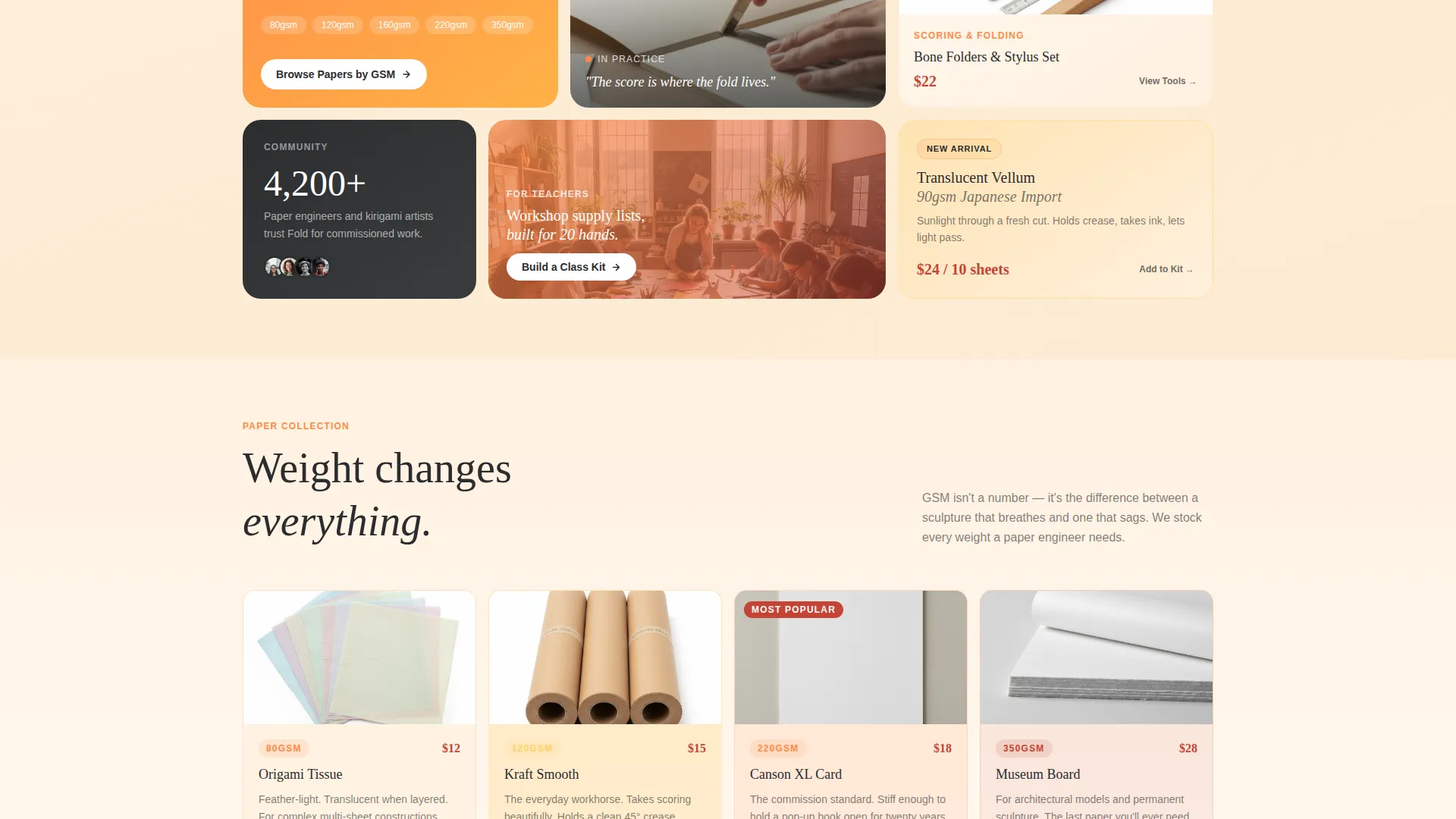
Every product bento cell carries its own secondary call to action. Labels like "See This Blade" and "Browse Papers by GSM" make each tile an independent entry point into the catalog. This removes friction: visitors do not need to find a menu or scroll to the bottom to take action.
Sticky Mobile Call-to-Action Bar
On mobile, the primary call to action persists as a sticky bar at the bottom of the screen. The bar uses blood orange to stay visible across all scroll positions. It ensures the click into the catalog is always one thumb-tap away, regardless of where the visitor is on the page.
Citrus Burst Color System with Gradient Backgrounds
Page backgrounds wash from pale grapefruit pith to yuzu in long vertical gradients. Bento cells sit in soft tangerine-to-white fades. The blood orange accent is reserved for buttons and price callouts only. Charcoal text keeps legibility grounded while the warmth of the palette does the tonal work.
Page sections overview
| Section | Purpose |
|---|---|
| Header with Mockup | Establishes craft credibility and brand warmth with a paper-cut device visual and fading headline |
| Primary call to action Cell | Delivers the "Shop the Cut" button in blood orange at the top-right of the bento grid |
| Transformation Reveal Cells | Shows flat-to-formed before-and-after comparisons driven by a slider interaction |
| Product Blade Cell | Highlights precision blade quality through close-up fiber comparison |
| Paper Stock Cell | Guides visitors toward paper browsing by GSM weight category |
| Video Loop Cells | Embeds short looping clips of hands mid-cut to add life and craft context |
| Sticky Mobile Bar | Keeps the primary call to action visible at all scroll depths on mobile |
Design & branding system
The visual identity is built around the Soft Gradient theme using the Citrus Burst color palette. Every color choice has a role, and none compete with readability or function.
- Warm tangerine (#FF8A47), ripe yuzu (#FFD166), pale grapefruit pith (#FFF1E0), and deep blood orange (#C44536) form the full palette, with blood orange reserved strictly for buttons and price callouts
- Long vertical gradients wash from pith white to yuzu across page backgrounds, while bento cells fade from tangerine to white independently
- Grounded charcoal (#2B2D2F) carries all body text, keeping the warmth of the palette from competing with legibility
Mobile & speed optimization
The template is designed to work cleanly at every screen size. The mobile experience is not an afterthought; it is a parallel priority.
- The bento grid reflows for narrower screens so cells remain readable and tappable without pinching or horizontal scrolling
- The sticky bottom call-to-action bar appears on mobile only, keeping the primary action visible without cluttering the desktop layout
- Video loop cells are structured to play inline on mobile without interrupting the scroll rhythm
How this template helps you convert
Fold is a click-through landing page. Its single job is to earn one confident click into a product category. Every design decision serves that goal.
- The before-and-after reveal cells do the persuasion work visually, showing cut quality and finished results without relying on long product descriptions or customer reviews
- Tile-level calls to action remove the need for a single dominant button, letting each visitor self-select into the category that matches their current need, whether blades, papers, or scoring tools
Other information about this template
Fold is a single-page, section-led landing page template, not a multi-page store build. It is designed as a click-through gateway that drives traffic into an existing catalog rather than replacing it.
- The page intentionally carries no cart, checkout, or product listing components; the landing page earns the click, and the catalog handles the rest
- The template suits shops with a clear product range across a small number of categories, making tile-level navigation natural and uncluttered
- The "Everything Between the Blade and the Fold" headline is included as a starting point and can be replaced to match the store's own voice
- The Citrus Burst palette and Soft Gradient theme are fully expressed in the template and can be adapted to align with existing brand guidelines
Theme
Neo-Retro
Creative direction
Curated Collection
Color system
Ink & Paper
Style
Card Grid (Modular)
Direction
Quiz/Assessment
Page Sections
Bento Grid Modular Layout
Slider-driven Before and After Reveals
Paper-cut Style Device Mockup Header
Tile-level Secondary Calls to Action
Sticky Mobile Call-to-action Bar
Citrus Burst Gradient Color System
Related questions
Is this template suitable for a small kirigami supply shop just starting out?
Does this landing page include a shopping cart or product listing?
Can I replace the headline and tile calls to action with my own copy?
How does the before-and-after reveal work on mobile devices?
Can I adapt the color palette to match my existing brand?



