Art Director Portfolio Landing Page Template
Folio is a masonry-style art director portfolio landing page built around an Ink & Paper visual identity. It guides creative directors, brand managers, and editorial leads through a curated gallery of campaign, editorial, and motion work. A floating photo header, parallax depth, and a case deck download flow combine to present a distinctive creative point of view with quiet confidence.
by Rocket studio
Quick summary
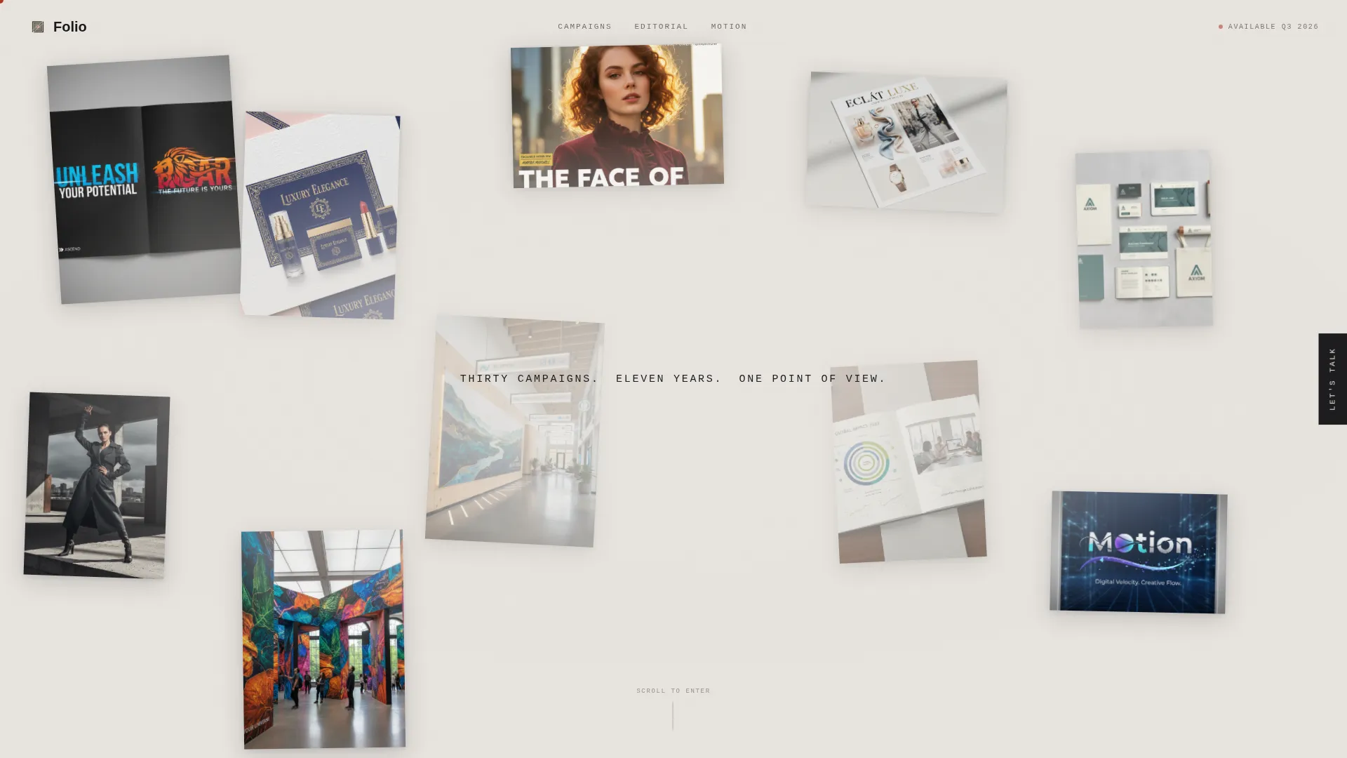
Folio is a single-page art director portfolio landing page that feels like walking through a private studio. Work is arranged in a deepening masonry gallery, moving from brand campaigns to editorial spreads to experimental motion. A floating photo header, a parallax cursor effect, and rubber-stamp red accents keep the Monochrome Steel palette focused entirely on the projects themselves.
Who this template is for
This template is built for experienced art directors who need to present multi-discipline work to sophisticated creative buyers. It suits freelancers pitching to agencies, independent directors building a collaborator roster, and senior creatives assembling a case for their next major engagement.
- Freelance art directors targeting agency creative directors and brand managers
- Multi-discipline creatives with campaign, editorial, and motion work to show
- Senior practitioners who want their portfolio to feel curated, not catalogued
What problem this template solves
A generic portfolio grid does nothing to communicate creative authority. Buyers scroll past work without slowing down. This template solves the pacing problem by structuring the page like a physical exhibition, so each section of the gallery earns the next.
- Fragmented portfolios that show work without context or narrative sequence
- A lack of credibility hooks before a contact or download request appears
- The mismatch between a creative's actual depth and how a flat grid presents it
What you get with this template
You get a fully structured single-page layout designed around a masonry gallery flow. Every section has a defined role, from the floating header that sets mood to the modal that captures qualified leads after the work has done its job.
- A constellation header with eight to ten floating campaign images and a delayed headline reveal
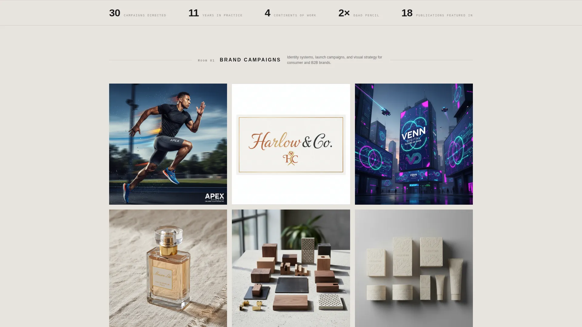
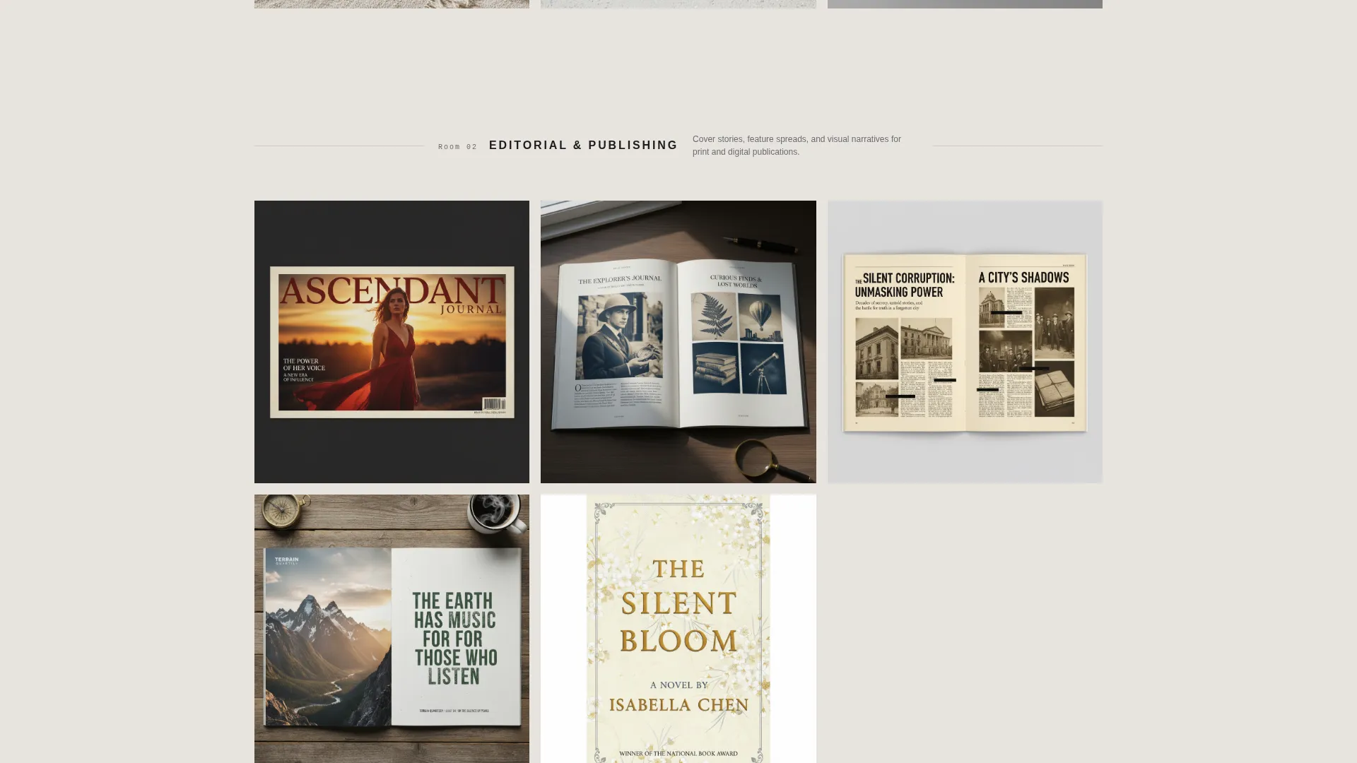
- Three distinct masonry gallery rooms covering brand campaigns, editorial work, and motion pieces
- A "Download the Case Deck" primary call to action with a two-field modal, plus a persistent side contact tab
Feature list
A brief overview of the core capabilities built into this template.
Floating Photo Header with Parallax Depth
Eight to ten campaign images, editorial spreads, and packaging shots are suspended at slightly different depths and rotations against a warm newsprint field. As the cursor moves, they drift with a subtle parallax effect as though prints were scattered across a light table. After a two-second pause, a single uppercase grotesque headline materializes between them.
Three-Room Masonry Gallery Walk
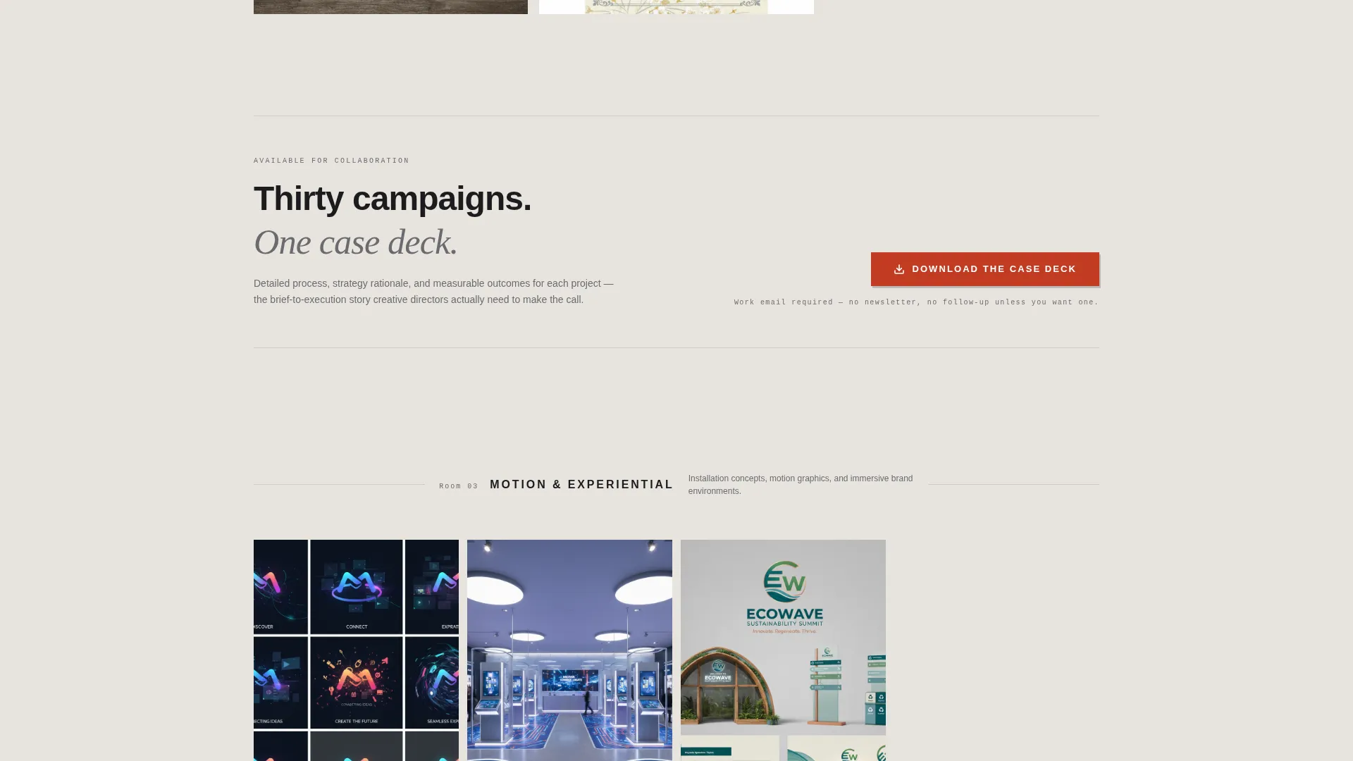
The gallery is divided into three distinct content rooms. The first room features large brand campaign tiles. The second uses narrower vertical tiles that mimic magazine spines for editorial work. The third room contains motion and experiential tiles that auto-play muted video loops on hover. The grid tightens gradually as the visitor scrolls deeper, reinforcing the feeling of moving further into a personal archive.
Case Deck Download with Lightweight Modal
After the second gallery room, a "Download the Case Deck" button appears in rubber-stamp red. Clicking it opens a modal with exactly two fields: work email and company name. This placement is intentional. The download request arrives only after credibility has already been established by the work itself.
Persistent Side Contact Tab
A vertical "Let's Talk" tab sits along the right edge of the page at all times. Clicking it slides out a contact form with a project-type toggle covering campaign, editorial, and brand identity work, plus a budget range selector. Visitors can reach out without losing their place in the gallery.
Hand-Set Gutter Labels
Between each gallery room, small category labels appear in the gutter in a hand-set type style, styled like gallery wall cards. These quiet markers orient visitors without interrupting the visual flow of the work.
Ink & Paper Monochrome Steel Palette
The entire color system uses deep graphite, warm newsprint, mid-tone pencil gray, and a single rubber-stamp red accent reserved for hover states and the cursor dot. Every surface recedes so the projects breathe. No secondary color competes with the work on display.
Page sections overview
| Section | Purpose |
|---|---|
| Floating Photo Header | Sets studio mood and reveals the brand headline after a timed pause |
| Delayed Headline Reveal | Presents the core point-of-view statement between the floating images |
| Brand Campaigns Room | Showcases large campaign tiles as the first gallery room |
| Editorial Publishing Room | Displays vertical tiles mimicking magazine spines as the second gallery room |
| Motion Experiential Room | Auto-plays muted video loops for motion and experiential work |
| Gutter Category Labels | Marks transitions between gallery rooms with hand-set type wall cards |
| Case Deck call to action | Anchors the primary download call to action after the second gallery room |
| Download Modal | Captures work email and company name via a two-field form |
| Persistent Contact Tab | Provides always-available slide-out contact form on the right edge |
Design & branding system
The visual identity is built on an Ink & Paper theme expressed through a Monochrome Steel color system. Every design decision reinforces the feeling of a freshly printed broadsheet laid flat on a steel desk. Type is tight, uppercase, and grotesque in style where it speaks loudest.
- Core palette: deep graphite (#1C1C1E), warm newsprint (#E8E4DF), mid-tone pencil gray (#6B6B6F), and rubber-stamp red (#C23B22) for hover states and the cursor dot
- Typography: tight uppercase grotesque for the hero headline; hand-set style type for gutter labels that echo physical gallery wall cards
- Visual philosophy: every surface recedes so the work breathes; no color competes with the projects on display
Mobile & speed optimization
The template is structured for responsive presentation across screen sizes. The masonry grid adapts so gallery rooms remain legible and the hover interactions translate naturally to touch contexts.
- Masonry grid reflows gracefully so brand, editorial, and motion tiles remain clear on smaller screens
- The persistent "Let's Talk" contact tab and the case deck modal are designed to remain accessible without crowding the viewport
- Muted video loops in the motion room are set to auto-play on hover, keeping bandwidth usage controlled by interaction rather than passive loading
How this template helps you convert
The page is structured so the work earns every conversion step before it is asked. No call to action appears before the visitor has seen enough to want to engage.
- The floating header and parallax depth create immediate sensory investment. Visitors slow down before they have read a single word, which primes them to engage with the gallery that follows.
- The primary "Download the Case Deck" call to action appears only after the second gallery room, at the exact moment credibility peaks. The two-field modal keeps friction low for qualified buyers who are already convinced.
- The persistent side contact tab provides a secondary path at any point in the scroll. Visitors who are ready to talk before reaching the modal can act immediately without backtracking.
Other information about this template
This template is a strong fit for art directors who present multi-discipline work spanning campaigns, publishing, and motion. It is equally useful for those building a focused pitch for a single client category. The layout's physical-book metaphor and gallery-room structure make it adaptable to a wide range of creative positioning strategies.
- Template style: Masonry / Pinterest single-page layout
- Category: Portfolio and Agency, Multi-Discipline Portfolio, Art Director Portfolio
- Theme and color system: Ink & Paper theme with Monochrome Steel palette
- Landing page direction: Content and Resource, with a case deck download as the primary conversion path
- The header concept (Floating Photos) and creative direction (Gallery Walk) are core structural features, not decorative options
Theme
Ink & Paper
Creative direction
Gallery Walk
Color system
Monochrome Steel
Style
Masonry/Pinterest
Direction
Content/Resource
Page Sections
Floating Photo Header with Parallax
Three-room Gallery Walk
Case Deck Download Modal
Persistent Side Contact Form
Hand-set Gutter Category Labels
Monochrome Steel Color System
Related questions
Can I replace the floating header images with my own campaign work?
How does the case deck download flow work?
Can I adjust the gallery rooms to fit my discipline mix?
Is the side contact tab always visible while scrolling?
What type of creative professional is this template designed for?