Creative Professional Career Portfolio Website Template
Folio is a layered, single-page portfolio landing page built for creative professionals who want their work to speak before they do. It uses an Ink and Paper visual theme with floating Polaroid-style photos, parallax depth, and staggered card layouts to create an immersive studio-visit feel. The primary call to action drives a portfolio PDF download, supported by a minimal contact form.
by Rocket studio
Quick summary
Folio is a creative professional portfolio landing page that unfolds like a handmade zine. It opens with scattered floating photos, moves through layered project cards with vellum-style captions, and closes with a portfolio PDF download and a minimal contact form. The Ink and Paper theme keeps the tone warm, tactile, and deliberately crafted.
Who this template is for
This template is built for independent creative professionals who need a portfolio presence that communicates craft and personality at a glance. It speaks directly to the kind of work that is best shown, not summarized.
- Printmakers, art directors, and illustrators presenting their process and output
- Creative professionals seeking collaborations, residencies, or commissions
- Artists preparing submissions for gallery curators or creative directors
What problem this template solves
Most portfolio pages feel like a filing cabinet: organized but lifeless. Folio solves the problem of presenting creative work in a way that feels as considered as the work itself. Visitors who land here are making quick decisions about whether to commission, collaborate, or pass.
- Generic portfolio grids fail to communicate process, personality, or creative depth
- A flat layout loses the attention of gallery curators and creative directors before the third scroll
- Standard contact forms feel impersonal for project inquiries that start with a rough idea
What you get with this template
Folio delivers a fully designed, single-page layout that functions as both a portfolio showcase and a networking bio. Every section is built to layer, stagger, and reward slow reading.
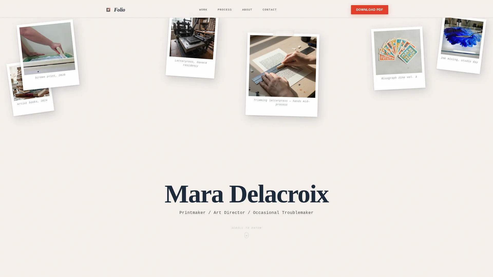
- A floating Polaroid-style header with parallax cursor drift and typewriter name animation
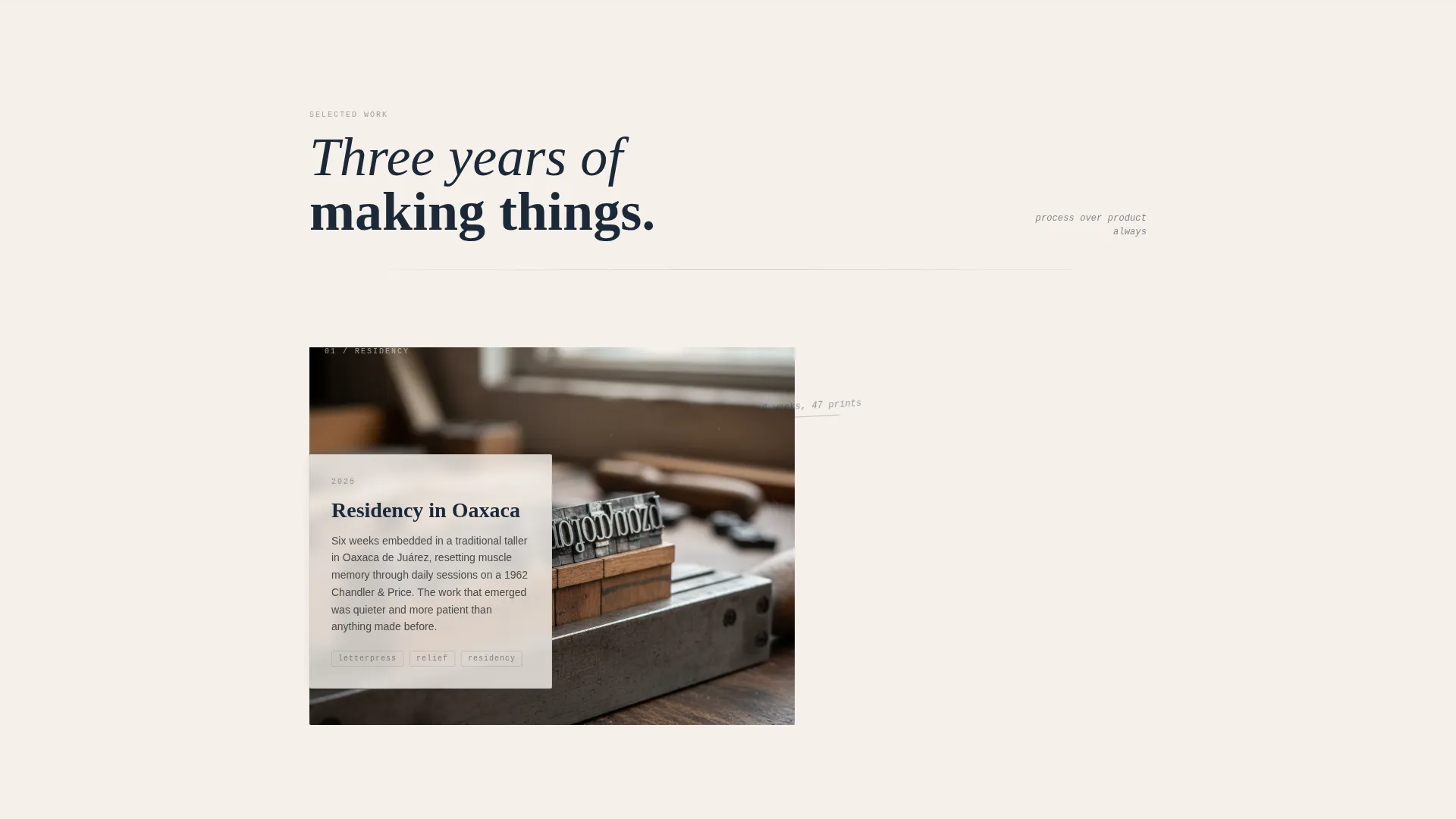
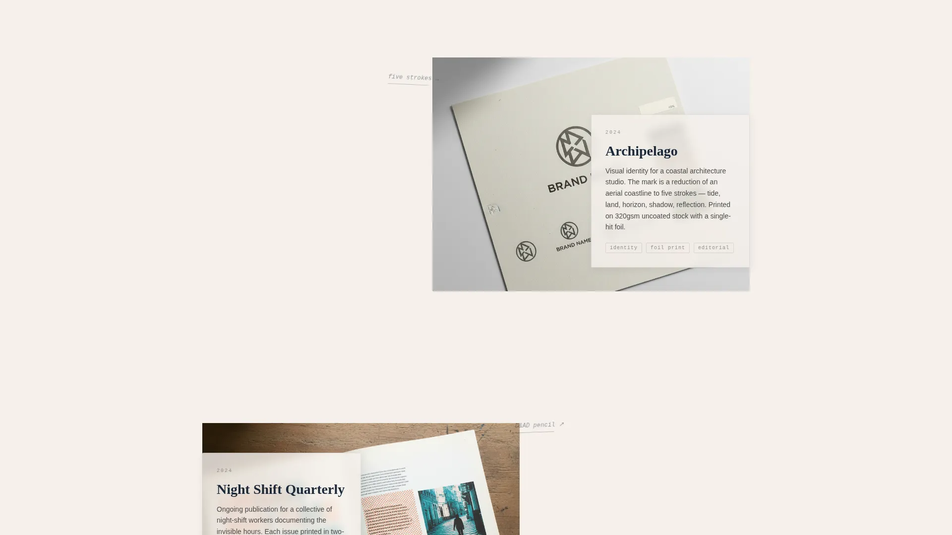
- Layered project cards with translucent vellum captions and handwritten-style tilted annotations
- A primary PDF download call to action and a minimal three-field contact form
Feature list
This template packages a cohesive set of visual and structural features. Each one is drawn directly from the Ink and Paper creative brief.
Floating Polaroid Header
Five or six images of varying size and rotation are scattered across the viewport. They overlap at irregular angles with soft paper-drop shadows. The visitor's cursor nudges them with a subtle parallax drift, and a typewriter animation reveals the name and single-line descriptor between the gaps.
Layered Project Cards
Each project section uses a stacked card structure: a full-bleed image underneath, a translucent vellum-style caption card on top, and a tilted handwritten annotation at the corner. Cards slide into frame at staggered depths as the visitor scrolls, building a sense of physical thickness.
Process-First Content Flow
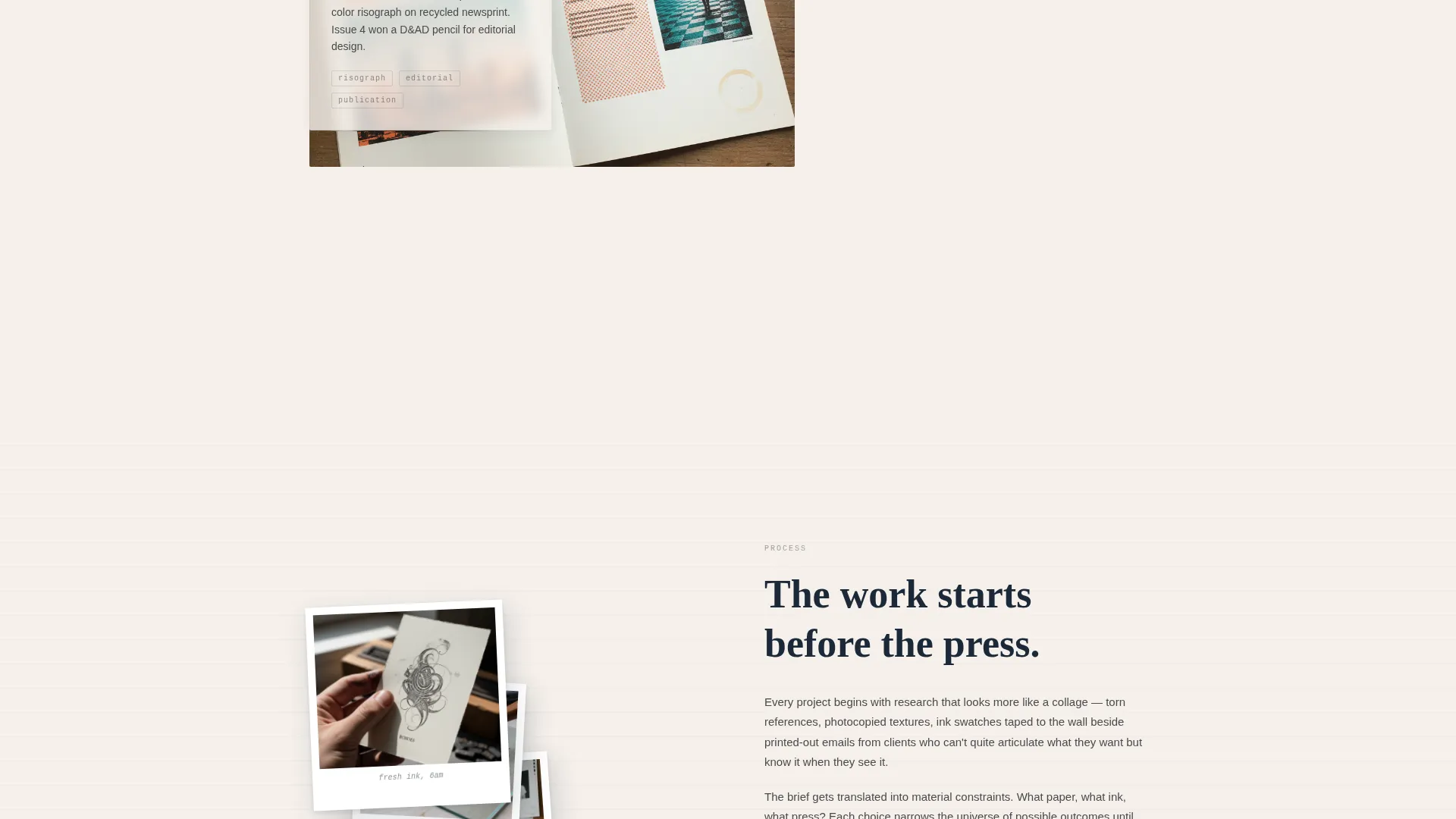
The page shares sketches, outtakes, and in-progress shots before presenting the download call to action. This sequencing builds trust so the PDF offer arrives after the visitor already feels familiar with the work.
Portfolio PDF Download Call to Action
A vermillion red download button appears after the third project section. Placement is deliberate: it follows enough displayed work to feel earned rather than premature.
Minimal Contact Form
The contact card asks for a name, a project type selection (editorial, exhibition, brand, or personal), and a single open textarea labeled "Tell me the rough idea." Nothing else. The simplicity matches the page's tone and lowers the barrier to reaching out.
Cloud Canvas Color System
The palette uses unbleached cotton white, graphite sketch gray, dried ink blue-black, and a single vermillion red accent. Vermillion is reserved for links, hover states, and occasional pull-quote initial caps. Every color feels like ink meeting paper rather than a backlit screen.
Page sections overview
| Section | Purpose |
|---|---|
| Floating Photo Header | Opens with scattered Polaroid-style images and typewriter name reveal |
| Name and Descriptor | Animates the creative title between the photo gaps on load |
| First Project Card | Introduces the first layered work sample with vellum caption |
| Second Project Card | Continues the studio-visit scroll with a residency photo essay spread |
| Logo Grid Spread | Displays logo marks on a tracing-paper-style grid layout |
| Third Project Card | Completes the project sequence before the download prompt |
| PDF Download Call to Action | Presents the portfolio PDF offer in vermillion red |
| Testimonial Strip | Serif-printed testimonial on a torn-strip element overlapping the next section |
| Contact Form Card | Minimal three-field form for project inquiry and rough idea submission |
Design & branding system
The visual identity follows an Ink and Paper theme using the Cloud Canvas color system. Nothing here is glossy or screen-optimized for brightness. Every design choice earns its place by feeling like a deliberate mark made by hand.
- Colors: unbleached cotton white (#F5F0EB), graphite sketch gray (#4A4A4A), dried ink blue-black (#1B2838), and vermillion red (#E23D28) as the sole accent
- Textures and effects: torn-tape header pin, paper-drop shadows, vellum transparency on caption cards, and tilted handwritten-style annotations
- Typography: serif type for testimonials and pull quotes; vermillion accent reserved for links, hover states, and initial caps
Mobile & speed optimization
The layered, overlap-heavy layout is designed to translate across screen sizes without losing its tactile character. Depth and stagger adapt to narrower viewports so the zine quality carries through on smaller screens.
- Parallax and staggered card animations are scoped to preserve the scroll experience on mobile
- Floating photo scatter and overlap sizing are adjusted for smaller viewports to maintain visual clarity
- The contact form and PDF call to action remain prominently placed on all screen sizes
How this template helps you convert
Folio is a Content and Resource landing page. It gives before it asks. The process-first structure builds trust incrementally so that both conversion actions feel like natural next steps rather than interruptions.
- The process content flow (sketches, outtakes, in-progress shots) builds credibility across three project sections before the PDF download button appears, making the offer feel like a reward rather than a pitch.
- The minimal contact form removes friction for early-stage project inquiries by asking only what is genuinely needed to start a conversation.
Other information about this template
Folio sits in the Personal and Resume category under the Creative Professional Career subcategory. It is designed specifically for the creative professional networking bio niche, where first impressions are formed in seconds and visual storytelling is the primary currency.
- Template style: Overlap and Layered, using stacked card depth and staggered scroll entry
- Header concept: Floating Photos with cursor-driven parallax drift
- Creative direction: Immersive Visual, turning the scroll into a studio visit
- Landing page direction: Content and Resource, with a PDF download as the primary call to action
- Theme: Ink and Paper with the Cloud Canvas color palette
Theme
Ink & Paper
Creative direction
Immersive Visual
Color system
Cloud Canvas
Style
Overlap/Layered
Direction
Content/Resource
Page Sections
Floating Polaroid Header with Parallax
Layered Vellum Project Cards
Process-first Content Sequencing
Portfolio PDF Download Prompt
Minimal Three-field Contact Form
Cloud Canvas Color System
Related questions
Who is this landing page template designed for?
What is the primary call to action on this template?
Can I use this template to accept project inquiries?
How does the floating photo header work?
Is this template suitable for gallery or residency submissions?



