Beauty Tech & Device Professional Website Template
Follicle is a Neo-Retro masonry landing page template built for a handheld scalp analyzer device. It guides visitors through a seasonal scroll story, from anagen growth to recovery, using cinematic dark visuals, rose-gold accents, and click-through cards. The primary call to action drives users toward the product detail and purchase page with zero form friction.
by Rocket studio
Quick summary
Follicle is a single-page masonry template designed for a handheld scalp analyzer device. It uses a seasonal scroll narrative, Spring through Winter, to walk visitors through the science of scalp health. Every card is a click-through surface, and the primary call to action pushes directly to a product detail and purchase page.
Who this template is for
This template suits direct-to-consumer beauty tech brands that want a page as personal as the product itself. It is built for teams who need to earn trust quickly and convert curious visitors into buyers without any form friction.
- Beauty tech founders selling a handheld scalp analysis device directly to consumers
- Estheticians or trichology practitioners adding a product landing page to their service menu
- Biohacker-focused brands whose buyers want clinical data framing over lifestyle copy
What problem this template solves
Most beauty device pages feel like a product spec sheet, cold, forgettable, and easy to leave. Follicle solves the credibility gap between "this looks interesting" and "I need to buy this now" by making the invisible visible before the call to action ever appears.
- Visitors arrive sceptical; the cinematic hero section leads with science, not product shots
- Buyers want proof; seasonal cards layer before-and-after content, dermatologist quotes, and clinical stats progressively
- Estheticians need professional framing; the winter recovery grid and clinical results section provide that tone
What you get with this template
You get a fully structured, single-page masonry layout with five distinct seasonal sections, a cinematic full-bleed header, and two mapped call-to-action placements. Every visual and copy zone is purpose-built around the scalp analyzer use case.
- A dark full-bleed hero with a bioluminescent scalp macro, a glow-pulse animation, and a thin serif tagline
- Four seasonal masonry sections (Spring, Summer, Autumn, Winter) each with their own card style, content type, and palette tone
- A floating primary call-to-action button and a secondary video modal trigger for a live scan preview
Feature list
This template's features are drawn directly from the brief and built around the device's core conversion goal.
Cinematic Dark Hero Section
The header fills the full viewport with an obsidian background and a rose-gold-lit scalp macro image. A subtle glow pulse and a diagonal hair strand detail create tension before the tagline fades in using thin Cormorant Garamond serif type.
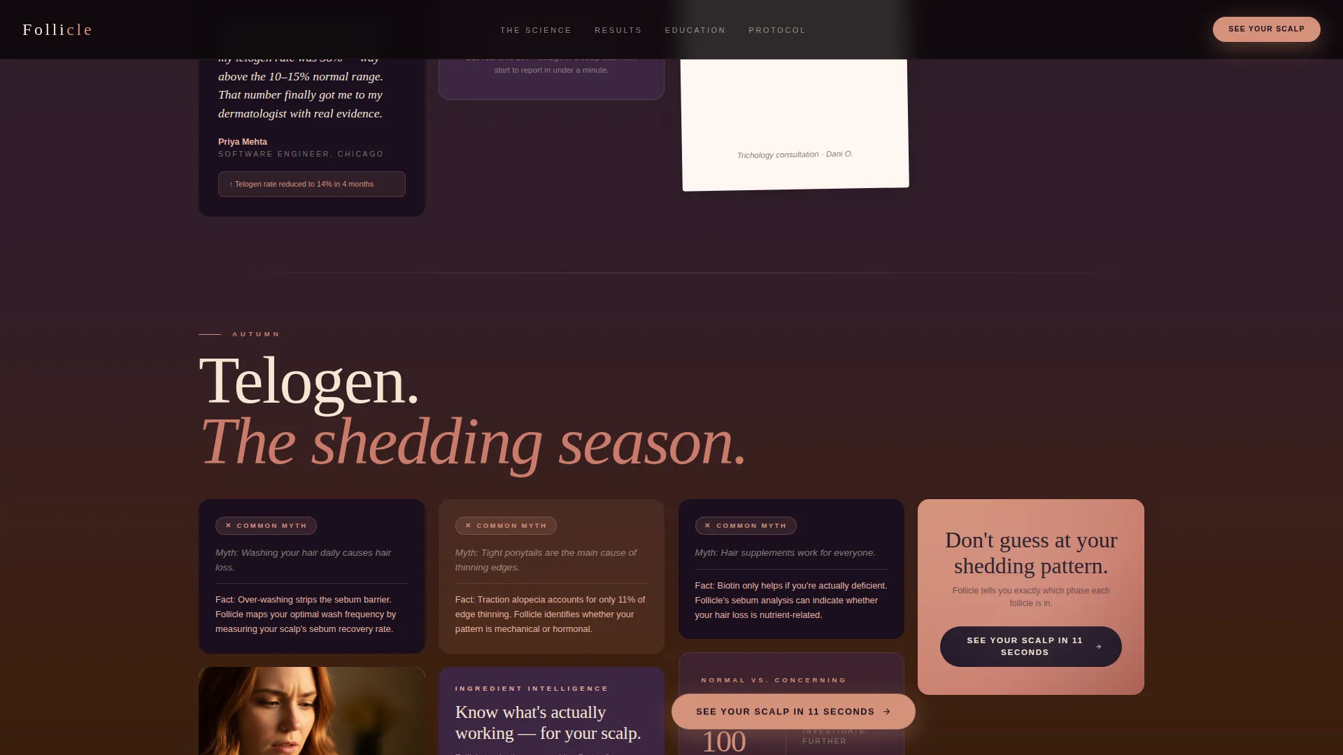
Seasonal Masonry Scroll Flow
The page is divided into four named seasonal sections. Spring covers anagen growth with scan cards and density scoring. Summer presents polaroid-style before-and-after user content. Autumn shifts the palette warmer and stacks myth-busting cards with ingredient breakdowns. Winter closes with a clinical results grid and dermatologist pull quotes.
Click-Through Card Architecture
Every masonry card is itself a click-through surface leading to the product detail and purchase page. There is no form, no friction, and no dead-end content block. The layout is designed to make every scroll stop feel like a reason to act.
Floating and Anchored Call-to-Action Placements
The primary call to action, reading "See Your Scalp in 11 Seconds," appears first as a floating button after the hero section and again as an anchored nudge inside seasonal cards. This dual placement keeps the conversion path visible without interrupting the story.
Live Scan Video Modal
A secondary call-to-action trigger labeled "Watch a Live Scan" opens an embedded video modal showing real-time device footage. This gives hesitant buyers a direct look at the device in use before committing to click through.
GSAP ScrollTrigger Animations
The template includes high-motion scroll animations built on GSAP ScrollTrigger: image reveals, masonry card stagger entries, parallax layer movement, and the hero glow pulse. Client Components handle the modal and animation logic while static sections use Server Components.
Page sections overview
| Section | Purpose |
|---|---|
| Hero Header | Open with cinematic scalp macro and tagline |
| Spring Masonry | Show anagen scan cards and first call to action |
| Summer Masonry | Display polaroid before-and-afters and testimonials |
| Autumn Masonry | Deliver myth-busting cards and ingredient content |
| Winter Clinical Grid | Present clinical results and dermatologist quotes |
| Arc Split Footer | Anchor brand tagline left, minimal links right |
Design & branding system
The visual identity follows a Neo-Retro aesthetic that feels like a vintage perfume advertisement reshot on 35mm film: dusty, intimate, and analog-warm, but clinically precise where it counts. Typography pairs Cormorant Garamond serif headlines with DM Sans for body text and interface elements.
- Color palette: deep twilight plum (#2A1B2E) as the primary background, electric rose-gold (#D4917A) for calls to action and hover states, dried petal pink (#E8B4A2) for card surfaces, and warm sand (#F5E6D3) for body text
- Palette shift: the Autumn section deliberately warms toward terracotta (#C97B6B) tones, giving the scroll a seasonal mood change that reinforces the hair-cycle narrative
Mobile & speed optimization
The template is built mobile-first because the core use case, a person checking their scalp in the bathroom mirror, happens with a phone in hand. Every section is designed to read clearly on a small screen before scaling up to desktop.
- Mobile-first layout ensures masonry cards reflow naturally on narrow viewports without losing the polaroid or seasonal card styling
- Server Components handle static hero and content sections to keep initial load lean; Client Components are scoped to the modal and GSAP animation logic only
How this template helps you convert
The page earns its click by progressively building evidence across the seasonal scroll. Visitors do not reach the final call to action cold. They arrive having seen magnified scalp scans, real user results, clinical data, and dermatologist opinions.
- The hero converts curiosity into engagement immediately: the bioluminescent scalp visual makes the science feel real before a single product claim appears
- Seasonal content layers social proof progressively, from user-generated before-and-afters in Summer to clinical percentage stats and expert quotes in Winter, so the final call to action lands with full credibility behind it
Other information about this template
This template is part of a broader masonry landing page collection designed for beauty tech and consumer health device brands. It is built with a clear direct-to-consumer conversion focus and a strong mobile-first philosophy.
- Template style: Masonry/Pinterest layout with seasonal section theming
- Color system label: Desert Rose
- Creative direction: Seasonal/Moment
- Header concept: Dark Full-Bleed with Glow
- Landing page direction: Click-Through to product detail and purchase page
- Localization defaults: English (US), USD pricing format, MM/DD/YYYY date format


Theme
Neo-Retro
Creative direction
Seasonal/Moment
Color system
Desert Rose
Style
Masonry/Pinterest
Direction
Click-Through
Page Sections
Cinematic Dark Hero Section
Seasonal Masonry Scroll Flow
Click-through Card Architecture
Dual Call-to-action Placement
Live Scan Video Modal
GSAP Scrolltrigger Animations
Related questions
Who is this landing page template designed for?
Does this template include a contact form or lead capture form?
What animation library does this template use?
Can the seasonal sections be edited to match different content needs?
What typography does this template use?


