Premium & Landing Page Template
Gather is a bento grid landing page built for a neighborhood group buying platform that unlocks wholesale prices on premium pantry goods. It combines an interactive price-reveal slider, live group-buy tickers, a sticky savings tracker, and a streamlined upgrade flow to turn curious browsers into committed Curator members.
by Rocket studio
Quick summary
Gather is a single-page bento grid landing page designed for a gourmet group buying platform. It pools neighborhood purchasing power to unlock wholesale prices on artisan olive oils, single-origin chocolates, and small-batch charcuterie. The page guides visitors from first impression through price revelation to a frictionless membership upgrade in one continuous scroll.
Who this template is for
This template is built for founders and product teams running a food and gourmet group buying platform. It suits operators who need to communicate complex tiered pricing in a visual, emotionally engaging way.
- Home cooks and dinner party hosts who want premium pantry goods at wholesale prices
- Office managers organizing curated monthly pantry drops for their teams
- Platform operators converting free members into paid Curator subscribers
What problem this template solves
Most food platform pages bury their best argument: buying alone costs more. Visitors leave before they understand what group buying actually saves them. This template makes that case visually and immediately.
- The Before/After Reveal slider turns abstract savings into a tangible, draggable moment
- Live group-buy tickers surface real scarcity without manufactured urgency
- The sticky savings bar personalizes the value proposition based on what each visitor hovers on
What you get with this template
You get a fully designed, section-led landing page that moves a visitor from curiosity to conversion. Every component is purpose-built for a gourmet group buying context.
- A bento grid product layout with progress bars, member avatars, and unlock status tiles
- An interactive retail-versus-group-price slider across multiple product tiers
- A two-step upgrade form that reduces sign-up friction to order frequency and category preference
Feature list
This template includes purpose-built components drawn directly from the Gather concept brief. Each feature serves a specific role in the conversion flow.
Bento Grid Product Display
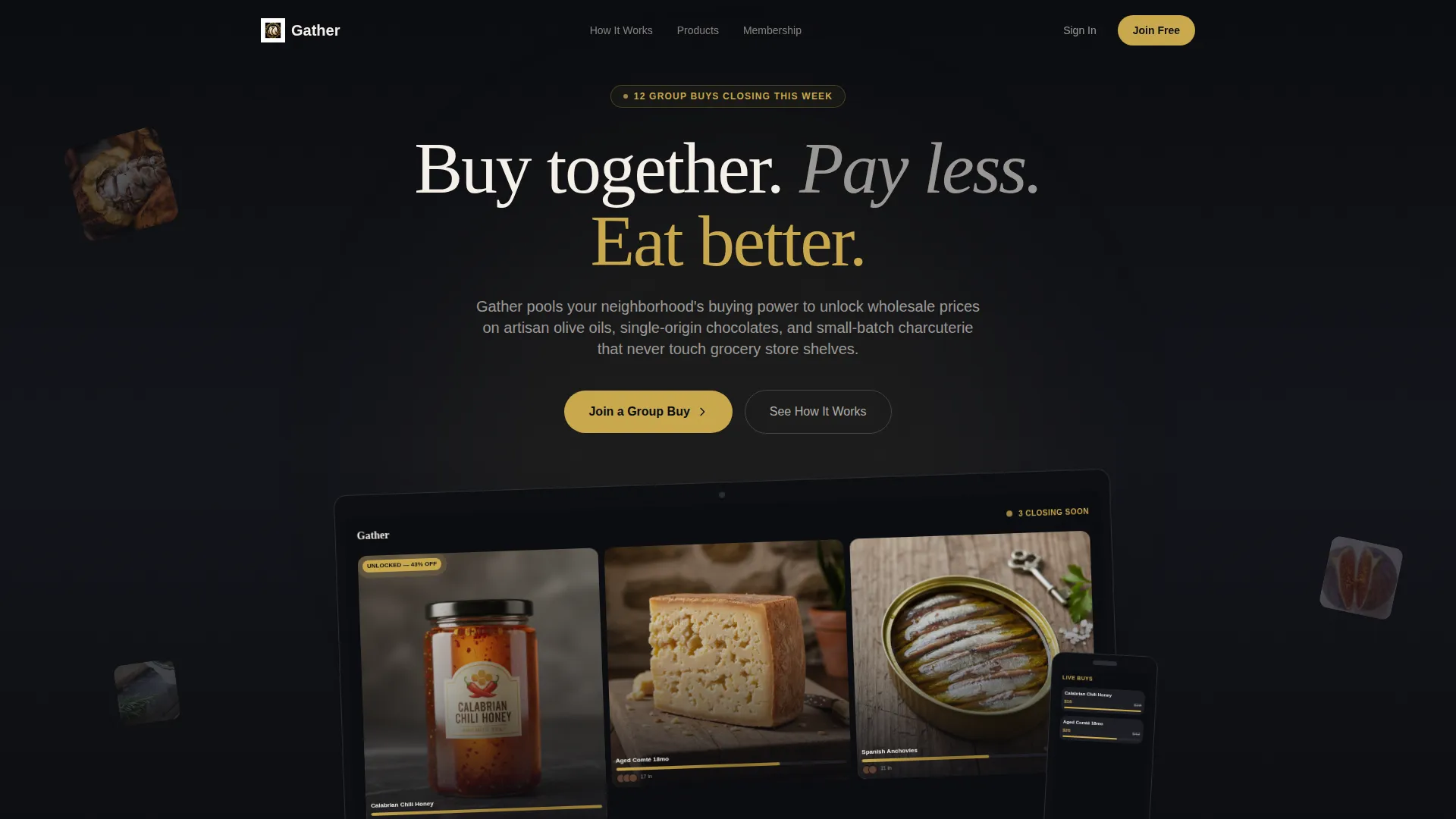
Each product tile in the grid shows a progress bar tracking how close the group buy is to its unlock threshold. Member avatars stack along the tile bottom, and one featured tile flashes an unlocked discount in gold. The layout makes the platform feel live and active from the first scroll.
Interactive Before/After Price Slider
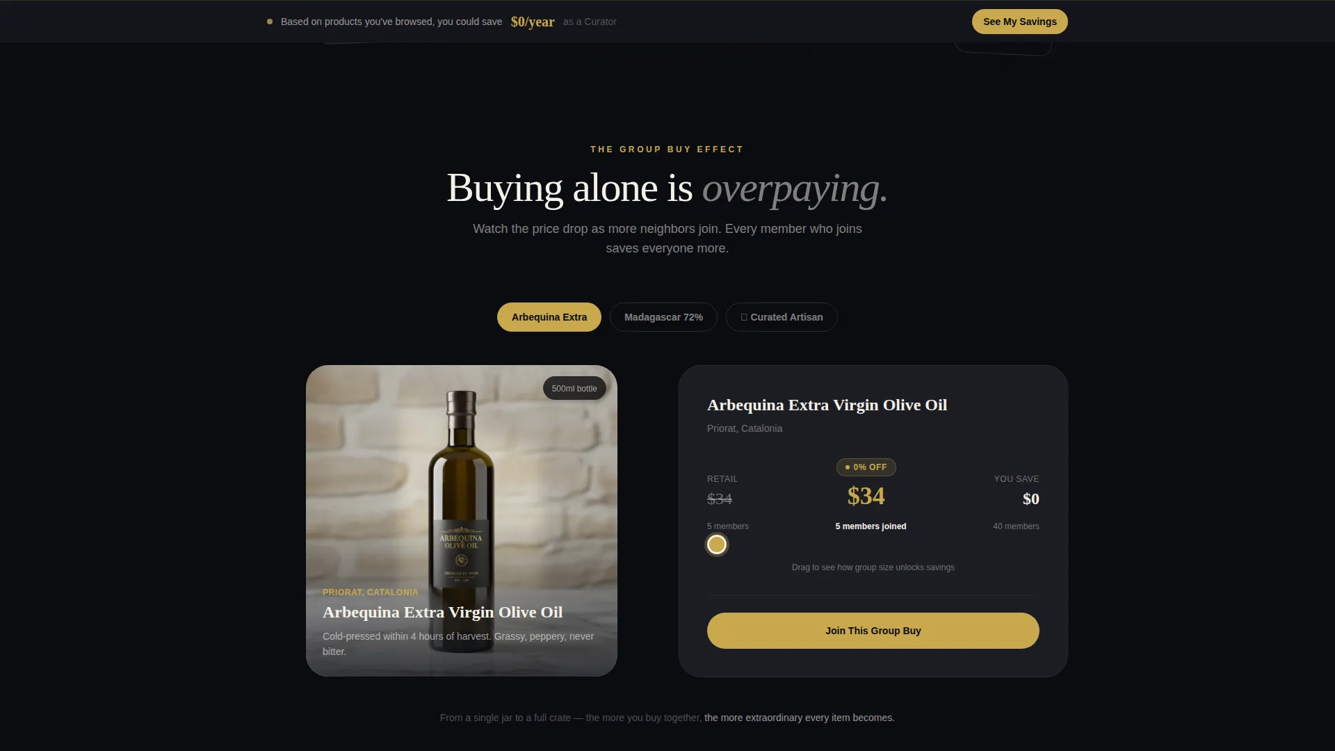
Visitors drag a slider on each product block to watch the price drop as the member count rises. The narrative escalates from a single jar with modest savings to a full curated crate with dramatic unlock percentages. This turns passive reading into an active discovery moment.
Live Group-Buy Ticker
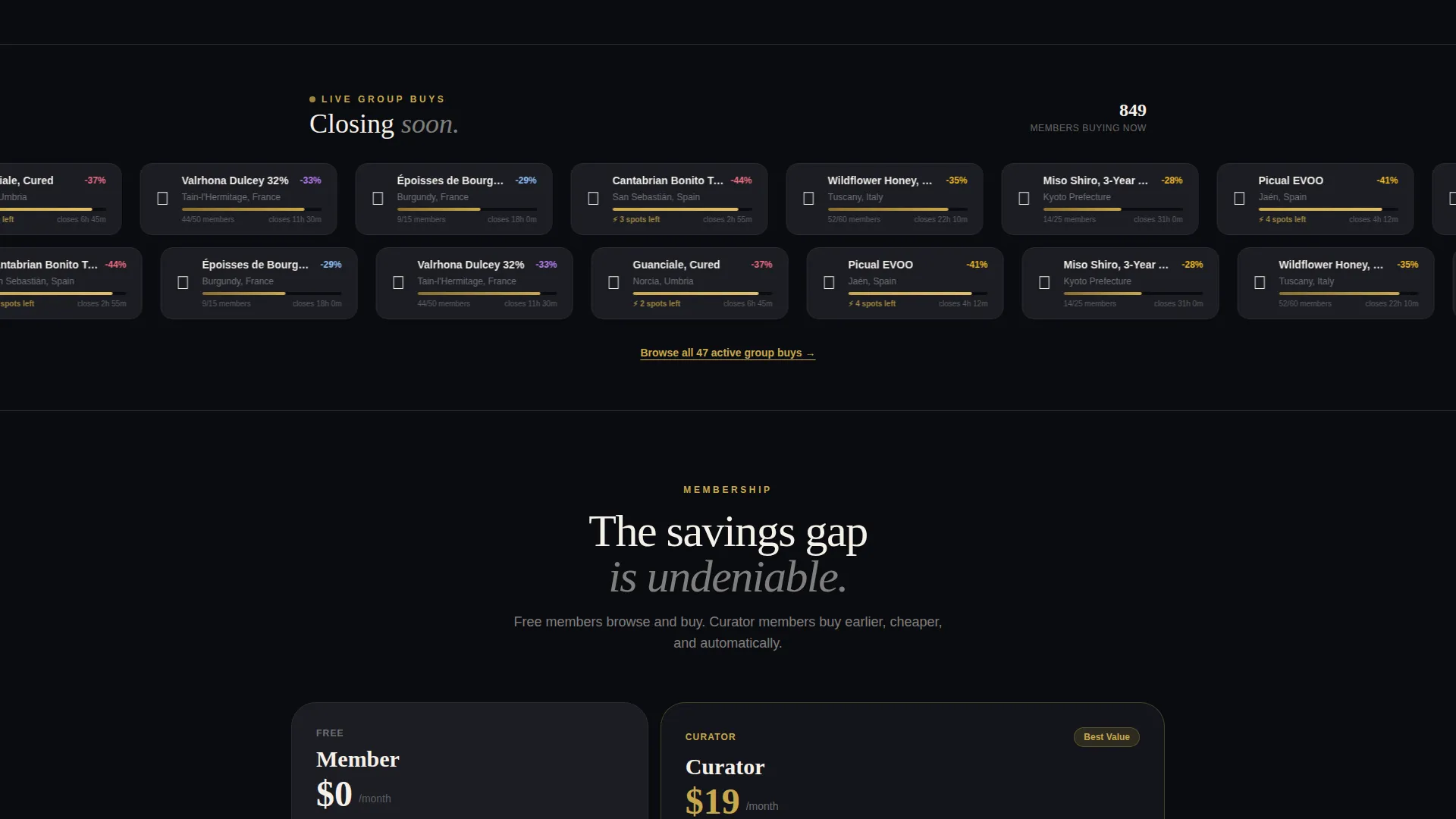
A midpage ticker displays active group buys that are closing soon. It communicates genuine scarcity and creates natural momentum toward joining before a buy closes. The ticker updates in real time to reflect current activity on the platform.
Sticky Savings Tracker Bar
A persistent bar at the bottom of the viewport calculates a visitor's hypothetical annual savings based on the products they have hovered on. It updates continuously and includes a quieter secondary call-to-action button that opens a personalized savings breakdown modal.
Tier Comparison Grid
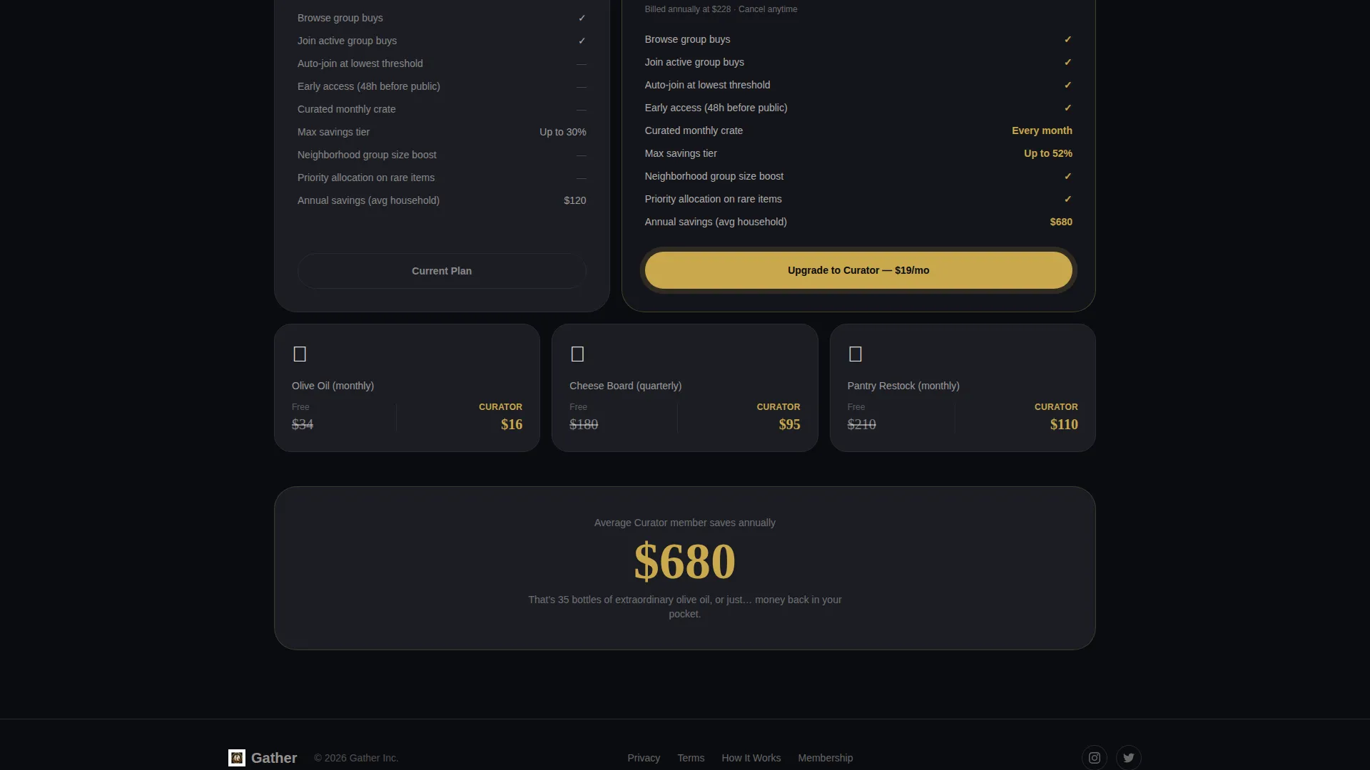
A structured comparison section displays the difference between free member access and the Curator membership tier. The savings gap becomes visually undeniable before the primary upgrade call-to-action is presented, making the upsell feel logical rather than pushy.
Streamlined Upgrade Form
The upgrade form asks only two questions: order frequency and preferred product categories. It then presents the annual Curator plan at a per-month price. The two-tap flow and single card entry step reduce sign-up friction to its practical minimum.
Page sections overview
| Section | Purpose |
|---|---|
| Header Device Mockup | Shows live platform mid-group-buy on floating laptop and phone |
| Bento Product Grid | Displays artisan products with progress bars and unlock status |
| Before/After Slider | Reveals retail versus. group price as visitor drags the control |
| Live Ticker Bar | Surfaces active group buys closing soon with real scarcity |
| Tier Comparison Grid | Contrasts free member access with Curator membership benefits |
| Upgrade Call-to-Action | Presents the primary "Upgrade to Curator" prompt post-comparison |
| Sticky Savings Bar | Tracks hypothetical annual savings and opens personalized modal |
| Upgrade Form | Captures order frequency and category preference before checkout |
Design & branding system
The visual identity follows a Marketplace Grid theme built on an Obsidian and Gold color system. The palette evokes a specialty grocer with dark shelving, handwritten gold-ink labels, and brown paper wrapping. Gold appears only where money is being saved or value is being revealed.
- Deep obsidian black (#0B0C10) as the primary background, parchment cream (#F5F0E8) for card surfaces and typography beds, and smoked walnut (#3E2C1E) for body text and secondary frames
- Warm hammered gold (#C9A84C) reserved exclusively for price tags, progress bars, and unlock thresholds
- A soft scatter of real ingredients on dark marble behind the header devices reinforces the artisan sourcing narrative
Mobile & speed optimization
The bento grid layout is designed to reflow naturally for smaller screens, keeping product tiles, progress bars, and the sticky savings bar functional across device sizes.
- The floating device mockup in the header presents both a laptop and a phone view, signaling that the platform experience is designed for mobile use
- The two-tap upgrade form is optimized for thumb-friendly interaction, reducing friction on mobile checkout flows
- The sticky savings bar persists across all viewport sizes, keeping the personalized value prompt visible throughout the scroll
How this template helps you convert
The page is structured as a sequential trust-building and upsell engine. Each section does specific conversion work before passing the visitor to the next.
- The header device mockup establishes platform credibility immediately by showing a live, populated group-buy grid with real product names and visible progress
- The Before/After Reveal slider shifts the visitor from passive reading to active participation, making savings feel personal and concrete before the tier comparison arrives
- The tier comparison grid and "Upgrade to Curator" call-to-action are placed after the emotional and rational case has been fully made, so the upgrade feels like a natural next step rather than an interruption
Other information about this template
This template is categorized under Retail and E-Commerce, specifically the Food and Gourmet E-Commerce subcategory. It is designed for a food and gourmet auction-style group buying platform where collective purchasing drives price discovery.
- The creative direction follows a Before/After Reveal pattern, with the Gallery and Detail template style providing rich product context alongside functional buying mechanics
- The Marketplace and Multi landing-page direction means the bento grid can showcase many products simultaneously without losing the single-page conversion focus
- The header concept is a Bundle Deal execution rendered through a device mockup, immediately communicating the group-buy mechanic to first-time visitors
Theme
Marketplace Grid
Creative direction
Before/After Reveal
Color system
Lavender Dream
Style
Gallery + Detail
Direction
Marketplace/Multi
Page Sections
Bento Grid Product Display
Interactive Before/after Price Slider
Live Group-buy Ticker
Sticky Savings Tracker Bar
Tier Comparison Grid
Streamlined Two-step Upgrade Form
Related questions
What type of platform is this landing page designed for?
Can I update the products shown in the bento grid?
How does the sticky savings bar engage visitors?
How minimal is the Curator upgrade form?
What membership tiers does this template support visually?



