Foundation Repair Contractor Website Template
Footing is a modular card-grid landing page built for foundation repair companies. It opens with a location input bar, then unfolds into before-during-after repair case cards, single-stat callout strips, and a zero-friction click-through to a free inspection booking. The Monochrome Steel palette and hydraulic-yellow calls to action make trust and urgency feel structural, not salesy.
by Rocket studio
Quick summary
Footing is a single-page, card-grid landing page template for foundation repair contractors. It leads with a direct location question, then builds confidence through modular repair case cards and relentless proof strips. Every element guides the visitor toward one action: booking a free inspection on the next page.
Who this template is for
This template is built for foundation repair businesses that need to convert anxious homeowners into booked inspections quickly. It works especially well for contractors who have a real portfolio of completed jobs and want that evidence front and center.
- Foundation repair contractors targeting residential homeowners in specific local areas
- Real estate professionals needing a fast-turnaround inspection booking flow before a deal closes
- Property investors evaluating repair scope and cost before committing to a purchase
What problem this template solves
Homeowners searching for foundation help are already worried. A generic hero image and a contact form do nothing to calm that anxiety. This template replaces vague reassurance with direct, location-aware proof, showing visitors that houses like theirs have already been fixed nearby.
- Visitors leave before booking because the page never earns their trust with real evidence
- Generic contractor pages feel disconnected from the visitor's specific neighborhood and situation
- Long forms and multiple steps create friction that stops people from scheduling an inspection
What you get with this template
You get a fully structured, single-page layout built around one conversion goal. The design is ready to receive your case study content, your stats, and your branding without requiring a redesign from scratch.
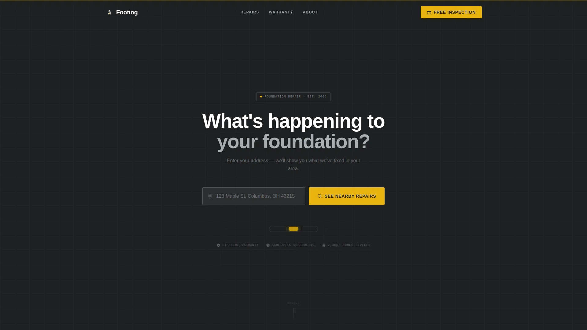
- A location input header with address entry, zip-code auto-detect, and a focused "See Nearby Repairs" button
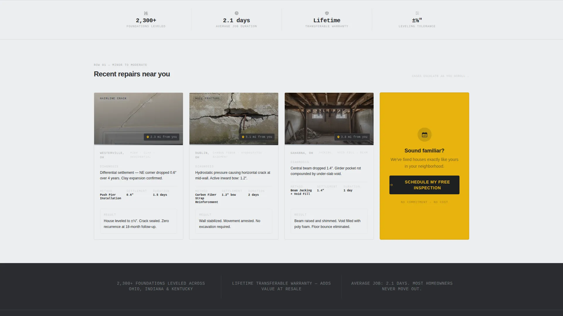
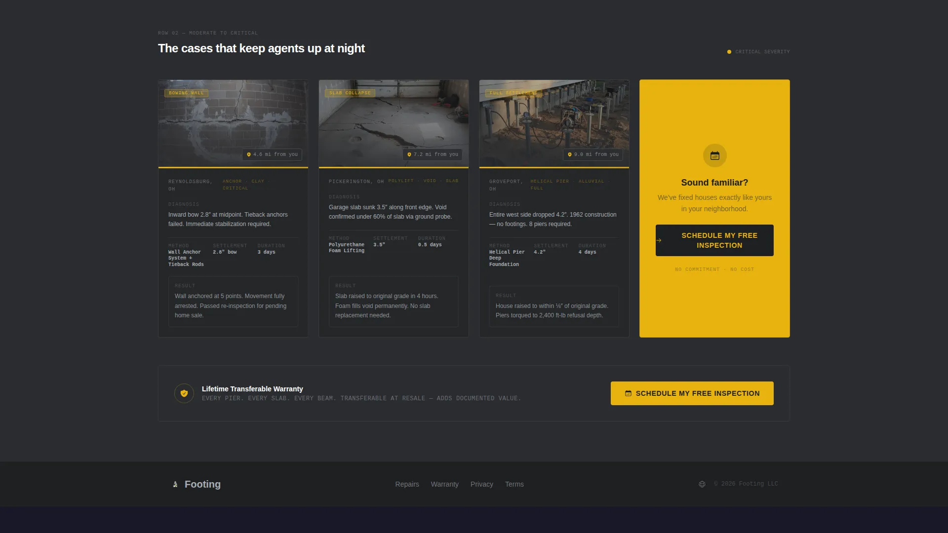
- A scrollable modular card grid where each card tells a compressed repair story with damage thumbnail, diagnosis details, method used, and result
- Single-stat callout strips between card rows, a sticky mobile call to action bar, and a hydraulic-yellow "Schedule My Free Inspection" button placed at every key decision point
Feature list
This template is built around specific structural decisions, each one serving the foundation repair sales context directly.
Location Input Header
The page opens with an oversized address field on a charcoal background. Above it sits the headline "What's happening to your foundation?" and a sub-line that reads "Enter your address, we'll show you what we've fixed in your area." The field has a subtle yellow outline on focus and a zip-code auto-detect trigger, plus a single "See Nearby Repairs" button.
Modular Repair Case Cards
Each card in the grid tells a complete before-during-after story. Cards include a damage thumbnail, the diagnosis (pier count, soil type, settlement measurement), the repair method, the outcome, and a small map pin showing job proximity. As the visitor scrolls, cases escalate from hairline cracks to bowing walls to full slab replacements.
Single-Stat Callout Strips
Between every row of case cards, a full-width strip interrupts the scroll with one bold proof point. Examples from the brief include "2,300+ foundations leveled," "Lifetime transferable warranty," and "Average job: 2.1 days." These strips keep the pace urgent and the evidence cumulative.
Zero-Friction Click-Through Flow
No forms live on this page. The entire page is a click-through designed to push visitors to a separate free inspection booking page. This keeps the on-page experience clean and removes every barrier between interest and commitment.
Sticky Mobile call to action Bar
On mobile devices, a persistent bottom bar carries the primary call to action throughout the scroll. Visitors never have to scroll back up to find the next step, regardless of how far down the page they have read.
Hydraulic-Yellow call to action System
The primary call-to-action button, "Schedule My Free Inspection," appears in hydraulic yellow (#E8B30E) at three points: inside the header after address entry, in the sticky mobile bar, and as the final card in every grid row. Yellow is used nowhere else on the page, making every action point unmissable.
Page sections overview
| Section | Purpose |
|---|---|
| Location Input Header | Captures address, sets local context, triggers proximity search |
| Address Entry Field | Accepts input, auto-detects zip code, activates call to action |
| Header call to action Button | First "Schedule My Free Inspection" placement post-entry |
| Repair Case Grid | Displays modular before-during-after job cards in rows |
| Stat Callout Strip 1 | Interrupts scroll with a single bold proof number |
| Case Cards Row 2 | Escalates damage severity shown in the card grid |
| Stat Callout Strip 2 | Delivers second standalone proof point between rows |
| Case Cards Row 3 | Closes grid with most severe repair cases shown |
| Stat Callout Strip 3 | Final proof strip before the page-end call to action section |
| Final call to action Card | Last grid card; primary "Schedule My Free Inspection" placement |
| Sticky Mobile Bar | Persistent bottom call to action visible throughout mobile scroll |
Design & branding system
The visual identity follows a Service Utility theme using a Monochrome Steel color system. The palette is intentionally minimal, evoking the inside of a work van rather than a polished agency site, which signals credibility and competence to a trades-focused audience.
- Four-color palette: structural charcoal (#2B2D30), galvanized silver (#A8ADB3), poured-concrete off-white (#EDEEEF), and hydraulic yellow (#E8B30E) reserved exclusively for calls to action and warning indicators
- Backgrounds alternate between concrete off-white and charcoal sections; card surfaces float in silver with sharp 1px borders; body text uses charcoal on light backgrounds and silver on dark
- Hydraulic yellow appears only where the visitor needs to act, creating a visual hierarchy that is impossible to misread
Mobile & speed optimization
The template is structured with a mobile-first reading flow in mind. The sticky call to action bar ensures the primary action is always one tap away, regardless of scroll depth.
- Sticky bottom bar on mobile keeps "Schedule My Free Inspection" visible throughout the entire scroll without interrupting the card-reading experience
- The card grid is modular, meaning rows stack cleanly on narrow screens without collapsing the before-during-after narrative inside each card
- No hero images or stock photography are used anywhere on the page, which reduces visual load and keeps the layout sharp on all screen sizes
How this template helps you convert
This template is designed as a pure click-through funnel. Every design and content decision reduces hesitation and points toward a single next step.
- The location input header creates immediate personal relevance by asking about the visitor's specific address, making the page feel like a local service rather than a national brand.
- The escalating case card grid builds trust progressively, showing the visitor that jobs matching their situation have already been completed nearby, which makes booking an inspection feel like the logical next move rather than a risk.
- The zero-form, click-through structure removes all on-page friction; the visitor only needs to click once to reach the booking page, keeping drop-off at its lowest possible point.
Other information about this template
This template is part of a broader set of construction and home service templates designed for the general contractor and specialty trades niche. It is built specifically around the foundation repair use case but can support adjacent structural services where a case-study-driven proof model is the right conversion strategy.
- Template style: Card Grid (Modular), suited to businesses with a portfolio of completed jobs to showcase
- Creative direction: Case Study Narrative, meaning the page is structured to tell real repair stories rather than make abstract promises
- Landing page direction: Click-Through, meaning all conversion happens on the next page and this page exists solely to earn the click
- Header concept: Location Input, a distinctive opener that immediately differentiates this page from a standard contractor homepage
- Theme: Service Utility, a visual tone that communicates trades expertise without relying on lifestyle photography or decorative elements

Theme
Service Utility
Creative direction
Case Study Narrative
Color system
Monochrome Steel
Style
Card Grid (Modular)
Direction
Click-Through
Page Sections
Location Input Header with Zip-code Auto-detect
Modular Before-during-after Repair Cards
Single-stat Proof Callout Strips
Zero-friction Click-through Structure
Sticky Mobile Call-to-action Bar
Hydraulic-yellow Call to Action Placement System
Related questions
What type of business is this template built for?
Does this template include a contact form or booking form?
Can I customize the stat callout strips with my own numbers?
How does the location input header work in the template?
Is this template suitable for a real estate agent or property investor audience?



