Artisan Gourmet Food Marketplace Landing Page
Forage is a single-page artisan food marketplace landing page built around a warm Citrus Burst palette and a layered Marketplace Grid layout. It combines a full-viewport lifestyle header, draggable Before/After Reveal sections, and a three-tier subscription card stack to move home cooks, gift-givers, and weekend hosts from casual browsing to an upgrade decision.
by Rocket studio
Quick summary
Forage is a richly layered artisan food marketplace landing page. It opens with an overhead lifestyle shot of a rustic table, walks visitors through dramatic product reveals, and closes with a tiered upgrade path. The design feels like a sun-drenched farmers' market, abundant, tactile, and full of sensory detail that earns the purchase.
Who this template is for
This template suits food-focused businesses and curated marketplace operators who sell products that deserve better presentation than a supermarket shelf can offer.
- Small-batch food sellers and artisan producers launching a curated subscription or box service.
- Gourmet marketplace founders who need a single persuasive page to present tiered upgrade paths to existing free-tier members.
- Gift box brands and weekend-host product curators targeting buyers who want conversation-starting pantry items.
What problem this template solves
Artisan food products lose their appeal when placed in a generic storefront layout. Shoppers cannot feel the difference between a commodity olive oil and a single-estate Sicilian press just by reading a product name. This template closes that sensory gap visually before the visitor reaches the checkout.
- Commodity fatigue: visitors arrive used to fluorescent-lit, barcode-forward grocery packaging and need a contrast experience to shift their perception.
- Weak upgrade motivation: free-tier users stay passive without a clear, visual reason to commit to a paid subscription tier.
- Flat product presentation: standard grid layouts fail to communicate craft, provenance, or the full pantry transformation on offer.
What you get with this template
You get a fully structured single-page layout with every key section pre-designed and ready to populate with your own products, photography, and pricing.
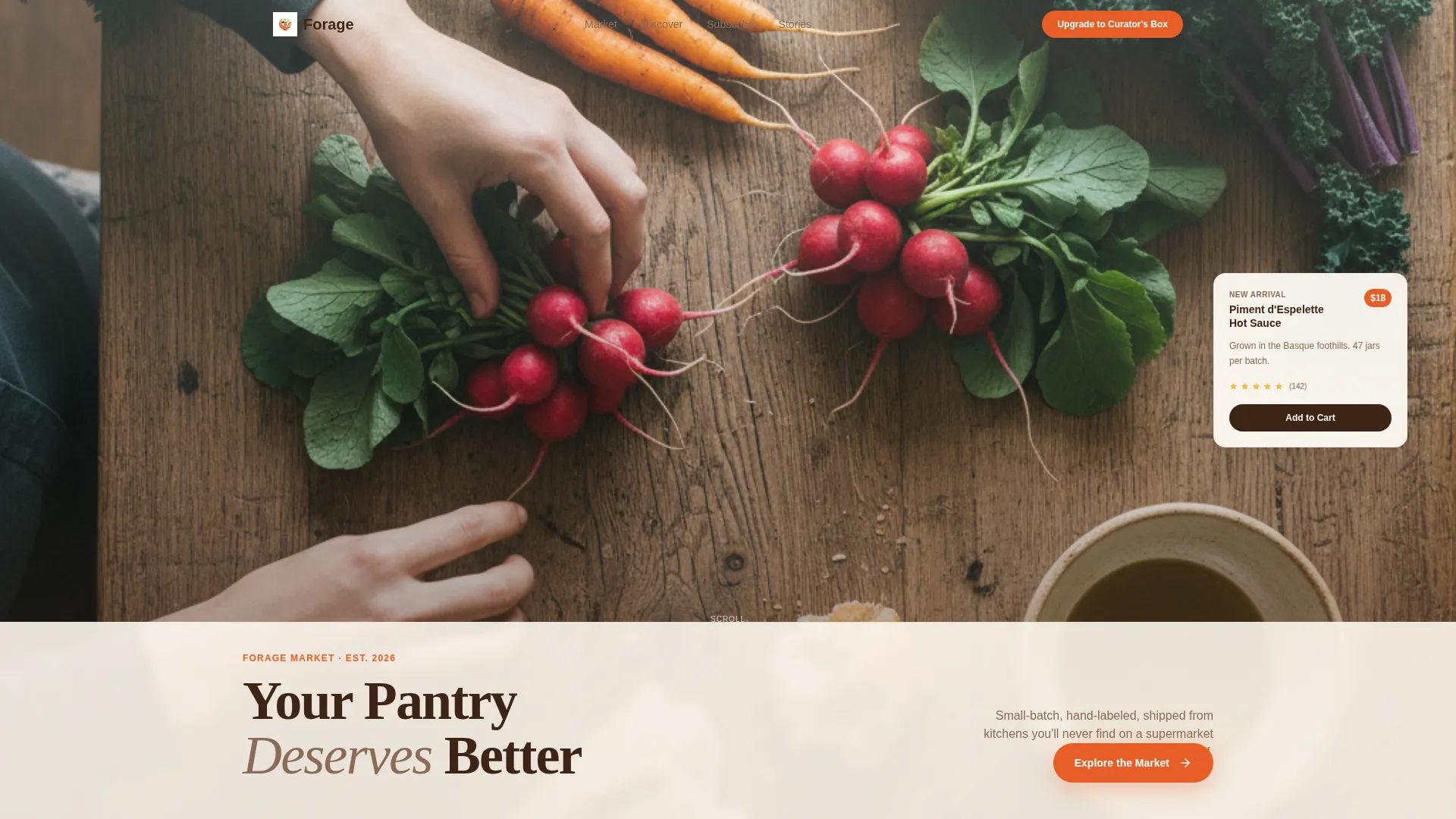
- A full-viewport lifestyle header with a layered translucent panel, headline, and an overlapping blood-orange call-to-action button.
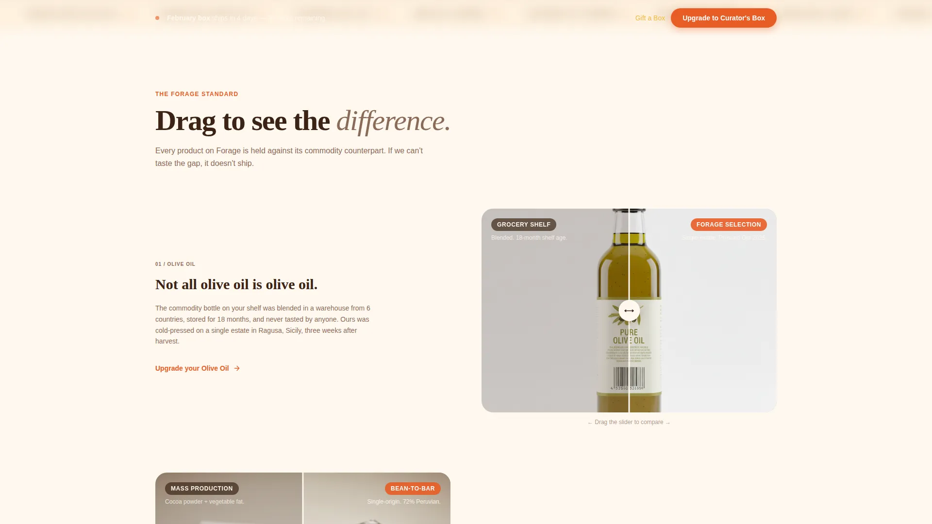
- Three draggable Before/After Reveal sections that escalate from individual product comparisons to a full pantry transformation story.
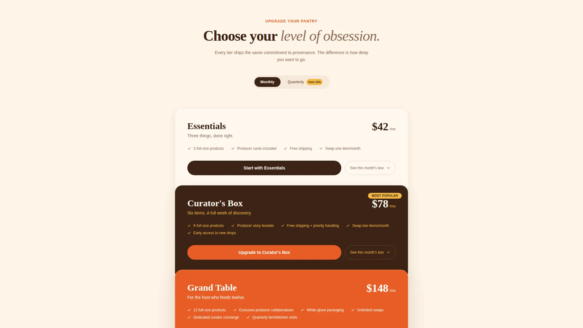
- A three-tier subscription card stack with inline billing-toggle drawers, a sticky upgrade bar, and a secondary gift path.
Feature list
This template delivers a focused set of visual and structural features, each one grounded in the artisan food marketplace experience the brief describes.
Full-Viewport Lifestyle Header
The header fills the entire screen with an overhead shot of a crowded rustic oak table. A translucent cream panel slides over the bottom third, carrying the headline "Your Pantry Deserves Better" in espresso brown. A blood-orange button breaks the grid edge, making the first call to action feel physical and immediate.
Draggable Before/After Reveal
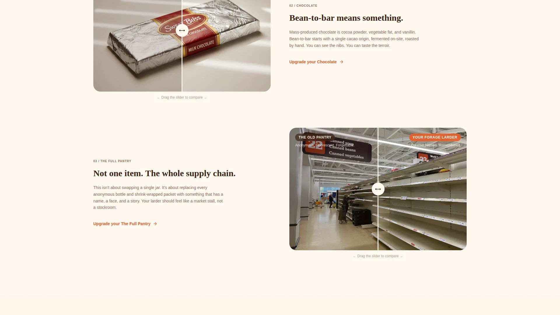
Three reveal sections use a draggable slider to contrast commodity products with their artisan counterparts. The sequence moves from a single product pair to a full pantry transformation, building a cumulative case for upgrading the entire kitchen supply chain rather than buying one item.
Layered Three-Tier Subscription Cards
The upgrade path presents three tiers, Essentials, Curator's, and Grand Table, as physically stacked, overlapping cards. Each card sits visually atop the last, reinforcing the "more" metaphor. Clicking any tier opens an inline drawer showing that month's products and a toggle between monthly and quarterly billing, all without leaving the page.
Sticky Upgrade Bar
After the visitor scrolls past the third reveal section, a sticky blood-orange bar persists at the top of the viewport. It keeps the primary "Upgrade to Curator's Box" call to action visible without interrupting the reading flow below it.
Secondary Gift Path
A "Gift a Box" call to action appears in lemon-on-espresso styling beneath the tier cards. It targets gift-givers without competing visually with the primary upgrade button, giving the page two conversion paths that serve different buyer intents simultaneously.
Citrus Burst Marketplace Grid
The layout uses a Marketplace Grid theme where product cards overlap and cast soft shadows, as if physically stacked on a table. Lemon washes sit behind layered cards, blood orange fires every button and price tag, and cream dominates the background to keep the page warm and readable throughout.
Page sections overview
| Section | Purpose |
|---|---|
| Lifestyle Header | Opens with immersive overhead table shot and primary call to action |
| Before/After: Olive Oil | Contrasts commodity oil with single-estate Sicilian press via draggable slider |
| Before/After: Chocolate | Contrasts mass-produced bar with bean-to-bar slab showing visible cocoa nibs |
| Before/After: Full Pantry | Escalates reveal to sad shelf versus styled larder transformation |
| Upgrade Tier Cards | Presents Essentials, Curator's, and Grand Table as stacked, clickable cards |
| Inline Product Drawer | Opens per-tier to show monthly products and billing toggle without page change |
| Sticky Upgrade Bar | Persists after third scroll section to keep primary call to action visible |
| Gift a Box Path | Secondary lemon-on-espresso call to action targeting gift-givers below tier cards |
Design & branding system
The Citrus Burst color system is built around four grounding colors that all work together on a warm, kitchen-light visual register. Every color has a clear role, so the page never feels cluttered despite its layered grid structure.
- Blood orange (#E85D26) for all primary buttons, price tags, and urgent calls to action; Meyer lemon (#F4B942) for card washes and secondary accent areas; fresh ricotta cream (#FFF8F0) as the dominant background tone.
- Espresso brown (#3B2314) anchors all body text and navigation, keeping long reading sections grounded and easy to scan.
- Product cards overlap with soft drop shadows, mimicking physical stacking on a wooden cutting board under golden-hour kitchen light.
Mobile & speed optimization
The layered Marketplace Grid layout is structured to reflow cleanly on smaller screens without losing the tactile, overlapping card effect that defines the desktop experience.
- The lifestyle header viewport fill and translucent panel scale down while preserving the headline and call-to-action button placement above the fold.
- The Before/After draggable sliders convert to tap-friendly interactions on touch devices, keeping the reveal mechanic functional on phones and tablets.
How this template helps you convert
Every structural decision in this template is designed to move a passive browser toward an active upgrade or gift purchase.
- The Before/After Reveal builds escalating contrast across three sections, making the sensory gap between commodity and artisan products feel personal and cumulative before the visitor reaches the pricing cards.
- The sticky upgrade bar ensures the primary call to action stays in view after the third scroll section, so visitors who finish the reveal sequence are never more than one tap away from committing.
- The inline billing-toggle drawer removes the friction of leaving the page to explore pricing, letting curious visitors compare monthly and quarterly options in context and click through without losing their place.
Other information about this template
This template is built for the Food and Gourmet E-Commerce category and sits at the intersection of curated marketplace and artisan subscription retail. It is designed as a single landing page rather than a multi-page storefront, so it works best when paired with a dedicated checkout or account flow hosted elsewhere.
- The page direction is Marketplace/Multi in style, meaning the visual language supports a broad product range presented as a curated collection rather than individual product detail pages.
- The template style combines a Gallery presentation with Detail-level product storytelling, matching the Gallery + Detail template style noted in the intersection context.
- The header concept is oriented around a lifestyle Bundle Deal feel, where the value of the full collection is more prominent than any single product, aligning with the Bundle Deal header concept from the intersection fields.
- The creative direction follows a Before/After Reveal approach, one of the most effective structures for gourmet and specialty food brands that need to shift perception before presenting price.
Theme
Marketplace Grid
Creative direction
Before/After Reveal
Color system
Lavender Dream
Style
Gallery + Detail
Direction
Marketplace/Multi
Page Sections
Full-viewport Lifestyle Header
Draggable Before/after Reveal
Layered Three-tier Subscription Cards
Sticky Upgrade Bar
Secondary Gift Path
Citrus Burst Marketplace Grid
Related questions
Can I replace the lifestyle header photograph with my own imagery?
How does the inline product drawer work on the tier cards?
Is this template designed for a single product or a full curated range?
Can the Gift a Box section be removed or replaced?
When does the sticky upgrade bar become visible?



