Low-FODMAP Food & Dining Professional Website Template
Forage is a hero-dominant landing page template built for low-FODMAP grocery delivery services. It uses a Photo Grid Mosaic header, an Origin Story scroll structure, and a Desert Rose color system to guide IBS sufferers, dietitians, and parents from first impression to a single curated shop click. Every section builds supply-chain trust before asking for anything.
by Rocket studio
Quick summary
Forage is a single-page, click-through landing page template for low-FODMAP food delivery businesses. It combines a 12-tile mosaic hero, a scrolling origin story, and a warm Agrarian Root visual identity to convert cautious buyers into confident shoppers. The page ends at one destination: a curated, pre-filtered food ordering shop.
Who this template is for
This template is designed for founders and marketers running a curated food delivery service in the gut-health niche. If your business depends on earning deep trust before a visitor will spend money, this landing page design was built for you.
- Low-FODMAP grocery delivery brands targeting IBS sufferers aged 25 to 55
- Dietitians and nutrition practices creating elimination-phase product kits
- Parents searching for safe food ordering options for children with unexplained gut sensitivities
What problem this template solves
Most food delivery landing page designs lead with price or convenience. Forage leads with proof. Your visitors have already read too many labels and still flared up. They need to trust your supply chain before they will trust your shop.
- Buyers abandon food delivery websites when provenance feels vague or unverified
- A generic landing page cannot communicate Monash certification or dietitian review at a glance
- Visitors need a clear, emotive journey from sourcing to doorstep before committing to food ordering
What you get with this template
This template gives you a fully structured, single-page layout with every section scripted to answer a specific buyer doubt. The landing page design is clean and purposeful, with no wasted space and no off-topic detours.
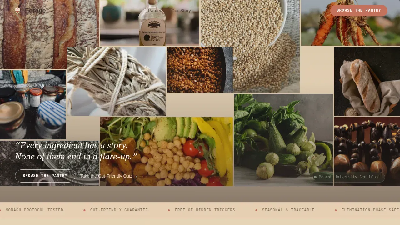
- A 12-tile Photo Grid Mosaic hero with a ghost call-to-action and a cream tagline set low in the frame
- Four narrative scroll sections covering sourcing, testing, packing, and a full-bleed shop call-to-action
- A footer built on an Arc Browser Split pattern with logo, navigation links, and social and legal rows
Feature list
Photo Grid Mosaic Hero
Twelve unevenly cropped tiles fill ninety percent of the viewport with extreme close-up ingredient photography. Each tile uses a different aspect ratio, creating a patchwork rhythm that draws the eye downward. The ghost "Browse the Pantry" button sits over the mosaic, inviting a click without pressure.
Origin Story Scroll Structure
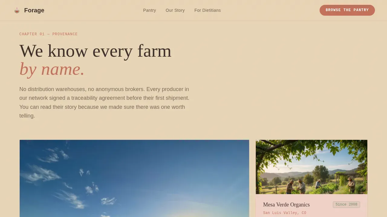
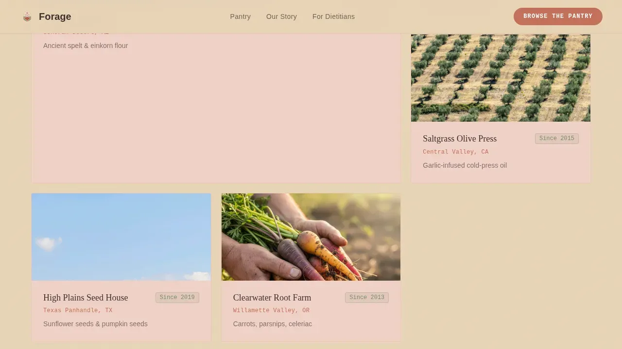
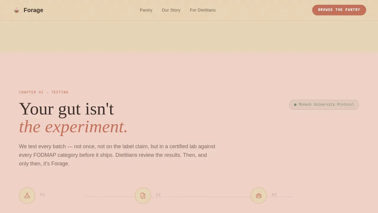
Scrolling past the hero pulls visitors backward through each product's journey. Named farms and small-batch producers appear by region. A three-step diagram explains the Monash protocol and dietitian review process. A packing section shows hands wrapping glass jars in recycled kraft paper.
Dual Call-to-Action System
The primary call-to-action, "Browse the Pantry," appears first as a ghost button, then resurfaces as a solid terracotta button after the sourcing story. A secondary text link, "Take the Gut-Friendly Quiz," offers a softer path to a personalized box recommendation for visitors who need more guidance.
Sticky Mobile Call-to-Action Bar
On mobile, the primary call-to-action anchors to a sticky bottom bar so visitors always have access to the shop without scrolling back up. This supports the mobile-first landing page design priority and keeps food ordering within one tap at any scroll depth.
Desert Rose Color System
Terracotta marks every interactive element. Sand and blush alternate as section backgrounds. Sage appears only on trust badges and certification icons. Mesquite brown anchors all body text. The palette is consistent and brand-ready out of the box, requiring no color decisions from the user.
Agrarian Root Typography System
Headlines use Fraunces, a warm serif that reads like a hand-lettered label. Body copy uses DM Sans for clean legibility. Labels and badges use JetBrains Mono for a precise, clinical counterpoint that signals accuracy without clinical coldness.
Page sections overview
| Section | Purpose |
|---|---|
| Photo Grid Mosaic Hero | Opens with product intimacy and a ghost call-to-action |
| Named Farm Sourcing | Answers "Can I trust where this comes from?" |
| Monash Testing Diagram | Answers "Is it actually certified?" with a three-step flow |
| Kraft Packing Reveal | Answers "Will it arrive safely?" through tactile imagery |
| Shop Call-to-Action | Drives the click to a pre-filtered curated shop |
| Gut-Friendly Quiz Link | Soft secondary path for undecided visitors |
| Arc Split Footer | Logo, links, social icons, and legal in a clean split layout |
Design & branding system
The visual identity follows an Agrarian Root theme. Every color choice reflects the high-desert kitchen garden atmosphere described in the brief, giving the landing page a sensory, editorial quality that generic food delivery website design rarely achieves.
- Terracotta (#C4705A) for all calls-to-action and interactive elements; sand (#E8D5B7) and blush (#F0D2C7) for alternating section backgrounds
- Sage (#7A8B6F) reserved for trust badges and certification marks; mesquite (#3B2F2B) for all body text
- Fraunces serif headlines, DM Sans body text, and JetBrains Mono for labels and badges
Mobile & speed optimization
This landing page is built mobile-first. The mosaic hero collapses gracefully on smaller screens, and the sticky bottom call-to-action bar ensures food ordering is always one tap away. The layout is fully responsive, which is essential for food delivery websites where the majority of visitors arrive on a phone.
- GSAP ScrollTrigger handles mosaic parallax, staggered reveals, and scroll-velocity tile shifts
- Server Components power static sections; Client Components handle scroll animations to keep the site lean
- The design avoids heavy elements that increase bounce rate and degrade the website's performance on mobile connections
How this template helps you convert
The entire landing page is engineered as a click-through. There is no form and no account creation. Every section reduces a specific fear, and every call-to-action leads to a single pre-filtered destination. That focus is what keeps visitors moving forward instead of leaving.
- Trust is built progressively: sourcing, testing, and packing sections answer the three hardest buyer doubts before the shop call-to-action appears, dramatically lowering resistance at the moment of decision.
- Two paths serve two mindsets: ready buyers click "Browse the Pantry" while hesitant visitors take the quiz, meaning the landing page captures intent at both ends of the consideration spectrum.
Other information about this template
The Forage artisan pantry delivery landing page template is designed for teams creating their first food delivery website as much as for established brands redesigning an underperforming page. It works as a standalone landing page or as a campaign-specific entry point for ad campaigns driving traffic from social media platforms.
Food delivery website templates like Forage let you launch a pro-quality website without building from scratch. Customizable grocery delivery templates allow users to tailor the design to suit their brand, and this template follows that principle with organized layers and a clearly documented color and type system.
- The template supports basic features needed to process payments through a linked shop page, and certain functionalities can be extended through other third party features or plugins as your services grow
- Consent preferences and cookie handling are considerations for any live food delivery website; the template's structure is compatible with standard consent category banners that store information and enable users to visit anonymously or preferences accept specific tracking
- Tools like analytics analytical cookies, Google Analytics, and Google Tag Manager can be configured after launch to track site usage, calculate visitor counts, recognise unique visitors, identify bots, and build an analytics report; collected data includes session duration, traffic source, bounce rate, and campaign data to measure key performance indexes and experiment advertisement efficiency
- The Google reCAPTCHA service can be integrated to protect form endpoints and identify bots attempting malicious spam attacks; Cloudflare bot management and support cloudflare bot management features help protect the site and provide visitors with a secure experience including providing secure log in flows where needed
- A randomly generated number within the cookie RC system can be used alongside always active necessary cookies to determine if a user's browser supports cookies and to recognise unique visitors without collecting personally identifiable data; a cookie stores information anonymously to help the site navigate efficiently and measure the website's performance through the site's analytics report
Theme
Agrarian Root
Creative direction
Origin Story
Color system
Desert Rose
Style
Hero-Dominant (90/10)
Direction
Click-Through
Page Sections
Photo Grid Mosaic Hero
Origin Story Scroll Structure
Dual Call-to-action System
Sticky Mobile Call-to-action Bar
Desert Rose Color System
Agrarian Root Typography System
Related questions
Who is this landing page template designed for?
Can I customize the colors and typography?
Does the landing page include a quiz or interactive element?
What sections are included in this landing page?
Is this template suitable for running paid ad campaigns?



