Hobby & Passion Supplies Comparison Website Template
Forage is a bento grid landing page template built for wild plant foraging and wildcrafting supply stores. It pairs a full-bleed forest-floor hero with a live quiz that narrows thousands of products down to seven tailored gear picks. The Neo-Retro palette, comparison-driven grid tiles, and dual conversion paths make it equally useful for weekend mushroom hunters and outdoor educators outfitting whole classes.
by Rocket studio
Quick summary
Forage is a single-page bento grid template designed for wildcrafting and foraging supply retailers. A full-bleed hero image sets the mood instantly, while a five-question visual quiz walks visitors toward a personalized gear kit. Comparison-style grid tiles escalate urgency from convenience to safety, making the right tool feel necessary rather than optional.
Who this template is for
This template fits any retailer or educator selling gear to people who gather food and plants from the wild. It is especially well-suited for shops that carry a mix of tools, field references, and harvest containers across different buyer skill levels.
- Weekend mushroom hunters stepping up from improvised gear to proper harvest equipment
- Herbalists building out serious wildcrafting kits with knives, loupes, and botanical guides
- Outdoor educators outfitting groups of twenty or more with dependable, repeatable starter kits
What problem this template solves
First-time and intermediate foragers often arrive at a shop feeling overwhelmed. They do not know which tool covers which need, and generic category pages do not reassure them. This template removes that friction by guiding each visitor toward a specific, confident purchase.
- Beginners freeze in front of large catalogs and leave without buying anything
- Safety-critical gear like field guides and identification loupes gets buried among accessories
- Group buyers, such as educators, need a fast path to bulk-ready kit recommendations
What you get with this template
You get a fully structured, single-page bento grid layout ready to carry your product story from first scroll to checkout intent. Every section has a clear job, and the conversion flow is built in from the start.
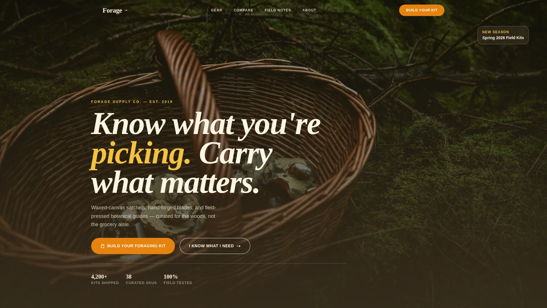
- A full-bleed hero section with slab-serif headline type and a styled forest-floor image treatment
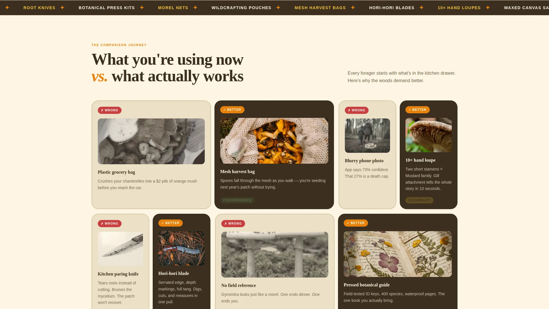
- A bento grid of comparison tiles that escalate from convenience problems to safety concerns
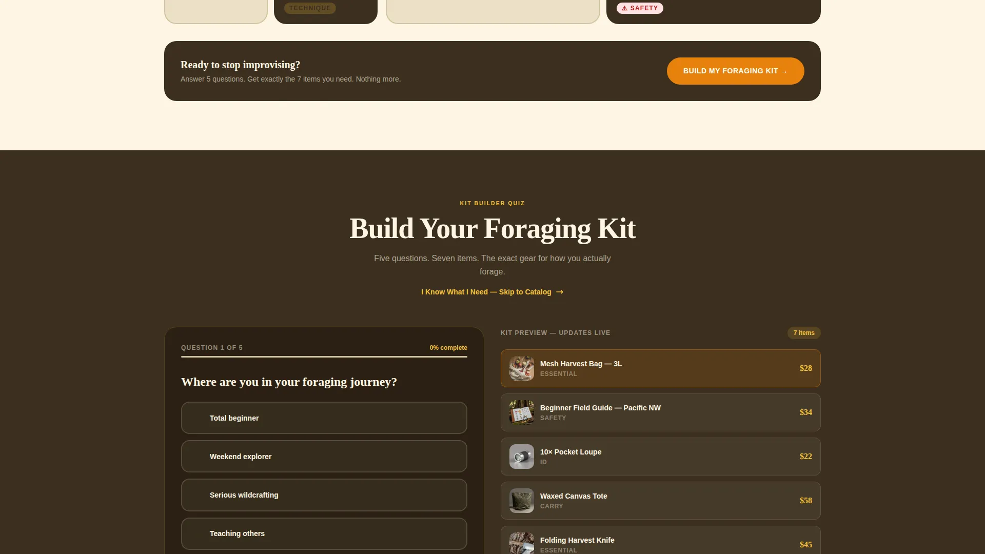
- A five-question visual quiz with a live kit preview and a direct-to-catalog skip path
Feature list
This template ships with purpose-built sections and conversion mechanics that reflect how foraging shoppers actually think and buy.
Full-Bleed Hero Section
The header fills the entire viewport with an overhead forest-floor photograph. Dappled golden-hour light and a durable slab-serif headline set the tone before the visitor reads a single product name.
Comparison Journey Bento Grid
Each grid tile pairs a common beginner mistake on the left with the correct tool on the right. The comparisons escalate from bruised produce and torn roots to blurry identification photos and dangerous look-alike situations, building quiet urgency as the visitor scrolls.
Five-Question Visual Quiz
The quiz asks about experience level, primary forage type, terrain, group size, and budget. Each answer reshuffles a recommended kit displayed live beside the questions, narrowing the full catalog down to exactly seven relevant items shown as a clear packing list.
Dual Conversion Paths
Visitors who want guidance take the quiz via the primary "Build Your Foraging Kit" call to action. Confident buyers skip straight to the catalog with a secondary "I Know What I Need" link, so no customer feels forced through a flow that does not suit them.
Neo-Retro Bento Card Layout
The modular card grid uses warm parchment cream and deep loam brown backgrounds with chanterelle orange and crushed goldenrod accent colors. The layout feels like a 1970s naturalist catalog, which reinforces trust with an audience that values craft and authenticity.
Typography-Led Hierarchy
Chunky slab-serif type handles headlines and product callouts, while body copy stays readable at smaller sizes. The typographic system is designed to feel like pencil-noted field guide margins rather than a generic e-commerce storefront.
Page sections overview
| Section | Purpose |
|---|---|
| Full-Bleed Hero | Establishes mood and lead headline |
| Comparison Grid Tiles | Escalates tool urgency visually |
| Quiz Entry Block | Launches the five-question kit builder |
| Live Kit Preview | Updates recommendations in real time |
| Skip-to-Catalog Link | Offers a direct path for confident buyers |
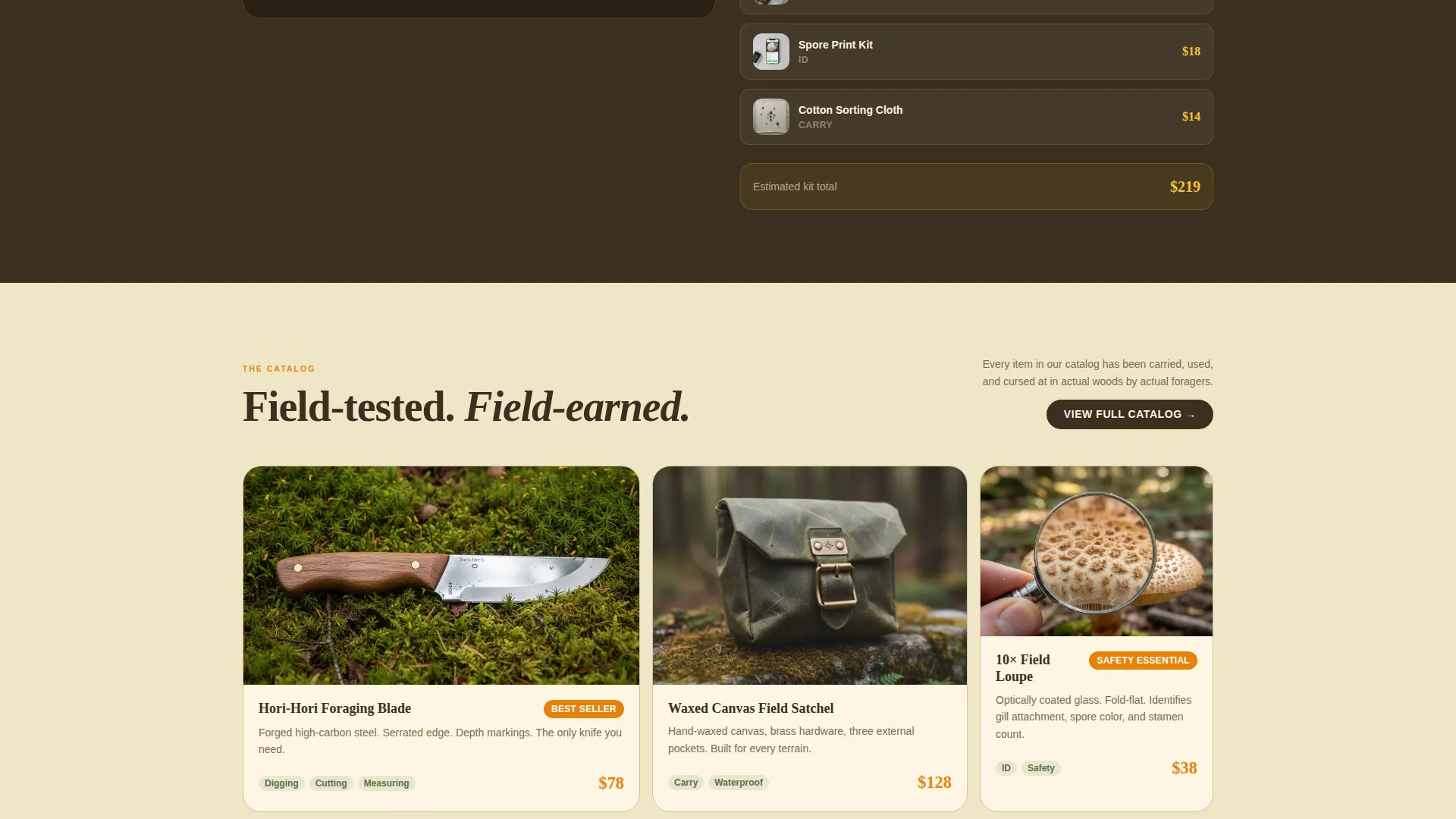
| Field Reference Showcase | Highlights botanical guides and ID tools |
| Harvest Kit Cards | Displays curated gear groupings |
| Footer Call to Action | Reinforces the primary conversion prompt |
Design & branding system
The visual identity follows a Neo-Retro direction that feels like a vintage naturalist catalog printed on thick kraft paper. Every color and type choice reinforces the sense that this shop understands the field, not just the shelf.
- Color palette: chanterelle orange (#E8820C), crushed goldenrod (#F5C33B), deep loam brown (#3B2F1E), wild sorrel green (#5A7247), and warm parchment cream (#FDF6E3) for alternating backgrounds
- Citrus tones activate on buttons, price tags, and hover states to guide the eye toward action without feeling aggressive
- Chunky slab-serif headlines carry the visual weight, evoking well-loved field guides with soft spines and margin notes
Mobile & speed optimization
The bento grid layout is built to reflow cleanly on smaller screens without losing the comparison logic that drives conversions. Each tile remains legible and tappable when stacked vertically on a phone.
- Bento grid columns collapse to a single-column stack on mobile so comparison pairs stay paired and readable
- The quiz interface is designed for tap-friendly answer selection rather than relying on hover interactions
- Hero image treatment is structured so the headline and call-to-action remain visible without cropping on common phone screen sizes
How this template helps you convert
Every layout decision in this template points toward one outcome: a visitor who feels confident enough to add items to their cart. The quiz mechanic does the persuasion work that a static product grid cannot.
- The comparison tiles create a felt need before the visitor even reaches the quiz, turning passive browsing into active problem-solving.
- The five-question quiz makes each visitor feel personally understood, and the live seven-item kit preview removes the anxiety of choosing wrong from a large catalog.
- The dual call-to-action structure means both uncertain beginners and experienced foragers find a path that respects their confidence level, reducing drop-off at the decision point.
Other information about this template
This template is categorized under Retail and E-Commerce, specifically within the Hobby and Passion Supplies subcategory. It is designed for a niche audience with strong intent and specific gear requirements.
- The template style is a Card Grid (Modular) layout, making it straightforward to swap product cards, reorder tiles, or add seasonal collections without rebuilding the page structure
- The creative direction is built around a Comparison Journey narrative, which is distinct from a standard curated collection or bundle-deal layout and is particularly effective for safety-adjacent gear categories
- The intersection match score for this template is 9 out of 10, indicating strong alignment between the page structure, the target audience, and the conversion mechanic
- This template is suitable for single-operator forage shops, multi-instructor wilderness schools, and herbalist supply brands that want a page that feels earned rather than assembled
Theme
Neo-Retro
Creative direction
Curated Collection
Color system
Ink & Paper
Style
Card Grid (Modular)
Direction
Quiz/Assessment
Page Sections
Full-bleed Forest Hero
Comparison Journey Bento Grid
Five-question Visual Quiz
Live Kit Preview Panel
Dual Call-to-action Flow
Neo-retro Modular Card Layout
Related questions
Can I use this template without running the quiz feature?
Is this template suitable for a store selling both mushroom hunting and herbal wildcrafting gear?
How does the comparison grid help sell safety-critical gear?
Can outdoor educators use this template to recommend group kits?
What makes this layout different from a standard product grid page?



