Eco-Friendly Business Professional Website Template
Forage is a sustainable café landing page template built around a Before/After Reveal scroll experience. It pairs a warm Sunset Gradient visual identity with a loyalty mockup header, an upsell-first conversion flow, and a gallery grid of menu items. Every section moves visitors from awareness to action, ending at a single "Upgrade to Reusable" call to action.
by Rocket studio
Quick summary
Forage is a single-page café template designed for eco-conscious food businesses. It opens with a device mockup showing a loyalty dashboard, then guides visitors through a Before/After scroll that makes the waste gap between conventional and sustainable choices impossible to ignore. The end goal is one clear upgrade: reusable containers over disposables.
Who this template is for
This template is built for café owners and sustainable food businesses who want a landing page that earns trust and drives real conversions. It works especially well for operators who offer tiered service, from single drinks to full event catering.
- Independent café owners running a zero-waste or low-waste operation
- Local food businesses offering reusable container subscriptions or catering packages
- Office catering coordinators and event planners looking for a sustainable ordering path
What problem this template solves
Most café websites look the same. They show a menu, a map, and a contact form. They do nothing to communicate the values behind the business or to move a visitor toward a higher-value order. Forage fixes that gap directly.
- Visitors leave without understanding what makes the café different from any other neighborhood spot
- There is no visual proof of the environmental impact a customer makes by upgrading their order
- The path from "browsing the menu" to "booking a catering package" is unclear or missing entirely
What you get with this template
Forage delivers a fully structured landing page with a gallery grid, a Before/After reveal scroll, and a device mockup header that sells both the system and the story. Every layout decision supports the upsell flow.
- A sticky "Upgrade to Reusable" call-to-action button that locks in after the third scroll section
- A menu gallery grid where every item card carries its own micro-call-to-action: "Add the Tiffin Option"
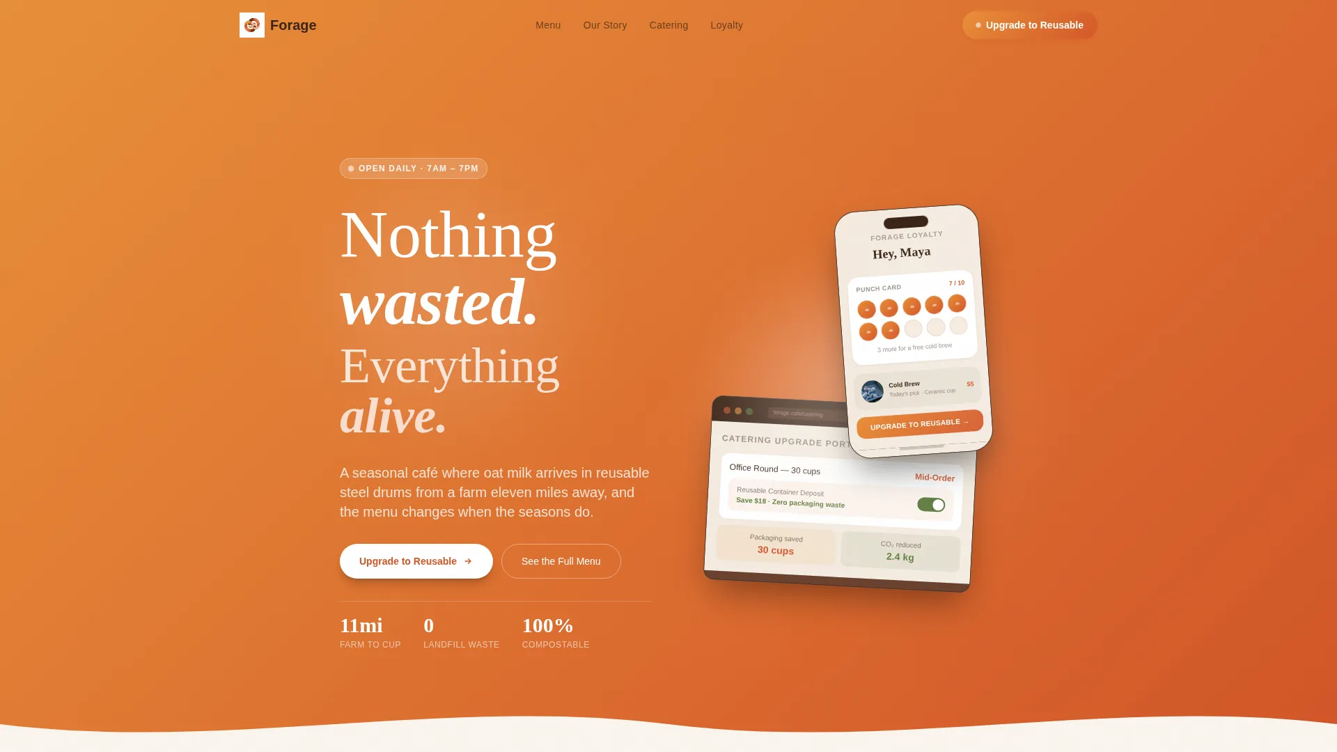
- A header mockup section pairing a phone loyalty punch card with a laptop catering upgrade portal
Feature list
This template packs a focused set of layout features that work together to move a first-time visitor toward a committed order.
Before/After Reveal Scroll
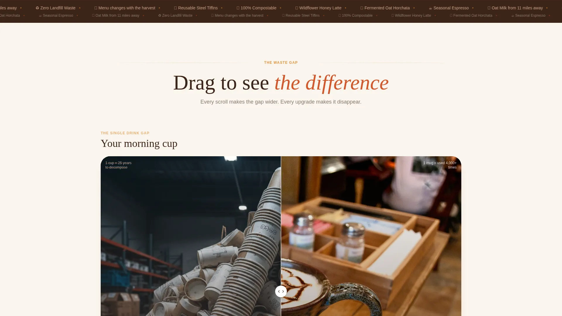
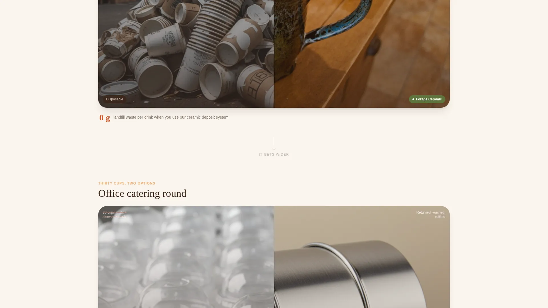
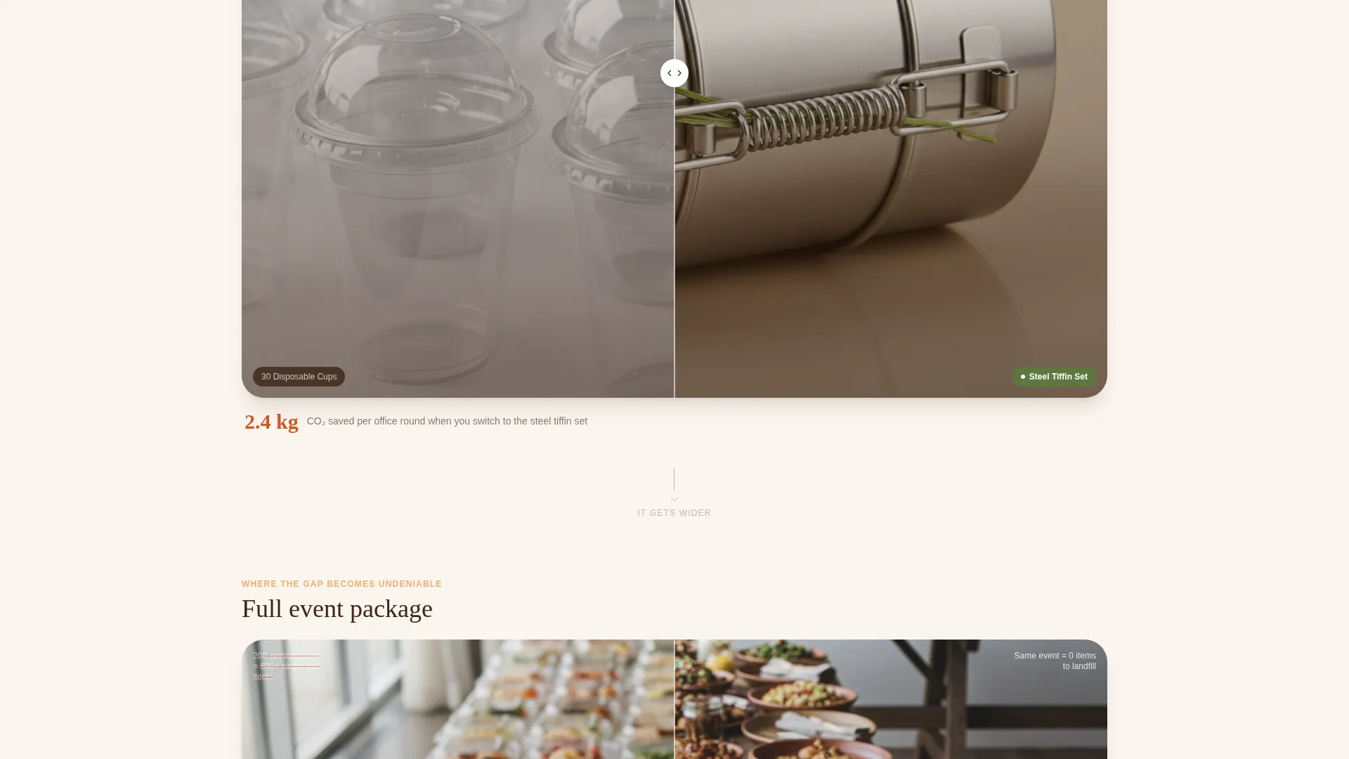
Each scroll section pairs a conventional waste scenario against the Forage alternative using a center-slider reveal. The contrast escalates from a single drink to a full event package, making the environmental difference visceral and personal with each swipe.
Device Mockup Header
The header places a phone and laptop at a slight angle over an amber-to-persimmon gradient wash. The phone screen shows a loyalty punch card at seven of ten stamps; the laptop shows the catering upgrade portal mid-order. A soft-focus barista photograph bleeds through behind the devices.
Loyalty Dashboard Mockup
The loyalty mockup is the first place the primary call to action appears. A reusable container deposit toggle is shown switched to green, giving visitors a clear visual cue before they scroll any further.
Menu Gallery Grid
The gallery grid presents every menu item as a card with its own micro-call-to-action. Discovery visitors can browse the full seasonal menu and add the tiffin upgrade directly from the card, keeping the conversion path short.
Sticky Upsell Call to Action
After the third scroll section, the "Upgrade to Reusable" button anchors as a sticky element at the bottom of the viewport. It stays visible through the rest of the page so the upgrade option is never more than one tap away.
Tiered Conversion Flow
The page opens by asking visitors to identify their current order size: single drinks, weekly office rounds, or event catering. Each tier then reveals its own cost savings and waste reduction numbers, making the upgrade feel relevant and personal rather than generic.
Page sections overview
| Section | Purpose |
|---|---|
| Mockup Header | Introduce loyalty dashboard and catering portal |
| Loyalty Punch Card | Show progress and trigger first upsell call to action |
| Before/After: Single Drink | Contrast disposable cup against ceramic mug |
| Before/After: Office Round | Contrast plastic clamshells against steel tiffins |
| Before/After: Event Package | Escalate waste gap to full catering scale |
| Sticky call to action Anchor | Lock upgrade button after third reveal section |
| Menu Gallery Grid | Browse seasonal items with tiffin micro-calls to action |
| Order Size Selector | Route visitors to their relevant upgrade tier |
| Savings and Waste Reveal | Show cost and impact difference per tier |
| Secondary Menu Path | Guide discovery visitors into the full gallery |
Design & branding system
The visual identity follows a Directory and Discovery theme built on a Sunset Gradient color system. Every color in the palette is chosen to feel warm, organic, and slightly imperfect, the way a well-used ceramic bowl looks after an afternoon of sunlight.
- Warm amber (#E8913A) and ripe persimmon (#D4572A) flow across section backgrounds as a living gradient
- Soft clay pink (#F2C4A8) softens card surfaces and hover states throughout the gallery grid
- Deep loam (#3B2417) anchors all typography with the grounded weight of turned earth
Mobile & speed optimization
The Forage template is structured with a mobile-first layout so the Before/After slider, gallery cards, and sticky call-to-action button all behave cleanly on smaller screens. The device mockup header scales responsively without losing the layered depth of the photograph behind the devices.
- The center-slider reveal in each Before/After section is touch-friendly and works on phones without extra controls
- Gallery cards stack into a single column on narrow viewports so every item and its micro-call-to-action remain fully tappable
- The sticky upsell button adjusts its position for mobile bottom-bar behavior so it never overlaps critical content
How this template helps you convert
The conversion architecture of this template is deliberate. Every layout element is placed to reduce friction and increase the perceived cost of not upgrading.
- The Before/After scroll builds emotional pressure gradually. Each reveal makes the waste gap wider, so by the time the visitor reaches the event catering section, choosing the conventional option feels like the harder choice.
- The tiered order flow makes the upgrade feel personal. Visitors self-select their order size first, so the savings and impact numbers they see are specific to their own habits rather than a generic average.
- The sticky call-to-action button removes the need to scroll back. Once it locks in after the third section, the upgrade is always one tap away regardless of where the visitor is on the page.
Other information about this template
Forage was built against a Directory and Discovery theme using a Masonry layout approach for the gallery grid, giving it a Pinterest-style browsing feel inside a focused single-page structure. The template style suits eco-friendly retail and food service businesses that want their values visible at first glance.
- The template sits in the Retail and E-Commerce category under the Eco-Friendly Business subcategory
- It is well suited for businesses in the sustainable food and beverage niche, including zero-waste cafés, eco-conscious catering services, and package-free grocery concepts
- The Intersection Match Score for this template is 9 out of 10, reflecting strong alignment between the eco-friendly café niche and the upsell-first landing page direction
Theme
Directory & Discovery
Creative direction
Before/After Reveal
Color system
Cloud Canvas
Style
Masonry/Pinterest
Direction
Quiz/Assessment
Page Sections
Before/after Reveal Scroll
Device Mockup Header
Menu Gallery Grid
Tiered Conversion Flow
Sticky Upsell Button
Loyalty Dashboard Mockup
Related questions
Can I change the seasonal menu items in the gallery grid?
Does the Before/After slider work on mobile devices?
Can I use this template for a catering-only business rather than a full café?
How does the sticky call-to-action button behave on different screen sizes?
Can I replace the loyalty mockup screens with my own brand assets?



