Eco-Friendly Business Specialist Professional Website Template
Forage is a bento grid landing page template built for eco-friendly pet shops. It pairs a kraft-paper visual identity with a Before/After Reveal layout that swaps conventional pet products for sustainable alternatives tile by tile. A bundle deal hero, a sticky "Shop the Clean Swap" call-to-action bar, and a short Pet Profile Quiz guide visitors toward a purchase decision they already feel good about.
by Rocket studio
Quick summary
Forage is a single-page bento grid landing page for sustainable pet shops. It opens with a flat-lay bundle hero, moves through a Before/After product reveal grid, and closes with a sticky call-to-action bar. The Ink and Paper color system keeps everything feeling lo-fi and trustworthy. The Pet Profile Quiz routes each visitor to a filtered product collection that fits their pet.
Who this template is for
This template is built for independent and direct-to-consumer pet shop owners who lead with sustainability. It works best when your products carry a clear eco story and your buyers care about ingredients, materials, and waste.
- Eco-focused pet shop owners selling compostable, clean-label, or regeneratively sourced products
- Pet brand founders who need a click-through landing page to a full online store
- Retailers whose customers include first-time puppy parents, senior-dog allergy managers, or eco-conscious cat owners
What problem this template solves
Sustainable pet products are often harder to sell online than they are in person. Ingredient-label anxiety, greenwashing skepticism, and choice overload all push hesitant buyers away before they ever reach the cart. This template addresses that gap directly.
- Replaces vague eco claims with a visual side-by-side product comparison that shows the actual swap
- Uses a bundle deal with clear savings to lower the risk of a first purchase
- Routes uncertain visitors through a short quiz so the right products find the right pet
What you get with this template
You get a fully structured, single-page layout ready to customize for your eco pet brand. Every section is purposefully ordered to move a visitor from curiosity to a confident click.
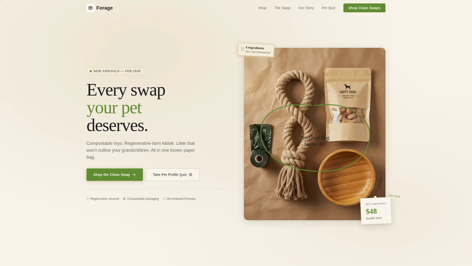
- A Bundle Deal hero section with flat-lay photography direction, a hand-drawn price annotation, and a torn-paper savings callout
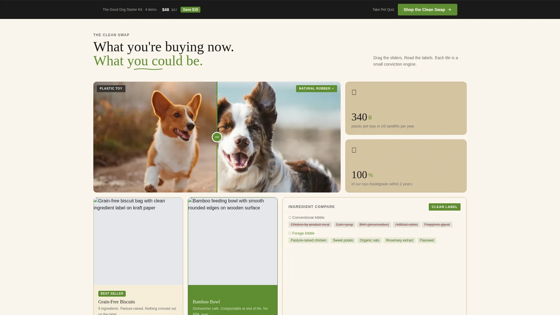
- A scrollable Before/After bento grid with drag-slider tiles that compare conventional and eco-alternative products
- A sticky bottom call-to-action bar that appears after the third grid row and stays visible as the visitor scrolls
Feature list
This template is built around a focused set of layout and interaction features grounded in the source brief. Each one serves a specific job in the path from first impression to purchase click.
Bundle Deal Hero Tile
The header opens with a top-down flat-lay photograph on a crumpled kraft paper background. A hand-drawn circle and scrawled annotation name the bundle, while a torn-paper price tag shows the original total crossed out. The composition communicates value without a single sales-y line of copy.
Before/After Bento Grid
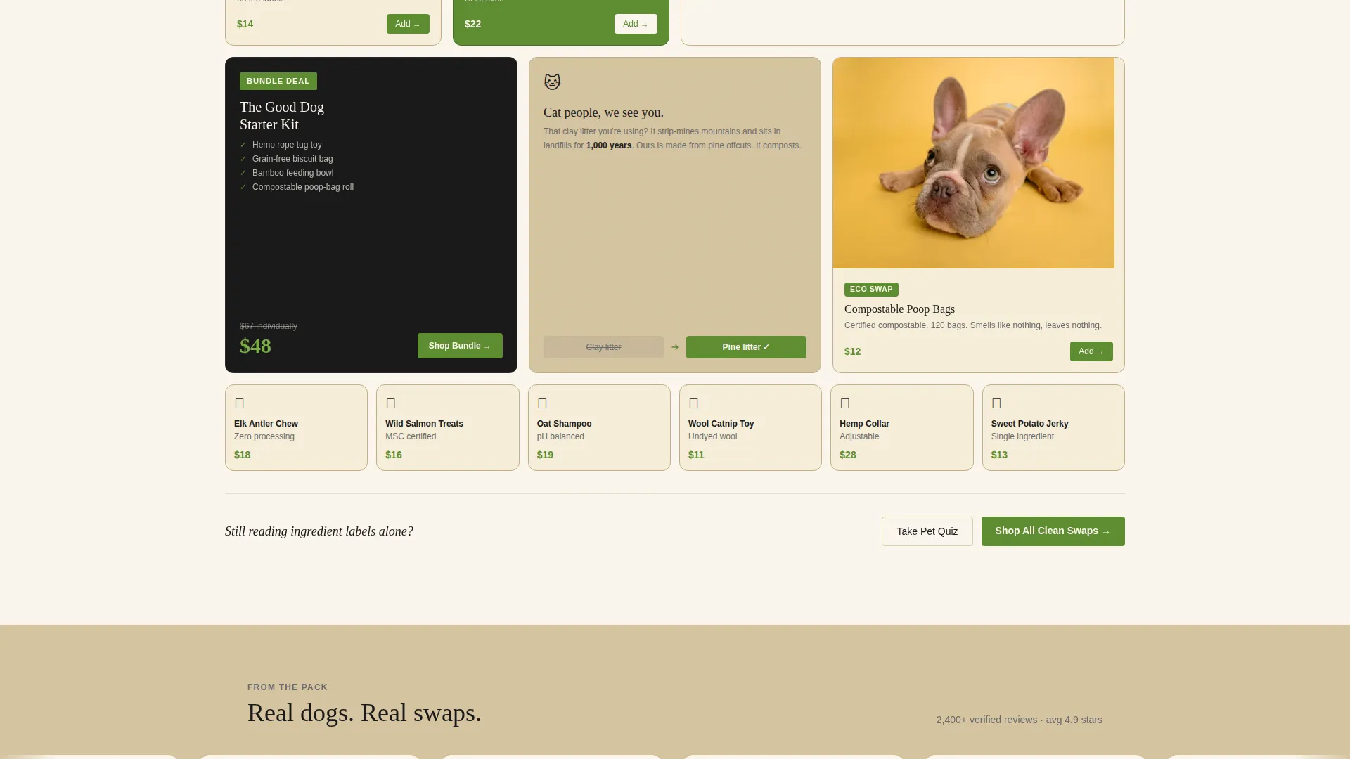
The core layout is a bento grid where each tile flips a familiar pet product against its eco counterpart. A drag slider splits the two sides visually. As the visitor scrolls, tiles grow smaller and more numerous, building a catalog rhythm that feels like shopping rather than reading.
Sticky "Shop the Clean Swap" Bar
The primary call-to-action appears first inside the hero tile, then reappears as a fixed bottom bar after the third grid row. The sprout green button stays visible without interrupting the scrolling experience, reinforcing the purchase path at the right moment.
Pet Profile Quiz Path
A short, three-question quiz collects pet type, age, and one allergy detail. It then routes the visitor to a filtered collection page, reducing decision fatigue for buyers who are overwhelmed by ingredient options or managing a pet with dietary restrictions.
Ink and Paper Visual Identity
The full color system uses unbleached kraft, letterpress black, pencil-sketch gray, and a single sprout green accent. Texture and contrast do the visual work instead of gradients or decorative effects. The result feels hand-crafted and deliberately un-corporate.
Ingredient Panel Comparison Tile
One dedicated bento tile places a mainstream kibble ingredient panel beside a clean-label alternative. Problematic ingredients are highlighted in pencil-sketch gray. This tile alone addresses a core anxiety of label-conscious pet owners without requiring a word of explanation.
Page sections overview
| Section | Purpose |
|---|---|
| Bundle Deal Hero | Introduces the starter kit, shows savings, and presents the primary call-to-action |
| Before/After Grid (Row 1) | Opens the product swap narrative with larger, slower tiles |
| Before/After Grid (Row 2) | Deepens the comparison with ingredient panel and material swap tiles |
| Before/After Grid (Row 3) | Accelerates tile density to build catalog momentum |
| Sticky call to action Bar | Keeps the "Shop the Clean Swap" action visible after row three |
| Pet Profile Quiz | Collects three inputs and routes visitor to a filtered product collection |
Design & branding system
The visual identity follows an Ink and Paper color system built for a Directory and Discovery theme. Every color choice references the tactile world of kraft paper, hand-stamped zines, and farmers' market signage. Nothing here looks like a generic e-commerce template.
- Color palette: unbleached kraft (#D5C4A1) as the base, letterpress black (#1A1A1A) for text, pencil-sketch gray (#6B6B6B) for secondary labels and highlights, and sprout green (#5E8C31) reserved exclusively for buttons, badges, and price callouts
- Texture over gradient: the design system relies on paper texture and typographic contrast rather than decorative gradients or drop shadows
- Hand-drawn annotation style: circle callouts and scrawled labels give the hero and grid tiles a found, editorial quality rather than a polished, corporate finish
Mobile & speed optimization
The bento grid layout is structured to reflow naturally across screen sizes. Tile density scales down gracefully on smaller viewports so the Before/After comparisons remain readable without horizontal scrolling.
- Bento grid tiles stack vertically on mobile, preserving the scrolling catalog rhythm on smaller screens
- The sticky call-to-action bar stays anchored at the bottom of the viewport on all device sizes
- The Pet Profile Quiz is compact enough to complete in under a minute on a phone, keeping the conversion path short on mobile
How this template helps you convert
Every layout decision in Forage is oriented toward a single outcome: a confident click through to the full store. The template does not rely on persuasive copy alone. It uses visual proof, savings transparency, and personalization to lower hesitation at each step.
- The bundle deal hero shows a real saving ($67 individual total crossed out against a $48 bundle price) before the visitor reads a single product description, anchoring perceived value immediately.
- The Before/After drag-slider grid lets visitors see the swap themselves rather than read about it, turning a skeptical browser into an engaged product explorer.
- The Pet Profile Quiz reduces choice overload by routing each visitor to a collection already filtered for their pet, making the final click feel like a recommendation rather than a gamble.
Other information about this template
Forage fits naturally within the broader eco-friendly pet retail category, where brands compete on transparency and values as much as price. The template's Directory and Discovery theme makes it adaptable beyond a single bundle launch.
- The template is designed as a click-through landing page, meaning the primary goal is routing visitors to an existing online store rather than completing a transaction on the page itself
- The bento grid style is drawn from a Masonry and Pinterest-influenced layout direction, giving the page a content-rich, browsable feel without requiring a deep product catalog on the page
- The Before/After Reveal creative direction is a recognized conversion pattern for eco and clean-label brands, where showing the swap is more persuasive than describing it
- The Quiz/Assessment landing page direction makes this template relevant for pet brands with multiple product lines segmented by pet type, age, or dietary need
- Template style, color system, and header concept are all drawn from the matched intersection of Eco-Friendly Business within the Retail and E-Commerce category
Theme
Directory & Discovery
Creative direction
Before/After Reveal
Color system
Cloud Canvas
Style
Masonry/Pinterest
Direction
Quiz/Assessment
Page Sections
Bundle Deal Hero with Savings Callout
Before/after Drag-slider Grid
Accelerating Tile Density
Sticky Call-to-action Bar
Three-question Pet Profile Quiz
Ingredient Panel Comparison Tile
Related questions
Can I use this template for a cat-focused shop, not just dogs?
Is this template a full online store or a landing page?
How do I adapt the Before/After tiles for my own products?
Do I need a professional photographer for the flat-lay hero?
What kind of pet brands is this template best suited for?



