Bold Metalsmith Blog & Portfolio Landing Page
Forge is a masonry-style landing page built for metalsmith blogs and portfolios. It pairs a manifesto-driven scroll with an organic, Pinterest-style grid of portfolio images, process shots, and blog cards. The Void & Violet color system and a bold slab-serif headline create a workshop atmosphere that earns trust and invites visitors to subscribe.
by Rocket studio
Quick summary
Forge is a single-page metalsmith portfolio and blog template built around a masonry grid and a manifesto-style scroll. It pairs abyssal black backgrounds with oxidized violet accents to create the mood of a working forge at midnight. A centered slab-serif headline anchors the page, and a newsletter call-to-action converts curious visitors into subscribers.
Who this template is for
This template is designed for makers who want their work to speak before their bio does. It puts the craft front and center and gives visitors a reason to stay, scroll, and subscribe.
- Independent metalsmiths and blacksmiths running a one-person shop
- Interior designers and collectors sourcing bespoke hardware or sculptural pieces
- Hobbyist smiths looking for technique breakdowns from a practicing maker
What problem this template solves
Most portfolio templates flatten craft into a generic gallery. They separate the work from the voice behind it, leaving visitors with no reason to return. Forge solves this by weaving written declarations directly into the grid, so the philosophy and the proof live side by side.
- Generic portfolio layouts strip context away from handmade work
- Visitors leave without subscribing because there is no compelling reason to give an email address
- Technique-hungry readers cannot tell whether a site is worth following until they have already left
What you get with this template
You get a fully designed, single-page layout that doubles as a portfolio, a blog entry point, and a newsletter funnel. Every section is purpose-built for a metalsmith audience and styled to match the weight and texture of the work itself.
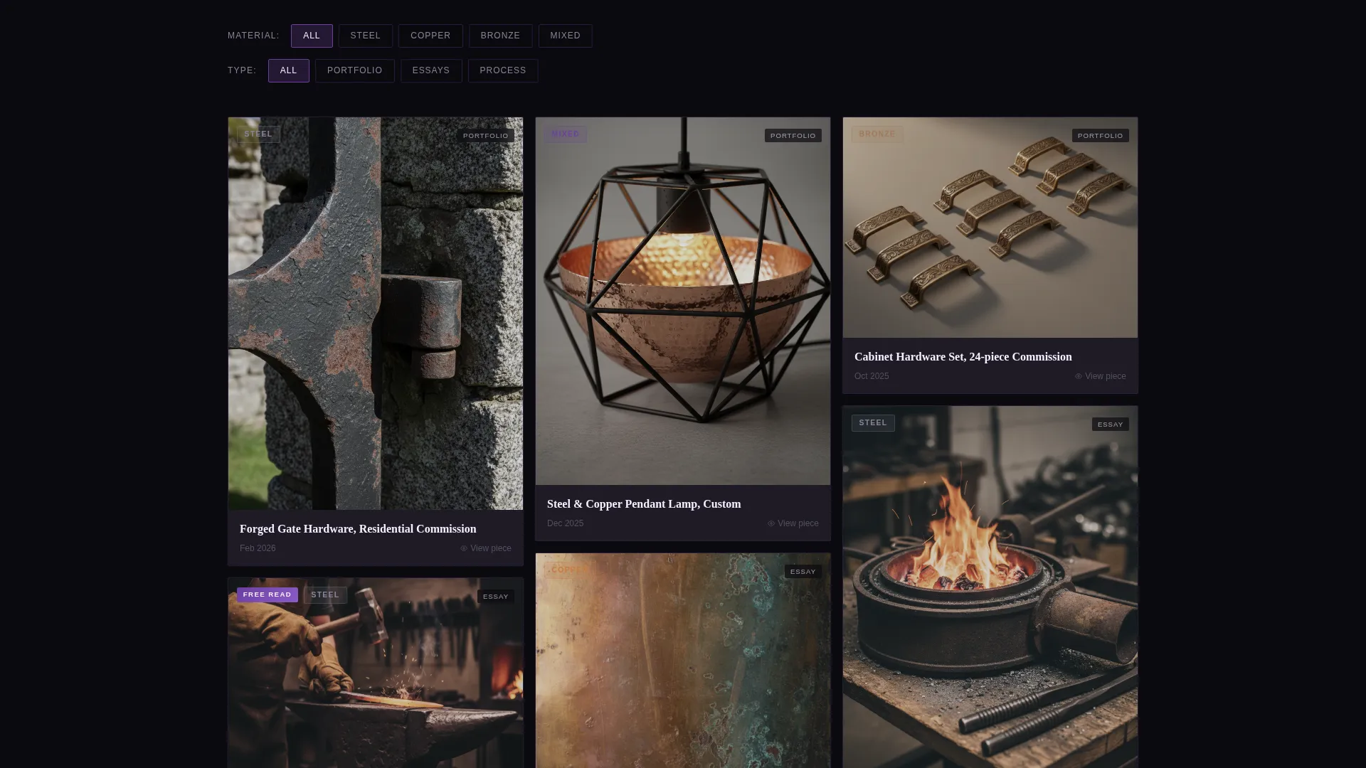
- A masonry grid with material and content-type filter controls
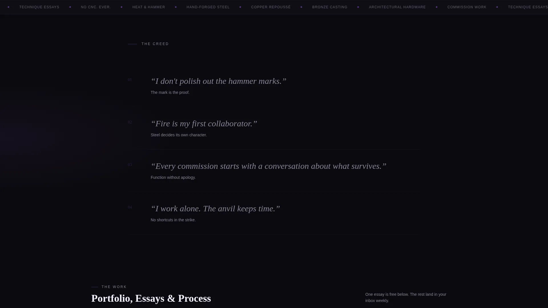
- A manifesto-style scroll that moves from philosophy to portfolio proof
- A newsletter signup form asking only for a first name and email address
Feature list
This template ships with six core design and layout features, each chosen to serve the metalsmith portfolio and blog use case.
Giant Centered Headline
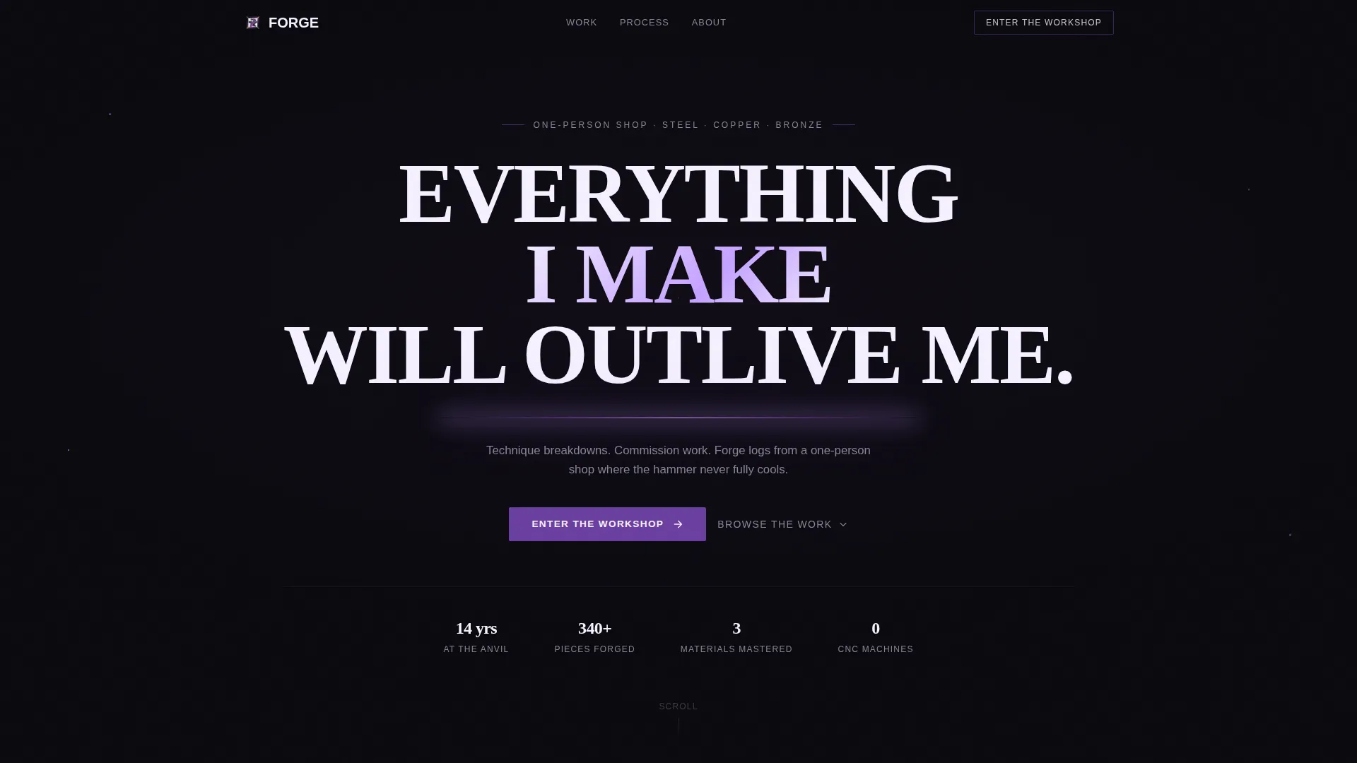
The opening header uses white slab-serif type stamped across a pure black background. A single thin violet rule glows beneath it. The headline reads as a maker's oath rather than a tagline, setting the tone before a single image loads.
Manifesto Scroll Structure
The page is structured as a blacksmith's creed broken into short declarations. Each statement anchors a section of the masonry grid below it. The scroll escalates from personal philosophy to hard portfolio proof.
Organic Masonry Grid
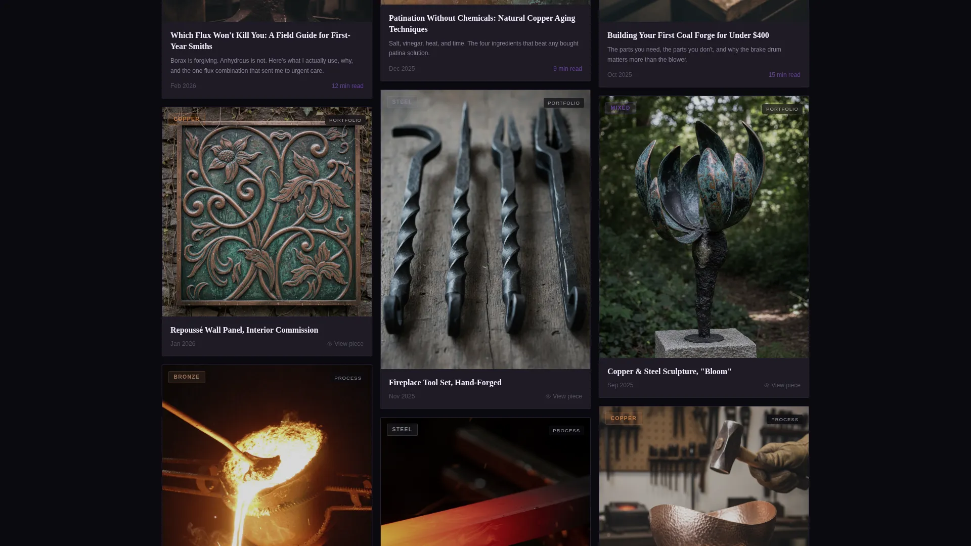
The grid uses tiles of varying heights to display close-up patina textures, full commission shots, and mid-process photography together. Visitors can filter the grid by material, including steel, copper, bronze, and mixed, and by content type, including blog posts, portfolio pieces, and process videos.
Free Technique Post Inclusion
One complete technique article is visible in the grid without a signup. It demonstrates the depth of the content and gives visitors a concrete reason to trust the newsletter offer.
Newsletter Signup Flow
The primary call-to-action, labeled "Enter the Workshop," leads to a lightweight signup form. It asks only for a first name and an email address and promises weekly forge logs, technique essays, and commission announcements.
Void & Violet Color System
The palette uses abyssal black at #0B0A0F, forge-smoke charcoal at #1E1B26, and oxidized violet at #6B3FA0 as the primary surface and accent tones. Molten lilac at #C4A1FF appears on hover states and pull-quotes, keeping the visual energy focused and intentional.
Page sections overview
| Section | Purpose |
|---|---|
| Hero Headline | Opens with the maker's oath stamped in white slab-serif type across black |
| Violet Rule Divider | Provides a glowing visual break between the headline and the manifesto |
| Manifesto Declarations | Anchors the scroll with short bold statements of craft philosophy |
| Masonry Portfolio Grid | Displays portfolio images, blog cards, and process videos in organic tile layout |
| Material Filter Controls | Lets visitors filter grid content by steel, copper, bronze, or mixed |
| Content Type Filter | Separates blog posts, portfolio pieces, and process videos inside the grid |
| Free Technique Post | Shows one full technique article openly to demonstrate newsletter value |
| Newsletter Signup | Converts visitors with a minimal first-name-and-email form |
Design & branding system
The visual identity follows an Atelier Studio theme built entirely around the Void & Violet color system. Every color choice is grounded in the physical experience of metalwork, from the darkness of a forge room to the shimmer of hot steel hitting quench oil.
- Typography uses white slab-serif type for headlines, creating a stamped, maker's-mark quality against the black background
- The four-color palette runs from #0B0A0F black through #1E1B26 charcoal and #6B3FA0 violet, with #C4A1FF lilac reserved for hover states and pull-quotes
- The thin violet rule beneath the headline acts as the only decorative element in the header, keeping the opening spare and striking
Mobile & speed optimization
The masonry grid and manifesto layout are designed to remain readable and navigable at smaller screen sizes. The sparse, high-contrast palette keeps the visual hierarchy clear even on compact displays.
- The centered headline and single-rule header translate cleanly to narrow viewports without reflow issues
- Grid tiles reflow naturally as screen width changes, preserving the organic, varied-height feel on mobile
- Filter controls for material and content type remain accessible as the layout adapts to smaller screens
How this template helps you convert
The conversion path is built into the scroll itself. Visitors are not asked to trust a pitch; they are shown the work, given a sample of the writing, and then invited to go deeper.
- The free technique post visible in the grid proves the newsletter's value before the signup form is ever seen, reducing friction and increasing trust.
- The "Enter the Workshop" call-to-action leads to a minimal two-field form, keeping the commitment low and the ask clear.
Other information about this template
This template is a strong fit for metalsmith makers who want a single online destination that handles portfolio presentation, blog discovery, and audience building at the same time. It is built on the Atelier Studio theme and designed to feel handcrafted rather than generated.
- The Manifesto creative direction makes this template distinct from standard portfolio grids
- The Content/Resource landing-page direction means it functions as a discovery hub, not just a static showpiece
- The masonry layout supports mixed content types naturally, so new blog posts and new portfolio pieces can be added without disrupting the visual rhythm
- The color system is pre-set and intentional; swapping accent colors is straightforward but the Void & Violet palette is purpose-built for this aesthetic
Theme
Atelier Studio
Creative direction
Manifesto
Color system
Void & Violet
Style
Masonry/Pinterest
Direction
Content/Resource
Page Sections
Manifesto-driven Scroll Structure
Organic Masonry Grid Layout
Material and Content-type Filters
Free Technique Post Visibility
Minimal Newsletter Signup Form
Void & Violet Visual Identity
Related questions
Who is the Forge template designed for?
Can I show different types of content in the masonry grid?
How does the newsletter signup work?
Do visitors need to sign up to see any content?
Can I change the colors or typography to match my own brand?



