Dark Brand Strategist Landing Page Template
Forge is a dark, asymmetric brand strategist landing page built on a cinematic 60/40 grid. It opens with a draggable Before/After slider that makes the strategic transformation self-evident. Every scroll reveals case studies, sharp narrative, and a focused inquiry form, designed to attract serious brand partners and quietly filter out everyone else.
by Rocket studio
Quick summary
Forge is a single-page portfolio template for independent brand strategists. It pairs a 60/40 asymmetric grid with a Monochrome Steel color system to create a gallery-dark atmosphere that feels deliberate and authoritative. The Before/After slider header, cinematic case study scroll, and focused inquiry form work together as one seamless argument for the work.
Who this template is for
This template is built for solo brand strategists who do serious work and need a page that signals that immediately. It is not a general portfolio template, it speaks directly to high-intent buyers already frustrated with surface-level design.
- Independent brand strategists running a one-person studio
- Creative directors who quietly handle strategy work for agency clients
- Brand consultants targeting Series A founders, mid-size agencies, or legacy businesses
What problem this template solves
Most strategist portfolio pages explain the work instead of showing the transformation. They list services, describe process, and ask visitors to imagine the outcome. Forge removes that gap. The page itself demonstrates strategic thinking in its structure, pacing, and restraint.
- Generic portfolio layouts bury the most powerful proof: the before and after
- Lengthy service pages attract browsers instead of serious partners
- Weak visual hierarchy makes strong strategic work look indistinguishable from commodity design
What you get with this template
You get a fully structured one-page layout that carries a visitor from first impression to qualified inquiry without a single wasted section. Every component is grounded in the source brief and built to do specific persuasive work.
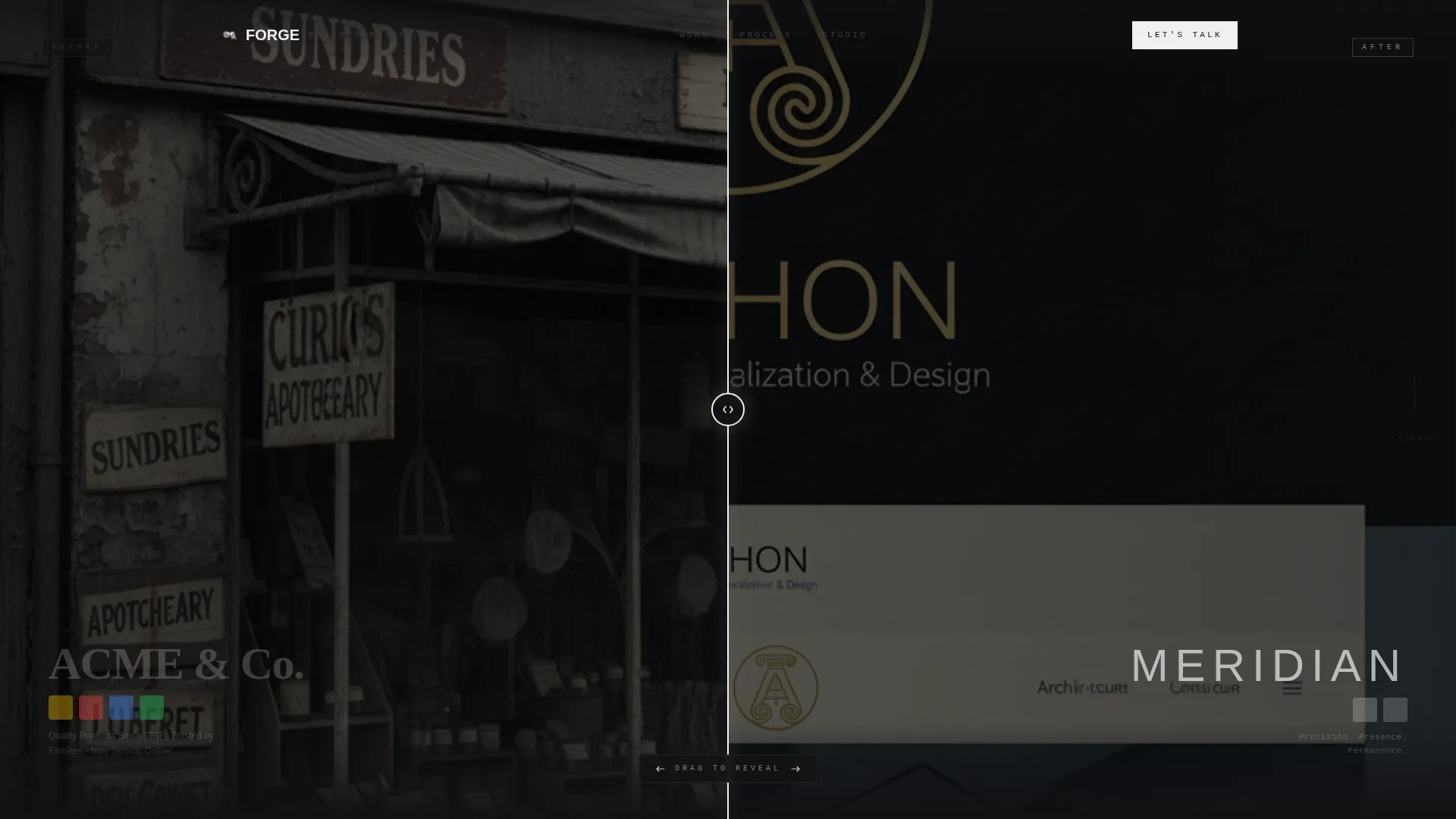
- An interactive Before/After header slider that reveals brand transformation across the full viewport
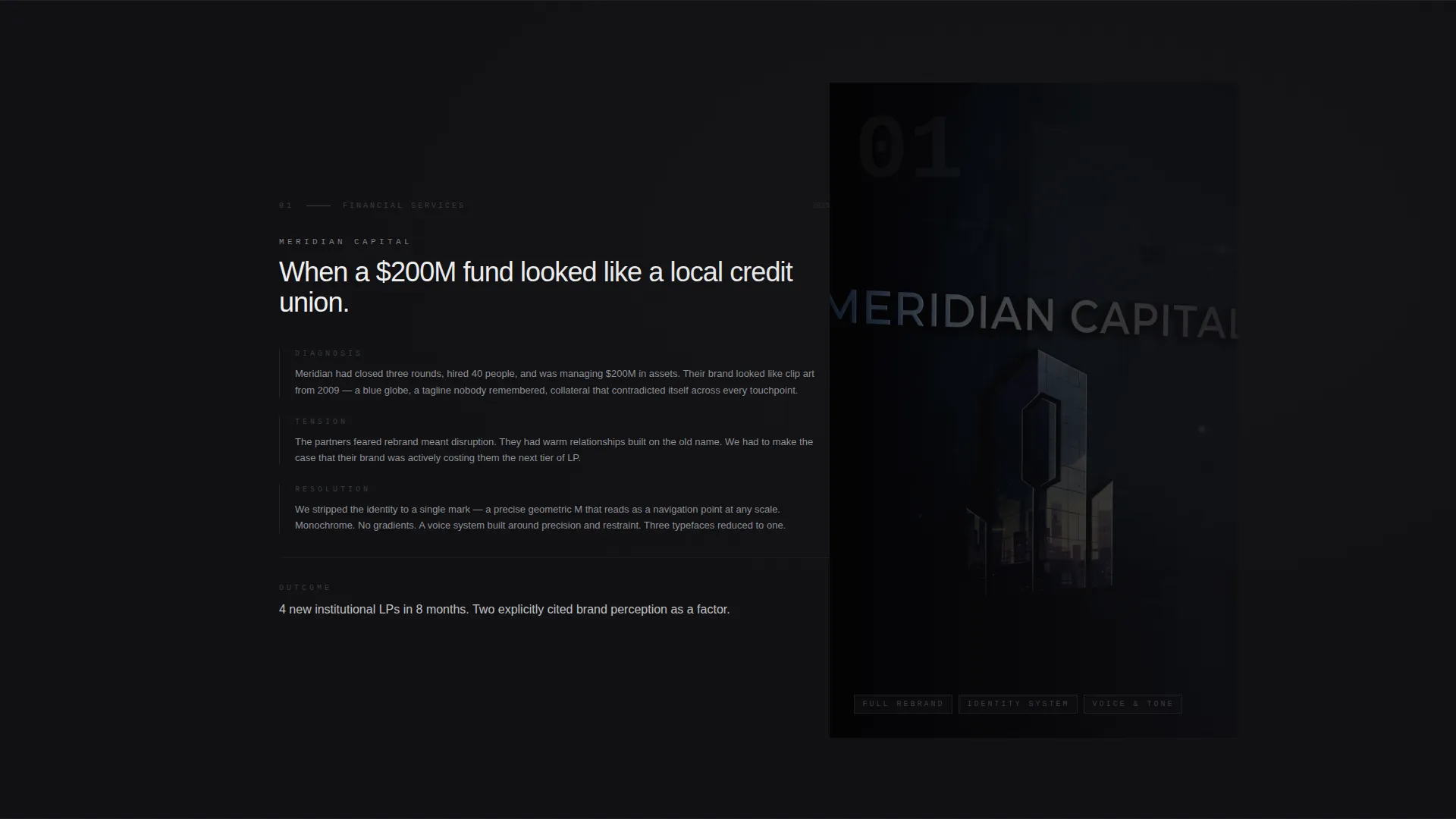
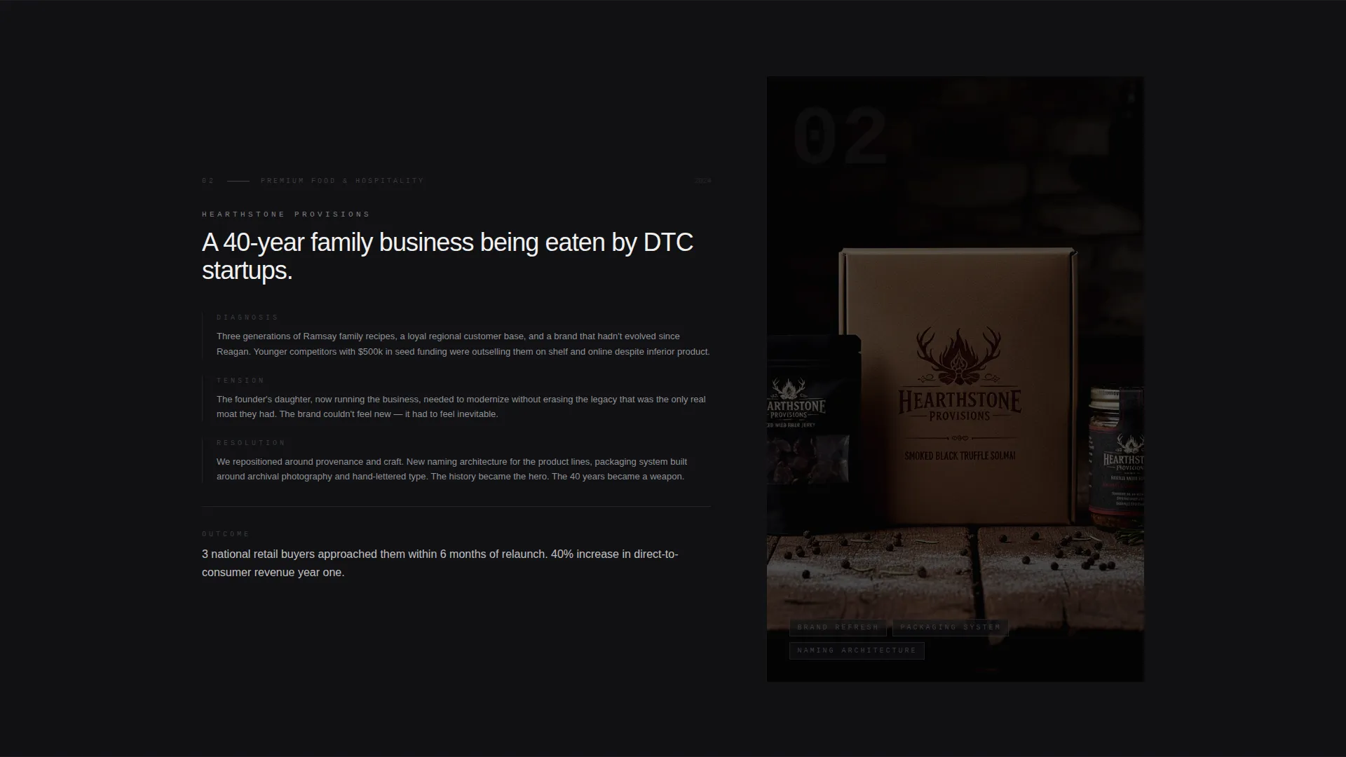
- Full-viewport case study sections with a 60-column visual panel and 40-column strategic narrative
- A dual-placement inquiry form with four targeted fields and no calendar or pricing distractions
Feature list
This section covers the core functional components included in the Forge landing page template.
Before/After Transformation Slider
The header splits the 60/40 grid into two states. The left panel shows a dated, inconsistent brand identity. The right panel reveals the rebuilt system. Visitors drag a vertical blade across the viewport, and a typewritten headline in polished chrome appears only once the slider moves: "The distance between where your brand is and where it should be."
Full-Viewport Case Study Sections
Each case study occupies the entire viewport height. The wider 60-column panel holds large-format visual work, packaging, signage, and digital interfaces. The narrower 40-column panel carries the strategic narrative: the diagnosis, the tension, and the resolution. Sections emerge from darkness rather than sliding in, creating a cinematic, fade-up pacing.
Cinematic Scroll Behavior
Sections do not animate in from the side. Each one fades up from a near-black background, like eyes adjusting to a new room. The pacing is deliberate and builds a cumulative argument that brand strategy is architecture, not decoration.
Edge-to-Edge Client Quote Break
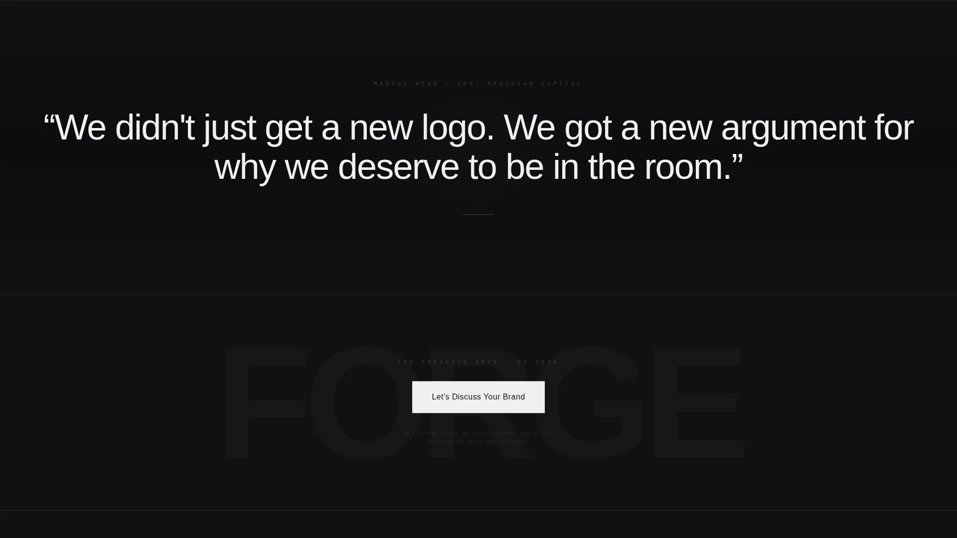
Midway through the page, a single client quote stretches across the full width in oversized searing white type. It breaks the grid intentionally. The effect punctuates the scroll rhythm and adds a moment of social proof without a separate testimonials section.
Dual-Placement Inquiry Form
The call to action "Let's Discuss Your Brand" appears twice, once floating after the second case study and once anchoring the final section. The form collects four fields: company name, a URL field labeled "Your current brand lives here," a dropdown for engagement type (Full Rebrand, Brand Refresh, or Strategy Only), and an open text field labeled "What's broken?" The form is designed to feel like the first honest conversation, not a sales funnel.
Monochrome Steel Design System
The entire page operates within four precisely defined tones. Deep forge black (#111114) anchors every background. Brushed gunmetal (#3A3D42) carries secondary text and structural elements. Polished chrome (#C8CCD0) is used for body type and hover states. Searing white (#F0F0F0) is reserved exclusively for headlines and the primary call-to-action button. Hover transitions shift elements from gunmetal to polished chrome, like metal catching light when turned in your hand.
Page sections overview
| Section | Purpose |
|---|---|
| Before/After Slider Header | Demonstrates brand transformation interactively across the full viewport |
| Typewritten Brand Headline | Appears after slider interaction to frame the strategic value proposition |
| Case Study One | Full-viewport visual and narrative pairing for the first featured project |
| Case Study Two | Full-viewport visual and narrative pairing for the second featured project |
| Floating call to action Placement | Surfaces the inquiry call to action after the second case study |
| Edge-to-Edge Quote | Full-width client quote that punctuates the page mid-scroll |
| Final Inquiry Form | Anchors the page close with the four-field partnership inquiry form |
Design & branding system
The Forge template uses a Monochrome Steel palette that communicates authority through restraint. There are no gradients, no accent colors, and no decorative elements. Every visual decision reinforces the idea that clarity is the most sophisticated form of design.
- Four-tone color system: deep forge black, brushed gunmetal, polished chrome, and searing white, each with a specific and exclusive role
- Hover states transition from gunmetal to polished chrome, adding tactile feedback without breaking the dark atmosphere
- Typography lives in chrome and white against near-black backgrounds, keeping contrast high and reading fatigue low
Mobile & speed optimization
The asymmetric 60/40 grid is designed to adapt without losing its visual logic on smaller screens. The template maintains the dark immersive atmosphere and cinematic pacing on mobile viewports.
- The Before/After slider is structured for touch-drag interaction on mobile devices
- Full-viewport case study sections reflow gracefully so that the visual panel and narrative column stack cleanly on narrow screens
- The inquiry form fields are spaced and sized for comfortable input on mobile without requiring zoom
How this template helps you convert
Forge is engineered for one outcome: turning a curious visitor into a qualified inquiry. Every layout and copy decision supports that single goal.
- The Before/After slider removes the need to explain what you do, visitors experience the transformation before they read a single word, making the value case self-evident.
- The dual-placement call to action meets visitors at two natural decision points: mid-scroll after proof is established, and at the close once the full argument has landed.
- The inquiry form fields are chosen to qualify intent rather than collect contacts. A visitor who fills in "What's broken?" is already engaged enough to be worth a conversation.
Other information about this template
This template fits within the Portfolio and Agency category, specifically the Brand Strategist Portfolio subcategory. It is suited to the one-page portfolio niche where the page itself must act as a portfolio piece.
- The template style is an asymmetric grid layout with a 60/40 column split running throughout the page
- The creative direction is classified as Immersive Visual, meaning the layout, motion behavior, and color system work together to create a mood rather than just display information
- The header concept is a Before/After Slider, a structural choice that makes the transformation the first and most persuasive interaction on the page
- The landing page direction is Partnership and Business-to-Business engagement, meaning the form and calls to action are calibrated for high-value, longer-cycle client relationships
- The Intersection Match Score for this template configuration is 13, reflecting a highly specific alignment between the theme, creative direction, color system, template style, and landing page direction
- The template does not include a calendar embed, pricing section, or service rate card by design, the form is the only conversion point, and that is intentional
Theme
Dark Immersive
Creative direction
Immersive Visual
Color system
Monochrome Steel
Style
Asymmetric Grid (60/40)
Direction
Partnership/B2B
Page Sections
Before/after Transformation Slider
Full-viewport Case Study Sections
Cinematic Fade-up Scroll Behavior
Edge-to-edge Client Quote
Dual-placement Inquiry Form
Monochrome Steel Color System
Related questions
Can I customize the case study content for my own projects?
Does the Before/After slider work on mobile devices?
Is the inquiry form connected to any external tool out of the box?
Who is this landing page template designed to attract?
Can I add more case studies beyond the two included?



