Fitness Professionals Mastermind Landing Page Template
Forge is a masonry-style landing page template built for a private quarterly mastermind retreat serving independent fitness professionals. It guides visitors through a Hero's Journey narrative, from isolation stats to member transformation proof, then into a three-step application form. The warm Botanical color system and hand-drawn hearth illustration make registration feel like an earned invitation, not a transaction.
by Rocket studio
Quick summary
Forge is a single-page event registration template for a private fitness professionals mastermind. It uses a Hero's Journey scroll structure, a masonry confession grid, and a three-step application form to turn qualified visitors into applicants. The Botanical color system and custom hearth illustration set a warm, selective tone from the first scroll.
Who this template is for
This template was built for fitness industry community organizers who run selective, application-based gatherings. It works equally well for founders launching a new cohort and operators promoting an existing quarterly retreat.
- Independent gym owners and online fitness coaches building a peer community
- Boutique studio operators who want a credible, invitation-style registration page
- Mastermind organizers who need a narrative-driven page that earns trust before asking for commitment
What problem this template solves
Most fitness professionals operate without a trusted peer group. Generic event pages do not reflect that reality, and a basic registration form does nothing to signal selectivity or community warmth. This template addresses both problems at once.
- It frames isolation as the real pain point before presenting the mastermind as the answer
- It replaces cold sign-up forms with a three-step application that feels earned
- It uses real member voices and transformation metrics to do the persuasion work
What you get with this template
You get a fully structured, single-page layout designed specifically for a fitness professionals mastermind event registration. Every section is pre-built and sequenced around a narrative arc.
- A Hero's Journey scroll flow covering the Ordinary World, the Struggle, the Room, and outcomes
- A masonry confession and transformation grid with staggered card layouts
- A three-step application form with a persistent bottom call-to-action bar that appears after midpage scroll
Feature list
This template packs a focused set of components, each designed to reduce friction and build trust at the right moment in the scroll.
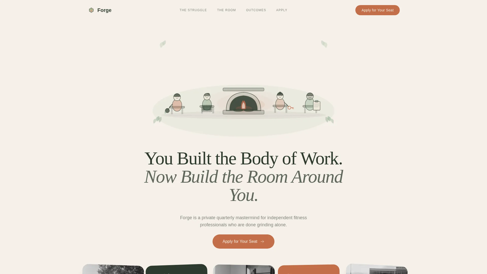
Hand-Drawn Hearth Illustration Header
The header features a custom warm-ink illustration of diverse fitness professionals gathered around a glowing hearth. Each figure holds a symbol of their craft: a kettlebell, a laptop, a studio key, or a clipboard. The illustration style uses watercolor botanical fills with no hard digital edges, setting an editorial tone from the first pixel.
Masonry Confession and Transformation Grid
The masonry grid holds two distinct card types: anonymized pre-join confessions and post-join transformation snapshots. Cards vary intentionally in height, some tall with full stories, others small with a single metric. Scroll-reveal and grayscale-to-color hover animations make the grid feel alive and uneven, like a real shared pinboard.
Three-Step Application Form
The form lowers the entry barrier with a single opening question before asking for deeper details. Step one asks what the applicant coaches and for how long. Step two collects revenue range and current bottleneck via dropdowns. Step three captures name, email, and Instagram handle.
Persistent Bottom Call-to-Action Bar
After the visitor scrolls past the midpoint, a fixed bottom bar appears with the primary "Apply for Your Seat" call to action in terracotta. This keeps the conversion prompt visible without interrupting the narrative flow of the page.
Hero's Journey Scroll Narrative
The page is structured as a five-beat story: isolation, struggle, threshold crossing, the room itself, and outcomes. Each section shifts tone and visual density deliberately, guiding the reader from recognition to desire to action without a hard sell.
Fern-Accented Testimonial and Proof Blocks
Testimonials and metric cards are styled in living fern green to visually separate them from the body copy. This color coding helps readers spot social proof quickly while scrolling, reinforcing trust at the exact moment momentum might stall.
Page sections overview
| Section | Purpose |
|---|---|
| Hero Illustration | Opens with the hearth scene and the primary serif headline |
| Ordinary World | Presents isolation stats and member archetype recognition cards |
| The Struggle | Masonry grid of anonymized pre-join confessions |
| The Room | Retreat details, Slack thread fragments, and transformation snapshots |
| Outcomes and Testimonials | Metric cards and fern-accented named testimonials |
| The Next Room | Upcoming gathering details and primary application call to action |
| Footer | Logo and tagline on the left, navigation links on the right |
Design & branding system
The Botanical color system gives the page a greenhouse-meets-farmhouse-kitchen feel: alive, grounded, and warm. Every color has a specific role, so the layout reads cleanly at a glance.
- Forest floor (#2D3A2E) anchors headlines and navigation; terracotta (#C46E4A) warms every button, hover state, and call-to-action element
- Living fern (#7A9E7E) marks testimonials and proof blocks; raw linen white (#F5F0E8) holds the grid together as the primary background breathing space
- Typography pairs DM Serif Display for headlines with IBM Plex Sans for body text, balancing editorial authority with everyday readability
Mobile & speed optimization
The template is built desktop-first with strong mobile adaptation so members can review and apply between sessions on any device. The interaction layer stays lightweight and client-side.
- Scroll reveals and masonry card stagger animations are medium-weight and tied to viewport entry, keeping the page responsive on smaller screens
- The three-step form and persistent bottom bar are both designed to function cleanly on mobile without layout breakage
- Static-first architecture with client-side form interactions keeps the page snappy on slower connections
How this template helps you convert
Every design and copy decision points toward one outcome: a completed application. The page earns trust across the scroll before it ever asks for commitment.
- The Hero's Journey structure mirrors the reader's own experience, creating recognition before the call to action appears, so the click feels natural rather than pressured.
- The three-step form reduces perceived commitment by starting with a single low-stakes question, making it easier for qualified applicants to begin without hesitation.
- The persistent bottom call-to-action bar keeps "Apply for Your Seat" visible after the midpoint, capturing intent from readers who are convinced but need a visible next step.
Other information about this template
This template sits in the Community and Nonprofit category under the Fitness Professionals Community subcategory. It is designed specifically for the fitness professionals mastermind group niche and carries a high intersection match for that use case.
- The template style is masonry and Pinterest-grid layout, making it well suited to content-rich community pages where social proof varies in length and format
- The creative direction follows the Hero's Journey framework, a narrative arc that works for any application-gated community or cohort-based program in the fitness industry
- The header concept uses a custom illustration rather than photography, which keeps the template flexible for organizers who do not yet have professional event photos
- The lp direction is event registration, so the template is optimized for driving completed applications rather than general awareness or lead capture


Theme
Community Hearth
Creative direction
Hero's Journey
Color system
Botanical
Style
Masonry/Pinterest
Direction
Event Registration
Page Sections
Hand-drawn Hearth Illustration Header
Masonry Confession and Transformation Grid
Three-step Application Form
Persistent Bottom Call-to-action Bar
Hero's Journey Scroll Narrative
Related questions
Can I use this template without professional photography?
How does the three-step application form work?
Is this template suitable for a recurring quarterly event?
Can the masonry grid handle cards of different content lengths?
What makes this different from a standard event registration page?


