Side Project & Hobby Showcase Portfolio Website Template
Fork is a full-width immersive landing page template built for open source projects. It uses a dark monochrome steel palette and a case study narrative structure to walk visitors from a real engineering problem through to working code and community proof. The page drives clicks to a GitHub repository with zero friction and no forms.
by Rocket studio
Quick summary
Fork is a single-page, full-width immersive landing page template for open source projects. It tells a case study story in four scroll sections, moving from problem to production. The dark terminal aesthetic, syntax-highlighted code blocks, and sticky call-to-action bar make it purpose-built for developers who want to earn trust before asking for a click.
Who this template is for
This template is designed for developers and engineering teams who maintain or contribute to open source projects. It speaks directly to the people who actually read documentation, scan code, and evaluate dependencies before committing to them.
- Project maintainers who want to showcase momentum and real-world impact to potential contributors
- Engineering leads evaluating whether a library or tool is production-ready and actively maintained
- Solo developers or small teams launching a side project and wanting a credible, professional web presence
What problem this template solves
Most project pages fail to earn trust fast enough. A wall of text in a generic README layout does not show that the code works, that people use it, or that the community is active. Visitors leave before they ever reach the repository link.
- The template removes that friction by leading with a specific, recognizable engineering pain point before introducing the solution
- It presents actual code snippets, configuration examples, and before-and-after benchmark data to prove the project works
- It replaces vague claims with visible community proof: contributor counts, star history, and pull request velocity
What you get with this template
You get a complete, single-page layout designed around a narrative scroll experience. Every section has a defined role in moving the visitor from skeptic to confident clicker.
- A full-bleed photo header with a monospaced project title, four narrative content sections with parallax transitions, and a sticky call-to-action bar
- Syntax-highlighted code snippet blocks, a before-and-after benchmark chart area, and a minimal sparkline for star history
- A Monochrome Steel color system with commit-green reserved for interactive elements and success states, all set in a monospaced typeface
Feature list
This template is built around one clear goal: get the right visitor to click through to the repository. Every feature serves that goal.
Full-Bleed Photo Header
The header opens with a macro-lens photograph of a backlit mechanical keyboard. Shallow depth of field and a terminal reflection on the monitor glass set the atmosphere immediately. The project name fades in at the bottom third in a monospaced typeface, styled like a film title card.
Four-Section Case Study Narrative
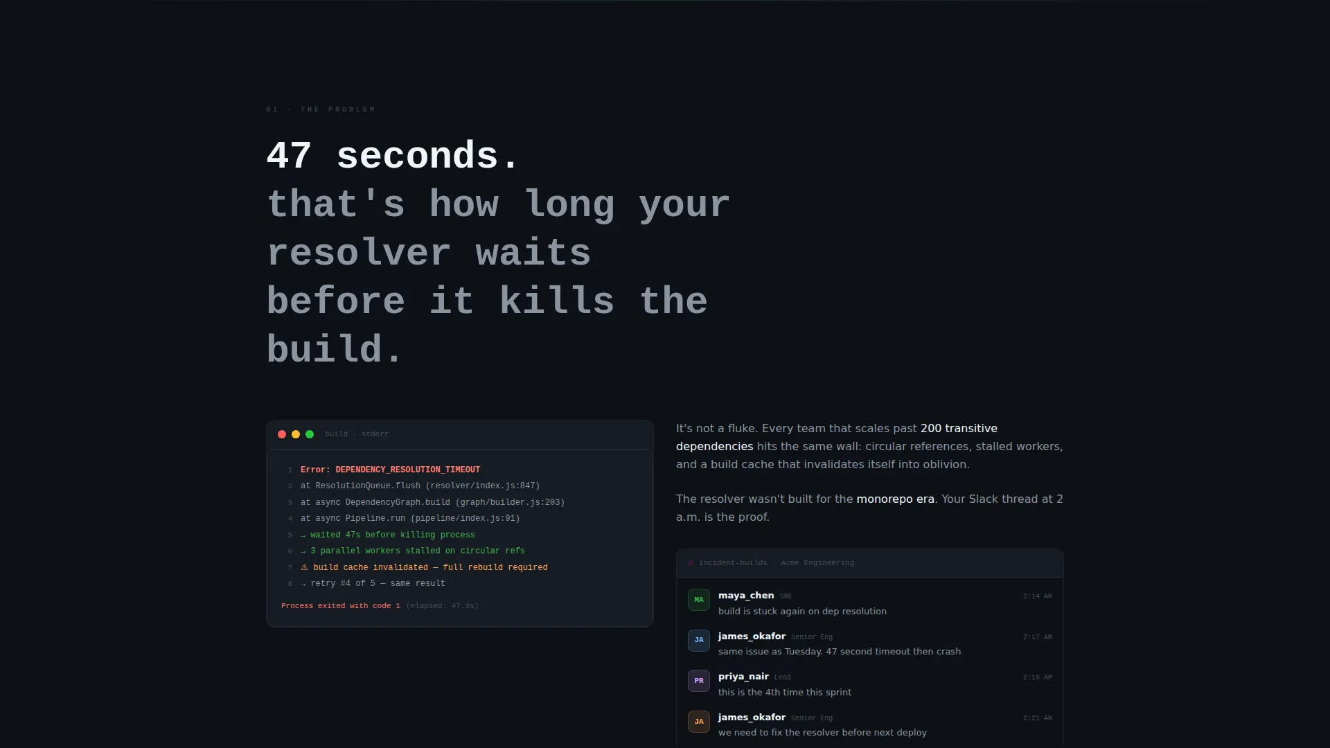
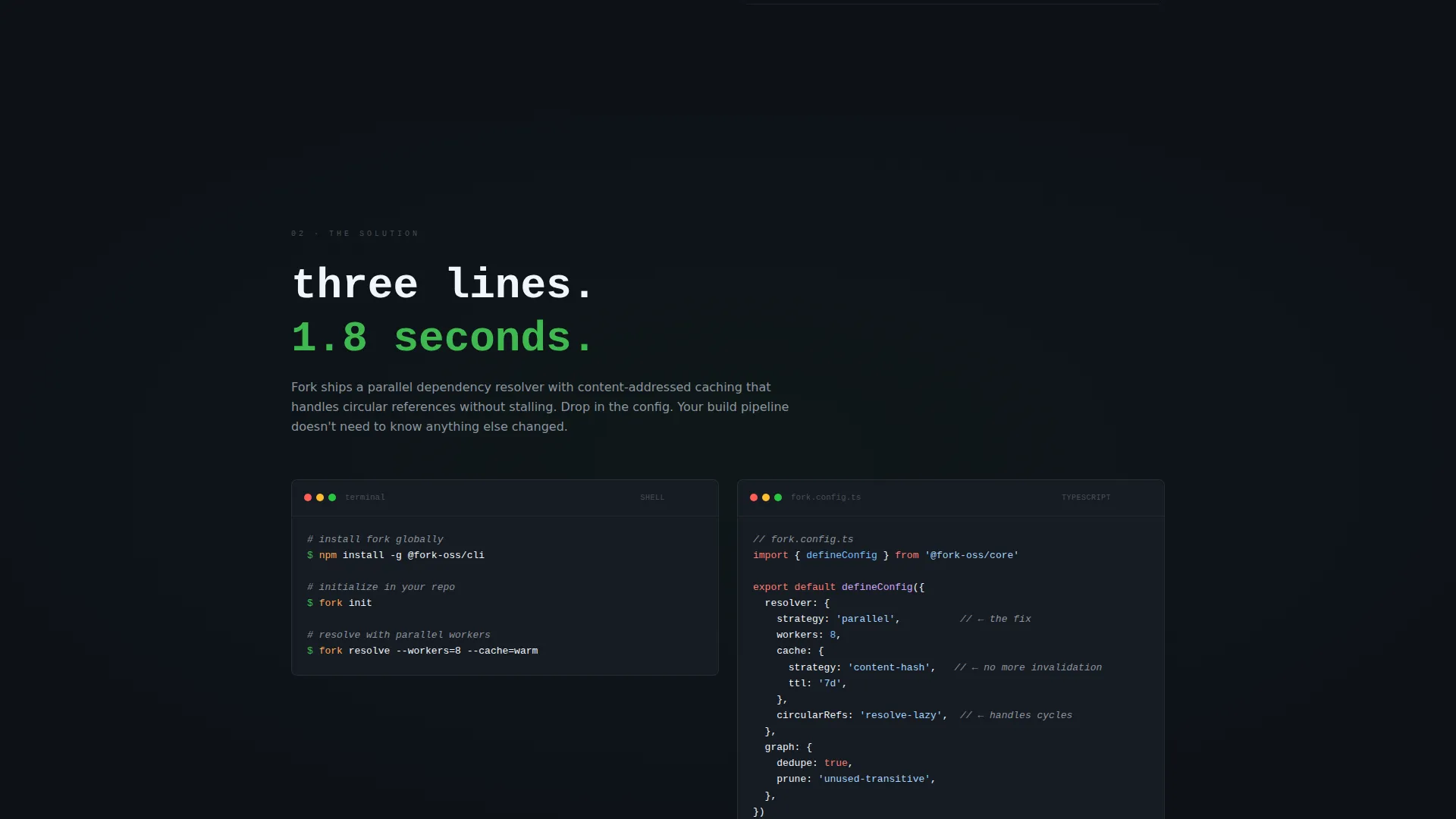
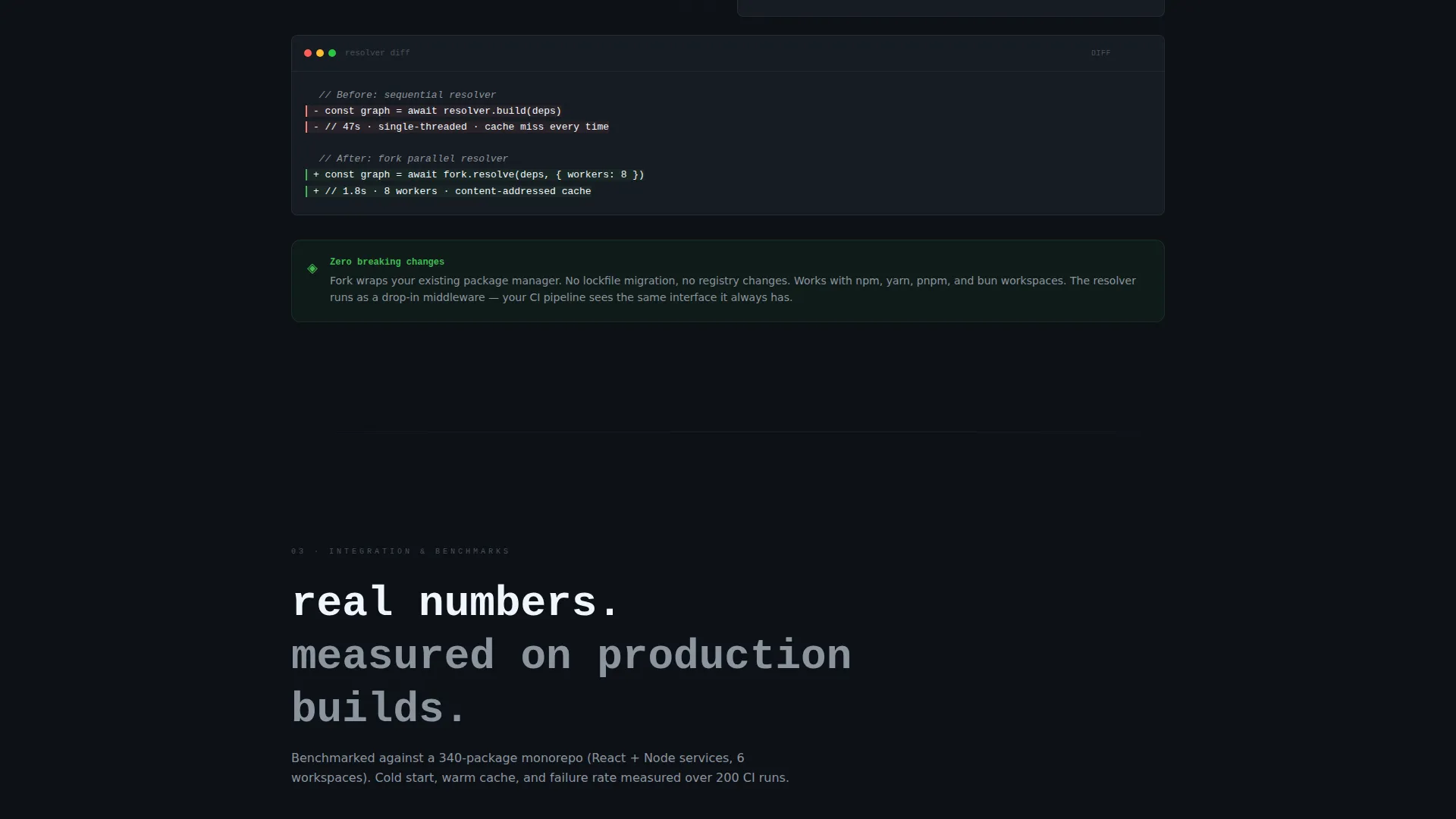
The scroll tells one continuous story. Section one names a specific engineering bottleneck in the language of stack traces and incident threads. Section two introduces the project as the fix. Section three walks through integration with config files and CLI commands. Section four widens to community data and momentum.
Syntax-Highlighted Code Blocks
Actual code snippets are presented with syntax highlighting against the steel-dark background. This gives visitors a direct read of how the project works before they visit the repository.
Benchmark Chart and Before-and-After Data
Section three includes a before-and-after benchmark chart area with real numbers. This gives engineering leads the evidence they need to evaluate the project without leaving the page.
Community Proof and Sparkline
Section four renders contributor count, stars over time as a minimal sparkline, and pull request velocity. These are visible trust signals for anyone assessing whether the project has real momentum.
Sticky Call-to-Action Bar
A slim sticky bar appears after the first scroll. It holds a primary "View on GitHub" button and a secondary "Read the Docs" link. No form, no gate. The bar stays available once the visitor has seen enough to act.
Page sections overview
| Section | Purpose |
|---|---|
| Full-Bleed Header | Sets atmosphere and introduces the project name |
| Problem Statement | Names a specific engineering bottleneck in familiar language |
| Solution and Code | Introduces the project with syntax-highlighted code snippets |
| Integration Walkthrough | Shows config, CLI commands, and benchmark data |
| Community and Momentum | Displays contributor count, star sparkline, and pull request velocity |
| Sticky call to action Bar | Pins primary and secondary actions after the first scroll |
Design & branding system
The visual identity follows a Lens and Frame theme built entirely around a Monochrome Steel palette. Every color choice is deliberate, and the single accent color is used with restraint so every interactive moment feels significant.
- Deep terminal black (#0D1117) and gunmetal gray (#161B22) form the background surfaces, letting content feel luminous against the dark
- Brushed steel (#8B949E) handles secondary text and structural detail, while bright white (#F0F6FC) is reserved for primary content
- Commit-green (#3FB950) appears exclusively on interactive elements and success states, functioning like a cursor on a diff line
Mobile & speed optimization
The template is built on a full-width immersive layout that translates cleanly to narrower viewports. The visual structure prioritizes content hierarchy so the narrative remains readable at any screen width.
- The sticky call-to-action bar is designed to remain accessible on mobile without obscuring content
- Code snippet blocks and the benchmark chart area are structured to reflow at smaller widths without breaking the reading experience
How this template helps you convert
The template is designed as a click-through page. It earns the click by proving value through evidence before the call to action is ever seen.
- The case study narrative structure builds trust progressively: the visitor sees the problem, the solution, the integration, and the community proof in sequence before the sticky bar becomes the focus
- The sticky call-to-action bar appears only after the first scroll, so the primary ask arrives after the visitor has already engaged with the content
- No form or gate stands between the visitor and the repository, which removes the most common reason a developer leaves without clicking
Other information about this template
This template fits naturally into the side project and hobby showcase subcategory, where developers need a page that looks intentional without requiring a full design system or marketing budget.
- The Lens and Frame theme and the Case Study Narrative creative direction make this template well suited for open source project pages that need to communicate technical credibility quickly
- The parallax section transitions are subtle, described in the brief as a racking focus effect, pulling the visitor deeper into the narrative without distracting from the content
- The template has no logo area, no navigation bar, and no form fields, which keeps the layout clean and the focus entirely on the project itself
- It works as a standalone showcase page that links out to an existing repository and documentation site rather than hosting those resources directly

Theme
Lens & Frame
Creative direction
Case Study Narrative
Color system
Monochrome Steel
Style
Full-Width Immersive
Direction
Click-Through
Page Sections
Full-bleed Photo Header with Title Card
Four-section Case Study Scroll
Syntax-highlighted Code Snippets
Benchmark Chart Area
Community Proof Sparkline
Sticky Click-through Call to Action Bar
Related questions
Does this template include a navigation menu?
Can I use this template if my benchmark data is not ready yet?
Is this template suited to a project that is still in early development?
What triggers the sticky call-to-action bar to appear?
Does the template come with the header photograph?



