Food & Beverage Contract Manufacturing Landing Page
Formulate is a zigzag landing page template built for food and beverage contract manufacturers. It uses a Checklist and Audit creative direction to walk prospective clients through facility certifications, process capabilities, and traceability side by side with a grayed-out "typical co-packer" column. The result is a self-qualifying buyer journey that earns the conversion before the form even appears.
by Rocket studio
Quick summary
Formulate is a precision-built landing page template for food and beverage contract manufacturers. It opens with a Before/After case study header, moves through alternating audit-style sections, and closes with a guided qualification form. Every layout decision reflects the production floor it represents: structured, accountable, and confidence-inspiring.
Who this template is for
This template is designed for contract manufacturers that work in the food and beverage space and need to communicate facility credibility, process range, and compliance rigor to serious buyers. It speaks directly to the three buyer profiles the brief identifies.
- Emerging CPG founders who have outgrown a commercial kitchen co-packer and need a certified, scalable partner
- Mid-market brand managers managing multiple SKUs across several co-manufacturers with recurring quality and allergen issues
- Private-label buyers at regional grocery chains who require a turnkey partner from research and development through retail-ready packaging
What problem this template solves
Most contract manufacturer websites read like a brochure. They list capabilities without proof, stack certifications without context, and ask visitors to "contact us" before they have any reason to trust. Buyers arrive with real operational pain and leave without answers.
- Visitors cannot quickly compare your facility to their current supplier, so they stay uncertain and do not convert
- There is no structured path to qualify intent, meaning your sales team fields low-fit leads instead of ready buyers
- Compliance credentials get buried in text, failing to land the reassurance that procurement and quality teams need most
What you get with this template
This template delivers a fully structured, single-page layout that guides every visitor through a self-qualifying audit experience. It pairs strong visual identity with purposeful conversion architecture from the first scroll to the final form submission.
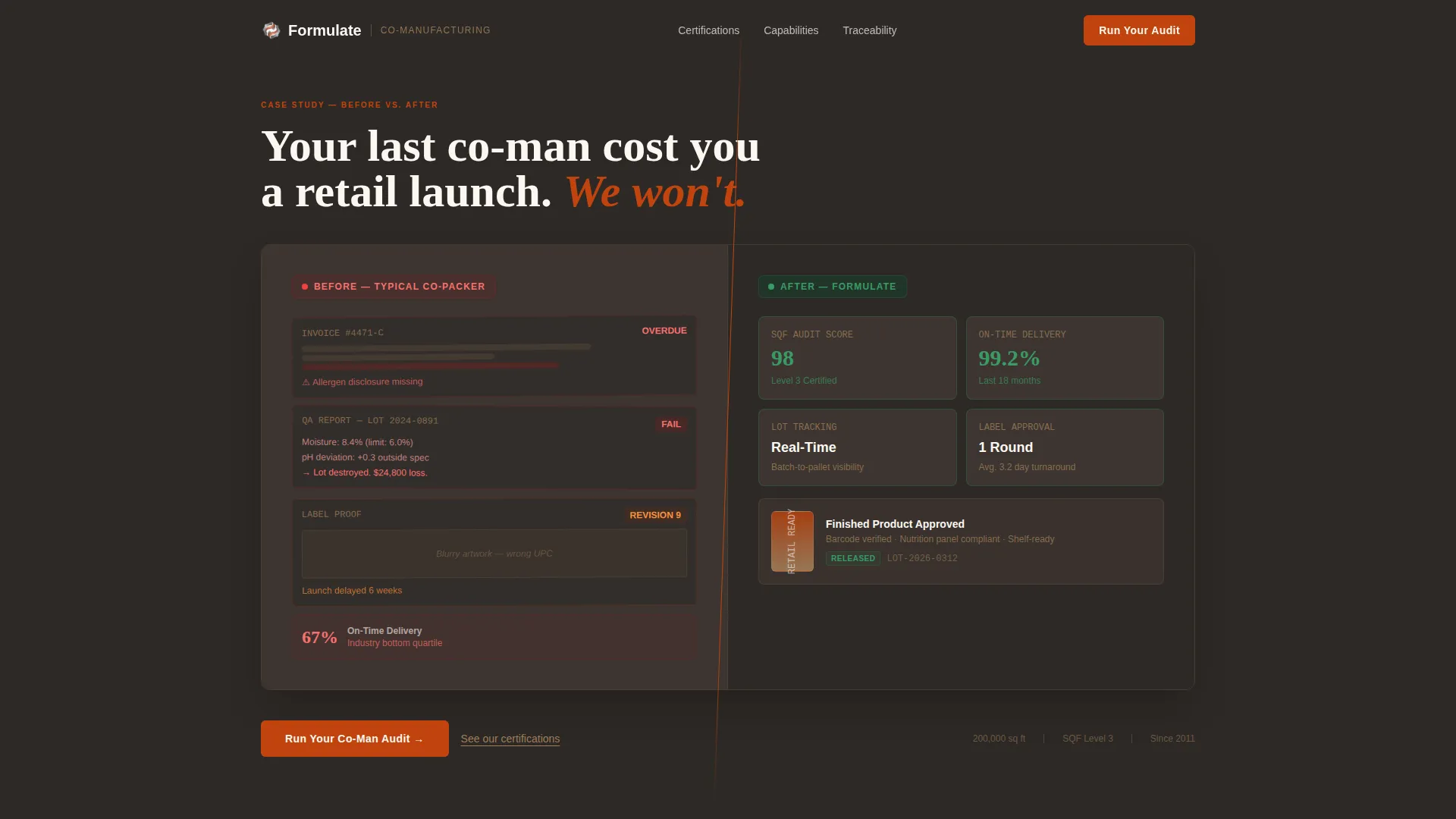
- A split Case Study Before/After header that frames the stakes immediately, using a diagonal wipe between a chaotic co-packer left panel and a clean production dashboard right panel
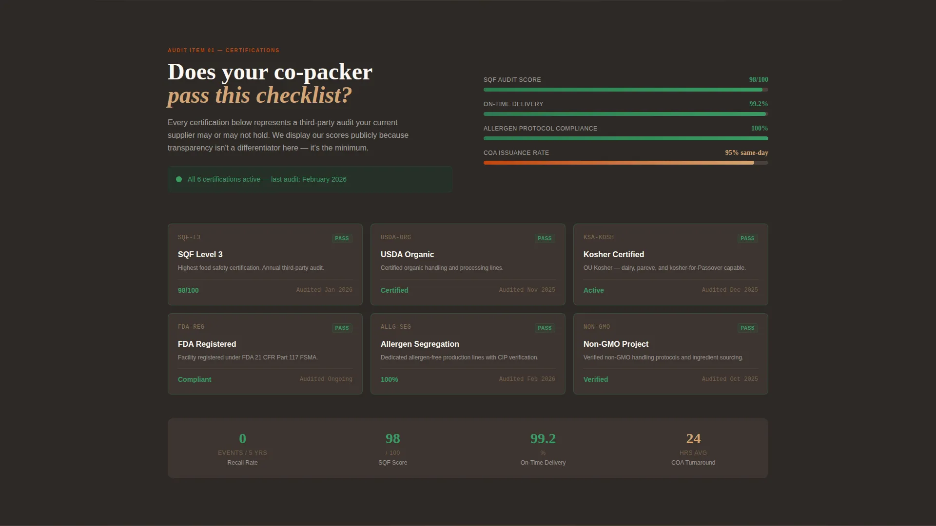
- A zigzag alternating section layout covering facility certifications, process capabilities, and lot-tracking transparency, each framed as a pass/fail audit check
- A sticky "Compare Your Co-Man" bar anchored in terracotta that appears after the second section, alongside a secondary gated PDF download path for early-stage visitors
Feature list
A paragraph introducing the feature blocks below: each feature below maps directly to a functional element described in the source brief, representing what this template is built to display and how it earns buyer confidence section by section.
Before/After Case Study Header
The header splits the viewport into two compositions. The left side shows mismatched invoices, failed quality assurance reports, and a label proof marked "REVISION 9." The right side reveals a clean production dashboard with lot tracking, a 98 SQF (Safe Quality Food) audit score, and a 99.2 percent on-time delivery rate.
Zigzag Audit Section Layout
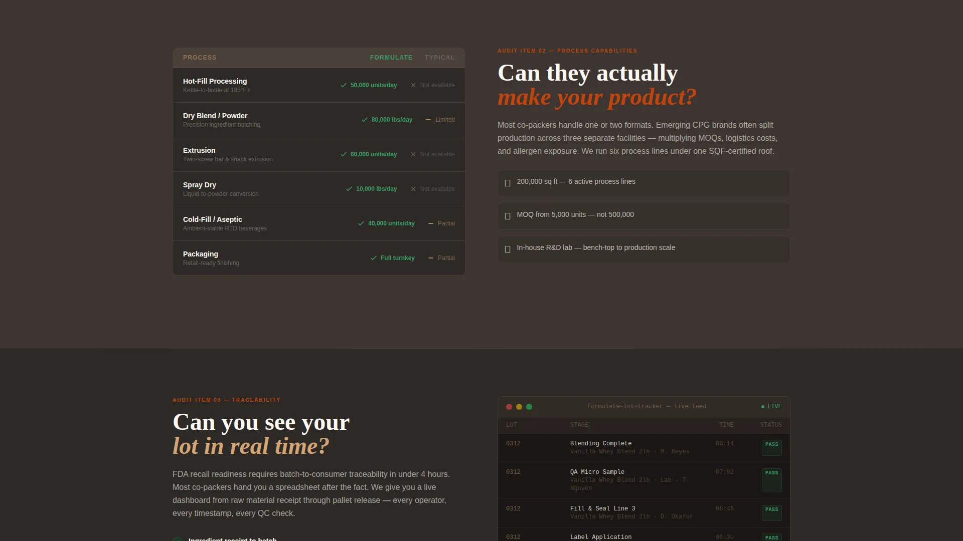
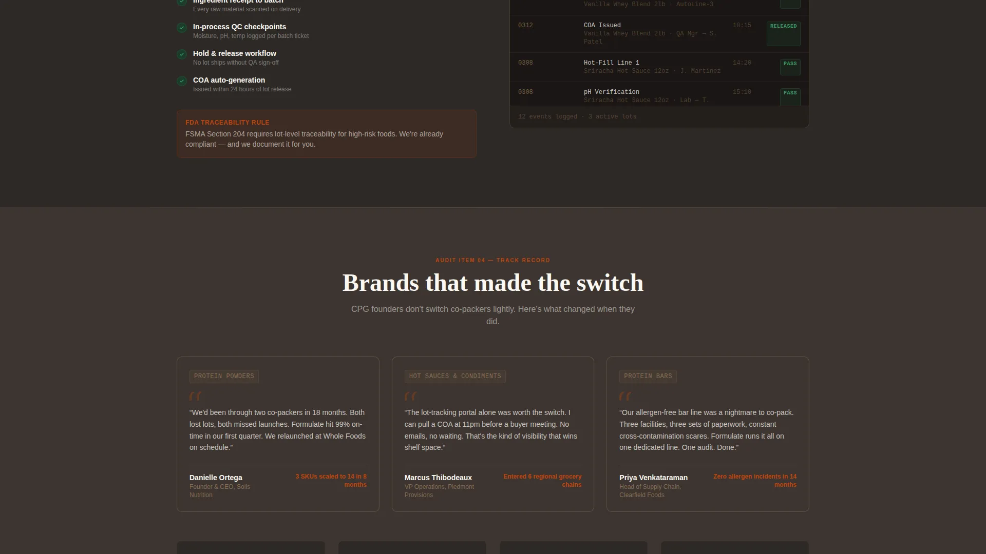
Each alternating section presents a co-manufacturing decision point as a pass/fail audit item. Visitors move through facility certifications displayed as live dashboard tiles, a process capability matrix versus a grayed-out typical co-packer column, and a mock lot-tracking interface they can scroll through.
Sticky Comparison Bar with Qualification Form
A persistent terracotta bar appears after the second section and stays visible as visitors scroll. Clicking "Run Your Audit" opens a guided form covering annual volume, product format, required certifications, and biggest pain point.
Gated PDF Conversion Path
Visitors who are not ready to engage with the qualification form can download a Co-Man Comparison Checklist as a gated PDF. The gate captures only email address and company name, keeping the friction low for early-stage prospects.
Dashboard Pro Visual Theme
The Dashboard Pro theme treats every section like a production dashboard panel. Data-dense but breathable, the layout separates critical metrics from background content the same way a well-organized operations screen separates alerts from status indicators.
Fire and Earth Color System
Volcanic charcoal serves as the primary background. Kiln-fired terracotta drives call-to-action buttons, compliance badges, and progress bars. Sunbaked clay handles secondary accents and divider lines, while ceramic white keeps card surfaces and text panels legible and clean.
Page sections overview
| Section | Purpose |
|---|---|
| Before/After Header | Establishes stakes with a split chaos-versus-clarity composition |
| Certifications Dashboard | Displays SQF Level 3, organic, kosher, and allergen-segregated credentials as live green-lit tiles |
| Capability Matrix | Compares hot-fill, dry blend, extrusion, and spray-dry capabilities against a grayed-out typical co-packer |
| Traceability Interface | Shows a scrollable mock lot-tracking screen to demonstrate batch accountability |
| Sticky Comparison Bar | Persists after section two with a terracotta "Run Your Audit" call to action |
| Qualification Form | Guided multi-field form capturing volume, format, certifications, and pain point |
| PDF Download Gate | Secondary conversion path offering the Co-Man Comparison Checklist for email capture |
Design & branding system
The Fire and Earth color system gives this template a visual personality that feels earned rather than designed. It borrows the weight of industrial materials and translates them into a digital interface that communicates operational seriousness without sacrificing usability.
- Volcanic charcoal (#2D2926) backgrounds create depth and focus, sunbaked clay (#D4A574) adds warmth to divider lines and secondary accents, and ceramic white (#FAF7F2) keeps card and text panels open and readable
- Kiln-fired terracotta (#C1440E) commands attention on call-to-action buttons, audit-pass compliance badges, and progress bars, making interactive and credentialing elements impossible to miss
- The overall palette reads like a cast-iron skillet seasoned over decades: functional, warm, and purposeful, never decorative
Mobile & speed optimization
The template is structured to remain fully readable and interactive at any screen size. The zigzag alternating layout reflows cleanly on narrower viewports, and the sticky comparison bar remains accessible without obscuring content on mobile.
- The qualification form fields (dropdown, multi-select, checkboxes, and single-select) are sized and spaced for touch input, reducing friction on mobile devices
- Dashboard tile layouts and the capability matrix adapt to stacked single-column views on smaller screens, preserving readability without horizontal scrolling
How this template helps you convert
This template is conversion architecture built around a single insight: buyers who audit themselves are far more ready to act than buyers who read a pitch. Every section nudges the visitor to measure their current situation against what they see on screen.
- The Before/After header opens with a direct challenge, "Your last co-man cost you a retail launch. We won't," immediately triggering self-assessment before the visitor has scrolled a single section
- The pass/fail audit framing across certifications, capabilities, and traceability sections builds a silent checklist in the visitor's mind, escalating the gap between their current supplier and what they are reviewing
- By the time the "Run Your Audit" qualification form appears, the visitor has already built their own internal case for switching, making form completion feel like a logical next step rather than a cold commitment
Other information about this template
This template is categorized under Manufacturing and Industrial, with a focused subcategory alignment in Food and Beverage Manufacturing. It is purpose-built for the food and beverage contract manufacturer niche and reflects the operational language, compliance vocabulary, and buyer psychology of that specific market.
- The template style is Zigzag/Alternating, meaning sections alternate left-right composition to create visual rhythm and prevent the layout from reading like a flat brochure
- The header concept is Case Study Before/After, a proven format for high-trust B2B landing pages where credibility must be established in the first viewport
- The landing page direction is Comparison/Versus, which is particularly effective for buyers who are actively evaluating suppliers and need structured proof rather than marketing claims
- The creative direction is Checklist and Audit, a framing device that puts the visitor in an evaluative mindset and makes each section feel like actionable due diligence rather than passive reading
Theme
Dashboard Pro
Creative direction
Checklist & Audit
Color system
Fire & Earth
Style
Zigzag/Alternating
Direction
Comparison/Versus
Page Sections
Before/after Case Study Header
Zigzag Audit Section Layout
Sticky Comparison Bar
Guided Qualification Form
Gated PDF Download Path
Dashboard Pro Visual Theme
Related questions
Who is this landing page template designed for?
What sections does this template include?
Does the template support two different lead capture paths?
What does the 'Run Your Audit' qualification form ask?
How does the pass/fail audit framing guide visitors toward conversion?