Emergency Preparedness Consulting Landing Page Template
Fortify is a single-page landing page template built for disaster preparedness consulting firms. It combines a credential-forward header, a three-column comparison table, and a five-phase methodology walkthrough to turn skeptical facility managers into confident leads. Two conversion paths, a consultation request form and a free checklist download, capture buyers at every stage of readiness.
by Rocket studio
Quick summary
Fortify is a high-authority landing page template for emergency preparedness consulting. It opens with verified credential badges, delivers a side-by-side gap analysis table, and walks visitors through a transparent five-phase engagement. Every section is designed to build conviction before the first call, converting informed facility leaders rather than curious browsers.
Who this template is for
This template is built for consulting firms that help organizations survive disruptions before they happen. It speaks directly to the clients those firms serve most.
- Facilities managers at hospitals and critical-care settings where downtime is not an option
- School district safety officers updating emergency operations plans under new federal guidelines
- Manufacturing plant directors facing rising insurance premiums tied to inadequate preparedness plans
What problem this template solves
Most preparedness consulting pages either bury their methodology behind vague promises or lean on fear-based imagery to close leads. Neither approach works with experienced facility managers who have seen every stock-photo disaster and reviewed every generic brochure.
- Visitors arrive skeptical and leave without a clear picture of what they are actually buying
- The lack of transparent process forces prospects to request a call just to understand basic scope
- Generic pages fail to separate a serious firm from lower-credentialed competitors
What you get with this template
Fortify gives you a complete, ready-to-customize landing page structured around trust signals and transparent methodology. Every section works together to move a cautious buyer from awareness to action.
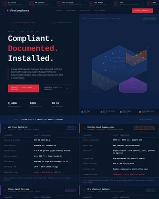
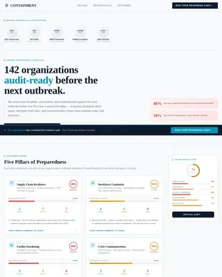
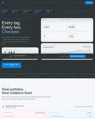
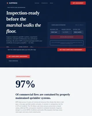
- An engineering blueprint visual system with a command navy, technical graphite, and hazard amber color palette
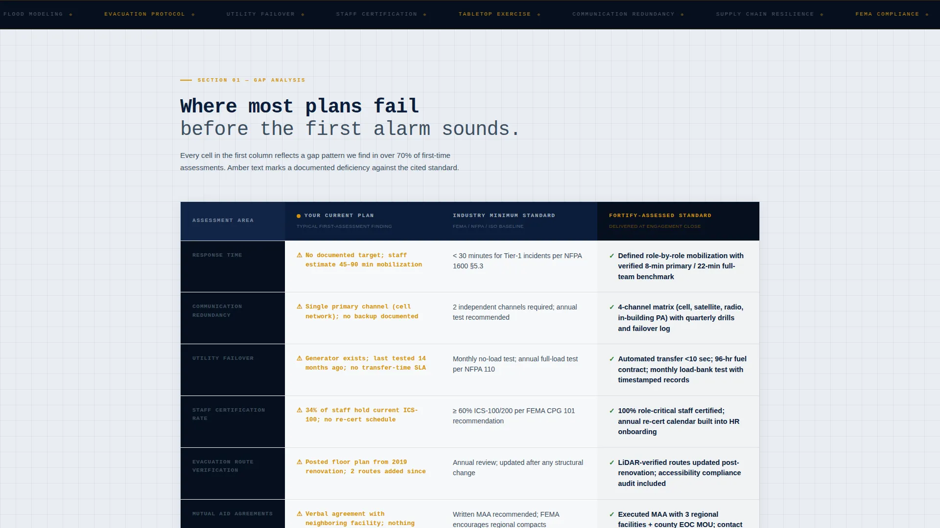
- A three-column comparison table showing gaps between current plans, industry minimums, and a fully assessed standard
- Two distinct conversion paths: a detailed consultation request form and a gated checklist PDF download
Feature list
This template is built around the specific components a preparedness consulting firm needs to earn trust and generate qualified leads.
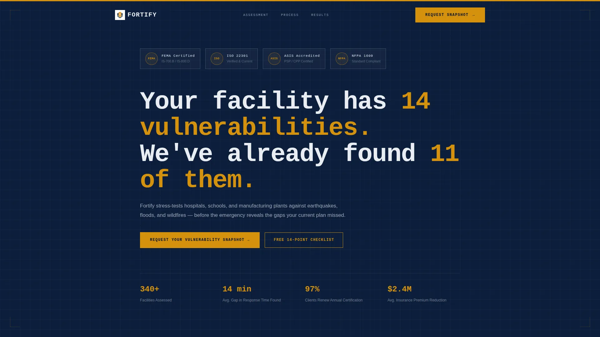
Credential Badge Header Row
The page opens with a horizontal row of engineering-style Award Badge illustrations. Each badge represents a key professional accreditation and is rendered with a metallic graphite bevel against a command navy background. The effect communicates authority before a single word of body copy is read.
Three-Column Gap Analysis Table
The comparison table runs rows for Response Time, Communication Redundancy, Utility Failover, and Staff Certification Rate across three columns. The first column surfaces common shortfalls in hazard amber warning text, making the value of a professional assessment immediately visible.
Five-Phase Methodology Walkthrough
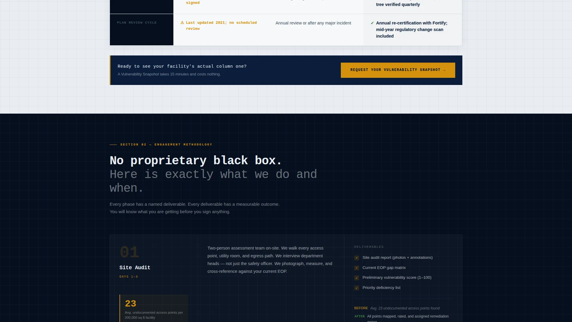
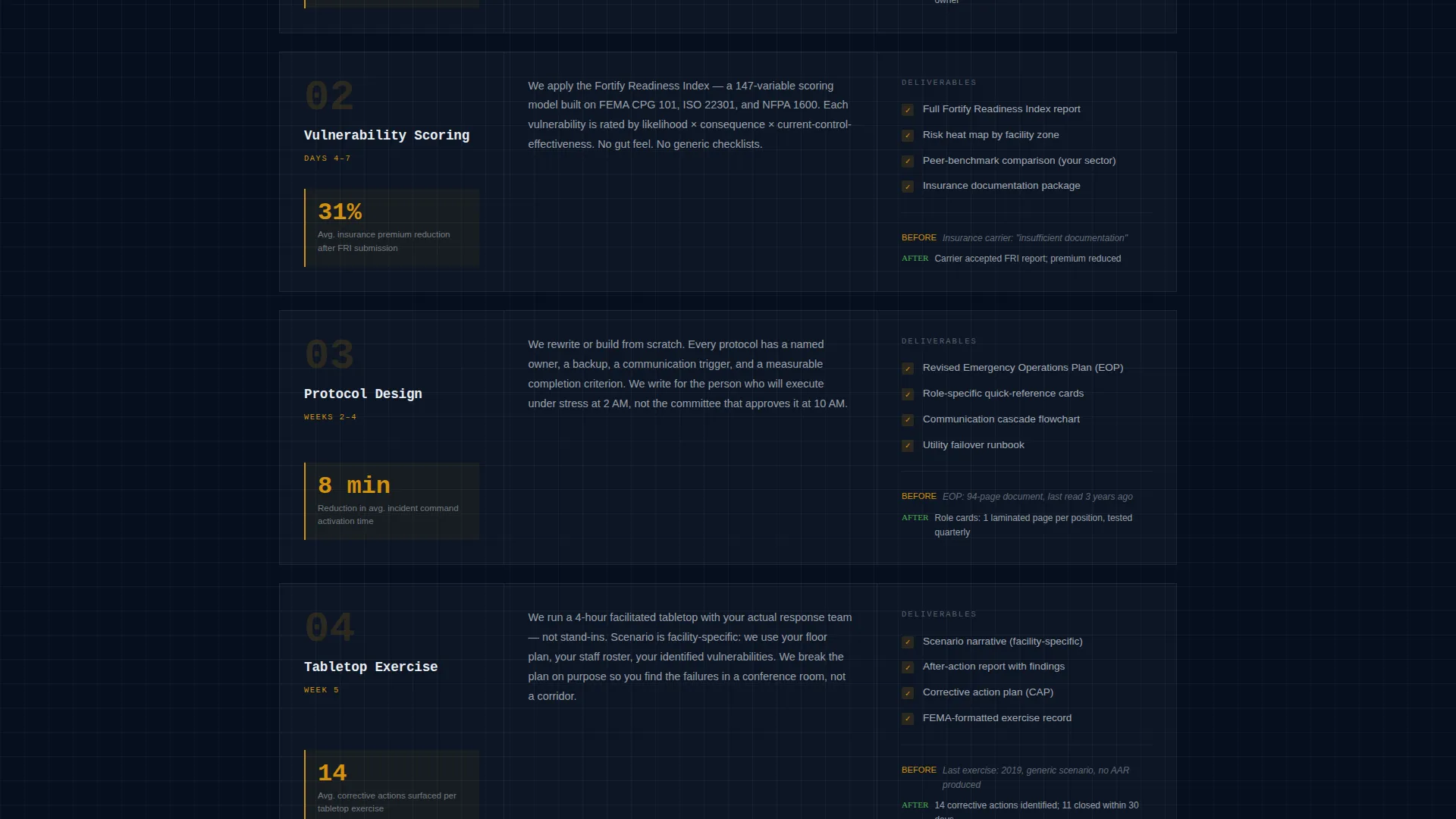
Each engagement phase, Site Audit, Vulnerability Scoring, Protocol Design, Tabletop Exercise, and Annual Re-Certification, gets its own numbered blueprint-style diagram. Each phase block includes a deliverables list and a real anonymized before-and-after metric.
Dual Lead Capture System
The primary call to action, "Request Your Vulnerability Snapshot," appears at the base of the comparison table and again at the page end. A secondary path offers a free downloadable PDF checklist gated behind email only, capturing earlier-stage prospects who are not yet ready for a full consultation.
Consultation Request Form
The form collects facility type, square footage range, current plan status, and a work email. This structure pre-qualifies leads so the consulting team arrives at every conversation with meaningful context.
Blueprint-Driven Visual Language
Monospaced slab typography, a faint grid-line texture on content areas, and amber used exclusively for calls to action and critical data callouts create a visual identity that feels like a classified readiness binder. There is no stock disaster photography anywhere on the page.
Page sections overview
| Section | Purpose |
|---|---|
| Award Badge Header | Establishes credentials and authority before the headline |
| Headline Block | Delivers a precise, data-driven hook in monospaced slab type |
| Comparison Table | Visualizes gaps between current plans and assessed standards |
| Phase One Block | Covers Site Audit with diagram, deliverables, and metric |
| Phase Two Block | Covers Vulnerability Scoring with diagram, deliverables, and metric |
| Phase Three Block | Covers Protocol Design with diagram, deliverables, and metric |
| Phase Four Block | Covers Tabletop Exercise with diagram, deliverables, and metric |
| Phase Five Block | Covers Annual Re-Certification with diagram, deliverables, and metric |
| Primary call to action Form | Collects facility details and routes to consultation request |
| Checklist Download | Captures earlier-stage leads with a gated PDF offer |
| Page-End call to action | Repeats the primary conversion prompt at scroll completion |
Design & branding system
The visual identity follows an Engineering Blueprint theme. Every color decision is purposeful and restrained.
- Command navy (#0B1D3A) anchors headers and full-width section backgrounds; technical graphite (#3D4F5F) carries body text and table borders; blueprint grid white (#E8EDF2) holds content areas with a faint grid-line texture
- Hazard amber (#D4910D) appears exclusively on calls to action, alert icons, and critical data callouts, ensuring every amber instance commands immediate attention
- Monospaced slab typeface for headlines and engineering-style seal illustrations for badge graphics reinforce a classified-readiness-binder aesthetic throughout
Mobile & speed optimization
The page layout is designed to remain clear and scannable on any screen size. The structured section-by-section flow translates naturally from desktop to mobile without losing hierarchy.
- The comparison table is structured for horizontal readability on wider screens and can be adapted for stacked display on smaller devices
- Blueprint grid textures, restrained color usage, and minimal decorative assets keep the visual layer lightweight and easy to render across devices
How this template helps you convert
Fortify is engineered to move cautious, high-stakes buyers through a full trust arc before they ever speak to a salesperson.
- The credential badge header and data-driven headline establish authority in the first seconds, filtering for serious buyers and signaling that the firm has already done the work
- The transparent methodology walkthrough eliminates the need for a discovery call just to understand scope, so visitors arrive at the form pre-sold on the approach rather than simply curious about pricing
Other information about this template
This template is a strong fit for business continuity planning consultancies operating in regulated or high-liability sectors. It is equally useful for firms positioning themselves alongside or against standard industry frameworks.
- The five-phase structure maps naturally to how professional emergency management engagements are scoped and delivered
- The checklist PDF download path is specifically designed to nurture contacts who recognize a need but are not yet ready to commit to a full site assessment
- The template supports a card grid modular layout approach, making individual phase blocks easy to reorder or expand as a firm's service offering evolves
- The page direction is optimized for business-to-business lead generation, with form fields and copy aimed at organizational decision-makers rather than general consumers
- The Service Utility theme and Case Study Narrative creative direction mean the page earns credibility through disclosed process and real metrics, not testimonials or vague claims
Theme
Service Utility
Creative direction
Case Study Narrative
Color system
Charcoal & Amber
Style
Card Grid (Modular)
Direction
Partnership/B2B
Page Sections
Credential Badge Header Row
Three-column Gap Analysis Table
Five-phase Methodology Walkthrough
Dual Lead Capture System
Blueprint-driven Visual Identity
Related questions
Can I customize the comparison table rows for my specific services?
What types of organizations is this landing page built for?
Does the template include the PDF checklist content?
Can I use only one of the two conversion paths?
How does the five-phase methodology section work?