Specialist Small Business Owner Insurance Professional Website Template
Shield is a Startup Velocity insurance landing page template built for home-based business owners. It pairs a Monochrome Steel visual system with a Problem-to-Solution zigzag layout, animated live metrics, and a three-step Coverage Score form. The template converts visitors by delivering real value before asking for commitment, helping insurance companies turn browsers into insured customers fast.
by Rocket studio
Quick summary
Shield is a single-page insurance landing page template designed for digital insurance platforms serving home-based business owners. It combines a data-forward Stats and Metrics header, a zigzag Problem-to-Solution layout, and a progressive three-step form that delivers a free Coverage Score instantly. The design runs cold, confident, and SaaS-grade from the first pixel to the final call to action.
Who this template is for
This template is built for insurance company teams, InsurTech founders, and independent insurance brokers who want a high-converting digital front door for small business owner home insurance. It suits any company ready to move fast and present its services with the confidence of a modern data platform rather than the warmth of a traditional agency website.
- Home-based business insurance providers targeting Etsy sellers, freelancers, and contractors
- InsurTech startups launching a direct-to-consumer insurance landing page for the first time
- Insurance brokers and agencies adding a dedicated landing page for a niche home-business product
What problem this template solves
Most standard homeowner insurance policies leave a dangerous gap for people running a business from home. The coverage a person buys to protect their living room rarely extends to the inventory in their spare bedroom, the client who slips on the front step, or the laptop that holds three years of client data. Home-based operators face real legal liability exposure every single day, yet most insurance landing pages treat them the same as a retired couple in a condo. This template addresses that disconnect head-on.
- Visitors land on vague insurance landing pages that never explain the coverage gap specific to home-based businesses
- Generic forms ask too many questions too soon, causing visitors to abandon before the company earns their trust
- Most insurance landing pages fail to communicate urgency or make the uninsured state feel real and costly
What you get with this template
This template gives your team a complete, ready-to-launch insurance landing page structure. Every section is purposefully sequenced to build trust, reveal risk, and convert. The design system, animations, and form flow are all specified in the layout so your development team can move straight to build without guessing at intent.
- A full zigzag landing page layout with five distinct content sections, from the Stats wall header through the Coverage Score call-to-action form
- A Monochrome Steel design system with four specified colors, two typefaces, and clear rules for every visual element including the logo placement and call to action contrast
- A three-step progressive form structure that collects only essential data and returns an instant coverage gap analysis to each visitor
Feature list
This landing page template is built around a small set of high-impact features. Each one serves the conversion goal directly.
Animated Stats and Metrics Header
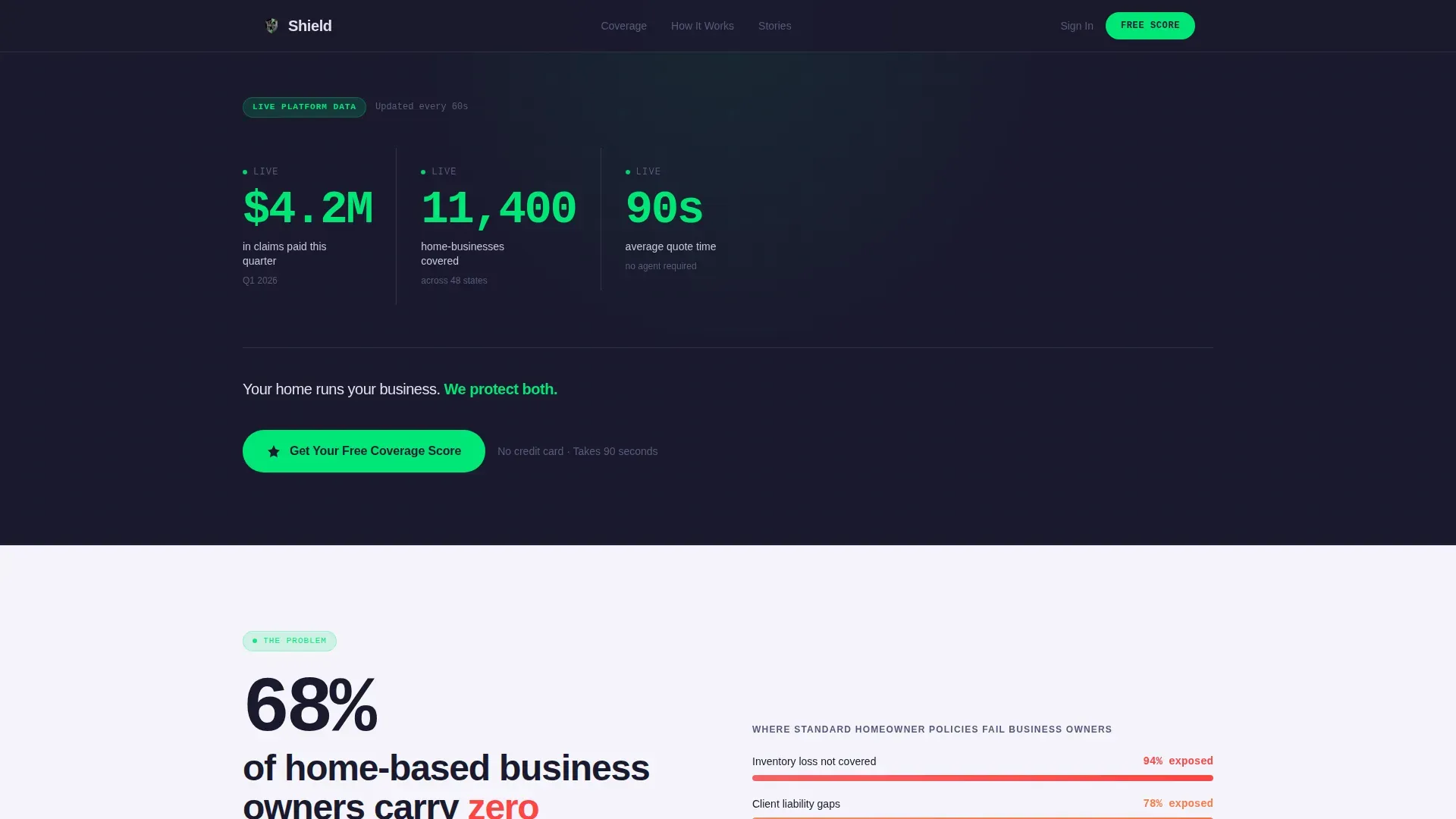
The header opens on a full-viewport forge-black panel displaying three animated counters. Each counter ticks upward in real time using electric-green monospace type, staggered by half a second so the eye moves naturally left to right. The three data points cover claims paid, homes covered, and average quote time. The first thing visitors see on this landing page conveys speed and credibility without a single stock image.
Zigzag Problem-to-Solution Layout
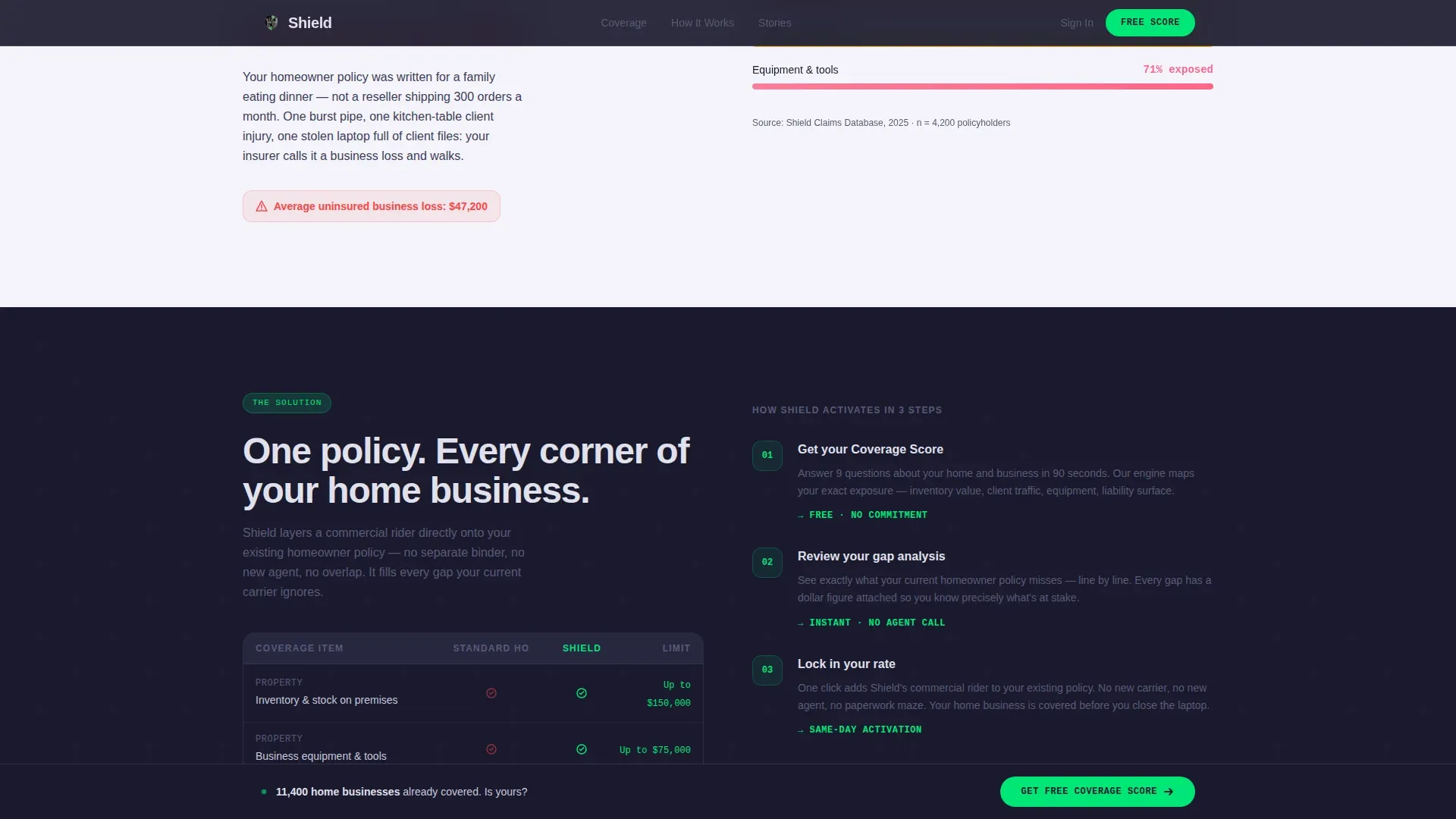
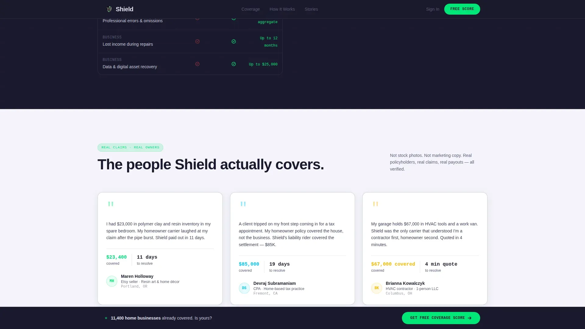
Five alternating panels walk visitors through a tightening Problem-to-Solution arc. Backgrounds flip between forge-black and chrome-white on each panel, keeping the eye engaged across the full scroll. The sequence moves from the coverage gap stat through the product spec explanation, then into real testimonials, then through escalating risk topics including property damage, legal liability, and business interruption coverage, each immediately resolved. The rhythm is tension then release, repeated until the uninsured state feels genuinely reckless.
Three-Step Progressive Coverage Score Form
The primary conversion mechanic is a three-step form that asks only what it needs at each stage. Step one captures home type and square footage. Step two asks about business category and on-site inventory. Step three asks about the visitor's current insurance carrier. The result is an instant coverage gap analysis delivered free, with no commitment required. Simplifying the form this way keeps visitors from feeling overwhelmed and dramatically increases completion rates.
Sticky Bottom Call-to-Action Bar
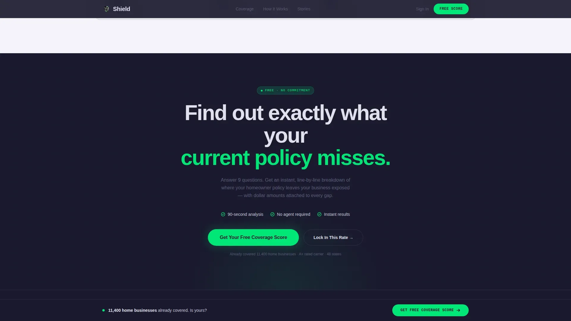
A secondary call-to-action bar is pinned to the bottom of the viewport as visitors scroll. The primary button reads "Get Your Free Coverage Score" in electric-green against forge-black. A secondary option reading "Lock In This Rate" serves visitors who are ready to convert immediately without going through the score flow. This persistent presence ensures the path to action is always one tap away.
Scroll-Triggered Animation System
Section reveals, counter animations, and staggered entry effects are all specified in the template. Each zigzag panel enters the viewport on scroll, reinforcing the tension-and-release narrative. Hover micro-interactions on key elements add a SaaS-grade polish that signals to visitors that this insurance company operates with the same precision it promises in its coverage.
Monochrome Steel Design Token System
The entire visual system runs on four defined colors and two typefaces. Forge-black and gunmetal handle structure and text. Chrome handles alternate backgrounds. Electric-green is reserved exclusively for calls to action and live data points. DM Sans handles all body and heading copy. JetBrains Mono renders the animated counters. The logo sits against the forge-black header with no competing visual noise.
Page sections overview
| Section | Purpose |
|---|---|
| Stats Metrics Header | Opens with animated claim, coverage, and quote-speed counters to establish instant credibility |
| Problem Gap Panel | Presents the coverage gap stat and describes the risk in plain language for home-based business owners |
| Solution Spec Panel | Explains how the insurance coverage works, laid out like a product spec for clarity |
| Testimonials Panel | Delivers real-business-type stories from a cake decorator, reseller, and tax preparer to build trust |
| Coverage Score call to action | Hosts the three-step progressive form and both primary and secondary conversion calls to action |
| Footer Row | Linear single-row footer with essential links, logo, and policy references |
Design & branding system
The Monochrome Steel palette is the entire personality of this landing page. There is no warmth here, no gradient sunrise, no friendly illustration. The design speaks the language of a SaaS dashboard built from rolled steel, and that language tells home-based business owners that this insurance company is as serious about their protection as they are about their work.
- Colors: forge-black (#1A1A2E) for primary backgrounds, gunmetal (#3D3D5C) for secondary surfaces and body text, polished chrome (#E0E0EC) for alternating panel backgrounds, and electric-green (#00E676) reserved only for calls to action and live data counters
- Typography: DM Sans for all headings and body paragraphs at every weight, JetBrains Mono exclusively for the animated counter numerals to reinforce the data-platform aesthetic
- Logo placement sits in the forge-black header with no competing color or visual element nearby, keeping brand identity clean and prominent
Mobile & speed optimization
The template is designed desktop-first with full mobile responsiveness specified throughout. Zigzag panels restack cleanly on smaller screens. The sticky call-to-action bar remains functional and tappable on mobile. Forms simplify to single-column layout automatically. Mobile-friendly landing pages load fast and keep things easy to read and tap, which matters enormously when most users research insurance options on their phones during short breaks in the workday.
- Counter animations are handled by client-side components while static sections use server-side rendering, keeping the page light and fast to first paint
- The three-step form reduces to a clean single-column flow on mobile, preserving the low-friction experience that drives completion rates
- Sticky call to action bar sizing and tap targets are optimized for thumb reach on standard smartphone screens
How this template helps you convert
An insurance landing page built on this template converts because every design and content decision is aligned to one goal: move the visitor from "I had no idea I was exposed" to "I need to get my score right now." Companies using focused landing pages generate significantly more leads than those that rely on general website pages. This template applies that principle precisely.
- The Stats and Metrics header delivers instant social proof through live data. Visitors see real numbers the moment they arrive: claims paid, homes covered, and a 90-second average quote time. The first thing a visitor perceives is speed and trust, which is exactly what high-converting insurance landing pages must communicate immediately.
- The Problem-to-Solution zigzag arc makes the coverage gap personal and urgent. Each panel escalates the risk, from property damage to liability to business interruption, then immediately resolves it with a clear coverage answer. By the time a visitor reaches the form, they already understand their exposure. The Coverage Score form then delivers genuine value for free before asking for money, which earns the click and the trust needed to complete the process.
Other information about this template
This template draws from best practices across the insurance landing page design space and from the specific needs of the modern InsurTech insurance company. Below are additional details relevant to buyers evaluating this template for their platform.
- The template is categorized under Finance and Insurance, with a specific niche focus on small business owner home insurance, making it a precise fit for companies in that vertical
- Insurance analytics best practices informed the data-forward header design. Insurance analytics helps organizations understand revenue trends and customer behavior, and presenting live claim and coverage data on the landing page mirrors that insight-first approach. Data visualization in insurance analytics can reveal policy performance signals, and the animated counter format applies that same principle to conversion
- The coverage gap narrative is grounded in real insurance industry dynamics. Standard homeowner insurance policies frequently exclude commercial property, cyber liability, and business interruption scenarios that home-based operators face daily
- Cyber liability coverage and cyber liability insurance are increasingly relevant for home-based businesses storing client data, and the template structure allows an insurance company to surface those topics naturally within the zigzag panels
- The three-step form mirrors risk assessment logic used by insurance companies and insurance brokers when qualifying leads. Collecting home type, business category, on-site inventory status, and current carrier gives the platform enough data to perform a meaningful coverage gap analysis
- The template addresses risk management concerns across multiple coverage types. These include property damage, bodily injury claims from clients visiting the home, wrongful termination exposure for home-based employers, fiduciary duty concerns for LLC operators, and data breach scenarios for businesses storing client records digitally
- Fraud detection signals can be embedded into the form flow by insurance company development teams, as the progressive structure collects the baseline data needed for such checks
- The design is aligned with examples of high-performing insurance landing pages: bold benefit-driven headline, transparent data points, short forms, social proof through testimonials, and a contrasting call to action button color
- AI tools and design tools used to build or customize this template should preserve the Monochrome Steel token system precisely. Replacing the electric-green accent or introducing warm tones will undermine the cold-confidence personality the template is built around
- The Startup Velocity theme positions the insurance company as a technology-first operation, which signals to visitors and investors alike that the company takes risk management seriously and runs with the same rigor a funded startup applies to its operations
- Founder Shield is a recognizable name in the startup insurance space, and companies building a comparable insurance landing page in that competitive segment can use this template to match that level of design credibility and conversion clarity
- The shield startup velocity small business owner home insurance landing page template is available as a complete, deployable layout for InsurTech teams ready to launch a focused acquisition page without starting from a blank canvas
- Insurance brokers and independent agents can also adapt this template for their own home-business insurance product pages, adjusting the logo, brand colors within the token system, and testimonial copy to reflect their specific client base
- The template supports easy access to the Coverage Score result without requiring account creation, which lowers the barrier for first-time visitors and increases the likelihood of return visits once the visitor is ready to pay and convert
Theme
Startup Velocity
Creative direction
Problem→Solution Arc
Color system
Monochrome Steel
Style
Zigzag/Alternating
Direction
Freemium/Trial
Page Sections
Animated Stats and Metrics Header
Zigzag Problem-to-solution Layout
Three-step Progressive Coverage Score Form
Sticky Bottom Call-to-action Bar
Scroll-triggered Animation System
Monochrome Steel Design Token System
Related questions
Who is this landing page template designed for?
What sections does the template include?
Can the design be customized for a different brand?
Does this template include the Coverage Score logic or just the form layout?
Is this template suited for mobile users?



