Growing Family Insurance Professional Website Template
Shield is a life insurance landing page template built for growing families. It combines a six-step quiz, frequently asked question-driven comparison tables, and an Executive Suite visual style to turn anxious late-night research into confident coverage decisions. The page guides visitors from a single bold headline to a personalized results table, without overwhelming them with forms or jargon.
by Rocket studio
Quick summary
Shield is a focused life insurance landing page template designed for new parents, mortgage holders, and breadwinners who need clarity fast. It uses a question-led scroll flow, steel-on-white comparison tables, and a six-step progressive quiz to turn coverage anxiety into a clear, personalized plan. Every section earns the next click.
Who this template is for
This template is built for insurance companies and marketers serving growing families in the United States. It fits businesses that want to replace generic quote forms with a smarter, more specific advisor experience. The page speaks directly to users who have done the 2 a.m. math and need answers, not noise.
- New parents and couples who recently signed a mortgage and are re-evaluating their coverage
- Breadwinners whose existing insurance products have not been updated since their family grew
- Insurance businesses and brokers who want high converting landing pages that qualify leads before the first call
What problem this template solves
Most people visit an insurance landing page and leave without acting. The page either overwhelms visitors with too many insurance options at once, or it gives so little information that visitors cannot tell whether coverage applies to their specific needs. Shield fixes both problems.
- Visitors feel spoken to, not processed. Each section opens with a question real people actually ask, then answers it with a comparison table built on real scenario numbers.
- The quiz replaces the cold form. Users see their personalized coverage gap before they are ever asked for an email address, removing the most common reason potential customers abandon the page.
- Clear messaging at every step keeps users engaged without burying them in policy detail.
What you get with this template
You get a complete, single-page insurance landing page that leads visitors through an emotionally resonant scroll and into a conversion-ready quiz. The layout balances a strong value proposition with rational proof, delivering clarity that builds trust before a visitor ever reaches the call to action.
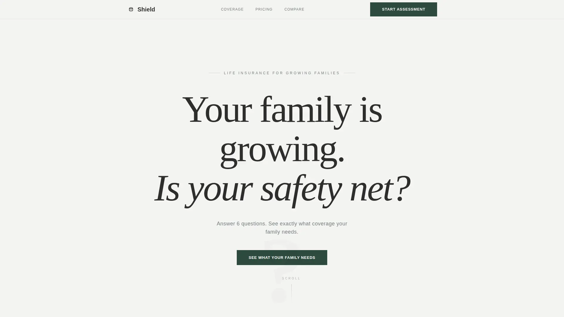
- A hero section with a giant centered serif headline and one forest-green call-to-action button, using white space as the primary design element instead of a hero image
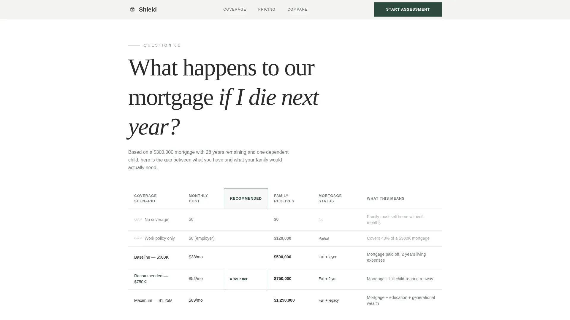
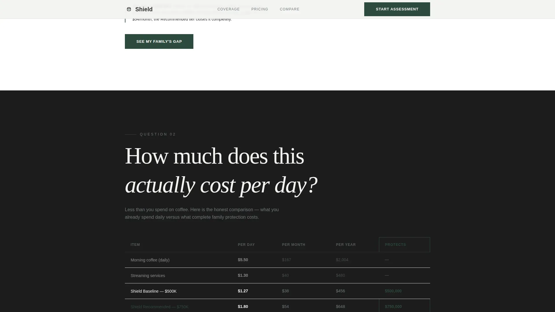
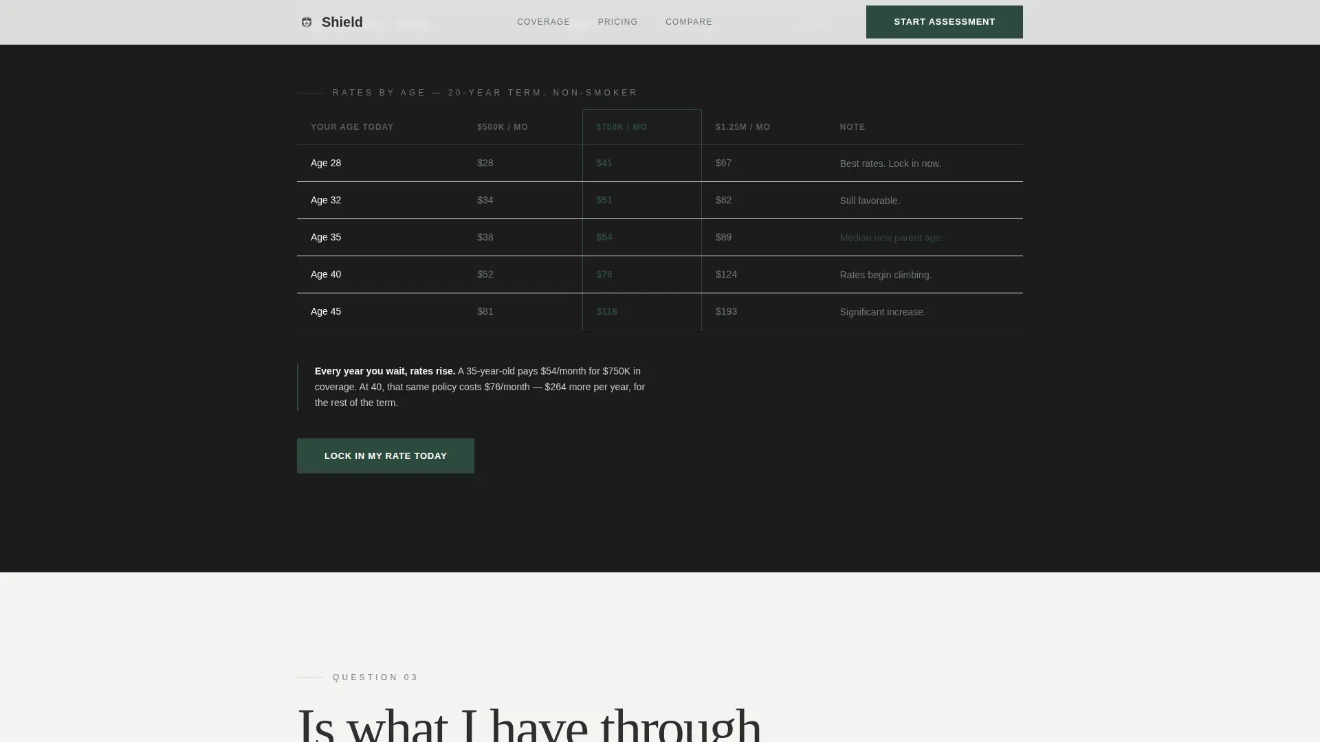
- Three frequently asked question-led sections, each pairing a parent-voiced question with a steel-bordered comparison table showing coverage gaps, daily cost reframes, and employer coverage shortfalls
- A six-step progressive quiz that collects dependents, income, mortgage balance, existing coverage, youngest child's age, and monthly spend comfort, then returns a personalized three-tier results table
Feature list
This insurance landing page template ships with purpose-built features. Every feature listed here comes directly from the template brief and serves a specific conversion role.
frequently asked question-Driven Comparison Table Sections
Three standalone page sections each open with a question a real parent has asked at night. "What happens to our mortgage if I die next year?" introduces a coverage gap table. "How much does this actually cost per day?" reframes premiums as a daily coffee price. "Is my work coverage enough?" exposes employer coverage gaps. Each table uses minimal gridlines with the recommended tier outlined in a thin forest-green border, guiding visitors without shouting.
Six-Step Progressive Quiz
The primary conversion tool is a quiz, not a form. Visitors move through one question per screen: number of dependents, household income range, outstanding mortgage balance, existing coverage, youngest child's age, and monthly spend comfort. A steel progress bar tracks each step. No email address is required until the personalized results are ready, which removes friction and keeps users moving forward.
Personalized Three-Tier Results Table
After completing the quiz, visitors see a results page with three coverage tiers: Baseline, Recommended, and Maximum. The table is specific to each user's inputs. A secondary call to action, "Talk to an Advisor," supports visitors who want human confirmation before they sign. This design answers objections at the moment they arise.
Monochrome Steel Design System
The page uses boardroom charcoal (#2D2D2D), brushed steel (#71797E), and cool white linen (#F4F4F2) as its core palette. Deep forest green (#2E4A3E) appears only on call-to-action buttons and positive indicators. This creates a clean layout that communicates authority. Backgrounds alternate between linen and charcoal, making each section feel distinct without requiring extra visual elements.
Giant Headline Hero Section
The hero section uses no photography and no illustration. The first impression is typography only: a high-contrast Fraunces serif headline at a scale that makes the punctuation feel deliberate. Beneath it sits a brushed-steel subline and one green button. The white space is the design. This approach gives visitors a strong, focused first impression and communicates clear messaging instantly.
Linear Single-Row Footer
A Pattern 1 linear footer keeps the page clean and closes without distraction. It supports the template's single-focus philosophy: every element on this landing page works toward one conversion goal.
Page sections overview
| Section | Purpose |
|---|---|
| Hero Headline | Sets tone and invites quiz entry |
| Mortgage frequently asked question Table | Shows coverage gap by policy level |
| Daily Cost Table | Reframes premium as daily savings |
| Work Coverage frequently asked question | Exposes employer coverage shortfalls |
| Six-Step Quiz | Collects inputs and qualifies leads |
| Quiz Results Page | Delivers personalized coverage tiers |
| Footer Row | Closes page with minimal distraction |
Design & branding system
Shield follows an Executive Suite visual theme that feels like the inside of a private bank. The design communicates that serious coverage decisions are handled here, without resorting to stock imagery or decorative warmth. The clean layout uses white space deliberately, and the restricted color system keeps the page focused.
- Typography uses Fraunces for serif headlines and DM Sans for body text, pairing authority with readability
- Forest green (#2E4A3E) is reserved exclusively for call-to-action buttons and positive indicators, never used decoratively, giving those elements a compelling reason to stand out
- Backgrounds alternate between cool white linen and boardroom charcoal, with text in brushed steel on light backgrounds and linen on dark, maintaining contrast and clarity throughout
Mobile & speed optimization
This template is built mobile-first. The six-step quiz is the primary conversion path, and it must work cleanly on a phone. The page uses a one-question-per-screen layout that is easy to tap through without scrolling back, and the steel progress bar gives users a clear sense of how far they have come.
- Static sections use server components for fast initial load; the quiz uses client components to manage step transitions and state
- Scroll reveal animations and step transitions are set to a medium intensity, keeping the page lively without slowing it down on older devices
- The comparison tables and results page are fully responsive, stacking columns cleanly on small screens so coverage data remains easy to read
How this template helps you convert
Landing pages built around a single focused action consistently outperform pages that ask visitors to do several things at once. Shield is structured to guide visitors from curiosity to commitment through a logical, low-friction sequence. Companies using landing pages generate 55% more leads than those that do not, and this template is designed to capture that advantage.
- The frequently asked question scroll flow builds emotional resonance before making any ask. Visitors see their real scenarios reflected in the tables, which builds trust and keeps them reading rather than bouncing.
- The quiz earns the click by promising specificity. Visitors are not asked to "get a quote" but to "see the exact gap between what they have and what their family would need," which is a far more compelling reason to continue.
- Trust signals appear throughout: specific dollar amounts in scenario tables, a "Talk to an Advisor" secondary call to action on results, and transparent three-tier coverage breakdowns. Social proof and clarity together improve conversion rates by reducing the hesitation that costs most insurance landing pages their leads.
Other information about this template
This template sits in the Finance and Insurance category, under the Growing Family Insurance subcategory. It is a great example of how an insurance landing page can serve a highly specific target audience without sacrificing design quality. The template style is Comparison Table, and the creative direction is frequently asked question-driven, making it naturally suited for users who arrive with common questions and need answers before they sign up.
- The page is localized for the United States, using USD and MM/DD/YYYY date formatting, which keeps all coverage amounts and scenario numbers relevant to American families managing health, home, auto insurance, and life coverage simultaneously
- Businesses in related verticals, such as business insurance or travel insurance, can adapt the frequently asked question-section structure and quiz mechanic for their own insurance products, since the underlying layout is flexible enough to support different coverage categories
- The shield trusted growing family home insurance landing page template is built to support the insurance business goal of generating qualified leads at scale, with seo optimized content areas that make it straightforward for marketers to publish and adjust copy without rebuilding the layout
- The template supports testimonials blocks and trust signal placements, including space for industry awards, security certifications, and Better Business Bureau accreditation above the fold, consistent with best practices for insurance website design
- Insurance brokers and companies can explore the quiz and table sections independently, saving time by launching a polished landing page without building each component from scratch
Theme
Executive Suite
Creative direction
FAQ-Driven
Color system
Monochrome Steel
Style
Comparison Table
Direction
Quiz/Assessment
Page Sections
Faq-driven Comparison Table Layout
Six-step Progressive Quiz
Personalized Three-tier Results Table
Executive Suite Visual Design
Typography-only Hero Section
Mobile-first Quiz Interface
Related questions
Does this template work for other types of insurance besides life coverage?
Do visitors need to provide an email address to use the quiz?
How many sections does this landing page template include?
Can I adjust the coverage tiers shown in the results table?
What makes this template different from a standard insurance quote form?



