Security Guard & Protection Professional Website Template
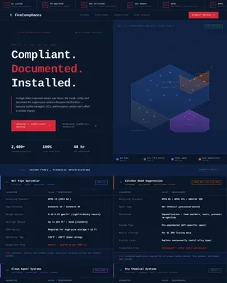
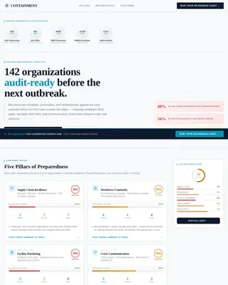
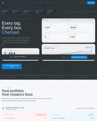
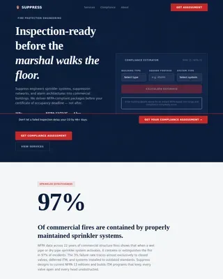
Shield is a single-column security guard landing page template built for commercial protection companies. It leads with live-styled performance counters, walks visitors through a Problem-to-Solution narrative arc, and closes with a qualifying lead-capture form. The dark navy and dispatch amber palette gives every section the authority of a real operations command center.
by Rocket studio
Quick summary
Shield is a single-column landing page template for security guard and protection companies. It opens with oversized performance metrics, builds a structured case against underperforming vendors, and converts visitors through a sticky comparison table and a qualifying multi-step form. The visual identity mirrors a dispatch command center: dark, sharp, and data-first.
Who this template is for
This template is built for security companies that serve high-stakes commercial clients. It speaks directly to prospects who have already felt the cost of unreliable protection.
- Property managers overseeing multi-building residential or commercial complexes
- Warehouse and logistics operations directors dealing with inventory shrinkage
- Event coordinators who need licensed, on-site security before a venue opens
What problem this template solves
Security buyers are skeptical. They have seen ghost shifts, late incident reports, and vendors who go dark after signing a contract. This template builds trust before a conversation ever starts.
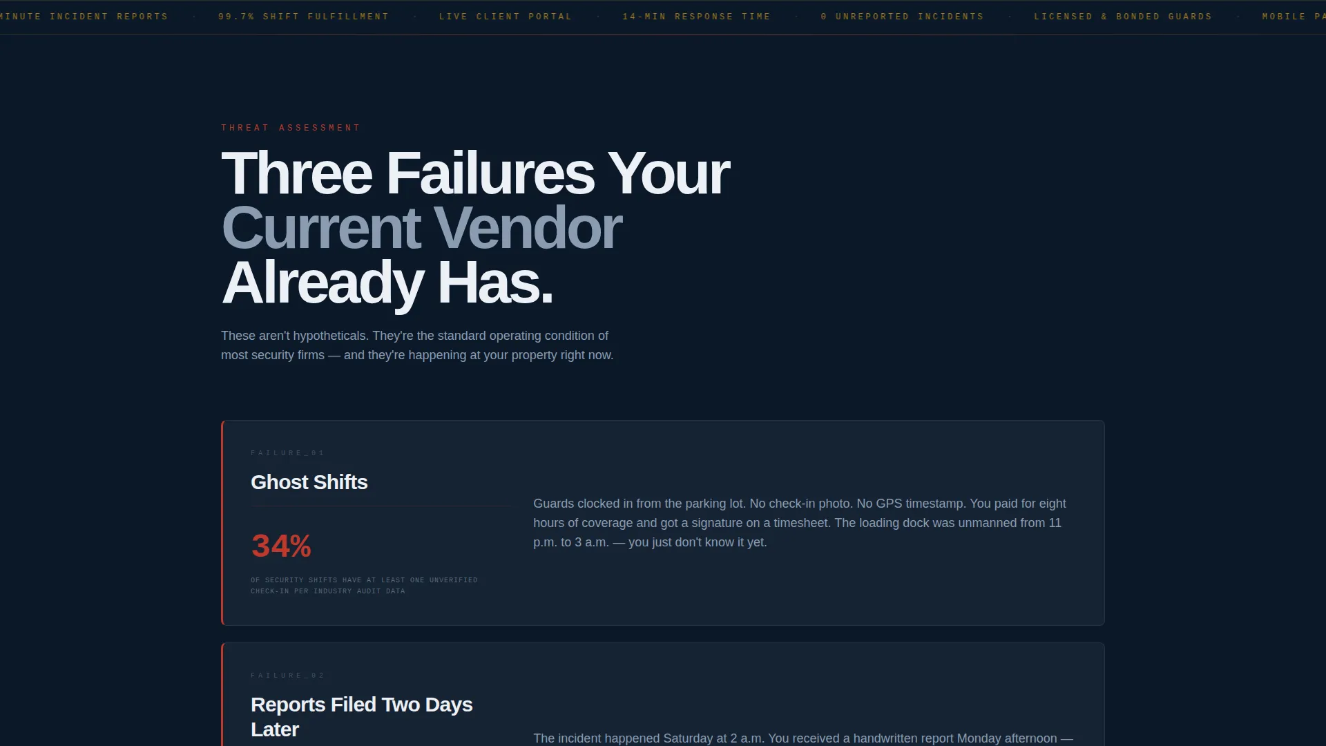
- It addresses the three most common vendor failures: no-show guards, delayed reporting, and zero accountability
- It replaces vague promises with proof points, using live-styled stats and a side-by-side comparison table
- It qualifies the lead through a structured form before any sales call happens
What you get with this template
The template delivers a complete, scroll-driven single-column landing page. Every section is purposeful and sequenced to move a skeptical buyer toward requesting an audit.
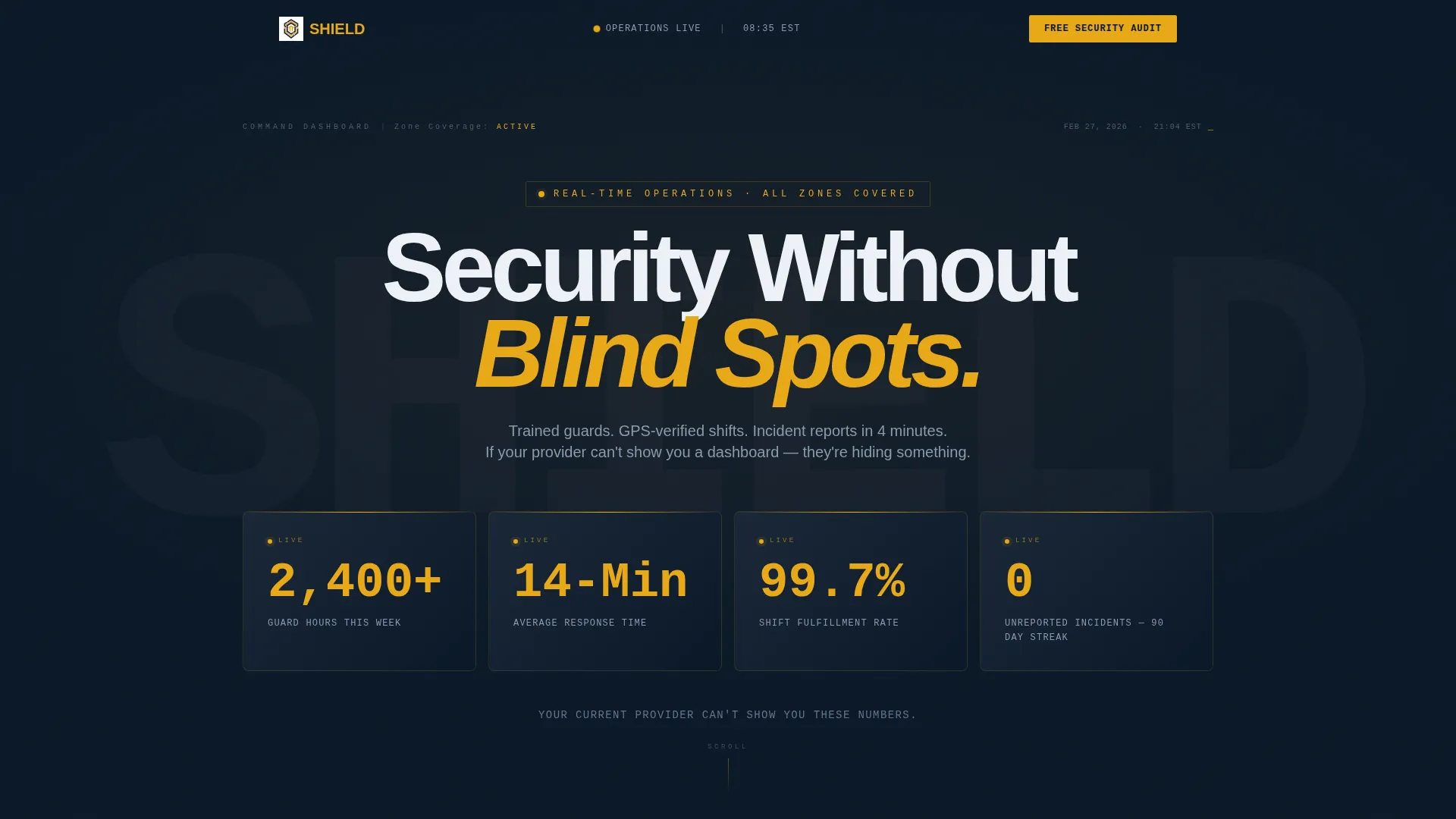
- A full-width hero stats bar with four dispatch amber performance counters in monospaced terminal typography
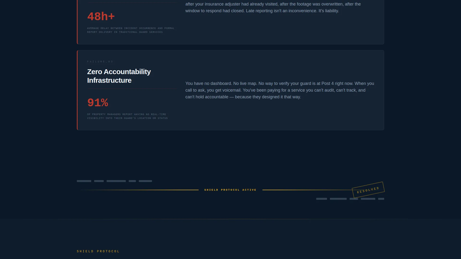
- A Problem-to-Solution narrative arc with a hard amber divider separating the two halves of the page
- A sticky side-by-side comparison table, a repeating primary call-to-action, and a multi-field qualifying intake form
Feature list
This section covers the core built-in components and design decisions that make Shield work as a conversion-focused security landing page.
Live-Styled Performance Counter Header
The header displays four oversized metrics in dispatch amber on a command-center navy field. Numbers are set in a monospaced font that reads like terminal output, with a single white subline challenging the visitor's current vendor. No photography. The data carries the authority.
Problem-to-Solution Narrative Arc
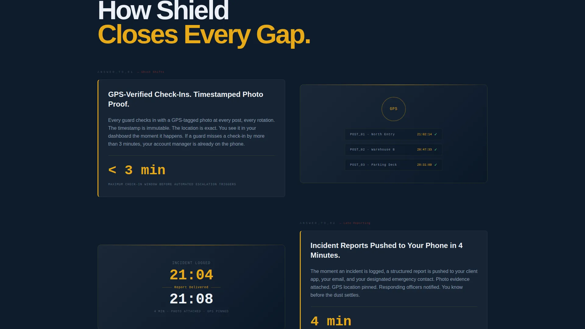
The first half of the page presents three familiar vendor failures: ghost shifts, 48-hour delayed incident reports, and no accountability dashboard. Each failure pairs with a red-amber industry-average stat. An amber horizontal rule cuts across the page like a redacted document line. Below it, every problem is answered with Shield's specific solution, including GPS-verified check-ins, four-minute push notifications, and a live portal screenshot.
Sticky Comparison Table
A side-by-side table locks to the viewport as the visitor scrolls through the mid-section. It contrasts a generic current provider against Shield across eight defined metrics. Amber checkmarks accumulate on the Shield column, making the gap visible without requiring the visitor to read every row.
Qualifying Lead Capture Form
The intake form opens with a property-type dropdown: commercial, residential, industrial, or event. It then collects square footage range, current weekly guard hours, name, and phone number. This sequence makes the visitor quantify their own security gap before speaking to anyone on the sales team.
Repeating Primary Call-to-Action
The call-to-action button labeled "Get Your Free Security Audit" appears at least twice: once after the comparison table and once in the page footer. Consistent placement in dispatch amber keeps the next step visible throughout the scroll.
Data Command Visual System
The entire template uses a four-color palette built for a darkened operations-room aesthetic. Amber is reserved exclusively for calls-to-action, live stats, and warning indicators. No decorative use of accent color dilutes its signal value anywhere on the page.
Page sections overview
| Section | Purpose |
|---|---|
| Stats Counter Header | Opens with four live-styled performance metrics to establish immediate authority |
| Problem Expose Block | Presents three common vendor failures with supporting industry-average stats |
| Amber Divider Break | Hard horizontal rule separates problem and solution halves of the page |
| Solution Answer Block | Mirrors each problem with a specific Shield capability and proof element |
| Comparison Table | Sticky side-by-side table across eight metrics with amber checkmark scoring |
| Primary call to action Repeat | Repeats the audit call-to-action after the comparison section |
| Qualifying Intake Form | Multi-field form that segments and qualifies the lead before sales contact |
| Footer call to action Block | Closes the page with a final call-to-action and supporting trust signals |
Design & branding system
The palette is built around a four-color Data Command system. Every color has a defined role, and none are interchangeable.
- Command-center navy (#0B1929) and tactical charcoal (#1C2A3A) form the dark background layers
- Alert-status white (#EDF0F5) handles all body copy and supporting text
- Dispatch amber (#E8A817) is used exclusively for calls-to-action, live performance stats, and warning-level indicators
Mobile & speed optimization
The single-column layout is inherently suited to mobile viewports. The scroll-driven narrative structure adapts cleanly without rearranging content logic.
- The stats header and comparison table are designed for narrow-screen readability with no horizontal scroll
- The qualifying form uses a stacked field order that works naturally on touchscreens
How this template helps you convert
Shield is built around a conversion sequence, not just an attractive layout. Every design decision serves the goal of moving a skeptical property or operations manager toward booking a security audit.
- The performance counter header creates immediate credibility before the visitor reads a single word of marketing copy, replacing stock imagery with real operational data
- The Problem-to-Solution arc keeps the visitor engaged by validating their frustrations first, then answering each one with a specific Shield capability and a visible proof element
- The qualifying form collects property type, square footage, and current guard hours before asking for contact details, so every inbound lead arrives pre-segmented and sales-ready
Other information about this template
Shield fits within the commercial security service niche and is designed for companies operating at a scale where a single unguarded breach carries significant financial exposure. The template style is a single-column flow, and the layout direction is click-through, moving the visitor from awareness to audit request in one continuous scroll.
- The template theme follows a Corporate Precision approach, keeping every visual element purposeful and removing decorative noise that would undercut the command-center authority
- The creative direction applies a Transparent Process framework, showing real operational metrics and specific capability claims rather than generic service descriptions
- The header concept centers on data and metrics rather than a logo bar, which fits the brief's instruction to lead with numbers as the primary trust signal
Theme
Corporate Precision
Creative direction
Transparent Process
Color system
Monochrome Steel
Style
Single Column Flow
Direction
Click-Through
Page Sections
Live-styled Performance Counter Header
Problem-to-solution Narrative Arc
Sticky Comparison Table
Qualifying Multi-step Lead Form
Repeating Call-to-action Placement
Data Command Color System
Related questions
What kind of security company is this template designed for?
Can I update the performance stats to match my company's real numbers?
How does the sticky comparison table work?
Can I customize the lead form fields and dropdown options?
Do I need design experience to customize this template?