Osteoporosis Care Reviews Website Template
Fortify is a split-screen landing page template built for clinical osteoporosis exercise programs. It opens with a real-data testimonial card, guides visitors through a three-phase progressive exercise breakdown, and funnels them into a seven-question bone health risk assessment. The result is a credibility-first page designed to convert a post-DEXA-scan audience into enrolled participants.
by Rocket studio
Quick summary
Fortify is a precision-designed landing page template for clinical bone health programs. It pairs a T-score testimonial card with a progressive phase guide and a seven-question assessment funnel. Every section is structured to earn trust fast, educate the visitor, and move them toward a personalized starting point in the program.
Who this template is for
This template is built for practitioners and program creators serving a specific, high-stakes audience. It works equally well for clinical operators and independent specialists who need a credible, structured page.
- Women in their late fifties and sixties who received a concerning dual-energy X-ray absorptiometry (DEXA) scan result and are looking for a clear, safe next step
- Adult daughters or family members researching bone health exercise programs on behalf of a loved one
- Physiotherapists who want a structured home exercise program they can prescribe between clinic appointments
What problem this template solves
After a difficult DEXA scan result, most people search for guidance and find only generic fitness content or medical-only information with no practical path forward. This template bridges that gap. It presents a clinical exercise program as trustworthy, personalized, and immediately actionable.
- Visitors arrive scared and sceptical; the testimonial header with real T-score data addresses that doubt within seconds
- There is no clear entry point on most exercise pages; the seven-question assessment funnel gives every visitor a personalized starting phase
- Generic fitness pages fail physiotherapists looking for a prescribable home protocol; this template speaks their clinical language throughout
What you get with this template
You get a complete, single-page layout built around one conversion goal: getting the right visitor into the right phase of a bone health program. The structure is purposeful and every section earns its place.
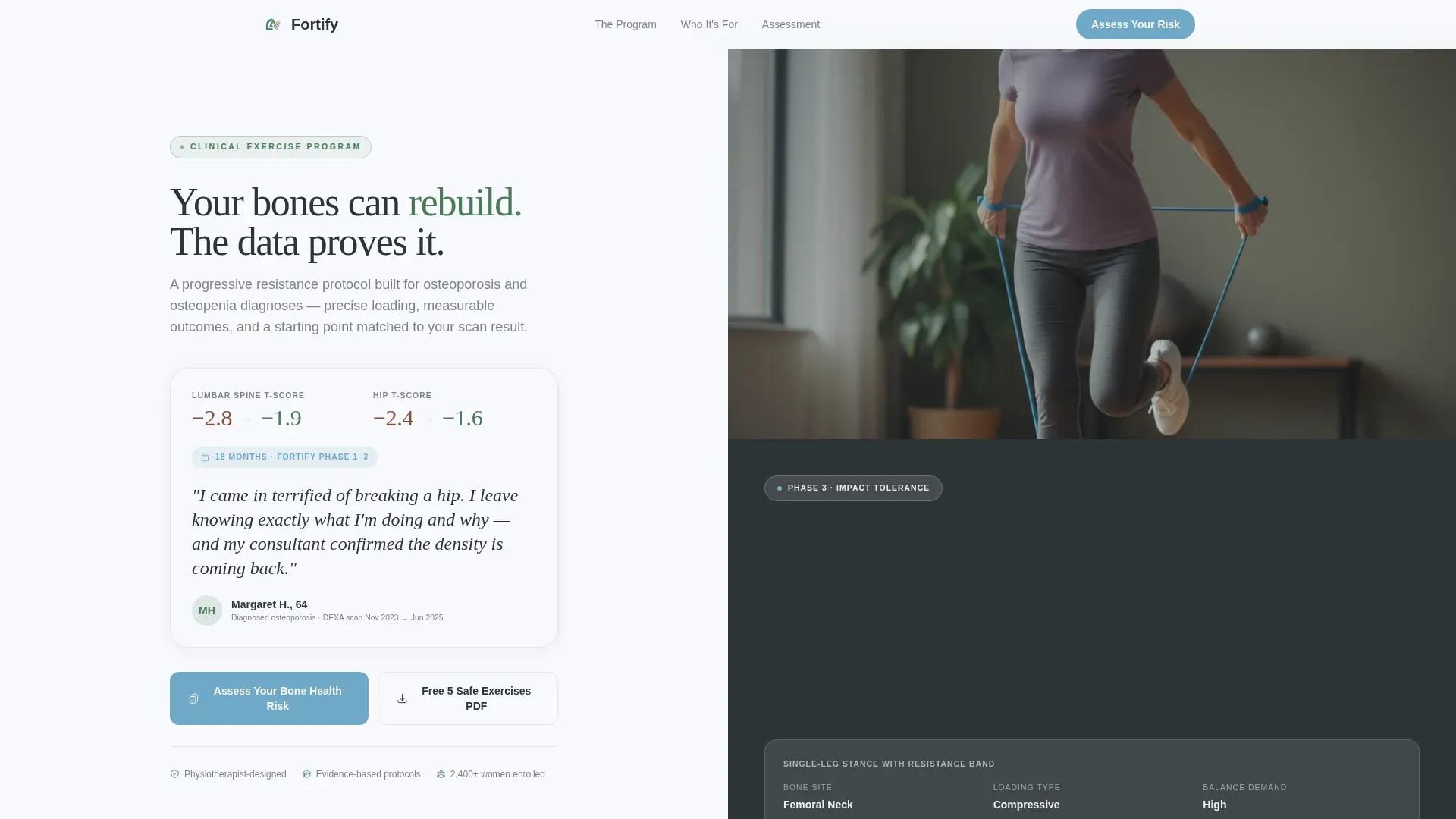
- A 50/50 split-screen hero featuring an oversized testimonial card with named patient data alongside a candid mid-exercise photograph
- A three-phase progressive exercise guide with clinical reasoning, bone-site targeting detail, and looping video placeholders per phase
- A seven-question bone health risk assessment with a mineral blue progress bar, a personalized risk tier output, and an email capture on the final screen
Feature list
A brief paragraph introduces the features below. Each component in this template was chosen to address a specific trust or conversion need for a clinical bone health audience.
Split-Screen Testimonial Hero
The header divides the screen evenly between a named patient testimonial card and a candid exercise photograph. The testimonial card displays the patient's age, diagnosis date, and before-and-after T-scores in large serif type. This specificity makes the section stop-scroll rather than scroll-past.
Three-Phase Progressive Exercise Guide
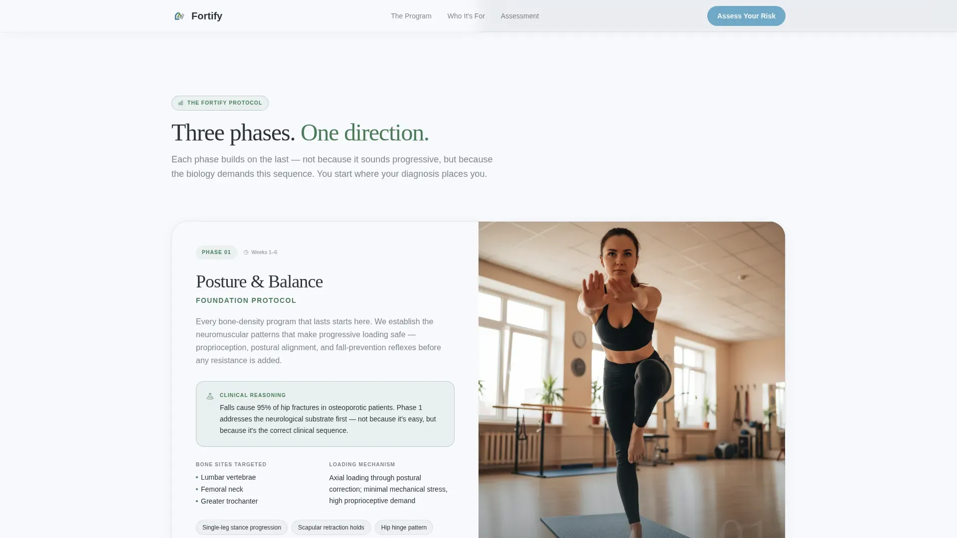
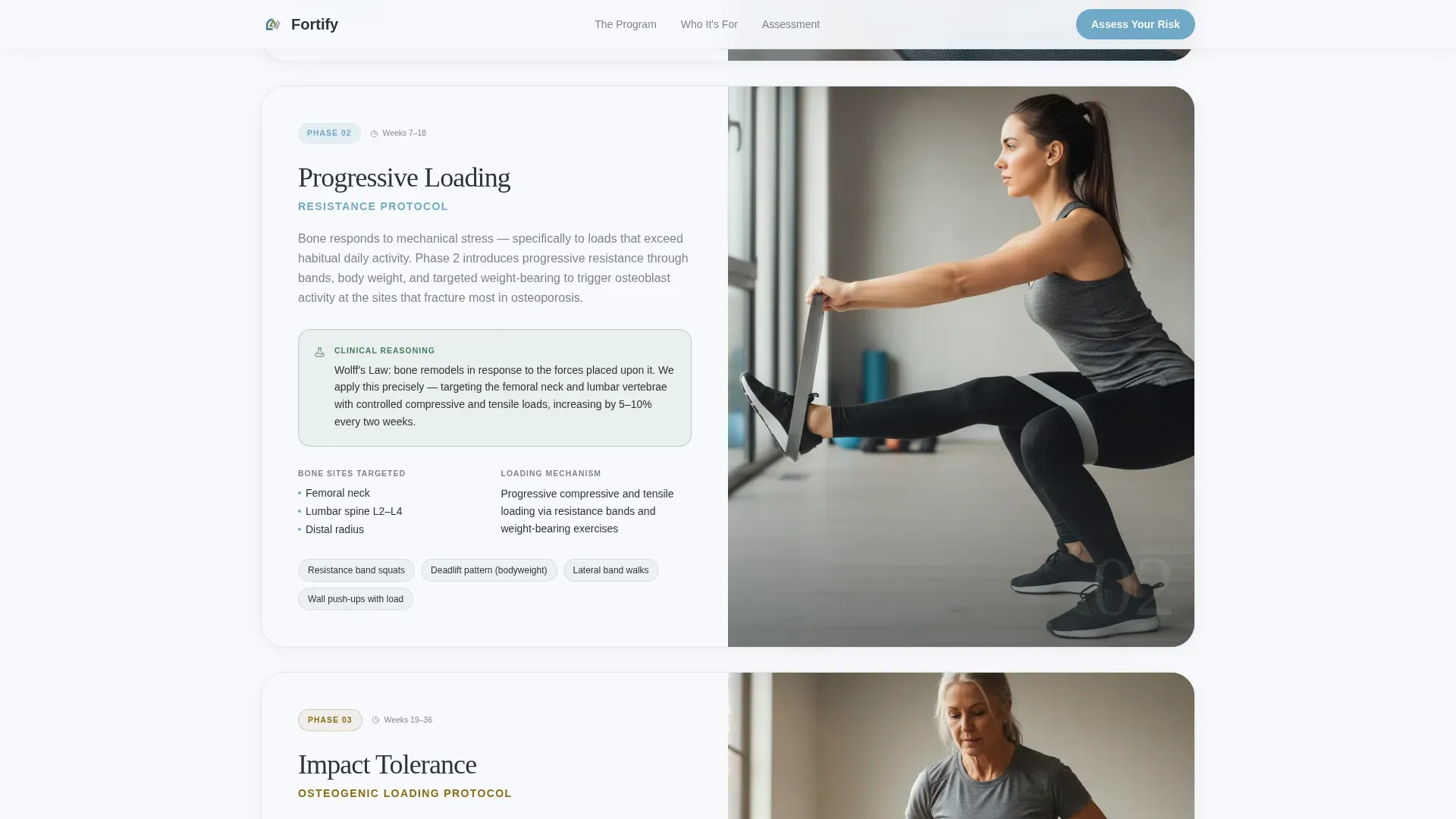
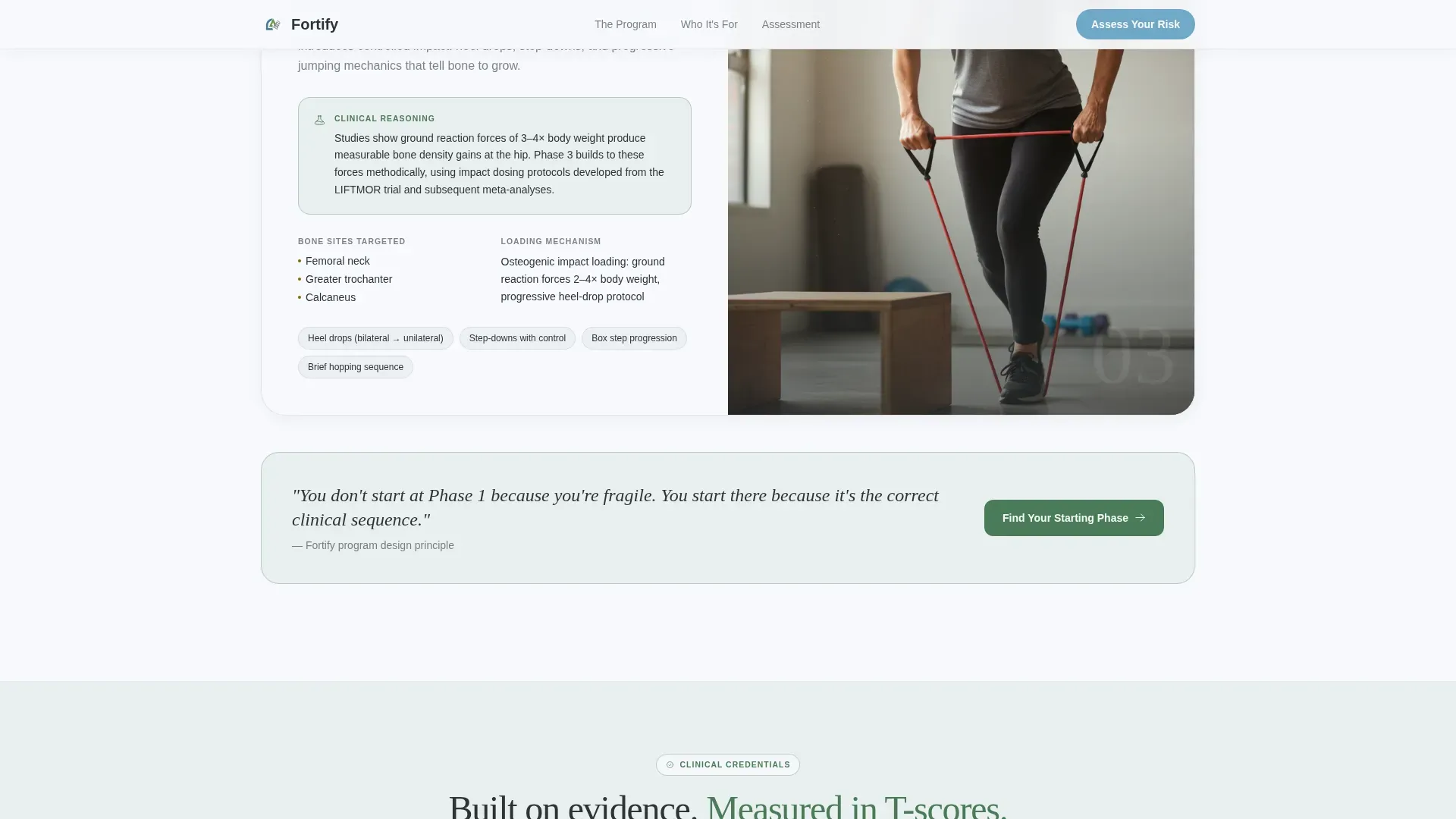
Each scroll section pairs a numbered phase card on the left with a looping video demonstration placeholder on the right. Phases move from posture and balance through progressive loading to impact tolerance. Each card includes the clinical reasoning behind the exercises, including which bone sites are targeted and what the loading mechanism is.
Seven-Question Assessment Funnel
The primary call to action opens a structured quiz. Each question appears on its own screen with a mineral blue progress bar tracking progress across the top. The funnel moves from low-pressure questions to deeper clinical detail, ending with a personalized Low, Moderate, or High risk tier and a recommended starting phase.
Secondary PDF Lead Capture
A secondary conversion path lets visitors download a free five safe exercises guide without completing the full quiz. This captures leads who are building trust but are not yet ready for full commitment, keeping them inside the program ecosystem.
Credibility Strip Section
A dedicated section presents clinical credentials, physiotherapist endorsements, and key program statistics. This section validates the program for both the primary consumer audience and referring physiotherapists evaluating it as a prescribable protocol.
Page sections overview
| Section | Purpose |
|---|---|
| Split-screen hero | Opens with named T-score testimonial and candid exercise photo |
| Phase one card | Introduces posture and balance training with clinical reasoning |
| Phase two card | Covers progressive resistance loading and targeted bone sites |
| Phase three card | Presents impact tolerance training as the capability escalation point |
| Assessment funnel | Seven-question bone health risk quiz with personalized tier output |
| Credibility strip | Displays credentials, physiotherapist endorsements, and key statistics |
| PDF lead capture | Secondary call to action for free five safe exercises download |
| Footer | Single-row linear footer with program navigation links |
Design & branding system
The visual identity follows a Corporate Precision theme built on an Alpine Fresh color system. The overall feel references a Swiss rehabilitation clinic at elevation: precise, clean, and quietly authoritative.
- Colors: glacier white (#F7F9FC) for backgrounds, granite charcoal (#2D3436) for body text, alpine pine (#4A7C59) for completed steps and positive indicators, and mineral blue (#6FA8C7) reserved for interactive elements and progress bars
- Typography: DM Sans handles all body text for clarity and clinical readability, while Fraunces serif appears in pull quotes and phase headings to add warmth and human weight
- Backgrounds alternate between glacier white and a faint pine wash at 8% opacity to create section rhythm without visual noise
Mobile & speed optimization
The template is designed desktop-first to match the careful, research-led behavior of its primary audience. Full mobile support is included so the page performs across all devices.
- The seven-question assessment funnel includes a persistent bottom bar call-to-action on mobile so the primary conversion path is always visible
- GSAP ScrollTrigger animations handle section reveals, progress bar fills, and quiz screen transitions with medium intensity to keep motion purposeful rather than distracting
How this template helps you convert
The conversion architecture of this template is built around reducing fear and increasing personalization at each stage of the page.
- The T-score testimonial card in the header converts initial scepticism into curiosity by presenting real clinical outcomes rather than vague promises, giving the visitor an immediate reason to keep reading
- The three-phase exercise breakdown escalates capability on screen, so the visitor sees exactly where they will end up and feels confidence that the program was designed for their specific diagnosis
- The assessment funnel delivers a personalized risk tier and recommended starting phase, making the call to action feel like a clinical recommendation rather than a sales prompt
Other information about this template
This template is specifically built for the osteoporosis care space and reflects the clinical language, audience psychology, and conversion mechanics that space requires. A few additional details are worth noting before you build.
- The template uses metric bone density units and neutral clinical English suitable for United Kingdom, Australian, and United States audiences
- Animation intensity is set to medium using GSAP ScrollTrigger for section reveals and quiz transitions; the quiz component uses client-side interactivity with state management and a slider input
- The footer follows a linear single-row pattern to keep the page exit clean and non-distracting
- The assessment funnel is designed to open with the least intimidating question first to reduce drop-off at the quiz entry point
Theme
Corporate Precision
Creative direction
Step-by-Step Guide
Color system
Alpine Fresh
Style
Split Screen (50/50)
Direction
Quiz/Assessment
Page Sections
Split-screen Testimonial Hero
Three-phase Progressive Exercise Guide
Seven-question Assessment Funnel
Secondary PDF Lead Capture
Credibility Strip Section
Related questions
Who is the primary audience this template is designed for?
Can a physiotherapist use this template to present a home exercise program?
What does the seven-question assessment funnel deliver to the visitor?
Is there a lower-commitment path for visitors not ready to complete the full quiz?
What typography and color system does this template use?



