Osteoporosis Care Education Website Template
Fortify is a single-page osteoporosis patient education landing page built for digital health platforms. It translates DXA scan results, T-scores, and FRAX percentages into plain language through an interactive zigzag audit flow. Visitors check off bone health factors section by section, watch a live risk tally build, and arrive at a primary call to action feeling informed rather than overwhelmed.
by Rocket studio
Quick summary
Fortify is a focused osteoporosis education landing page that turns clinical bone density numbers into language real patients understand. Using an alternating checklist-and-explanation layout, a persistent sidebar risk tally, and institutional credibility anchors, it guides recently diagnosed patients and their families from confusion to confident next steps in a single scroll.
Who this template is for
This template is built for digital health educators and patient empowerment platforms serving people navigating a new osteoporosis or osteopenia diagnosis. It suits practitioners who want to give patients a structured starting point before a specialist appointment.
- Women over fifty holding a radiology report full of unexplained T-scores and FRAX percentages
- Adult children researching a parent's bone density diagnosis late at night on a phone
- Post-fracture orthopedic patients who were told their injury should not have happened
What problem this template solves
Most patients leave a bone density scan with a printed report and no explanation. The clinical numbers, T-scores, DXA scan values, FRAX risk percentages, feel opaque and alarming without context. This template bridges that gap by turning each key bone health factor into an interactive, plain-language audit.
- Patients do not know what their numbers mean or what action to take next
- Midnight researchers need something immediate and tangible, not a call-back form
- One-size information pages create anxiety without offering a personal picture of risk
What you get with this template
You get a fully structured, single-page landing page with a strong typographic hero, four alternating audit sections, and a conversion architecture built around two calls to action. Every section is built for an audience that needs trust before it will click anything.
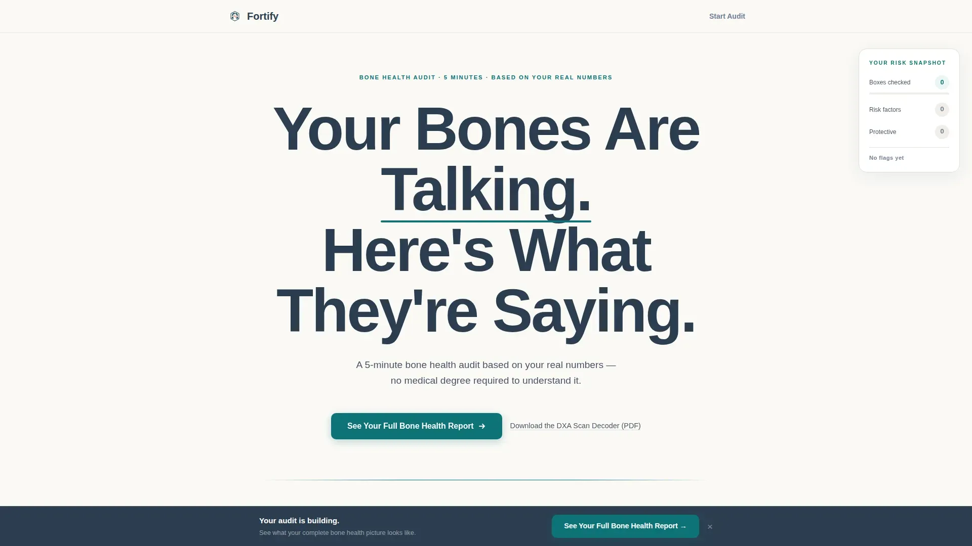
- A hero section with viewport-scale headline typography and a heartbeat-pulse teal underline animation
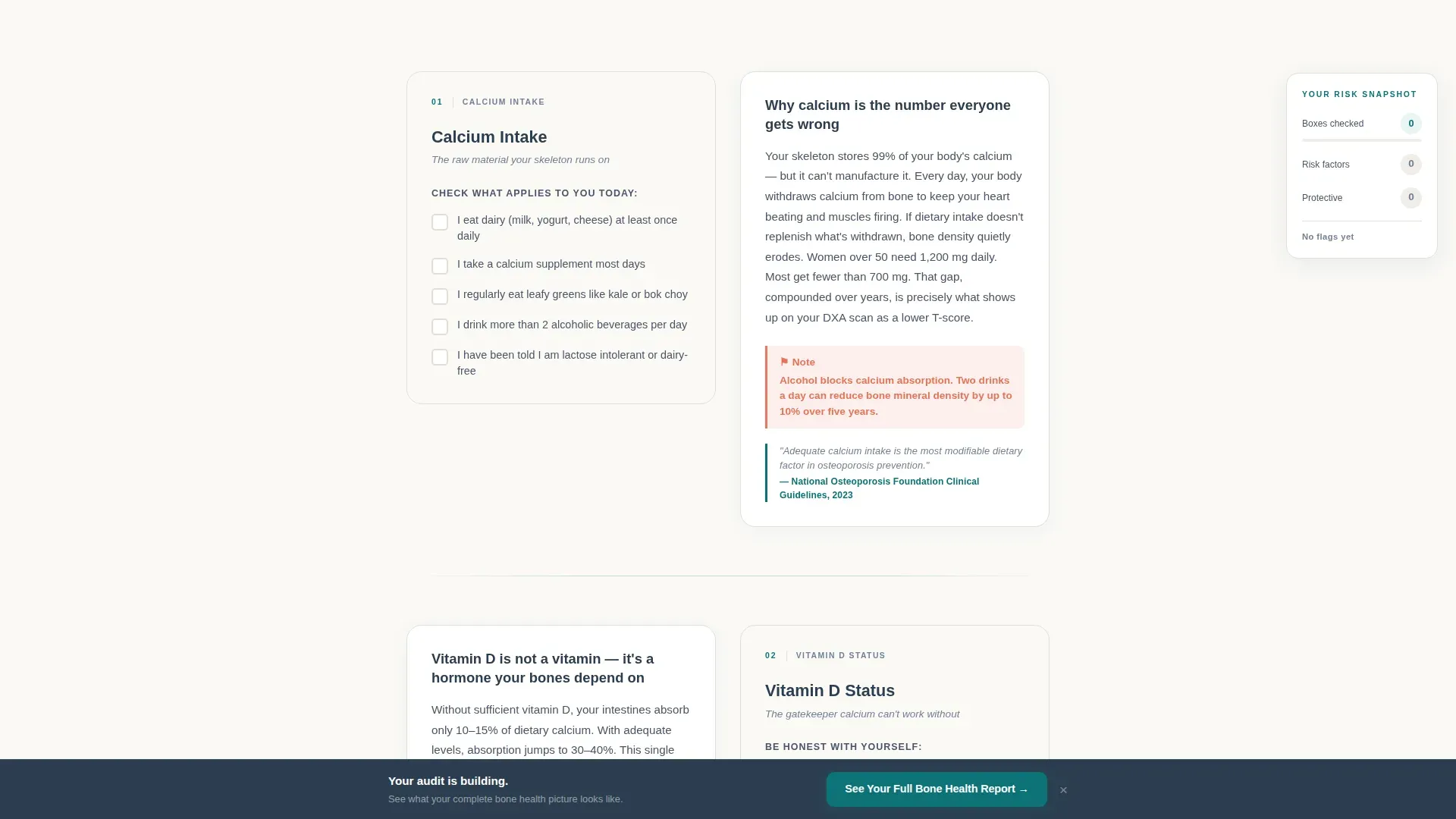
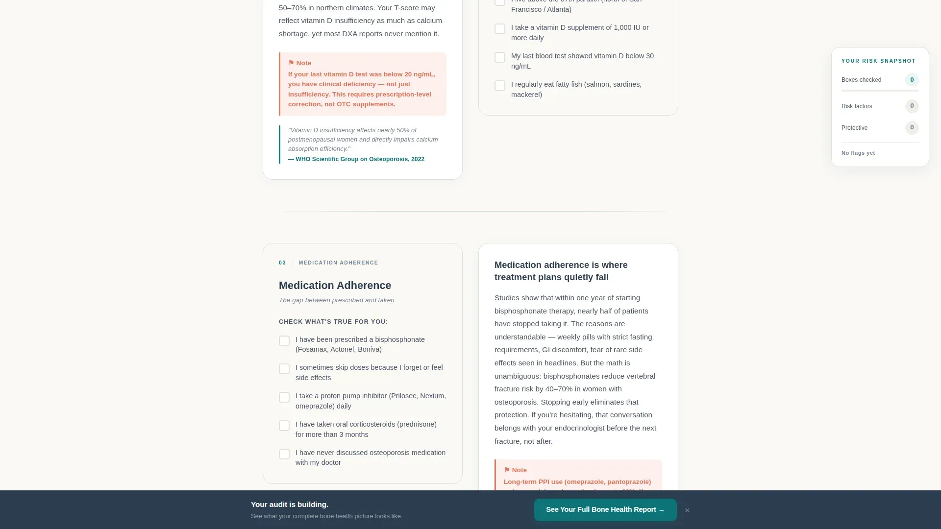
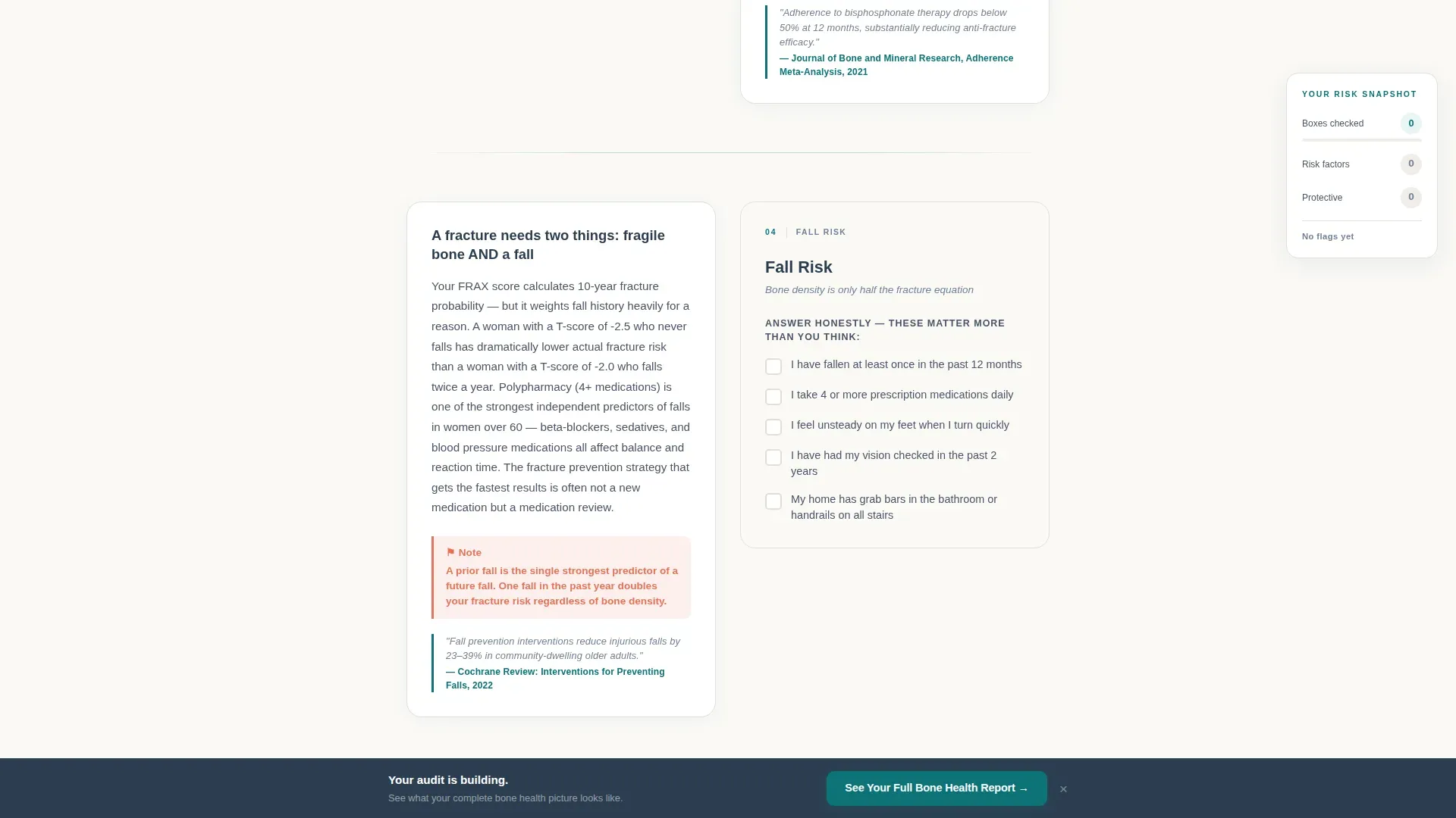
- Four zigzag audit sections covering calcium intake, vitamin D levels, medication adherence, and fall risk plus exercise frequency
- A persistent sidebar risk tally, a primary teal call to action button, a fixed bottom call to action bar, and a secondary PDF download link
Feature list
This landing page template is purpose-built for the osteoporosis patient education niche. Below are the core built-in features drawn directly from the template design brief.
Zigzag Checklist and Explanation Layout
Each audit section alternates between a yes/no micro-checklist panel and a plain-language explanation panel. This left-right rhythm keeps visitors actively participating rather than passively reading, and it mirrors the admit-then-learn cadence that builds genuine self-awareness section by section.
Live Persistent Risk Tally Sidebar
A sticky sidebar follows the visitor down the page, updating in real time as they check boxes. By the time they reach the bottom, they have a personal snapshot of their bone health picture, making the primary call to action feel like the obvious next step rather than a sales push.
Heartbeat Pulse Hero Animation
The hero section features a single-word teal underline that pulses once on load, referencing a heartbeat monitor in a clinical context. Combined with a viewport-dominating DM Sans headline, the effect establishes authority and emotional resonance without relying on photography.
Dual Call to Action Architecture
The primary call to action, "See Your Full Bone Health Report," appears beneath the hero and again as a fixed bottom bar that activates after the third section. A secondary text link offers a downloadable DXA scan decoder for visitors who are not yet ready to proceed, capturing intent at both commitment levels.
WHO and NOF Clinical Credibility Anchors
Each audit section closes with a single-sentence clinical insight sourced from World Health Organization or National Osteoporosis Foundation guidelines. These anchors lend the audit institutional weight and reassure patients that the information comes from recognized medical standards, not general wellness advice.
FAQ Accordion Component
An interactive accordion-style FAQ component allows visitors to expand answers to common questions at their own pace. It keeps the page visually clean while providing deeper context for patients who want more before committing to the full assessment.
Page sections overview
| Section | Purpose |
|---|---|
| Hero with Headline | Establish authority and present the primary call to action |
| Audit Section One | Calcium intake checklist with plain-language explanation |
| Audit Section Two | Vitamin D levels explanation with interactive checklist |
| Audit Section Three | Medication adherence checklist with plain-language explanation |
| Audit Section Four | Fall risk and exercise explanation with interactive checklist |
| Footer | Single-row linear footer with supporting links |
Design & branding system
The visual identity follows a Corporate Precision theme. The palette is described in the brief as feeling like a freshly printed lab report, sterile enough to trust and warm enough not to alarm. Every color has a specific functional role.
- Deep teal (#0D7377) for all buttons, section dividers, and the primary underline accent; bone-white (#FAF9F6) for open background breathing room; and charcoal slate (#2C3E50) for body text
- Warm catalyst coral (#E8735A) reserved exclusively for risk indicators and urgent callouts, appearing sparingly the way a flagged lab result demands attention
- DM Sans typeface used at a heavy weight for the hero headline and at readable body weight throughout, giving the page a clinical and authoritative typographic voice
Mobile & speed optimization
The template is designed desktop-first but built with strong mobile support in mind. Midnight researchers on phones are explicitly part of the target audience, so the layout adapts without losing audit usability on smaller screens.
- Scroll-reveal animations, checklist interactions, and the sticky sidebar tally are handled through client-side components, while static content sections use server-rendered components for fast initial load
- The fixed bottom call to action bar is especially effective on mobile, keeping the primary prompt visible without interrupting the audit flow
How this template helps you convert
Fortify earns its clicks by making each visitor realize, section by section, that they have unanswered questions about their own bone health. Specificity replaces fear, and each audit answer makes the full report feel necessary rather than optional.
- The live risk tally creates a personal stake in the outcome. Visitors are not reading about osteoporosis in general; they are building their own picture, which makes the call to action feel like completing something they already started.
- The dual call to action structure captures two distinct mindsets. Visitors ready to proceed click the primary teal button. Visitors who want something tangible first download the DXA scan decoder PDF, entering the funnel at a lower commitment level.
Other information about this template
Fortify is part of a template collection designed for health and medical education platforms. Additional context about the template's scope and compatibility is listed below.
- The template is built for English-language audiences using United States date formats and USD currency references where applicable
- Animation intensity is set to medium: the heartbeat pulse runs once on load, scroll reveals activate as sections enter the viewport, and checklist interactions respond to user input without overwhelming the clinical tone
- The single-row linear footer (Pattern 1) keeps navigation minimal, directing attention back to the primary call to action rather than away from the page
- The page is intentionally free of stock photography; typography and white space carry the visual authority, which aligns with the Corporate Precision design theme
Theme
Corporate Precision
Creative direction
Checklist & Audit
Color system
Teal Catalyst
Style
Zigzag/Alternating
Direction
Click-Through
Page Sections
Zigzag Checklist and Explanation Layout
Live Persistent Risk Tally Sidebar
Heartbeat Pulse Hero Animation
Dual Call to Action Architecture
WHO and NOF Credibility Anchors
FAQ Accordion Component
Related questions
Who is the primary audience for this template?
What interactive components does the template include?
Can I use this template without a clinical team on staff?
Does the template include a PDF download component?
What is the layout style of this template?



