Precision Risk Insurance Landing Page Template
Shield is a single-page life insurance landing page template built for single-parent households. It uses a dark command-center aesthetic, interactive comparison data grids, and a three-step progressive quote form to turn financial anxiety into a concrete coverage decision. The design is desktop-first with full mobile responsiveness, built around one clear goal: locking in a rate.
by Rocket studio
Quick summary
Shield is a high-intensity, data-driven life insurance landing page template designed specifically for single-parent households. It combines a dark full-bleed visual system, three interactive comparison grids, and a progressive three-step quote form to move anxious visitors toward a concrete coverage commitment. Every section earns attention with real numbers, not stock photography.
Who this template is for
This template is built for life insurance providers and financial protection brands that serve single-parent families. It speaks directly to the financial reality of households running on one income with dependents at home.
- Single-parent life insurance providers targeting divorced mothers, widowed fathers, and grandparent guardians
- Financial advisors or independent brokers who generate leads for term life coverage plans
- Insurance brands that want to replace brochure-style pages with a data-led, conversion-focused landing page
What problem this template solves
Most life insurance landing pages rely on warm photography and vague reassurance. That approach fails single parents, who arrive with specific fears and real dollar amounts in mind. Shield replaces sentiment with specificity.
- Single parents cannot afford decision paralysis. The template turns financial anxiety into arithmetic by showing real coverage gap figures, premium estimates, and side-by-side comparisons.
- Generic insurance pages do not reflect the unique pressure of a one-income household. Shield addresses mortgage payoff, childcare continuity, and college fund preservation in plain data form.
- Lead capture often asks for too much too soon. The progressive form structure reduces friction by earning trust before requesting personal information.
What you get with this template
Shield delivers a fully structured single-page layout with five distinct content sections, a dark corporate visual system, and multiple interactive components ready for implementation.
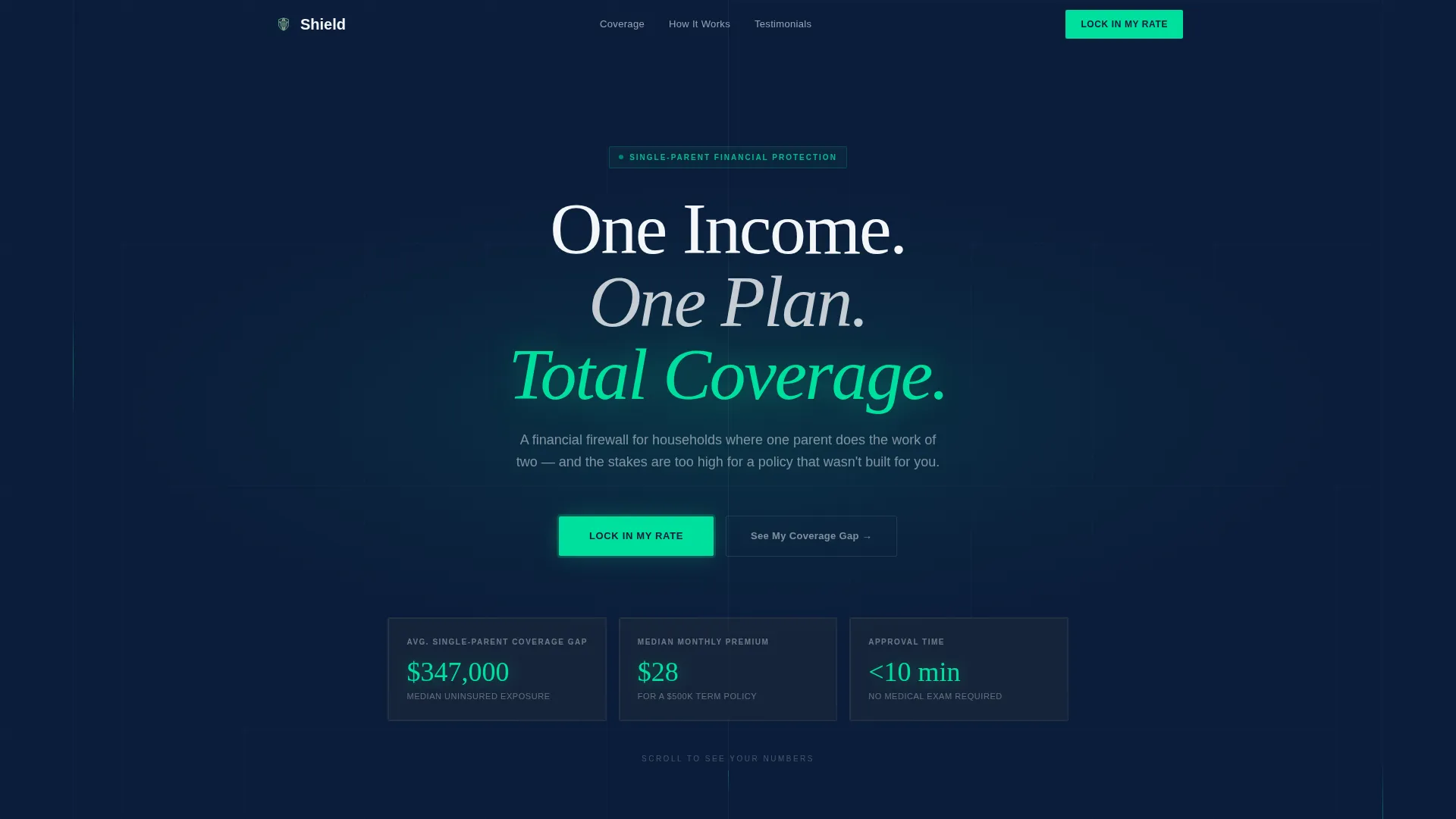
- A hero section with a radial glow animation, three live data tiles, and a headline built for immediate emotional relevance
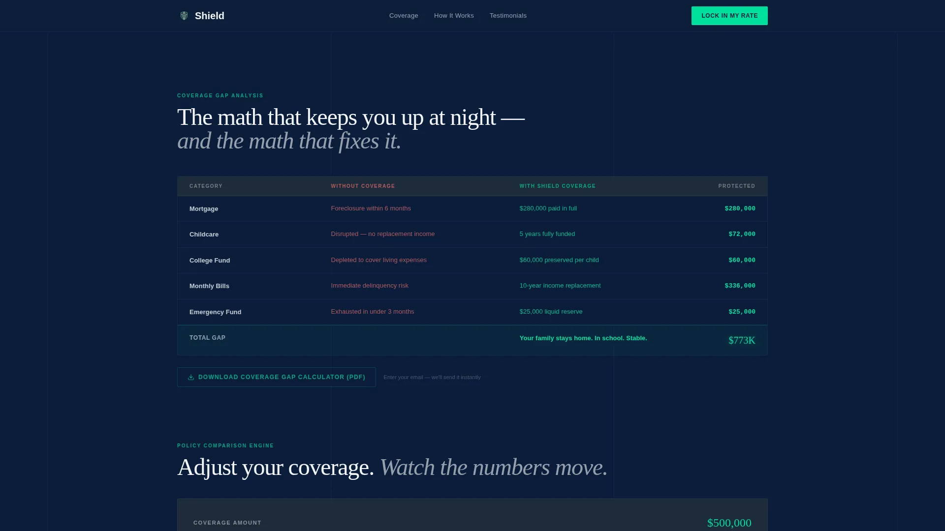
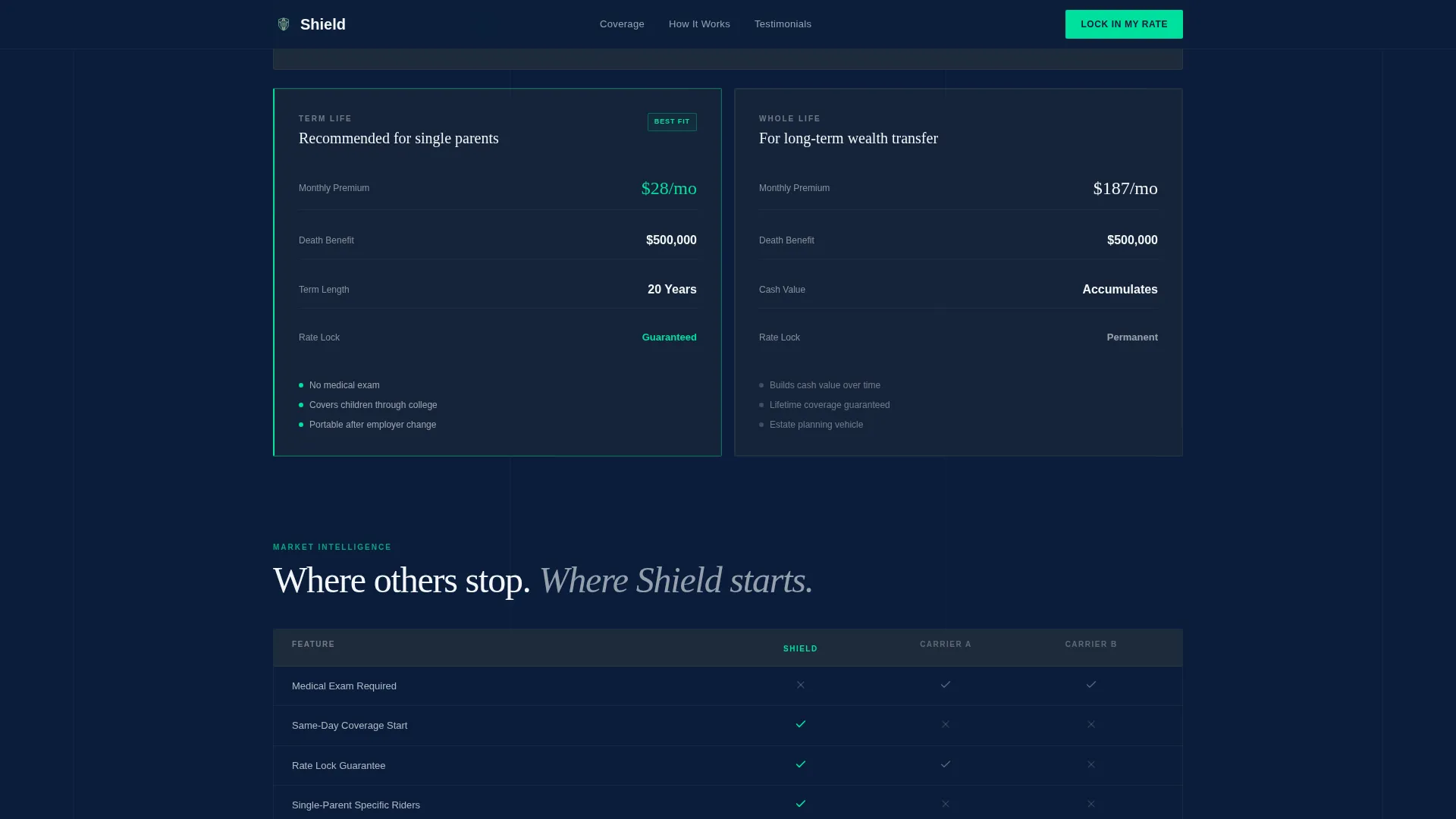
- Three interactive comparison data grids covering coverage scenarios, term versus whole life, and a competitor comparison table
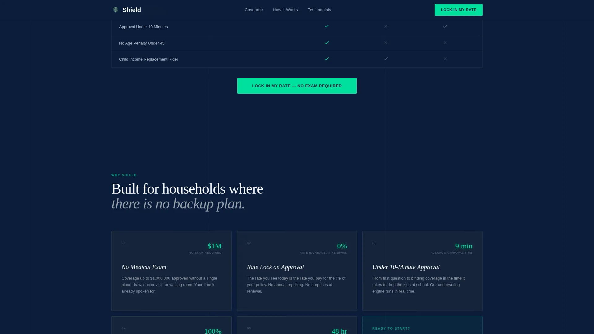
- A progressive three-step quote form, trust badges, a secondary PDF lead capture path, and five trust differentiator blocks
Feature list
This template includes purpose-built components designed to support a high-stakes financial decision. Each element is structured to reduce hesitation and build credibility step by step.
Dark Full-Bleed Hero with Live Data Tiles
The hero opens with a deep navy void and a phosphor-green radial glow that simulates a system powering on. Three data tiles fade in sequentially, each displaying a key financial figure. The numbers themselves serve as the emotional hook, replacing stock imagery entirely.
Three-Panel Comparison Data Grid
Scroll-triggered grids walk the visitor through three structured comparisons. The first contrasts life without coverage against life with coverage using real dollar figures. The second uses a live slider to compare term and whole life premiums side by side. The third provides an anonymized competitor comparison showing key differentiators.
Progressive Three-Step Quote Form
The "Lock In My Rate" form opens with only age and number of dependents. Step two reveals a personalized coverage estimate and asks for income range and smoking status. Step three collects name, email, and phone, reinforced by a "No medical exam required" trust badge and a 60-second quote commitment.
Secondary PDF Lead Capture Path
A "Download Coverage Gap Calculator" gate sits inside the comparison grid section. It captures email addresses for visitors who are not yet ready to complete the full quote form, providing a lower-commitment entry point into the lead funnel.
Five Trust Differentiator Blocks
The "Why Shield" section presents five specific proof points: no medical exam requirement, instant rate lock, approval under ten minutes, payout speed, and guardian assignment capability. Each differentiator is displayed as a discrete block rather than a generic feature list.
Testimonial Cards with Named Archetypes
Social proof is delivered through testimonial cards built around specific single-parent archetypes. Each card includes outcome-focused language and specific coverage dollar amounts, making the social proof feel grounded and credible rather than generic.
Page sections overview
| Section | Purpose |
|---|---|
| Hero Data Tiles | Opens with financial stats and headline to establish immediate relevance |
| Coverage Comparison Grid | Shows real dollar impact of being covered versus unprotected |
| Term versus. Whole Life Slider | Lets visitors compare policy types with a live interactive slider |
| Competitor Comparison Table | Highlights key differentiators against anonymized competing providers |
| Lock In My Rate Form | Captures leads through a low-friction three-step progressive form |
| Why Shield Blocks | Presents five trust differentiators in a scannable block layout |
| Social Proof Cards | Builds credibility with named single-parent testimonial archetypes |
| Footer | Minimal developer-style footer pattern for clean page closure |
Design & branding system
Shield uses a Corporate Precision visual identity built on a Navy Authority color system. The palette is deliberately dark and controlled, designed to feel like a financial instrument rather than a marketing brochure.
- Colors: command-center navy (#0B1D3A) for the primary background, gunmetal data-row gray (#1E2A3A) for grid rows, policy white (#F4F6F9) for body text, and phosphor green (#00E09E) reserved exclusively for calls to action and live calculation outputs
- Typography: Manrope as the primary sans-serif for data and interface elements, Fraunces as the serif display face for headline moments
- Animation: high-intensity GSAP-style CSS animations including radial glow pulse, sequential tile fade-in, scroll-triggered grid reveals, and live slider interactivity
Mobile & speed optimization
The template is designed desktop-first, reflecting the focused mindset of someone making a serious financial decision at a desk. Full mobile responsiveness is built in so the experience holds across all screen sizes.
- Desktop-first layout prioritizes the comparison grid experience, where side-by-side data reading is most effective
- Full mobile responsiveness ensures the progressive form, data tiles, and comparison sections remain usable on smaller screens
- Static sections use server component architecture while interactive grids and the quote form are handled client-side for smooth performance
How this template helps you convert
Shield is structured to move a hesitant visitor toward a lead submission without demanding trust before it is earned. Every section is sequenced to reduce friction and increase commitment.
- The hero data tiles lead with financial facts rather than brand messaging, so visitors immediately see numbers relevant to their situation before any ask is made.
- The comparison grids build a logical case across three stages, converting abstract fear into specific financial reasoning before the quote form appears.
- The progressive form starts with two low-stakes inputs, then reveals a personalized estimate, making the final step feel like a confirmation rather than a cold submission.
Other information about this template
Shield is built for a specific market intersection: single-parent life insurance within the broader finance and insurance category. The template reflects the realities of that niche in both its content structure and visual tone.
- Template style is Dashboard and Data Grid, making it well suited for providers who want to lead with data credibility rather than emotional marketing imagery
- Localization is set for the United States market, using USD, English language copy, and MM/DD/YYYY date formatting throughout
- The footer follows a minimal developer-style pattern, keeping the close of the page clean and professional without unnecessary visual weight
- The template supports a secondary conversion path alongside the primary quote form, giving providers two distinct lead capture touchpoints on a single page
Theme
Corporate Precision
Creative direction
Comparison Journey
Color system
Navy Authority
Style
Dashboard/Data Grid
Direction
Lead Generation
Page Sections
Dark Full-bleed Hero with Data Tiles
Three-panel Interactive Comparison Grids
Progressive Three-step Quote Form
Secondary PDF Lead Capture Gate
Five Trust Differentiator Blocks
Archetype-based Testimonial Cards
Related questions
Who is this landing page template designed for?
Does this template include the interactive slider and comparison grids?
Is this template mobile-friendly?
What makes this template different from a standard insurance landing page?
Does the template support more than one lead capture method?



