Architects Peer Advisory Board Landing Page Template
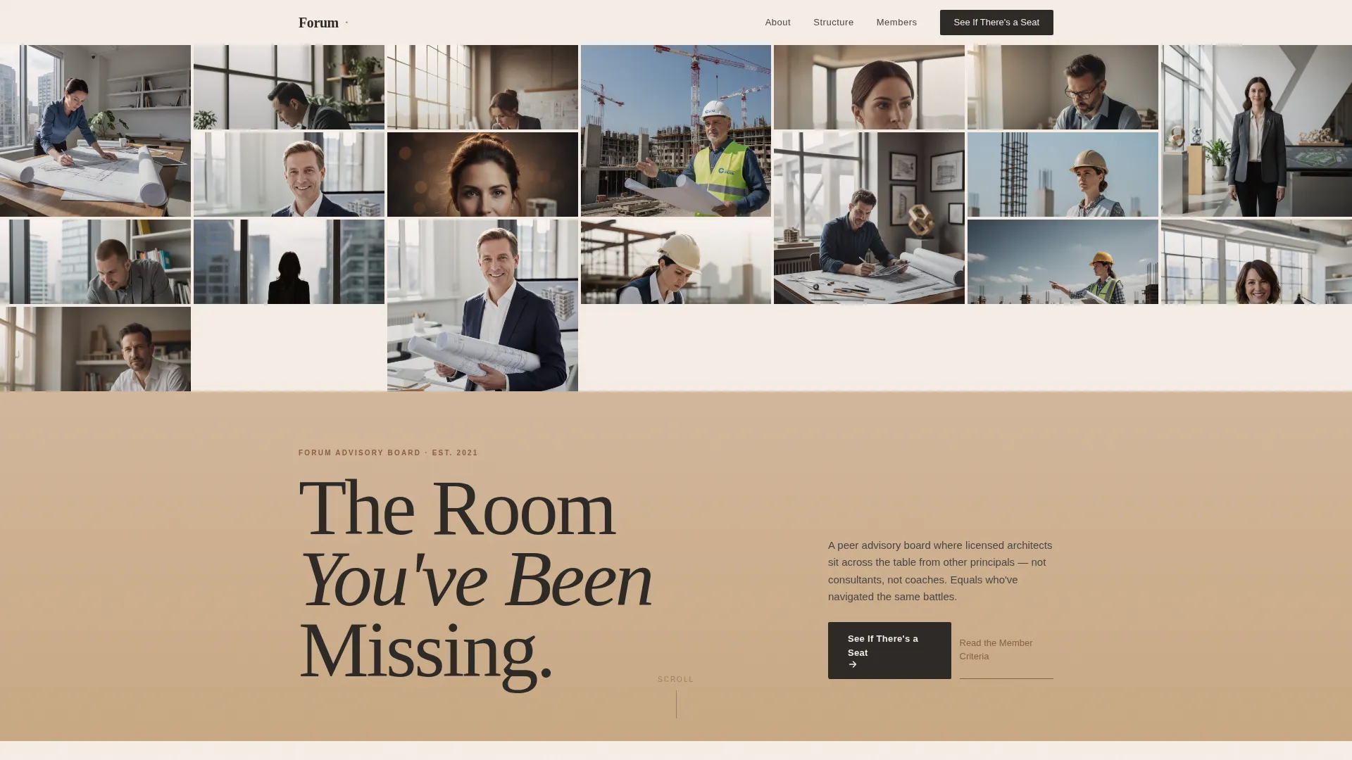
Forum is an editorial landing page template built for architects peer advisory boards. It guides firm principals through an emotionally resonant scroll journey, from the quiet cost of deciding alone to the proof that a room of equals exists. Warm Desert Rose colors, Fraunces serif headlines, and a mosaic portrait header give it the quiet authority of a quarterly journal.
by Rocket studio
Quick summary
Forum is a single-page, click-through landing page template designed for an architects peer advisory board. It uses a Hero's Journey narrative structure to move isolated firm principals from recognition to action. A Community Mosaic header, long-form editorial layout, terracotta pull quotes, and a persistent call-to-action bar work together to earn one deliberate click toward the application overview.
Who this template is for
This template is built for founding partners and managing principals of architecture firms. It speaks directly to practitioners who are past mentorship but have not yet found a peer network of true equals. If you run or market a professional membership community for licensed architects, this template was made with your audience in mind.
- Founding partners of 8 to 40-person architecture firms with 10 to 25 years in practice
- Managing principals navigating succession, acquisition, or firm-wide transformation
- Community organizers or program directors launching a peer advisory board in the architecture industry
What problem this template solves
Most community landing pages lead with features. This one leads with the visitor. Firm principals who eat lunch at their desks reviewing RFQs rarely encounter a page that names their situation honestly. Forum closes that gap by making isolation visible before it offers any solution.
- Principals make high-stakes strategic decisions without a trusted peer in the room
- Generic coaching and consulting pages fail to signal that the room is made of equals
- Visitors leave quickly when a page does not reflect the specific weight of running an architecture firm
What you get with this template
Forum delivers a fully structured, editorially styled landing page with five thematic sections and a persistent conversion element. Every section has a defined narrative role in the Hero's Journey scroll. Nothing on this page exists without a purpose tied to the single conversion goal: earning the click to the application overview.
- A Community Mosaic hero with a portrait grid, serif headline, and primary call-to-action
- Four narrative body sections covering isolation, board structure, member testimony, and transformation outcome
- A persistent bottom call-to-action bar that activates after the midpoint scroll, plus a secondary low-commitment text link
Feature list
This section covers the core built-in capabilities of the Forum template as defined in the source brief.
Community Mosaic Portrait Header
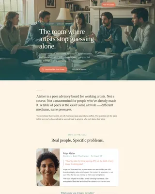
A grid of warm-toned architect portraits arranged asymmetrically to suggest a building elevation silhouette. No single face dominates the composition. The header carries the editorial headline "The Room You've Been Missing" in large Fraunces serif type over a sandstone band, with the primary call-to-action placed immediately beneath.
Hero's Journey Narrative Scroll
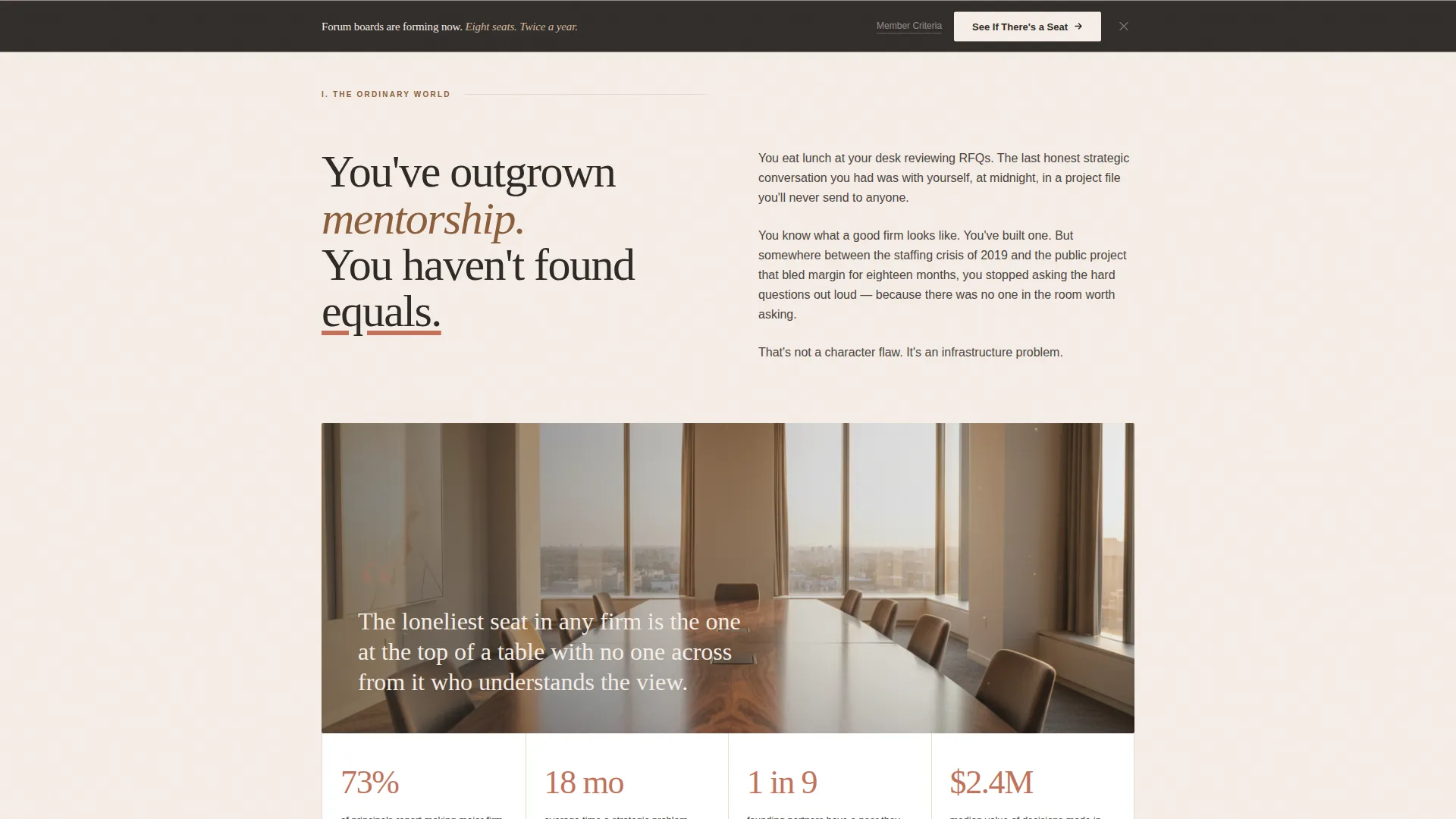
Five sections follow a deliberate emotional arc. The visitor enters as the isolated principal, encounters the cost of deciding alone, meets the board structure, reads real member testimony, and arrives at a transformation outcome. The scroll escalates emotional stakes while the layout alternates between full-bleed photography, two-column text blocks, and oversized pull quotes.
Terracotta Pull-Quote Testimony Blocks
Long-form member quotes are set in terracotta serif type against full-bleed backgrounds. Each quote carries a member name, firm, and city. There are no generic star ratings. The quotes are positioned at the Ordeal stage of the narrative, where proof of the room carries the highest emotional weight.
Persistent Click-Through Call-to-Action Bar
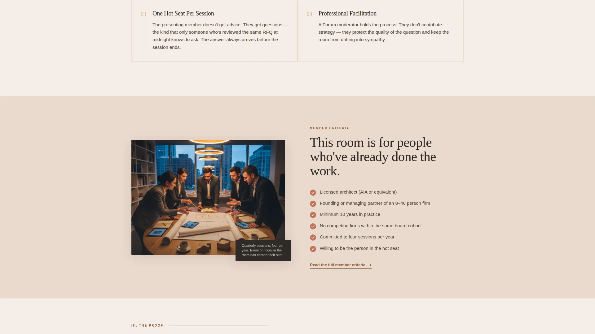
A bottom bar reading "See If There's a Seat" appears as a persistent element after the visitor crosses the midpoint scroll. It never interrupts the editorial reading rhythm but stays present as a quiet, consistent invitation. A secondary text link, "Read the Member Criteria," provides a lower-commitment path for visitors who want to self-qualify first.
GSAP Scroll-Driven Animation
The template includes medium-weight scroll animations built for desktop reading. Portrait mosaic hover depth, word-by-word quote reveals, and GSAP scroll triggers give the page the pacing of a long-form magazine profile. Static content uses server-rendered components while scroll-driven interactions are handled client-side.
Editorial Two-Column Layout System
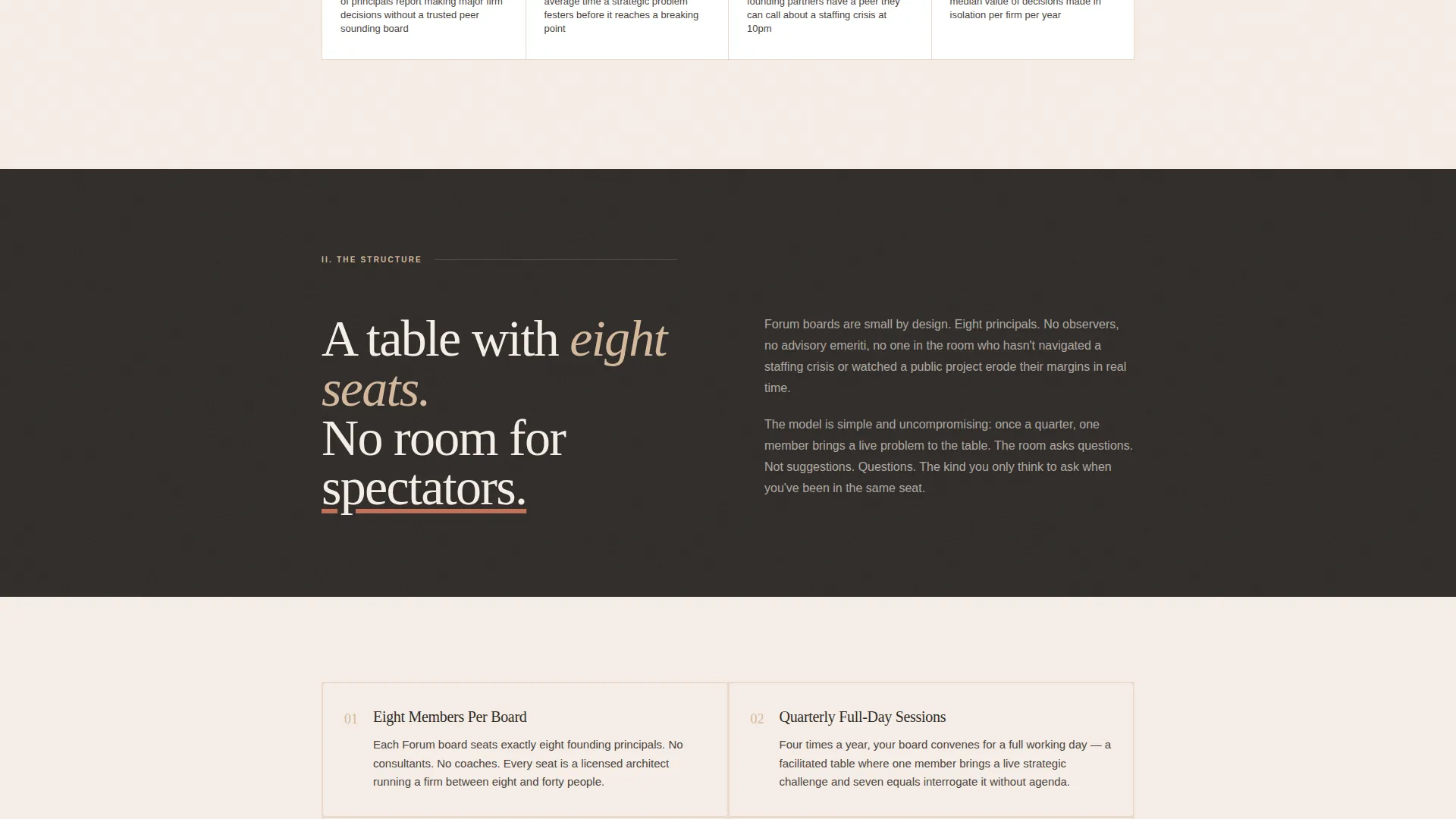
Body sections shift between full-bleed and two-column editorial formats. This layout rhythm mirrors a quarterly journal and slows the reader down intentionally. The design rewards attention rather than scanning, which suits the deliberate, analytical reading habits of architecture firm principals.
Page sections overview
| Section | Purpose |
|---|---|
| Hero Mosaic Header | Establishes collective identity and presents the primary call-to-action |
| Ordinary World | Names the isolation and cost of strategic decisions made alone |
| The Mentor | Explains board structure, facilitation model, and how Forum works |
| The Ordeal | Delivers long-form member pull-quote testimony as proof the room exists |
| Transformation Outcome | Presents strategic clarity result and activates the persistent call-to-action bar |
| Minimal Footer | Closes the page with a linear single-row footer and no distraction |
Design & branding system
The Desert Rose color system anchors Forum in the visual language of WPA-era civic architecture. Every color carries a structural role. Terracotta marks human emphasis, sandstone warms section divides, charcoal grounds all body text, and blush white gives the page the generous open margins of a journal no one rushes through.
- Terracotta (#C2725A) on pull quotes and human emphasis moments; sandstone (#D4B89C) on section bands; deep civic charcoal (#2E2A27) for all body text; blush white (#F5EDE6) as the primary page background
- Oxidized copper (#8B5E3C) used as an accent on pull quotes and interactive elements
- Typography pairing: Fraunces serif for all headlines and pull quotes, DM Sans for body copy and interface elements
Mobile & speed optimization
Forum is designed as a desktop-first experience, reflecting the real behavior of its target audience: principals who review the page during a desk lunch, not on a phone between appointments. The layout priorities and animation choices reflect this context. The template is still structured to render cleanly at smaller viewports.
- Server-rendered components handle all static content sections for faster initial load on desktop
- Client-side rendering is scoped to scroll-driven interactions and animation triggers only
- Desktop-first layout decisions are intentional and aligned with the stated device priority of the source brief
How this template helps you convert
Forum is built around a single conversion goal: the click to the application overview page. Every design and copy decision supports that one action without using a form, a modal, or an aggressive pop-up.
- The narrative scroll builds emotional recognition first, so the visitor arrives at the call-to-action already persuaded by their own experience of the problem
- The persistent bottom bar keeps "See If There's a Seat" visible after the midpoint without interrupting the editorial reading rhythm
- The secondary "Read the Member Criteria" text link captures visitors who are curious but not yet ready, keeping them engaged with the qualification process rather than losing them to a bounce
Other information about this template
Forum sits at the intersection of editorial design and professional community marketing. It is purpose-built for the architects community niche and reflects the specific dynamics of peer advisory boards in the architecture industry.
- Template style: Editorial and Magazine, with a Civic Service theme and WPA-era visual references
- Creative direction: Hero's Journey narrative structure applied to a click-through landing page
- Header concept: Community Mosaic, where the collective composition carries more weight than any individual portrait
- Color system: Desert Rose, a warm earthen palette suited to the dignity and patience of the target audience
- The landing page includes no on-page form; conversion happens entirely through click-through to the application overview
Theme
Civic Service
Creative direction
Hero's Journey
Color system
Desert Rose
Style
Editorial/Magazine
Direction
Click-Through
Page Sections
Community Mosaic Portrait Header
Hero's Journey Narrative Scroll
Terracotta Pull-quote Testimony Blocks
Persistent Click-through Call-to-action Bar
GSAP Scroll-driven Animations
Editorial Two-column Layout System
Related questions
Does this template include an application form?
What is the primary call-to-action on this landing page?
What fonts does this template use?
Is this landing page designed for desktop or mobile?
Can I adapt this template for a peer advisory board in a different industry?