Natural History Museum Landing Page Template
Fossil is a masonry-style natural history museum landing page template built around a Stage and Spotlight visual identity. It pairs an immersive vertical-video header with staggered specimen card columns, glowing exhibit badges, and a focused app download flow. The result is a theatrical, scroll-driven experience designed to turn casual visitors into engaged museum guests.
by Rocket studio
Quick summary
Fossil is a single-page museum landing page template designed for natural history institutions. It opens with a full-viewport vertical video reel, cascades into a masonry card layout, and closes with a high-converting app download section. The visual system uses deep blacks, charged indigo tones, and hot amber calls to action to create a darkened-gallery atmosphere that feels alive.
Who this template is for
This template suits any natural history museum or cultural institution that wants a cinematic online presence. It works especially well for venues with strong visual collections and time-sensitive programming.
- Museum marketing teams launching a new wing or seasonal exhibit
- Cultural institutions promoting a mobile app or ticketing experience
- Homeschool co-ops and education-focused venues needing a parent-friendly event page
What problem this template solves
Most museum pages feel like digital brochures: static, text-heavy, and emotionally flat. Fossil solves the gap between what a museum visit actually feels like and what its landing page communicates.
- Visitors leave the page before engaging because nothing builds urgency or wonder
- App downloads stall because the value is buried in fine print rather than shown as a living experience
- Rotating exhibits and night events get lost in generic grid layouts instead of feeling exclusive and time-sensitive
What you get with this template
You get a fully structured, single-page layout ready to fill with your own media and copy. Every section is intentionally ordered to carry a visitor from first impression through to app download.
- A full-viewport vertical video header with logo reveal, masonry card columns with glowing exhibit badges, and visitor pull-quote breaks
- A floating app download bar, a full-width app interstitial with SMS input field, and App Store and Google Play badge placements
- An animated icon card trio communicating the three app value promises: skip-the-line tickets, augmented reality specimen scanning, and real-time gallery maps
Feature list
This template is built around a specific set of high-impact layout and interaction components grounded in the source brief.
Immersive Vertical Video Header
The header fills the entire viewport with a vertical-format video shot at a child's eye level. The footage moves through the grand hall, past mounted skeletons and hanging pterosaur replicas, and ends with the museum logo slamming into frame. No narration is needed. The visual momentum does the work.
Masonry Card Layout with Exhibit Badges
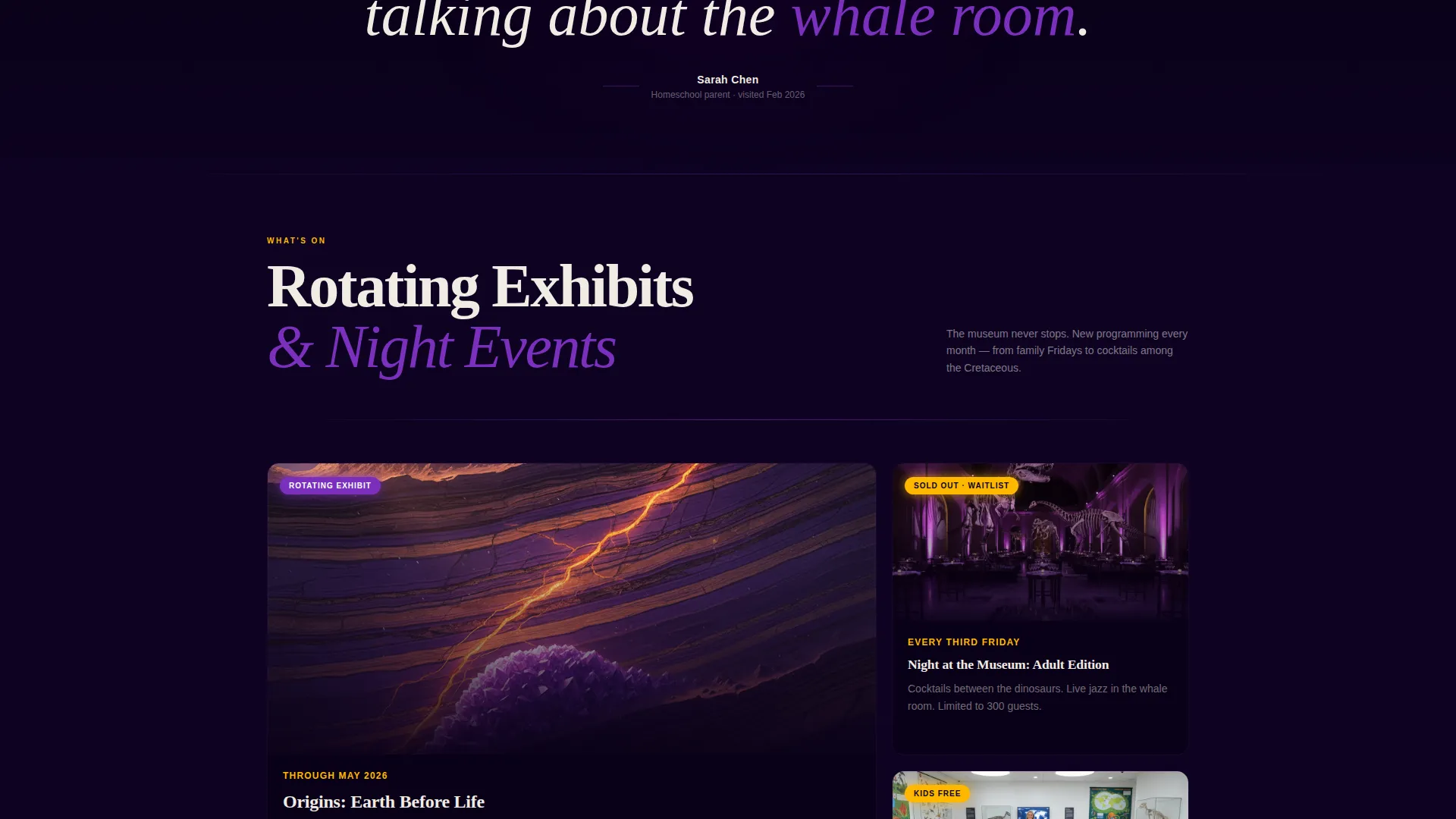
Below the reel, specimen and exhibit cards cascade in staggered columns. Each card is photographed under dramatic spotlighting against pure black. Glowing badges such as "NEW WING," "LIMITED RUN," and "KIDS FREE" are layered on cards to signal urgency and exclusivity at a glance.
Scroll-Escalating Content Rhythm
The page is structured so energy increases as the visitor scrolls. Permanent collection cards appear first, followed by rotating exhibits, then behind-the-scenes lab footage, and finally night-event programming. Each row feels more exclusive than the last, rewarding visitors who keep scrolling.
Visitor Pull-Quote Breaks
Between card clusters, oversized pull quotes are set in massive indigo type. These quotes read like concert reviews and act as emotional proof points. They break the visual pace and add a human voice to the otherwise image-driven layout.
Floating App Download Bar
After three seconds of scroll, a persistent bottom bar surfaces with the primary call to action: "Explore the Museum in Your Pocket." The bar stays accessible without interrupting the browsing experience until the visitor is ready to act.
Full-Width App Download Interstitial
After the events section, a full-width interstitial reinforces the app download with a single phone-number input field for an SMS link. App Store and Google Play badges appear as secondary options. Three animated icon cards communicate the core app promises clearly and quickly.
Page sections overview
| Section | Purpose |
|---|---|
| Vertical Video Header | Sets immersive, cinematic first impression with logo reveal |
| Masonry Exhibit Cards | Showcases specimens, exhibits, and experiences with urgency badges |
| Visitor Pull Quotes | Adds social proof between card clusters using oversized indigo type |
| Behind-the-Scenes Row | Builds exclusivity with lab footage and process content |
| Night Events Programming | Drives urgency around time-sensitive and ticketed evening experiences |
| Floating Download Bar | Surfaces app call to action persistently after three seconds of scroll |
| App Download Interstitial | Converts interest with SMS input, store badges, and icon card trio |
Design & branding system
The template uses an Electric Indigo color system that mimics the feeling of a darkened exhibition hall lit by a single ultraviolet light. Every color choice has a specific job.
- Deep exhibition-hall black (#0D0221) as the dominant background, charged indigo (#4B0082) and bioluminescent violet (#7B2FBE) for depth and layering, and specimen-label white (#F0ECE3) for all typography and card surfaces
- Hot amber (#FFB800) is reserved exclusively for calls to action and interactive badges, making every actionable element immediately recognizable
- The Stage and Spotlight theme treats each specimen card like a performer under a spotlight: high contrast, dramatic shadows, and a sense that every item on screen is the most important thing in the room
Mobile & speed optimization
The template is designed with a mobile-first scroll experience in mind. The vertical video header, floating bottom bar, and single-field SMS input all perform naturally on a phone screen.
- The masonry card layout reflows cleanly for smaller viewports so staggered columns remain readable without horizontal scrolling
- The floating app download bar is sized for thumb reach, and the SMS input field requires only one tap to engage on a mobile device
How this template helps you convert
Fossil is structured to move a visitor from wonder to action in a single scroll session. Every section is sequenced to build intent before asking for it.
- The vertical video header creates an emotional hook in the first few seconds, establishing the museum's atmosphere before a single word is read, which reduces bounce and keeps visitors engaged long enough to encounter the offer.
- The escalating card layout combined with urgency badges and pull quotes builds trust and excitement gradually, so by the time the app download interstitial appears, the visitor already feels connected to the experience and is far more likely to act.
Other information about this template
Fossil is a strong fit for institutions that want their digital presence to match the dramatic quality of their physical space. The template's theatrical design language scales naturally from dinosaur halls to gem galleries to special-event nights.
- The template style is Masonry or Pinterest layout, which suits collections with varied media formats and mixed card sizes
- The creative direction follows a Launch Energy approach, giving every exhibit the urgency of an album drop or premiere event
- The header concept is a Short-Form Reel, a format that performs naturally on social-native audiences already comfortable with vertical video
- The landing page direction is App Download, making this template a focused tool for museums actively growing their mobile audience


Theme
Stage & Spotlight
Creative direction
Launch Energy
Color system
Electric Indigo
Style
Masonry/Pinterest
Direction
App Download
Page Sections
Immersive Vertical Video Header
Masonry Card Layout with Badges
Scroll-escalating Content Rhythm
Visitor Pull-quote Breaks
Floating App Download Bar
Full-width App Download Interstitial
Related questions
What type of museum works best with this template?
Can I use this template without a museum app?
How does the masonry card layout handle different content types?
Is the vertical video header required for the template to work?
Who is this landing page designed to reach?


