Manufacturing Processes Cost Estimator Website Template
Foundry is a hub-and-spoke anchor-nav landing page template built for sand casting equipment manufacturers. It walks production managers through a Timeline Progression from Year 0 to Year 15, stacking side-by-side comparison data at every scroll point. A sticky "Run Your Cost Comparison" call to action and a guided total cost of ownership calculator turn serious research into a direct conversion.
by Rocket studio
Quick summary
Foundry is a single-page, anchor-nav landing page template for sand casting equipment manufacturers. It uses a Timeline Progression structure to build a cost comparison argument across four lifecycle milestones. The Carbon Fiber color system, panoramic header, and sticky amber call to action work together to keep production managers engaged from first load to final click.
Who this template is for
This template is built for mid-size sand casting equipment manufacturers whose sales team needs a page that speaks directly to production managers evaluating capital expenditure decisions. It suits teams selling muller systems, jolting machines, flask assemblies, and full green-sand molding lines.
- Production equipment manufacturers targeting plant-level buyers
- Sales and marketing teams who need comparison-driven, data-heavy pages
- Foundry suppliers competing against established equipment brands on total cost of ownership
What problem this template solves
Production managers evaluating new sand casting equipment rarely make fast decisions. They need hard numbers: cycle times, maintenance hours, scrap rates, and energy draw compared side by side against their current setup. A generic product page cannot carry that argument. This template is structured precisely to hold that evidence and build it section by section.
- Buyers leave generic pages because the cost justification is missing or buried
- Comparison tables and a guided calculator replace abstract claims with personalized data
- The lifecycle narrative keeps visitors scrolling instead of bouncing before they reach the decision point
What you get with this template
You get a fully structured, single-page layout that guides a production manager through a four-stage equipment lifecycle story. Every hub section anchors a year marker and holds comparison content, video loop placeholders, and call to action placements. The guided calculator section is designed to collect buyer inputs and return a personalized total cost of ownership comparison.
- A panoramic header section with a labeled production-flow progress bar and a delayed headline
- Four hub-and-spoke year-marker sections (Year 0, Year 3, Year 7, Year 15) with alternating comparison tables and video loop slots
- A sticky "Run Your Cost Comparison" amber call to action and a secondary "Request a Spec Sheet" path at each equipment section
Feature list
This section covers the core built-in components and structural capabilities included in the Foundry template.
Panoramic Header with Progress Bar
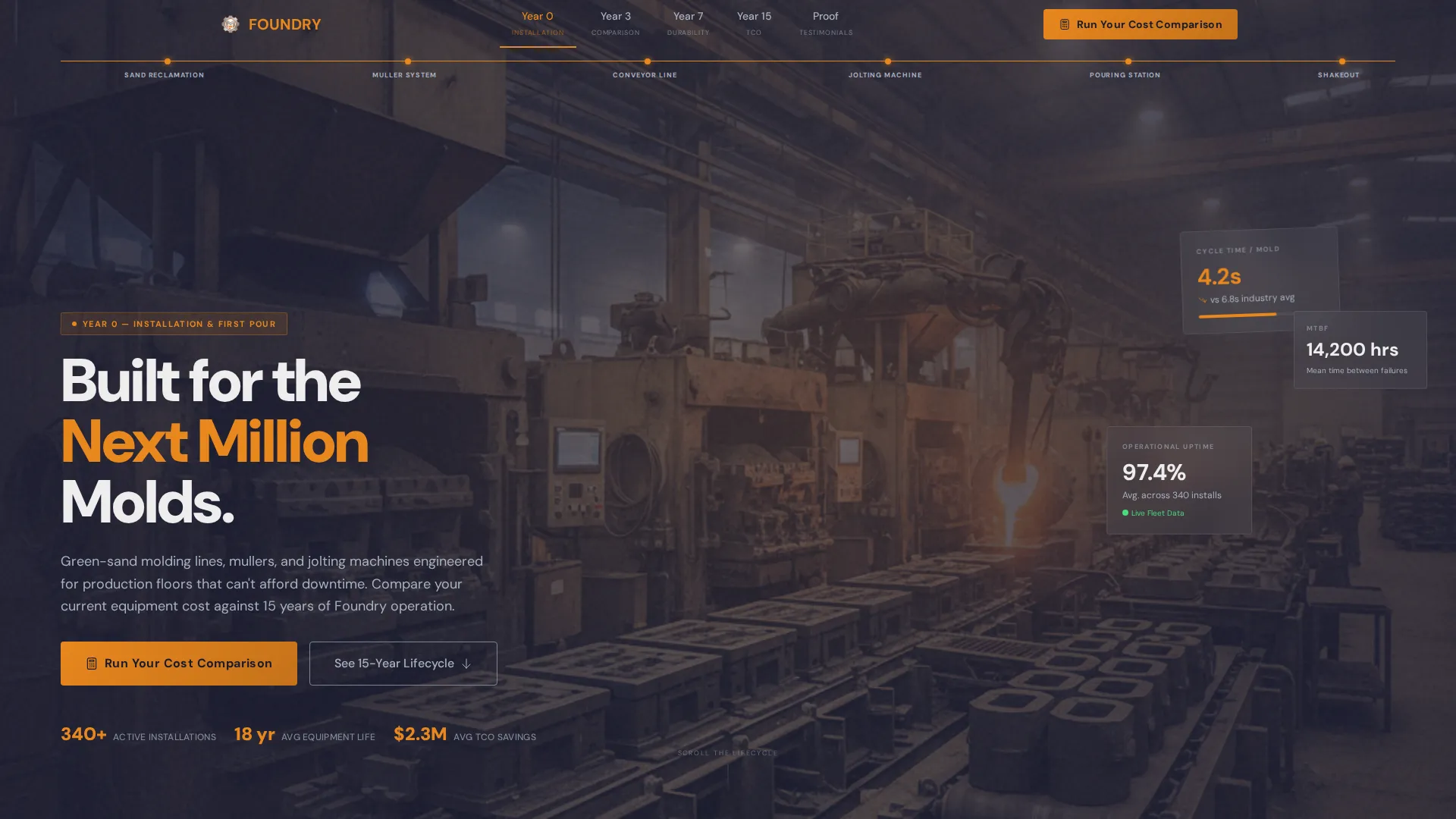
The header spans the full viewport width at operator chest-height perspective. A thin amber progress bar traces the production flow from left to right, labeling each station from sand reclamation hopper through muller, conveyor, jolting machine, and pouring station. The headline "Built for the Next Million Molds" appears in refractory white at lower-left after a two-second delay.
Hub-and-Spoke Anchor Navigation
Each of the four year-marker milestones functions as a hub on the anchor navigation bar. Visitors can jump directly to Year 0, Year 3, Year 7, or Year 15. Each hub connects to its spoke sections of comparison tables and video loop areas, keeping the page scannable without losing narrative momentum.
Side-by-Side Comparison Tables
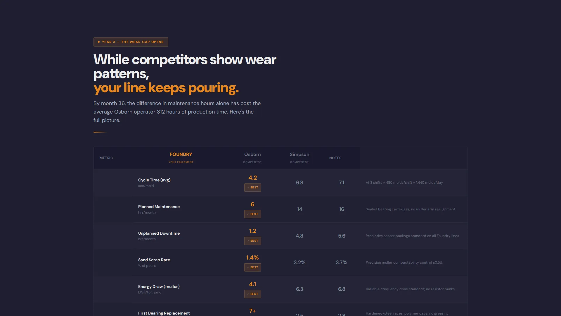
Alternating spoke sections hold structured comparison tables built in machined aluminum. These tables compare cycle times, maintenance hours, scrap percentages, and energy draw between this manufacturer's equipment and competitor configurations. The data layout makes the cost gap visible without requiring the buyer to calculate anything manually.
Guided Total Cost of Ownership Calculator
The primary call to action opens a guided calculator built into the page. The buyer selects their current equipment brand and model from a dropdown, then enters molds per shift, current scrap rate, and email address. The calculator is set up to deliver a personalized total cost of ownership comparison report to the buyer's inbox.
Sticky Amber call to action with Secondary Research Path
A "Run Your Cost Comparison" button in furnace-glow amber stays visible at each hub anchor as the visitor scrolls. A secondary "Request a Spec Sheet" link in aluminum-gray sits below each equipment section. Both paths are present throughout the page so buyers at different decision stages always have a clear next step.
Timeline Progression Narrative Structure
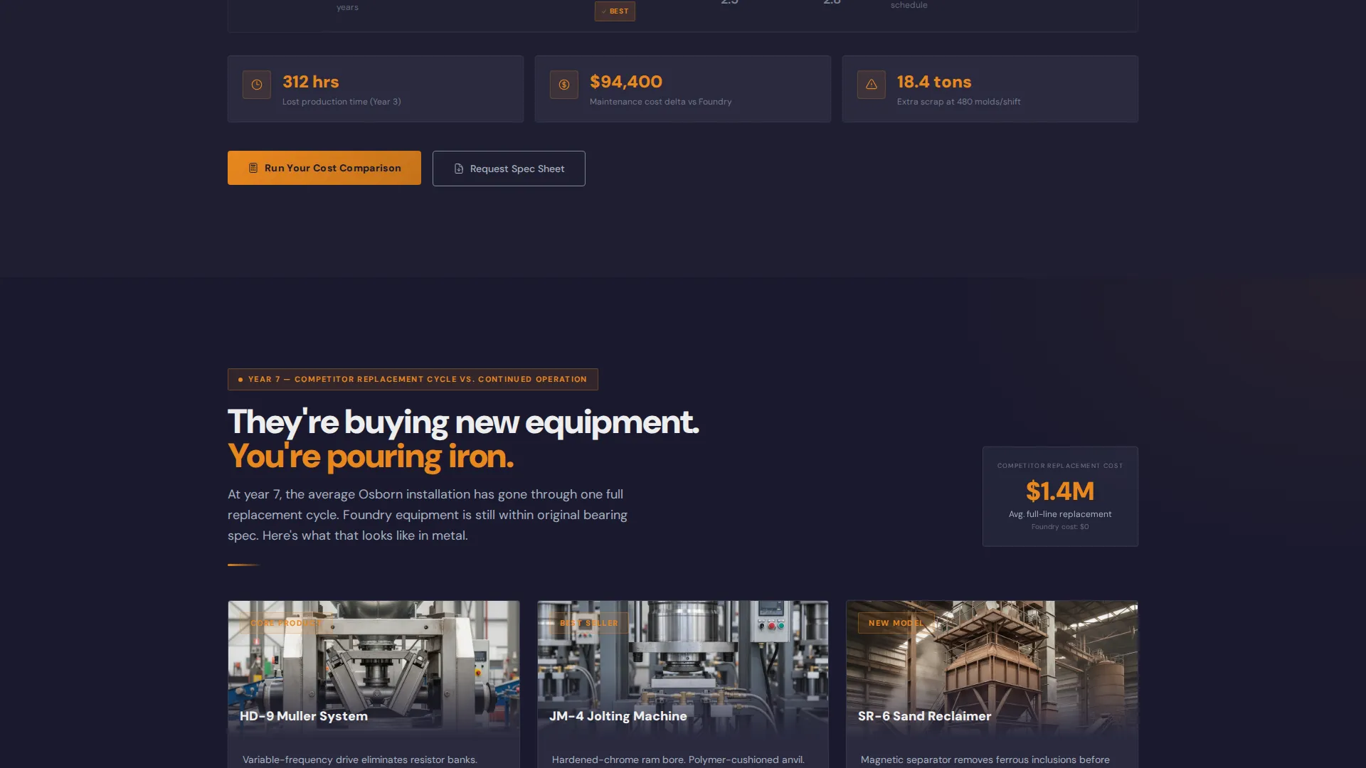
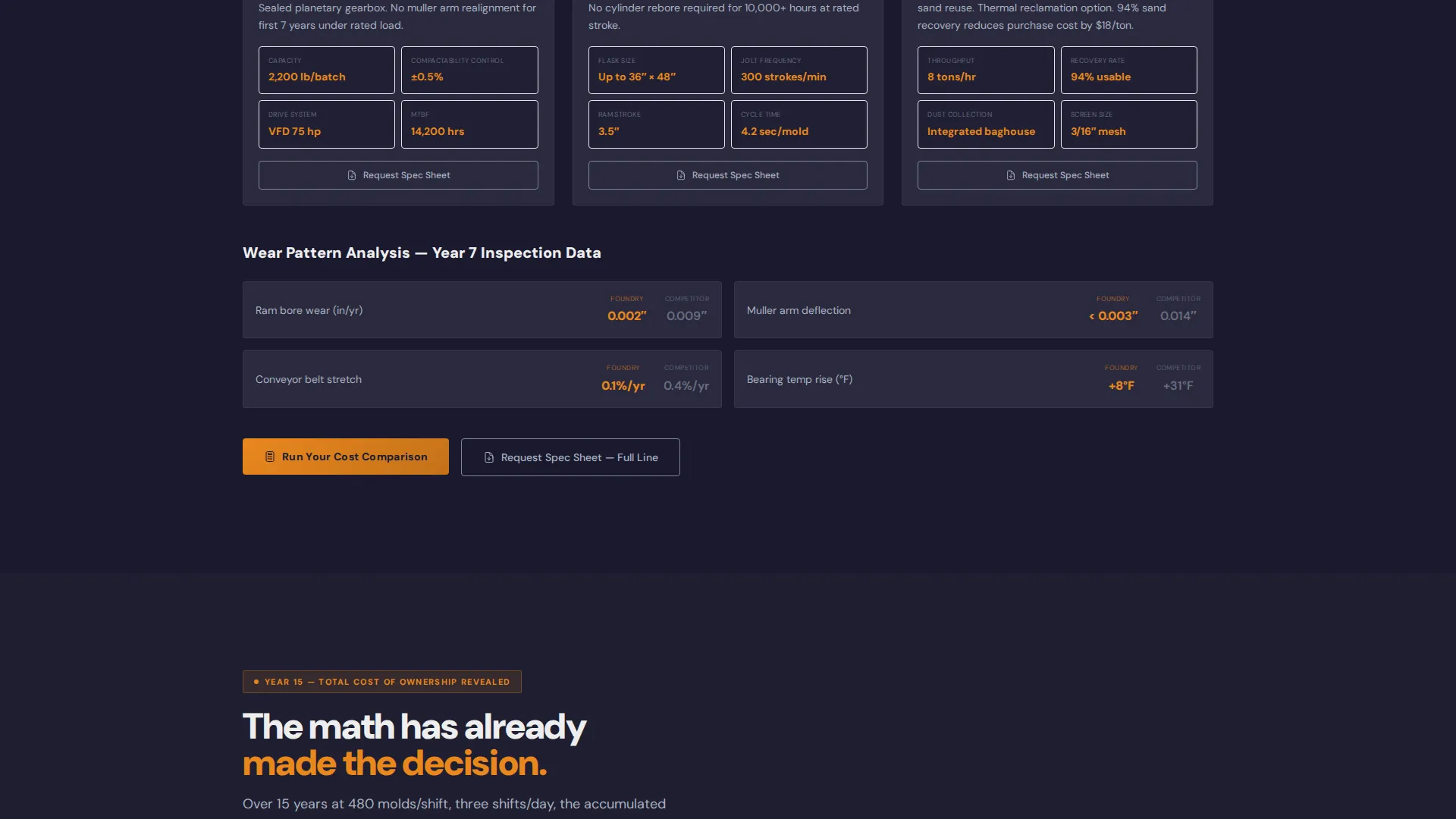
The page is organized as an accumulating evidence engine. Year 0 shows installation and first pour. Year 3 introduces wear patterns and downtime data for competing equipment. Year 7 contrasts replacement cycles. Year 15 reveals the full total cost of ownership gap. Each section adds weight to the argument already made above it.
Page sections overview
| Section | Purpose |
|---|---|
| Panoramic Header | Set scale and introduce the production line |
| Anchor Nav Bar | Let buyers jump to any year milestone |
| Year 0 Hub | Cover installation and first-pour performance |
| Year 3 Comparison | Show early wear and downtime divergence |
| Year 7 Analysis | Contrast replacement cycles side by side |
| Year 15 Reveal | Deliver the full total cost of ownership case |
| Calculator Module | Collect inputs and generate personalized report |
| Spec Sheet call to action | Capture research-stage visitors per section |
Design & branding system
The Carbon Fiber color system anchors the visual identity in a shop-floor palette that feels earned rather than decorative. Deep graphite (#1A1A2E) dominates backgrounds, giving every data surface a serious, industrial weight. Machined aluminum (#A8B2C1) structures cards and comparison tables for instant legibility. Furnace-glow amber (#E8871E) marks every call to action, highlight stat, and progress bar element. Refractory white (#EDEDED) keeps spec text and data fields clean and easy to scan.
- Graphite backgrounds give the page a low-distraction, factory-floor atmosphere
- Amber fires every interactive element and draws the eye to key conversion points
- Refractory white on data surfaces keeps comparison tables and spec sheets instantly readable
Mobile & speed optimization
The template is structured for clear rendering across screen sizes. The panoramic header adapts to viewport width, and the anchor navigation collapses cleanly for smaller screens. Comparison tables are formatted to remain legible without horizontal scrolling on mobile devices.
- Anchor nav collapses to a compact format on smaller viewports
- Comparison tables are structured to stay readable at mobile widths
- Sticky call to action button remains accessible throughout the scroll on all screen sizes
How this template helps you convert
The Foundry template is built around a single conversion logic: let accumulated data make the decision before the buyer has to. Every design and structural choice serves that goal.
- The Timeline Progression narrative builds a cost gap that grows more convincing with every scroll, so by Year 15 the comparison has already made the argument for the sales team.
- The guided total cost of ownership calculator turns abstract savings claims into a personalized PDF report tied to the buyer's own equipment model and production numbers, which converts research intent into a direct lead.
Other information about this template
The Foundry template is designed specifically for the sand casting equipment manufacturing niche. It is built to address the buying behavior of production managers at mid-size foundries who are comparing capital expenditure options with precision. The page supports the full green-sand molding line narrative, covering cope-and-drag flask assemblies, muller systems, and jolting machines as named equipment categories.
- The Service Utility theme keeps the visual tone functional and credible for an industrial audience
- The Hub and Spoke anchor-nav structure suits long, data-rich pages where buyers need orientation
- The template's comparison logic is well suited to competitive displacement scenarios, where a manufacturer needs to argue against an incumbent installed base
Theme
Service Utility
Creative direction
Timeline Progression
Color system
Carbon Fiber
Style
Hub & Spoke (Anchor Nav)
Direction
Comparison/Versus
Page Sections
Panoramic Header with Flow Progress Bar
Hub-and-spoke Anchor Navigation
Side-by-side Comparison Tables
Guided Total Cost of Ownership Calculator
Sticky Dual Call to Action System
Timeline Progression Narrative Engine
Related questions
Who is this landing page template designed for?
What does the guided calculator collect and return?
Can this template work for a single product or a full equipment line?
Does the template include actual performance data for the comparison tables?
How does the anchor navigation keep long-page visitors oriented?