Deconstructivist Architecture Pre-Launch Website Template
Fracture is a storybook landing page built for a deconstructivist preservation consultancy. It pairs a nine-cell photo mosaic header with full-viewport scroll-triggered case study panels, a ticking global at-risk counter, and a friction-light waitlist form. The Bold Brutalist design speaks directly to heritage board directors and facilities managers who already know their building is in trouble.
by Rocket studio
Quick summary
Fracture is a single-page, storybook-style landing page template designed for a preservation consultancy that specializes in deconstructivist architecture. It opens with a forensic photo mosaic, moves through museum-panel case studies, and closes with a pinned waitlist call to action. Every typographic and structural choice signals deep technical fluency to institutional clients.
Who this template is for
This template is built for a highly specialized professional audience. If you run a preservation practice focused on structurally complex or formally radical buildings, this template communicates your expertise immediately without over-explaining it.
- Municipal heritage board directors managing façade failure on landmark deconstructivist structures
- University facilities directors who have inherited a complex arts center or civic building with emerging material failures
- Cultural foundation trustees working to protect at-risk buildings from demolition or unsympathetic alteration
What problem this template solves
Institutional clients in heritage preservation are skeptical by default. They have seen too many generalist consultants claim fluency they do not have. A standard portfolio page does not earn trust at this level. This template solves the credibility gap by leading with forensic visual evidence and precise case language before asking for any commitment.
- It replaces vague capability statements with scroll-triggered case study panels that demonstrate real intervention knowledge
- It removes form friction entirely, asking only for building name, location, and one email address
- It creates a second conversion path through an at-risk registry, building community before the consultancy formally opens
What you get with this template
You get a fully structured, single-page layout with a clear visual and narrative logic from top to bottom. Every section is purpose-built to escalate trust and move an institutional visitor toward a waitlist slot.
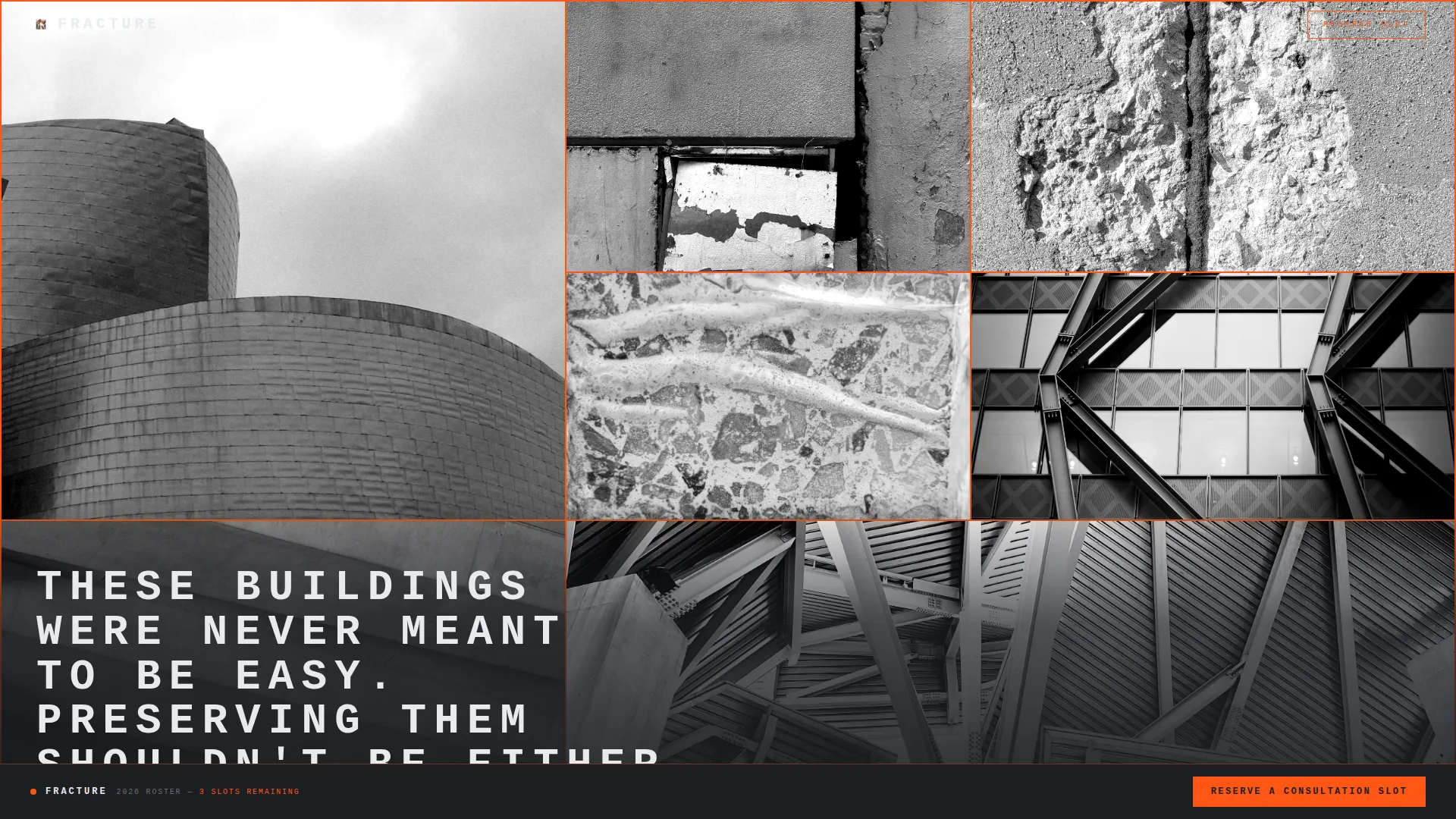
- A nine-cell asymmetric photo mosaic header with a stamp-on headline reveal triggered by the first scroll pixel
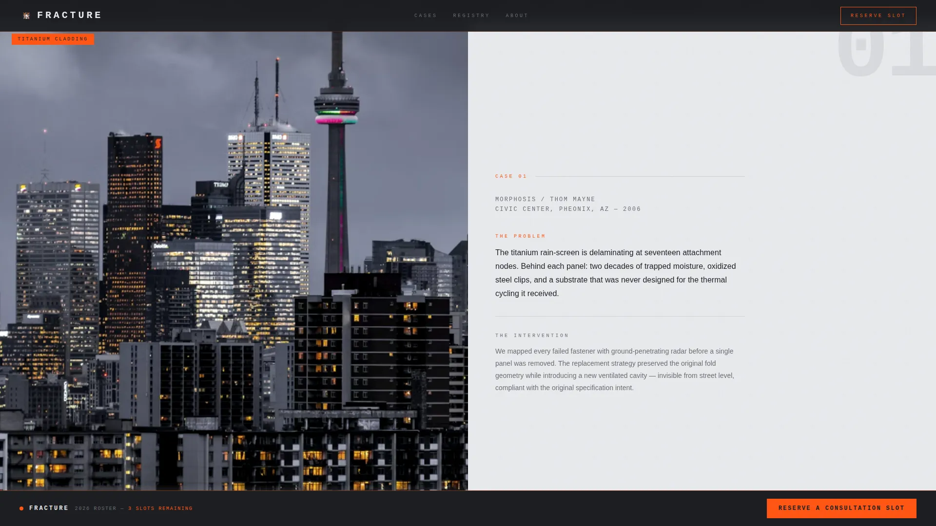
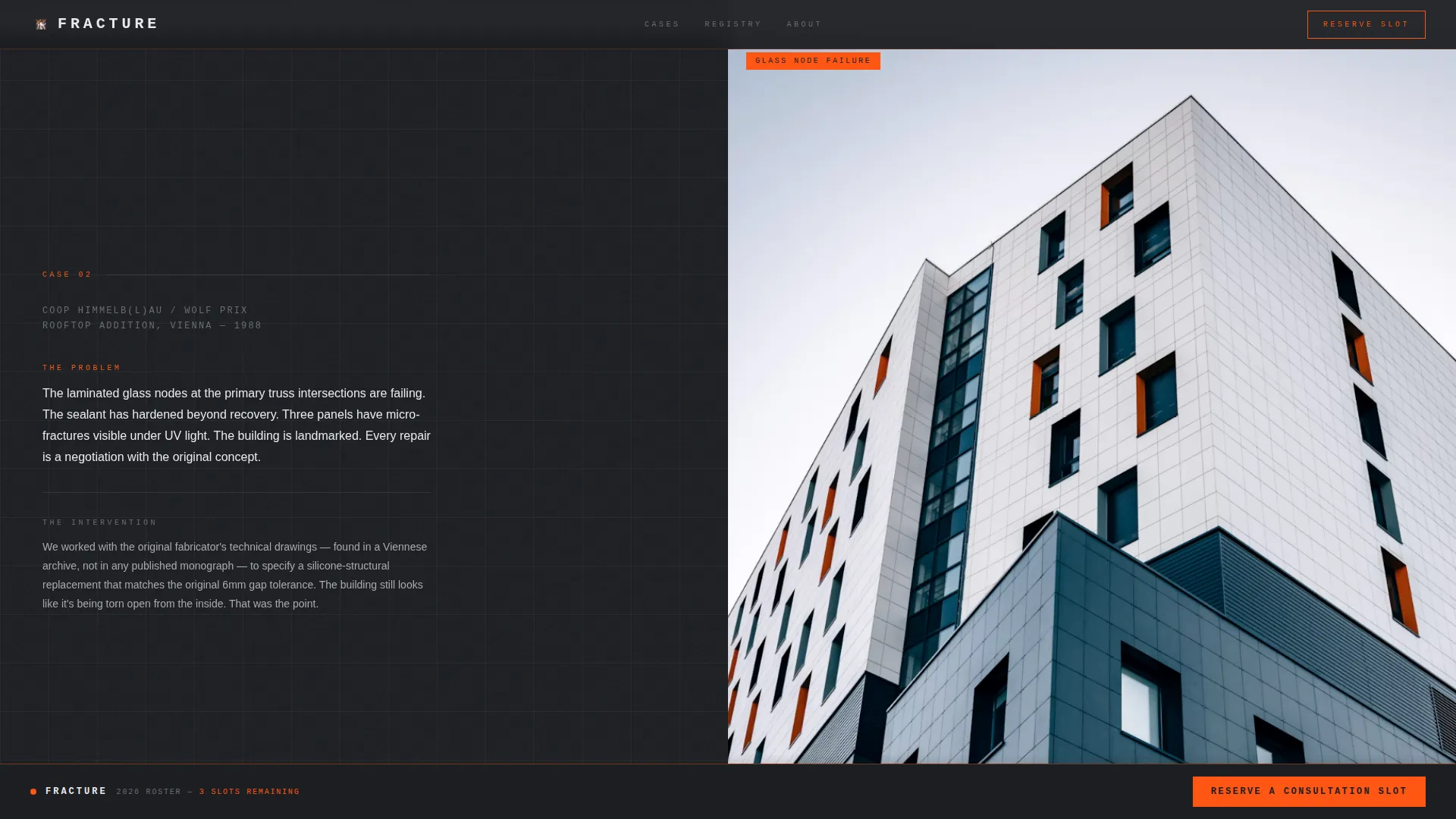
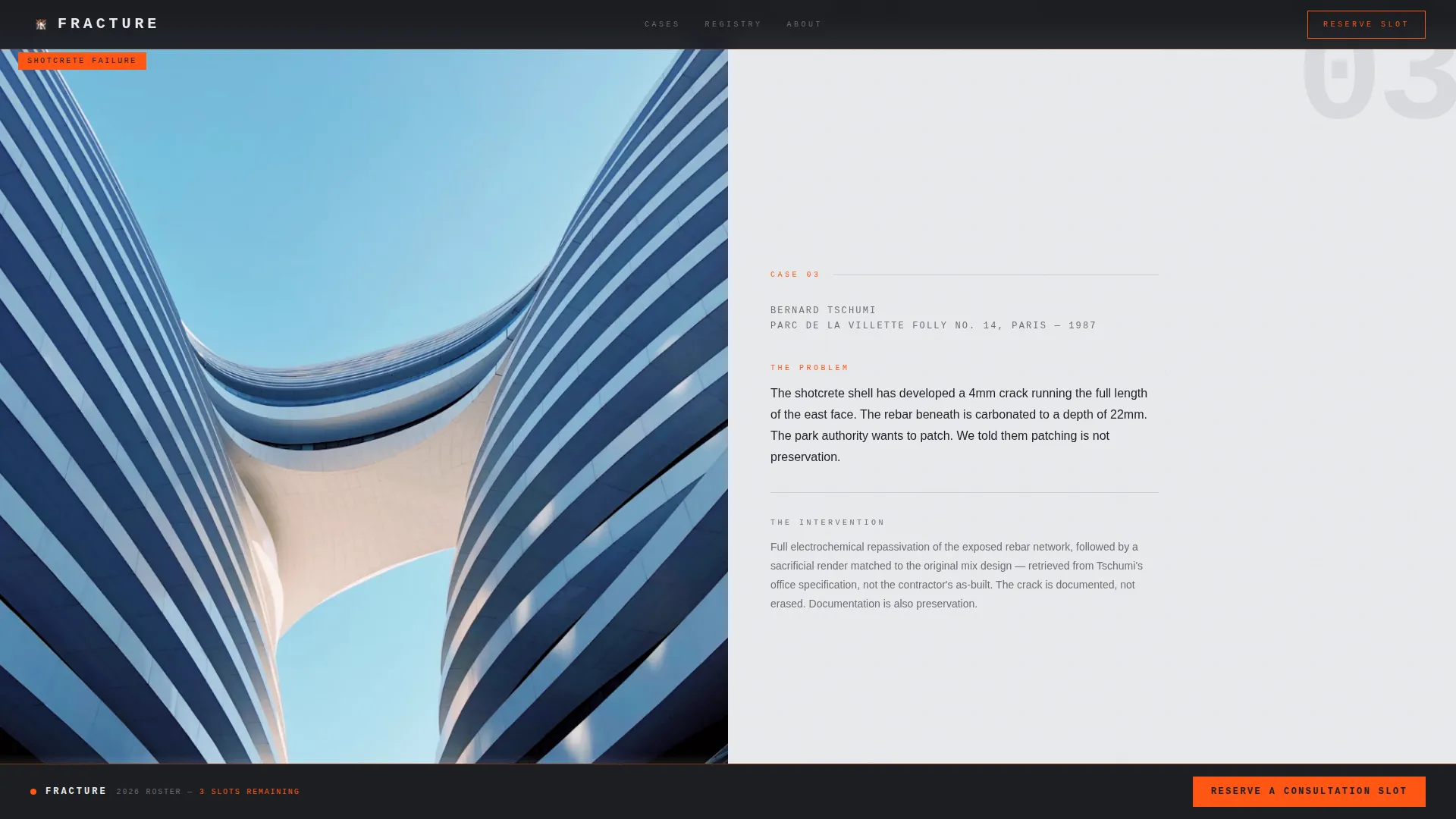
- Three full-viewport museum-panel case study sections with scroll-zoom detail photography and hard-cut transitions
- A ticking global counter section, a pinned safety-orange call-to-action bar, a three-field waitlist form, and a minimal single-row footer
Feature list
This template is built around a set of tightly defined components that work together to communicate authority, urgency, and precision.
Nine-Cell Asymmetric Photo Mosaic Header
The header arranges nine tightly cropped, high-contrast black-and-white photographs in a deconstructed bento grid. Hairline gaps of safety-orange separate every cell, giving the composition the feeling of a forensic evidence board. The headline stamps onto the screen only after the visitor scrolls a single pixel, anchored bottom-left in full uppercase with generous letter-spacing.
Scroll-Triggered Gallery Walk Case Studies
Three full-viewport panels each present one preservation case study as a museum panel. A single blunt sentence names the building's problem. A detail photograph then zooms slowly as the visitor scrolls. The rhythm of silence, image, text, and silence is maintained with hard cuts and no fade transitions.
Ticking At-Risk Counter Section
The final case-study panel gives way to a live counter showing how many deconstructivist structures worldwide are currently listed as at risk. The number ticks upward in real time, converting a statistic into a felt urgency that primes the waitlist form directly below.
Pinned Waitlist Call to Action
A safety-orange "Reserve a Consultation Slot" button pins to the bottom of the viewport after the first scroll. It remains visible throughout the entire page experience without obscuring content, keeping the conversion path open at every moment.
Friction-Light Three-Field Waitlist Form
The waitlist section asks for only three inputs: building name, location, and one email address. No unnecessary fields, no multi-step flow. This matches the psychology of the target client, who arrives already knowing their building is in trouble and needs a direct next step.
At-Risk Registry Submission Path
A secondary conversion option sits alongside the waitlist form. Visitors can submit a building to a publicly visible at-risk registry. This builds community investment and expands the consultancy's audience before it formally launches its full service roster.
Page sections overview
| Section | Purpose |
|---|---|
| Photo Mosaic Header | Open with forensic visual authority and a stamp-on headline reveal |
| Case Study Panels | Walk visitors through three scroll-triggered preservation scenarios |
| At-Risk Counter | Escalate urgency with a live global tally of endangered structures |
| Waitlist Form | Convert readied visitors with a three-field, low-friction sign-up |
| At-Risk Registry | Offer a secondary path for community building before launch |
| Minimal Footer | Close the page cleanly with a single-row, low-distraction footer |
Design & branding system
The visual identity is built on a Bold Brutalist framework with a Monochrome Steel color system. No gradients appear anywhere. Every background alternates between deep gunmetal and cold zinc white in hard blocks, as if forms have been stripped and the concrete is standing bare.
- Color palette: deep gunmetal (#1C1E22), exposed aggregate gray (#6B6E72), shuttered concrete (#A8AAAD), cold zinc white (#E8EAED), with safety-orange (#FF5714) used exclusively for interactive hotspots and the waitlist call to action
- Typography: IBM Plex Mono for structural and headline text, DM Sans for body copy, set in massive uppercase for headlines and always left-justified against generous negative space
- All section transitions are hard cuts with no fades, reinforcing the board-formed concrete aesthetic throughout the page
Mobile & speed optimization
The template is designed desktop-first, reflecting the workstation habits of institutional clients such as heritage board directors and facilities managers. Mobile support is included to ensure no visitor is turned away on a smaller screen.
- All scroll-triggered animations use Intersection Observer logic and GPU-accelerated transforms to keep motion smooth without layout interference
- The pinned call-to-action bar, the photo mosaic, and the case study panels are structured to reflow cleanly on smaller viewports
- The three-field form keeps mobile entry fast and low-friction, matching the desktop experience without introducing extra steps
How this template helps you convert
Fracture earns the click before it asks for it. Every design and content decision is calibrated to move a skeptical institutional visitor from first impression to waitlist submission.
- The forensic photo mosaic and stamp-on headline establish expertise in the first seconds, before a single word of body copy is read.
- Scroll-triggered case study panels demonstrate specific intervention knowledge, replacing vague credentials with concrete evidence that builds trust panel by panel.
- The ticking at-risk counter and pinned safety-orange call to action create a felt sense of urgency, so that submitting the three-field form feels like the logical next step rather than a cold commitment.
Other information about this template
Fracture sits at the intersection of heritage preservation practice and deconstructivist architecture, a niche where no standard portfolio template communicates the right level of material and structural fluency. The template is built as a storybook full-page layout, meaning all sections live within a single scrollable experience with no page reloads or separate routes.
- The Gallery Walk creative direction means each case study section functions as a standalone museum panel, giving the page a curatorial quality that resonates with cultural institution clients
- The template style and animation approach are suited to high-stakes consultancy launches, pre-launch waitlist campaigns, and heritage preservation advocacy pages
- The at-risk registry component doubles as a pre-launch audience tool, helping the consultancy build a database of engaged stakeholders before its first formal client intake
Theme
Bold Brutalist
Creative direction
Gallery Walk
Color system
Monochrome Steel
Style
Storybook/Full-Page
Direction
Waitlist/Coming Soon
Page Sections
Nine-cell Photo Mosaic Header
Scroll-triggered Case Study Panels
Live At-risk Global Counter
Pinned Safety-orange Call to Action
Friction-light Waitlist Form
At-risk Registry Submission
Related questions
Who is this template designed for?
Can I use this template for a waitlist or pre-launch campaign?
What sections are included in this template?
Does the page work on mobile devices?
How does the ticking at-risk counter work?



