Fracture — Striking Abstract Art Landing Page Template
Fracture is a masonry-style landing page built for a deconstructivist real estate specialist. It combines an editorial Ink and Paper visual identity with iridescent accents, a full-bleed blue-hour hero, a scroll-driven tonal shift, and a Pinterest-style listing grid. The primary conversion path is a gated archive of property dossiers, entered via email capture.
by Rocket studio
Quick summary
Fracture is a single-page, editorial-first landing page for a real estate practice that specialises exclusively in deconstructivist architecture. The design moves like a printed monograph: ink-dark to warm vellum as you scroll, with iridescent accents that surface only on hover. Every visual and copy decision signals curatorial authority before asking for an email.
Who this template is for
This template is built for a very specific kind of practice. It suits professionals who lead with architect provenance, not postcodes, and whose clients treat property acquisition as an act of collecting.
- Real estate specialists trading exclusively in deconstructivist or architecturally radical buildings
- Practices targeting high-net-worth tech founders, design-obsessed buyers, and institutional investors
- Agents or curators who need a content-destination page rather than a conventional listings portal
What problem this template solves
Generic real estate templates flatten every property into the same card format. They prioritise bedroom counts over architectural narrative. For a practice like this, that default approach actively undermines credibility with the audience it needs to reach.
- Buyers of deconstructivist properties do not respond to commodity layouts or stock photography aesthetics
- There is no standard template that leads with architect provenance and positions listings as collectible assets
- Most templates offer no pathway to gate premium research content behind a qualifying email capture
What you get with this template
You get a fully structured, single-page layout that functions as both a showcase and a content destination. Every section is purposefully sequenced to build trust before asking for anything.
- A full-bleed blue-hour hero with a scroll-triggered watermark headline reveal
- A masonry listing grid with iridescent hover states and architect-first card captions
- An inline archive gate with email capture and a single qualifying question
Feature list
This template is built around a deliberately high number of interaction and atmosphere details. Each feature reinforces the editorial identity of the practice.
Watermark Headline Reveal
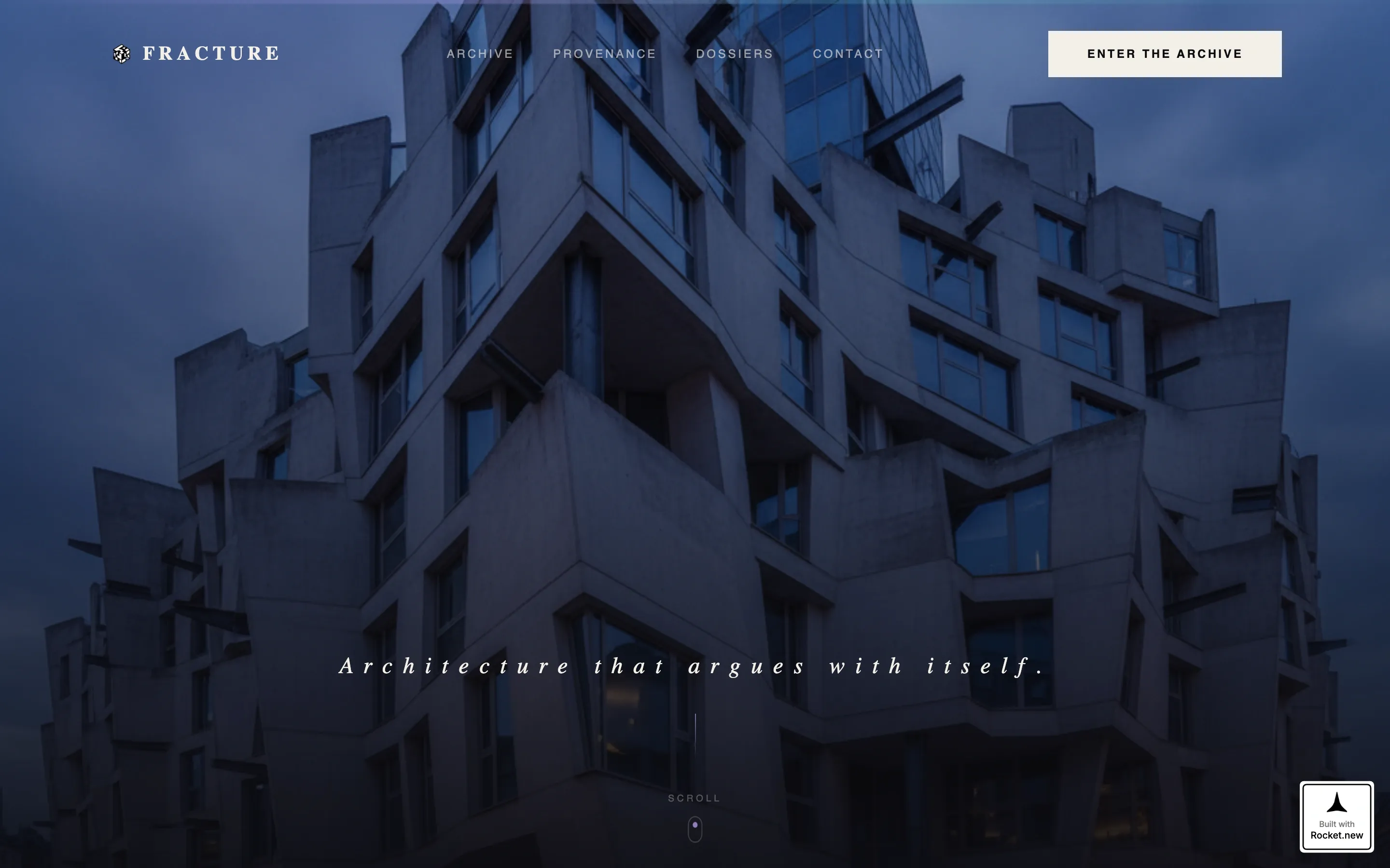
The hero section opens on a high-contrast architectural photograph. After a brief pause, a single line of thin, letterspaced serif type materialises on screen. The effect mimics a watermark developing on wet paper, setting the tone before any navigation or call to action appears.
Scroll-Linked Tonal Shift
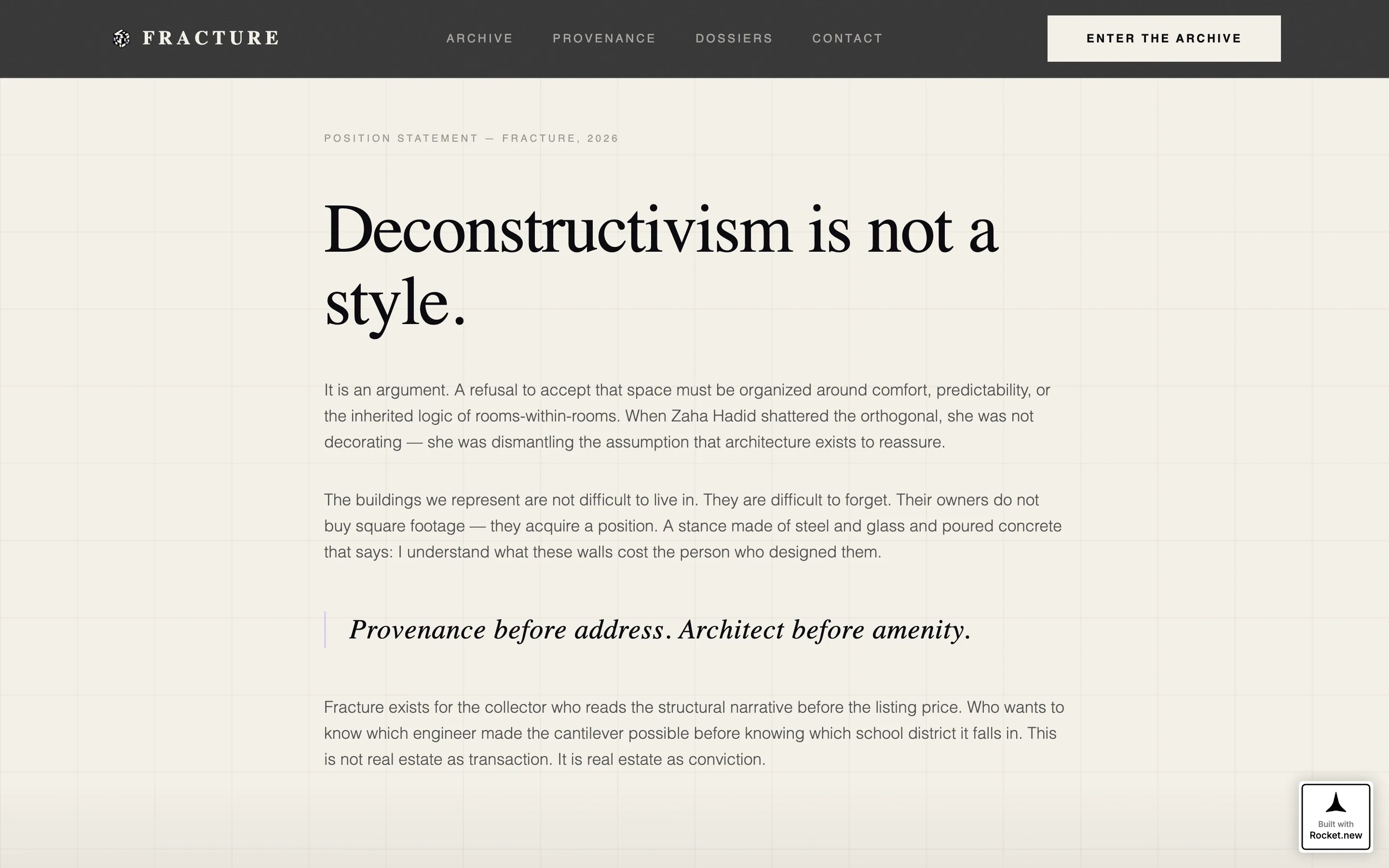
As the page scrolls from the hero into the manifesto section, the background transitions from deep ink black to warm unbleached vellum. This scroll-driven animation is continuous and smooth, giving the experience a page-turning quality that matches the monograph aesthetic.
Masonry Listing Grid
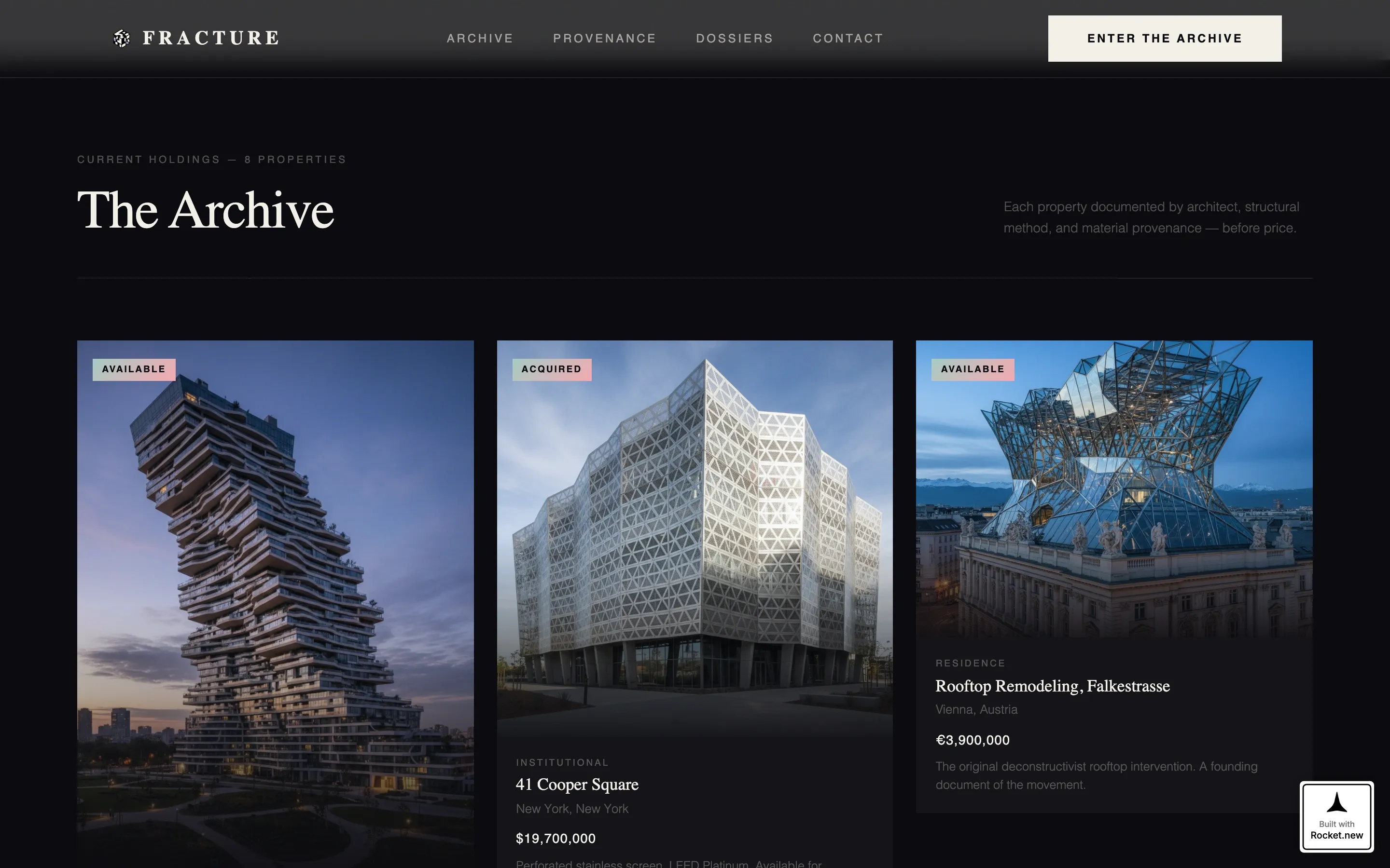
Cards are varied in height and width, mixing portrait, landscape, and near-square proportions. This irregularity mirrors the geometry of the buildings themselves. Each card is editorially photographed and captioned with the architect's name before the address.
Iridescent Hover States
Hovering over any listing card triggers a prismatic lilac border bloom. The effect is subtle and rewards attention rather than demanding it, consistent with the template's principle that iridescent accents should arrive like light leaks rather than dominate the layout.
Gated Archive Entry
The "Enter the Archive" call to action leads to an inline form that asks for an email address and a single qualifying question: "Are you collecting, relocating, or investing?" This gate is designed to feel like a private library entrance, not a lead form.
Collector's Guide Artifact Card
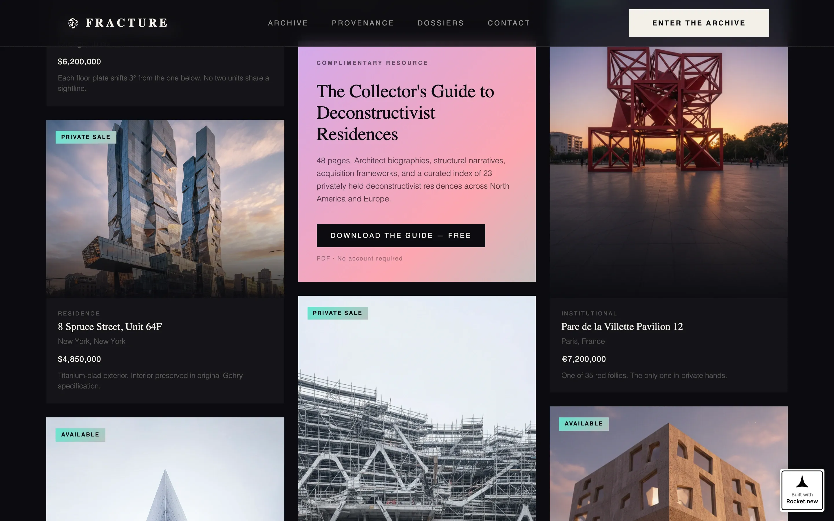
A downloadable PDF card is embedded mid-grid, styled identically to the listing cards but with the teal-to-rose gradient background. It reads as a discovered artifact within the editorial flow, not as a marketing interruption.
Page sections overview
| Section | Purpose |
|---|---|
| Full-Bleed Hero | Opens on a blue-hour architectural photograph with a delayed watermark headline reveal |
| Manifesto Block | Short editorial statement positioning deconstructivism as a stance, not a style |
| Masonry Listing Grid | Editorial property cards in varied sizes with iridescent hover borders and architect-first captions |
| Collector's Guide Card | Iridescent gradient artifact card offering a free PDF download mid-grid |
| Archive Gate | Inline email capture form with a qualifying question and "Enter the Archive" call to action |
| Minimal Footer | Horizontal flow footer with minimal navigation |
Design & branding system
The visual identity is built on an Ink and Paper theme interpreted through an iridescent color system. The palette is precise and intentional, with each color assigned a specific role.
- Deep calligraphy black (#0B0B0F) and unbleached vellum (#F4F0E8) form the primary background and text pairing, inverting as sections alternate
- Prismatic lilac (#C4A8FF) appears exclusively on hover states as a shimmering iridescent border accent
- A shifting teal-to-rose gradient (#5EEAD4 to #FDA4AF) is reserved for featured listing badges, the Collector's Guide card, and active interface edges
Mobile & speed optimization
The template is designed with a desktop-first priority, which reflects the editorial reading habits of the high-net-worth collector audience. The layout and animation system are structured to support that primary experience.
- Image lazy loading is built into the masonry grid to manage the visual weight of editorial photography
- CSS scroll-driven animations handle the tonal shift and card entrance sequences without relying on heavy scripting
- Staggered card entrance animations are timed to feel considered rather than mechanical on larger screens
How this template helps you convert
The page earns conversion by proving authority first. The sequence is deliberate: atmosphere before listings, listings before the gate, and the gate framed as access rather than surrender.
- The hero and manifesto establish curatorial credibility before any property or call to action appears, so the audience arrives at the grid already primed to trust the practice's judgment
- The Collector's Guide card mid-grid provides a low-friction first conversion point for visitors not yet ready to enter the archive, capturing intent at an earlier stage of the decision
- The archive gate qualifies leads at the point of capture with a single question, so the practice receives segmented intent data alongside each email address
Other information about this template
This template is part of a broader set of intersection-specific designs built for architecture and design niches. A few additional details are worth noting for buyers evaluating fit.
- The page is built in English, priced in United States dollars, and localised for a United States market context
- Typography uses Fraunces for serif headlines and DM Sans for body and interface text, pairing editorial warmth with functional clarity
- The footer follows a Vercel Horizontal Flow pattern, keeping the closing section minimal and unobtrusive
- Animation intensity is set to high, covering the watermark reveal, scroll-linked tonal shift, iridescent border bloom, and staggered card entrances
- The template is classified under the Architecture and Design category, within the Deconstructivist Architecture subcategory, and is built specifically for the Deconstructivist Realtor Specialist niche
Theme
Ink & Paper
Creative direction
Atmosphere & Mood
Color system
AI Iridescent
Style
Masonry/Pinterest
Direction
Content/Resource
Page Sections
Watermark Headline Reveal
Scroll-linked Tonal Shift
Editorial Masonry Grid
Iridescent Hover States
Gated Archive Entry Form
Collector's Guide Artifact Card
Related questions
What kind of real estate practice is this template designed for?
How does the archive gate work?
Can the masonry grid accommodate different types of listings?
What is the Collector's Guide card?
Is this template suited to a practice with only a small number of listings?



