Bold Brutalist Deconstructivist Architecture Landing Page
Fracture is a bold brutalist landing page built for deconstructivist architecture practices. It pairs a Monochrome Steel palette with cursor-reactive floating photography, a shifting asymmetric grid, and drag-to-orbit project exploration. The result is a raw, spatially aggressive website that drives commission inquiries by making visitors feel the weight of the work before they ever click through.
by Rocket studio
Quick summary
Fracture is a single-page brutalist landing page template designed for deconstructivist architecture practices. Six black-and-white project photographs float at conflicting angles in the hero. Each project section locks into a shifting asymmetric grid. The design is bold, raw, and deliberately disorienting, built to move cultural institutions, civic bodies, and private collectors toward a commission inquiry.
Who this template is for
This template is built for architecture practices whose work refuses to conform. It suits studios that design buildings which tilt, collide, and shear apart, and who need a website that communicates that spatial aggression instantly.
- Cultural institution directors commissioning landmark museums or civic landmark buildings
- Municipal bodies funding provocative public architecture projects
- Private collectors seeking residential design that challenges gravitational convention
What problem this template solves
Standard portfolio pages flatten complex spatial work into polished image galleries. For a deconstructivist practice, that kind of comfortable, generic web design is a misrepresentation. Visitors leave without feeling the true scale or intent of the buildings.
- Generic portfolio sites fail to convey structural contradiction or spatial disorientation
- Polished, corporate web design aesthetics undermine the raw honesty a brutalist practice depends on
- Conventional layouts give users no reason to search further or request a commission
What you get with this template
This template delivers a high-interactivity, desktop-first landing page that functions as a spatial object rather than a flat document. Every section is built from the source brief and designed to earn the click-through.
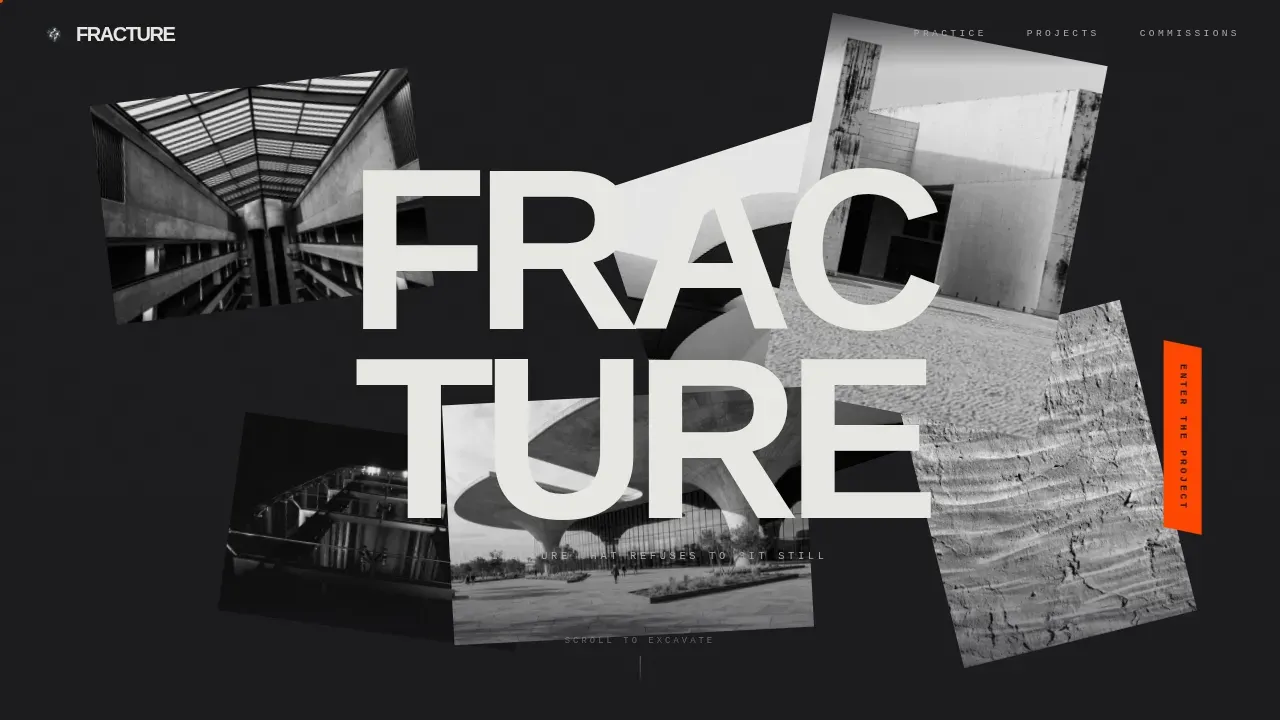
- A cursor-reactive hero with six floating black-and-white photographs at conflicting angles, revealing the firm name on cursor interaction
- Three project sections with a 60/40, 45/55, and 70/30 asymmetric grid that destabilizes as the visitor scrolls deeper
- A persistent construction orange "Enter the Project" call-to-action tab fixed to the viewport edge, plus a progressive secondary call-to-action that appears after three project sections are explored
Feature list
This template's design and interactivity features are grounded in the brief. Each one serves a specific function within the landing page.
Floating Photo Hero with Cursor Parallax
Six high-contrast black-and-white project photographs are suspended at conflicting angles across the viewport. They drift on scroll and respond to cursor position with parallax displacement. When the visitor's cursor disturbs the nearest image, it slides aside to reveal the firm name in massive condensed type. The hero immediately communicates spatial depth and bold design intent.
Drag-to-Orbit Project Explorer
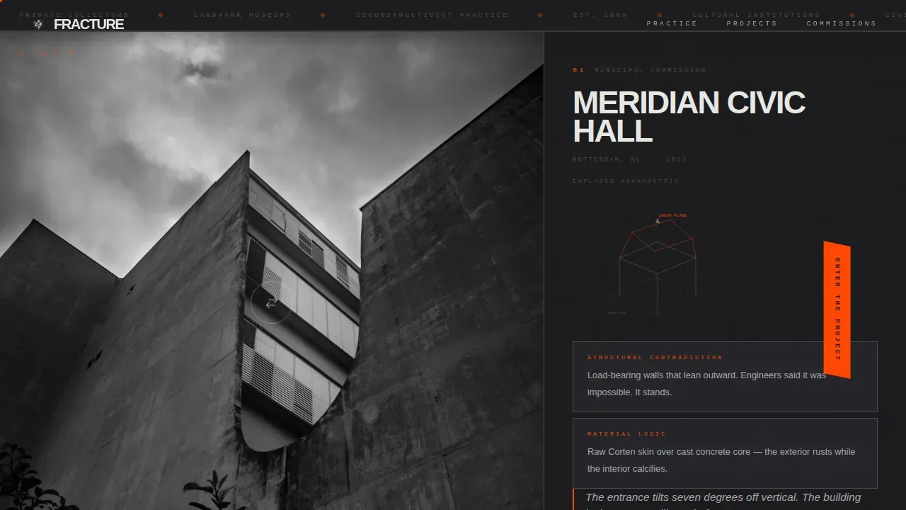
Each project section loads as a locked asymmetric composition. The larger panel holds a single dramatic exterior photograph that visitors can click-drag to orbit around the building across a 180-degree arc of stitched images. This gives users a sense of physical space rather than a static description of the building.
Destabilizing Grid System
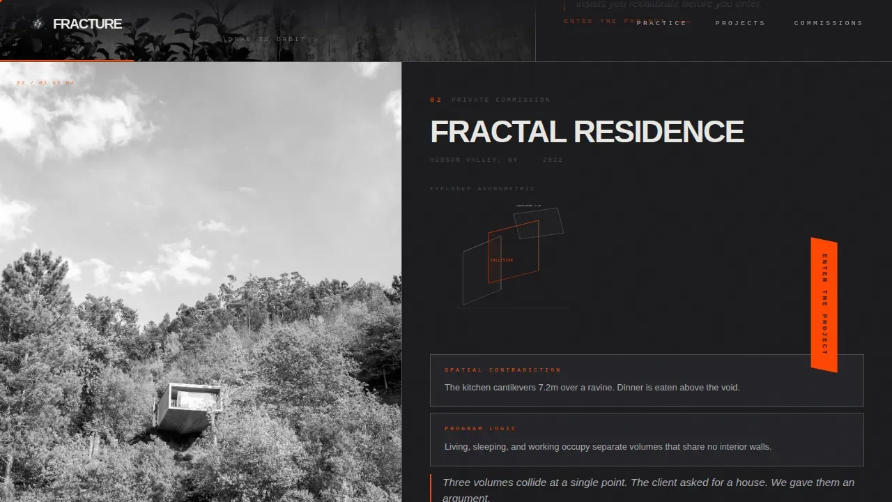
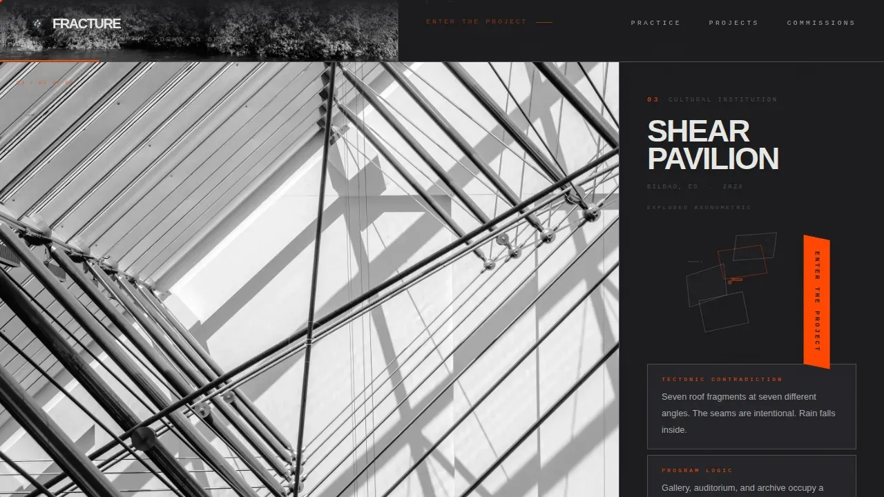
As the visitor scrolls deeper, the grid itself shifts. Column ratios move from 60/40 to 45/55 to 70/30. Margins collapse asymmetrically and type scales up without warning. This controlled fragmentation in layout mirrors the disorientation the buildings produce, and keeps users engaged across the full page.
Exploded Axonometric Panels
The narrow column in each project section displays exploded axonometric diagrams, structural contradiction callouts, and a single sentence of design intent in stark white type on a blackened iron background. The description is direct, minimal, and unapologetically heavy, consistent with brutalist web design principles that prioritize honesty over decoration.
Progressive Call-to-Action System
The primary "Enter the Project" call-to-action appears as a persistent angular tab fixed to the right edge of the viewport. A secondary "Start a Conversation" call-to-action slides in from the narrow column only after the visitor has explored at least three project sections. This rewards engagement and ensures the site earns its conversion rather than demanding it upfront.
Ultra-Minimal Footer
The footer follows a Vercel Horizontal pattern, ultra-minimal, no clutter, no unnecessary form fields. It keeps the page's raw, functional aesthetic intact through to the last pixel.
Page sections overview
| Section | Purpose |
|---|---|
| Floating Photo Hero | Introduces the practice through six cursor-reactive black-and-white project photographs at conflicting angles, revealing the firm name on interaction |
| Project One (60/40) | Civic museum exterior with drag-to-orbit photography, exploded axonometric diagram, and a single design intent statement |
| Project Two (45/55) | Private residence section with structural contradiction callouts and a shifted grid that begins to destabilize the layout |
| Project Three (70/30) | Cultural pavilion display with a further-fractured grid, oversized type scaling, and collapsed asymmetric margins |
| Commission Call-to-Action | Primary persistent call to action tab plus progressive secondary call to action reveal after three project sections are explored |
| Ultra-Minimal Footer | Clean horizontal footer closing the page with no excess elements |
Design & branding system
The visual identity is a Monochrome Steel system built around industrial materials and a single searing accent. Brutalist web design principles guide every decision, honesty of materials, raw color palettes, and bold typographic weight over decorative refinement.
- Colors: blackened iron (#1A1A1D) as the primary background, brushed gunmetal (#4A4A50) and raw zinc (#A8A9AD) as mid-tones, exposed aggregate white (#E8E8E4) for type, and construction orange (#FF4500) reserved exclusively for interactive hotspots and hover states
- Typography: Manrope in heavy condensed weights for oversized headlines, JetBrains Mono for structural callouts, both characterized by blunt, immediate impact consistent with brutalist web design standards
- Layout: fractured and asymmetric throughout, with sharp section dividers, no soft transitions, and a grid that shifts deliberately across project sections
Mobile & speed optimization
Fracture is desktop-first by design. The spatial orbit interactions and cursor parallax require pointer precision that touch screens cannot replicate. Mobile visitors receive a simplified fixed layout that preserves the bold visual identity without the interactivity layer.
- Desktop experience: full cursor parallax, drag-to-orbit photography, progressive grid destabilization, and animated call-to-action behavior
- Mobile experience: simplified fixed layouts that retain the Monochrome Steel palette, oversized type, and asymmetric composition without pointer-dependent interactions
- Performance approach: GPU-accelerated transforms only, with Intersection Observer used for stagger reveals across project sections
How this template helps you convert
This landing page is built around a click-through conversion model. The goal is to make the visitor feel the firm's work is too spatially complex to contain on a single page, then give them a clear, bold path forward.
- The persistent construction orange "Enter the Project" tab is visible from the moment the visitor lands, fixed to the right edge of the viewport and angled to provoke a reaction without interrupting exploration
- The secondary "Start a Conversation" call-to-action only appears after three project sections have been explored, arriving as a reward for engagement rather than a demand, which increases the quality and intent of every inquiry
Other information about this template
Brutalism in architecture emerged in the late 1940s and early 1950s as a reaction to wartime destruction. The term brutalism is derived from the French phrase béton brut, meaning raw concrete. Brutalist structures were designed for efficiency and simplicity, minimizing unnecessary decoration. Brutalist architecture was characterized by raw, exposed materials and a focus on functionality over aesthetics. Today, brutalism in web design is seen as a reaction against the lightness and optimism of overly polished mainstream sites, and as a response to frivolity in today's web design landscape.
The brutalist web design trend also emerged as a way to express skepticism toward corporate data collection practices and a lack of online transparency. Brutalist websites often express a concern for honesty that more refined sites paper over. This template fits naturally in that tradition. It is characterized by a raw, minimal statement that treats the webpage as a functional structure. The idea is to provoke a reaction, not to reassure.
- This brutalist web template is fully customizable without requiring any custom code, allowing users to add, rearrange, or redesign sections easily
- The template is well-suited for creative agency studios, experimental art sites, or any practice looking to stand out from a sea of polished pages
- Brutalist web templates like this one are a good option for the younger generation of architects and designers who want their site to make a bold visual statement
- Social media preview images benefit from the high-contrast monochrome aesthetics this template produces, making shares feel as heavy and raw as the buildings themselves
- Users can save time on custom design by starting from a template that already embeds the brutalist design logic, asymmetric layout, and grid destabilization described in the brief
- The number of interactive sections can be adjusted; the three-project structure shown is a strong starting point for most practices
Theme
Bold Brutalist
Creative direction
Interactive Explorer
Color system
Monochrome Steel
Style
Asymmetric Grid (60/40)
Direction
Click-Through
Page Sections
Cursor-reactive Floating Photo Hero
Drag-to-orbit Project Photography
Progressive Destabilizing Grid
Exploded Axonometric Side Panels
Progressive Dual Call-to-action System
Ultra-minimal Brutalist Footer
Related questions
Is this template suitable for a creative agency rather than a single architecture practice?
Does this landing page template require coding to customize?
What makes this different from a standard portfolio website?
Who is the primary audience this landing page is designed to reach?
Can this template support more than three project sections?