Motion Designer Portfolio Portfolio Website Template
Reel is a cinematic motion designer landing page built on an asymmetric 60/40 grid. It uses a scroll-as-timeline format to screen case studies like a film cut, not list them like a resume. The Ink & Paper color system, looping video panels, and a frictionless email call to action make this template ideal for motion designers ready to turn their reel into new work.
by Rocket studio
Quick summary
Reel is a single-page motion designer portfolio template that treats every scroll like a timeline playhead. Case studies enter the viewport as scenes, not cards. The 60/40 asymmetric grid pairs looping video clips with concise project context, building toward a terminal call to action that routes directly to an email compose window. It is built for motion designers who want their page to feel like a screening, not a slideshow.
Who this template is for
This template is built for independent motion designers and freelance motion artists who need a portfolio that matches the quality of the work they deliver. It speaks directly to the people browsing your page: agency creative directors, in-house brand leads preparing a product launch, and post-house producers filling a freelance seat on a tight deadline.
- Freelance motion designers building a client-facing case study portfolio
- Motion artists transitioning from studio employment to independent work
- Experienced motion designers who want their page to reflect the craft of their reel
What problem this template solves
Most portfolio pages treat motion work like a static gallery. Thumbnails sit in a grid, a play button waits for a click, and the energy drains out before the visitor ever commits. Motion work is sequential, rhythmic, and cinematic by nature. A standard grid layout fights that nature instead of using it.
- Static portfolio grids strip the pacing and tension out of motion work
- Generic layouts fail to communicate creative range across titles, product, and experiential categories
- High-friction contact forms lose the brief before the conversation starts
What you get with this template
This template gives you a fully structured single-page layout built around the logic of a film cut. Every section has a defined role, and the scroll experience is intentional from the first frame to the final call to action.
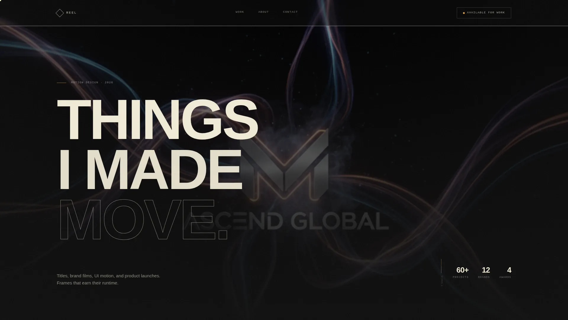
- A Type Over Image header with a looping showreel still and oversized headline
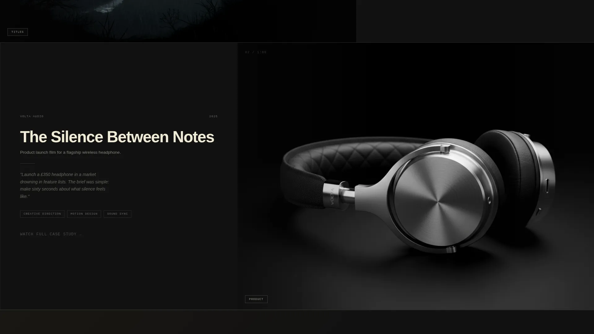
- An asymmetric 60/40 case study grid with looping video panels and project context columns
- Full-width typographic chapter cards separating work categories
- A terminal parchment call to action band linked to a pre-filled email compose window
Feature list
This template is built around a small number of deliberate, high-impact design decisions. Each feature earns its place.
Asymmetric 60/40 Case Study Grid
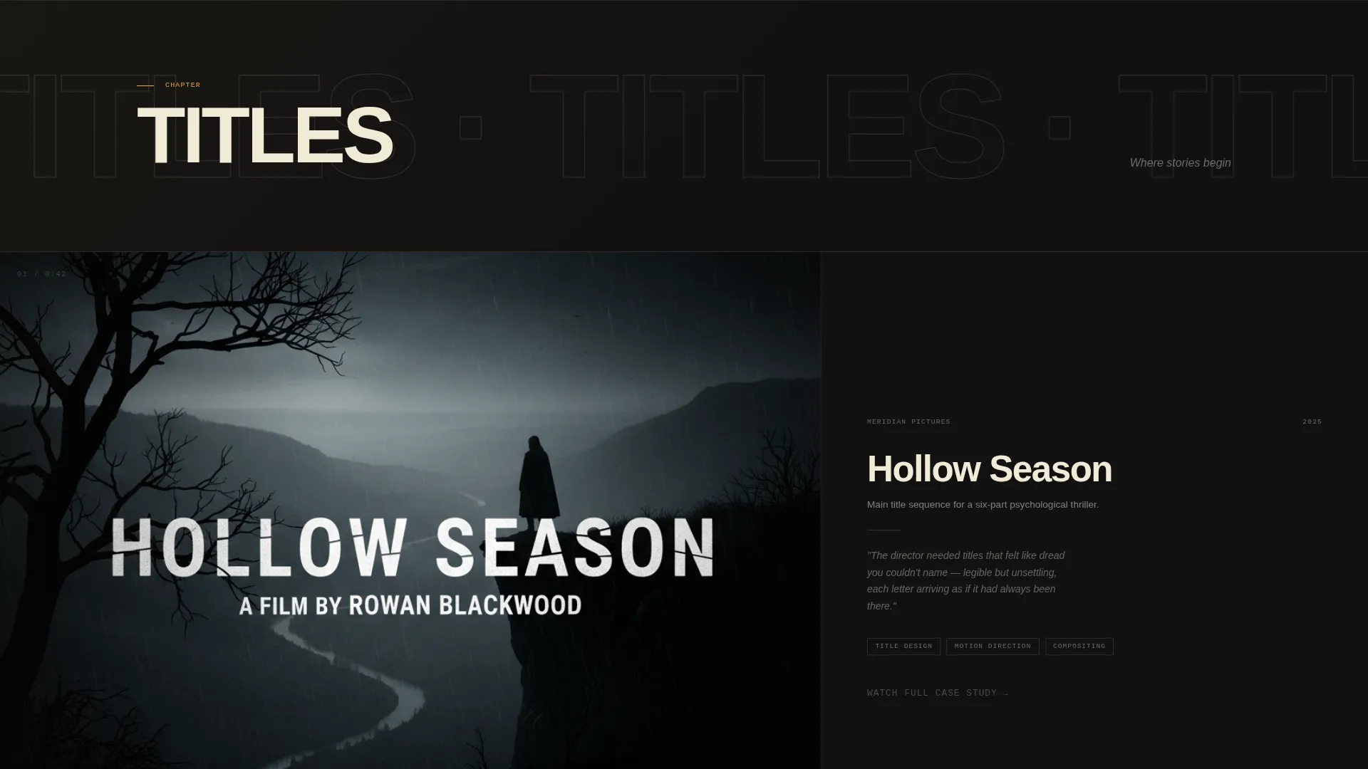
Each case study occupies the full viewport as a scene. The 60-column side holds a looping, auto-playing video clip cropped cinematically with no controls visible. The 40-column side stacks the project title, client name, role tags, and a single sentence describing the creative problem.
Cinematic Scroll Transitions
As the visitor scrolls, each new case study wipes or cross-dissolves the previous one. The pacing accelerates as the page progresses, mimicking an edit building toward a climax. The scroll behaves like a timeline playhead moving through a cut.
Type Over Image Header
The header places a bold, specimen-weight headline directly over a desaturated looping showreel still. The image uses a slow, barely perceptible parallax drift. No play button appears. The stillness creates tension and draws the visitor into the first scroll.
Typographic Chapter Cards
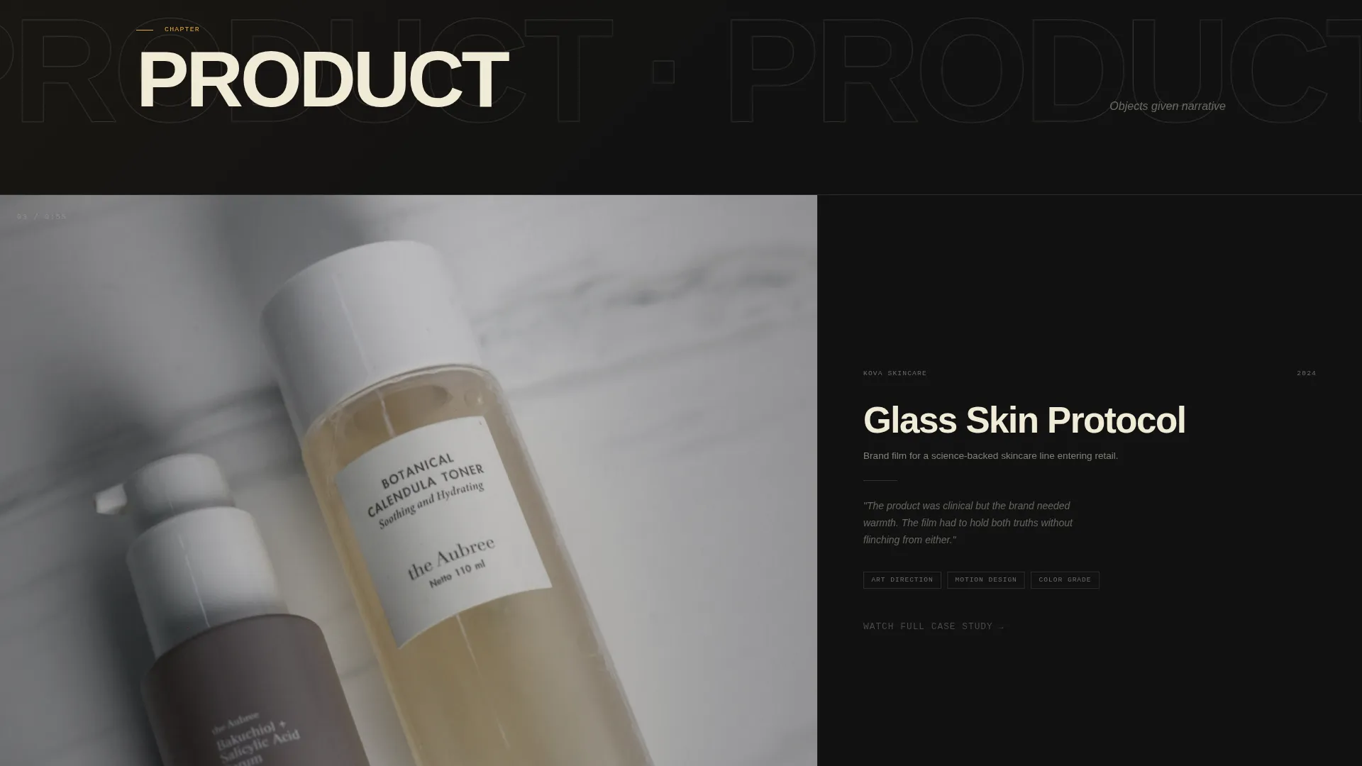
Between case study sections, full-width interstitial cards display category labels such as "TITLES," "PRODUCT," and "EXPERIENTIAL." These cards give the page rhythm, breathing room, and a clear sense of the designer's range.
Frictionless Email call to action
The terminal call to action is a full-width parchment band with a single button reading "Send Me the Brief." The click opens an email compose window pre-filled with a subject line. There is no form to complete, reducing friction to a single reply.
Per-Case-Study Amber Link
Each case study's 40-column text panel ends with a quiet amber link reading "Watch Full Case Study →" that routes to a dedicated project breakdown page. The color draws the eye without interrupting the editorial tone of the page.
Page sections overview
| Section | Purpose |
|---|---|
| Type Over Image Header | Introduces the designer with an oversized headline over a looping showreel still and slow parallax drift |
| First Case Study Scene | Opens the cinematic scroll sequence with a 60/40 looping video and project context panel |
| Chapter Card: Titles | Typographic interstitial that marks the Titles work category and resets scroll rhythm |
| Second Case Study Scene | Continues the cinematic sequence with the next project in the Titles category |
| Chapter Card: Product | Typographic interstitial marking the Product work category |
| Third Case Study Scene | Presents a product-focused project with looping clip and creative problem statement |
| Chapter Card: Experiential | Typographic interstitial marking the Experiential work category |
| Fourth Case Study Scene | Closes the case study sequence with an experiential project scene |
| Terminal call to action Band | Full-width parchment section with headline and email-compose button |
Design & branding system
The visual identity follows a Lens & Frame theme using the Ink & Paper color system. The palette is built for high contrast and editorial authority, deliberately limited so every color decision carries weight. The typography uses a tight-tracking sans-serif at specimen weight for display text, and mid-tone graphite for body copy to maintain readability against both black and parchment backgrounds.
- Deep editorial black (#111111) as the dominant background, evoking a darkened edit suite
- Warm parchment (#F0EAD6) used for the terminal call to action band and high-contrast text moments
- Projection-light amber (#E8A838) reserved strictly for hover states, active navigation indicators, and call to action pulse effects
Mobile & speed optimization
The template is designed to present motion work clearly on smaller screens without losing the cinematic intent of the layout. The 60/40 grid stacks vertically on mobile so video clips and project context panels read in natural sequence. Looping video clips are cropped and positioned to remain visually strong at narrower widths.
- Asymmetric grid collapses to a single-column stacked layout on mobile devices
- Looping video panels reframe and crop responsively to maintain compositional integrity
- Typographic chapter cards scale down cleanly and preserve their full-width rhythm on all screen sizes
How this template helps you convert
The page is structured to earn the click before asking for it. Every scroll adds evidence that the designer ships frames worth paying for, so that by the time the visitor reaches the call to action, the decision feels obvious.
- The cinematic scroll sequence keeps visitors engaged long enough to see the full range of work, building trust through craft before any ask appears.
- The per-case-study amber link offers a low-commitment next step at every project, routing curious visitors to a deeper breakdown without interrupting the page's momentum.
- The pre-filled email call to action removes every barrier between interest and contact, turning the final scroll into a single reply.
Other information about this template
This template is part of a broader portfolio and agency template collection focused on creative professionals. It is a strong fit for motion designers building their first standalone portfolio site as well as experienced practitioners refreshing a dated page. The single-page structure means all work, context, and contact live in one focused scroll rather than scattered across multiple pages.
- The template is designed for a single-page landing page format, not a multi-page site
- Chapter cards can be updated with any category names that match the designer's actual body of work
- The pre-filled email subject line in the call to action can be customized to match the designer's preferred intake phrasing
- The color system and type specimen can be adapted while staying within the Ink & Paper palette logic
Theme
Lens & Frame
Creative direction
Cinematic Sequence
Color system
Ink & Paper
Style
Asymmetric Grid (60/40)
Direction
Click-Through
Page Sections
Asymmetric 60/40 Case Study Grid
Cinematic Scroll Transitions
Type Over Image Header
Typographic Chapter Cards
Frictionless Email Call to Action Band
Per-case-study Amber Link
Related questions
Can I add more case studies to this template?
Does this template include video files or showreel footage?
How does the contact call to action work without a form on the page?
Can I relabel the typographic chapter cards to match my disciplines?
Is this template suitable for a freelance motion designer just starting out?