Product Designer Portfolio Booking Website Template
Frameshift is a bento grid landing page template built for product designers who document their work through cinematic video. It pairs a floating-photo header with scroll-driven case study cells, a sticky booking call-to-action, and a warm Cloud Canvas palette, giving design directors, startup founders, and agency recruiters an immersive first impression of your craft.
by Rocket studio
Quick summary
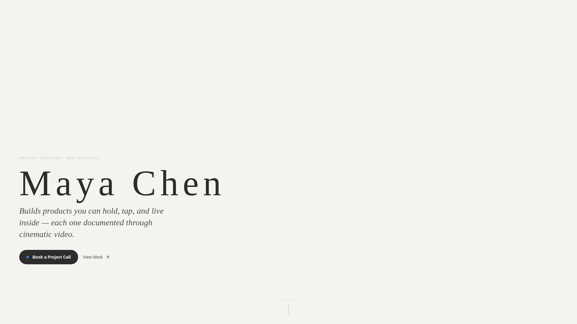
Frameshift is a single-page product designer portfolio template built on a bento grid layout. It opens with a constellation of floating project stills, then guides visitors through cinematic case studies at their own scroll pace. The design feels intentional and gallery-quiet, letting the work carry the room rather than the layout.
Who this template is for
This template is designed for product designers who ship physical and digital work and want a portfolio that reflects that level of craft. It suits designers who use video to document prototypes, process, and final outcomes.
- Freelance product designers attracting design directors and startup founders
- Senior individual contributors being considered for agency or in-house roles
- Product designers whose case studies include video, metrics, and material research
What problem this template solves
Most designer portfolios are static grids of screenshots that feel interchangeable. When your work includes physical prototypes, user research, and measurable outcomes, a flat image gallery undersells everything that makes you different.
- Visitors scan and leave before they understand the depth of your process
- No clear path from portfolio browsing to a project conversation or booking
- Case studies buried in PDFs never get read during a first visit
What you get with this template
Frameshift gives you a fully structured single-page layout that carries a visitor from first impression through to a booking action. Every section is designed with a specific job to do.
- A floating-photo header with six to eight overlapping project stills and parallax cursor response
- A bento grid case study system with video cells, text cells, material detail cells, and metric cells
- A sticky booking pill, a full-width mid-page call-to-action cell, and a PDF download path inside each project
Feature list
The template includes purpose-built components that work together to present cinematic product design work with clarity and confidence.
Floating Parallax Header
Six to eight project stills drift at varying scales and subtle rotations as the cursor moves. They overlap like Polaroids on a light table, anchored by a close-up prototype image at center-left. The designer's name sits beneath in wide-letterspaced charcoal type with a single location line.
Bento Grid Case Study Layout
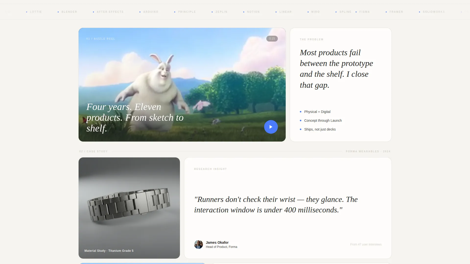
Each project unfolds across asymmetric grid cells that alternate between dense visual clusters and breathing-room text cells. A wide autoplay video cell opens each case study beside a one-sentence problem statement. Square, horizontal, and tall cells carry material details, research insights, and hero walkthrough videos in sequence.
Metric Outcome Cells
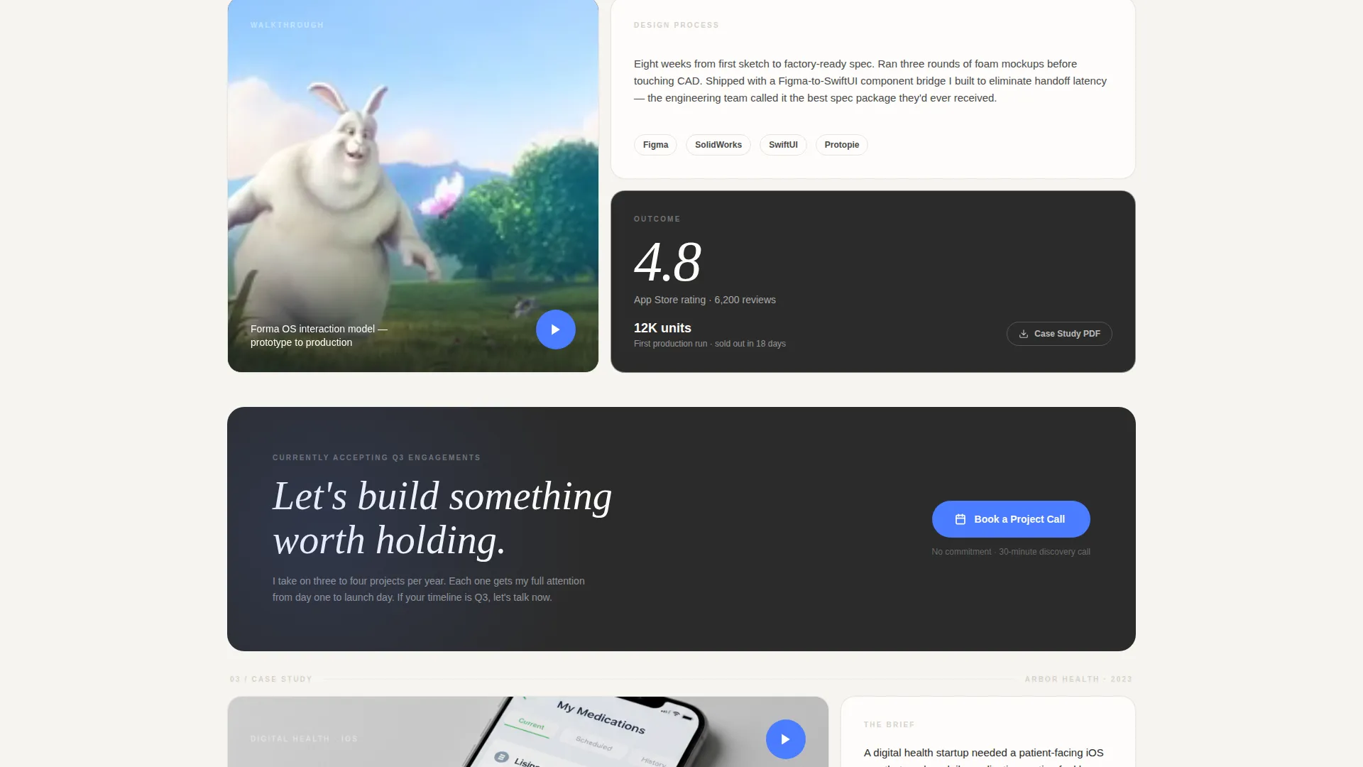
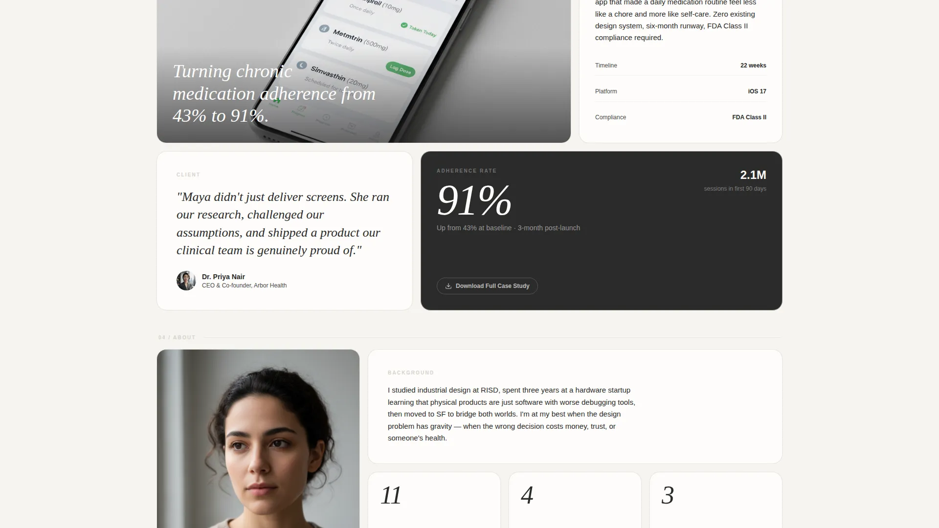
Every case study closes with a single dedicated cell displaying a concrete result. Examples such as a 4.8 App Store rating or 12,000 units on a first production run give visitors a fast, credible signal before the grid resets into the next project.
Sticky Booking Call-to-Action
A "Book a Project Call" pill appears in the top-right corner once the header scrolls out of view. It stays visible through the full scroll journey without blocking content, keeping the path to booking always within reach.
PDF Lead Capture Cell
Each project's final grid cell includes a quieter secondary path: "Download Case Study PDF." This captures a visitor's email in exchange for the deep-dive document, qualifying passive interest without interrupting the scroll experience.
Full-Width Mid-Page call to action Cell
Between case studies, a full-width bento cell surfaces the primary booking action again alongside a secondary line noting current availability. It acts as a natural pause point and a direct prompt to act before the visitor moves into the next project.
Page sections overview
| Section | Purpose |
|---|---|
| Floating Photo Header | Opens with drifting project stills and designer name |
| Hero Sizzle Cell | Autoplays fifteen-second reel beside the design problem |
| Material Detail Cell | Loops a close-up of physical or tactile project detail |
| Research Insight Cell | Surfaces the key user research finding for each project |
| Hero Walkthrough Cell | Plays the full project video in a tall bento cell |
| Metric Outcome Cell | Closes each case study with one concrete result stat |
| Mid-Page call to action Cell | Full-width booking prompt between case studies |
| PDF Download Cell | Captures email inside each project's final cell |
| Sticky Booking Pill | Persistent top-right pill linking to booking page |
Design & branding system
The visual identity uses a Lens and Frame theme with a Cloud Canvas color palette. The goal is a gallery-wall neutrality where every project thumbnail reads as the only color in the room.
- Soft cumulus white (#F6F4F0) and warm mist gray (#D6D1CA) form the page background, giving thumbnails a cotton-paper warmth to pop against
- Deep charcoal (#2B2B2B) handles all type, keeping hierarchy clean and legible without competing with imagery
- Signal blue (#4A7CFF) appears only on interactive states and the video play button, reserving its energy for moments that require action
Mobile & speed optimization
The bento grid layout is structured to adapt across screen sizes while keeping the cinematic feel intact on smaller viewports.
- Video cells are designed to present well whether playing inline or tapping through to a full view
- The floating header stills scale responsively so the overlapping Polaroid composition holds at mobile width
- The sticky booking pill and PDF download cells remain accessible throughout the scroll on all device sizes
How this template helps you convert
Every layout decision in Frameshift is built to move a qualified visitor toward one action: booking a project call.
- The sticky booking pill stays visible from the moment the header scrolls away, so there is never a moment when a motivated visitor has to hunt for the next step.
- The mid-page full-width call to action cell creates a deliberate pause between projects, surfacing current availability and giving hesitant visitors a low-pressure reason to act.
- The PDF download cell inside each project provides a secondary conversion path, capturing email from visitors who are not ready to book but want to go deeper.
Other information about this template
Frameshift is built specifically for the product designer video portfolio niche, where the ability to show rather than just tell is what separates strong candidates from memorable ones.
- The template style is a bento grid, a format well suited to presenting multi-format work including video, stills, text, and metrics in one coherent flow
- The Calendly embed is the intended destination for the "Book a Project Call" action; no form is included on the landing page itself
- The Cloud Canvas palette and Lens and Frame theme are defined in the template, making it straightforward to swap in your own project stills and brand type without breaking the visual system
- This template is category-matched to Portfolio and Agency use cases, specifically the Product Designer Portfolio subcategory
Theme
Lens & Frame
Creative direction
Case Study Narrative
Color system
Cloud Canvas
Style
Bento Grid
Direction
Click-Through
Page Sections
Floating Parallax Photo Header
Bento Grid Case Study System
Autoplay Sizzle Reel Cell
Metric Outcome Cells
Sticky Booking Call-to-action Pill
PDF Lead Capture Cell
Related questions
Does this template include a contact form?
How many case studies can I include in the bento grid?
Can I use this template if my work is mostly digital rather than physical products?
What happens when a visitor clicks 'Download Case Study PDF'?
Is the floating header animation easy to customize?