Supply Chain & Procurement Booking Website Template
The Freightaudit Ironclad Invoicerecovery landing page is built for freight audit and payment service providers. It combines a manifesto-style header, a side-by-side comparison table exposing unaudited versus audited invoice outcomes, and a transparent three-phase process section. The single-page layout drives qualified prospects toward a consultation booking click-through with three strategically placed calls to action.
by Rocket studio
Quick summary
This is a single-page, click-through landing page for a freight audit and invoice recovery service. It opens with an authoritative manifesto headline, presents a detailed comparison table of unaudited versus audited freight charges, and walks prospects through a three-phase audit methodology. Three calls to action push visitors toward a consultation booking page.
Who this template is for
This template is built for back-office freight audit and payment operations that need to convert skeptical, data-driven buyers. It speaks directly to the people watching margin erosion in real time.
- Logistics directors at mid-market manufacturers processing 500 or more loads per month
- Third-party logistics (3PL) chief financial officers tracking margin loss by fractions of a percent
- Supply chain vice presidents who have discovered their transportation management system (TMS) has been auto-approving invoices without review
What problem this template solves
Freight audit firms often struggle to communicate the true cost of inaction to prospective clients. A generic services page does not make the dollar loss feel real. This template makes it undeniable.
- Carriers quietly add duplicate charges, misapplied accessorials, and rate deviations that go unnoticed in manual or automated approval workflows
- Accounting departments approve invoices at volume without the time or tooling to match every bill of lading (BOL) to the underlying contract
- Prospects need to see specific charge types and recovered amounts before they trust a vendor enough to book a consultation
What you get with this template
The template delivers a complete, persuasion-structured single-page layout designed for freight audit and payment service providers. Every section earns the next click.
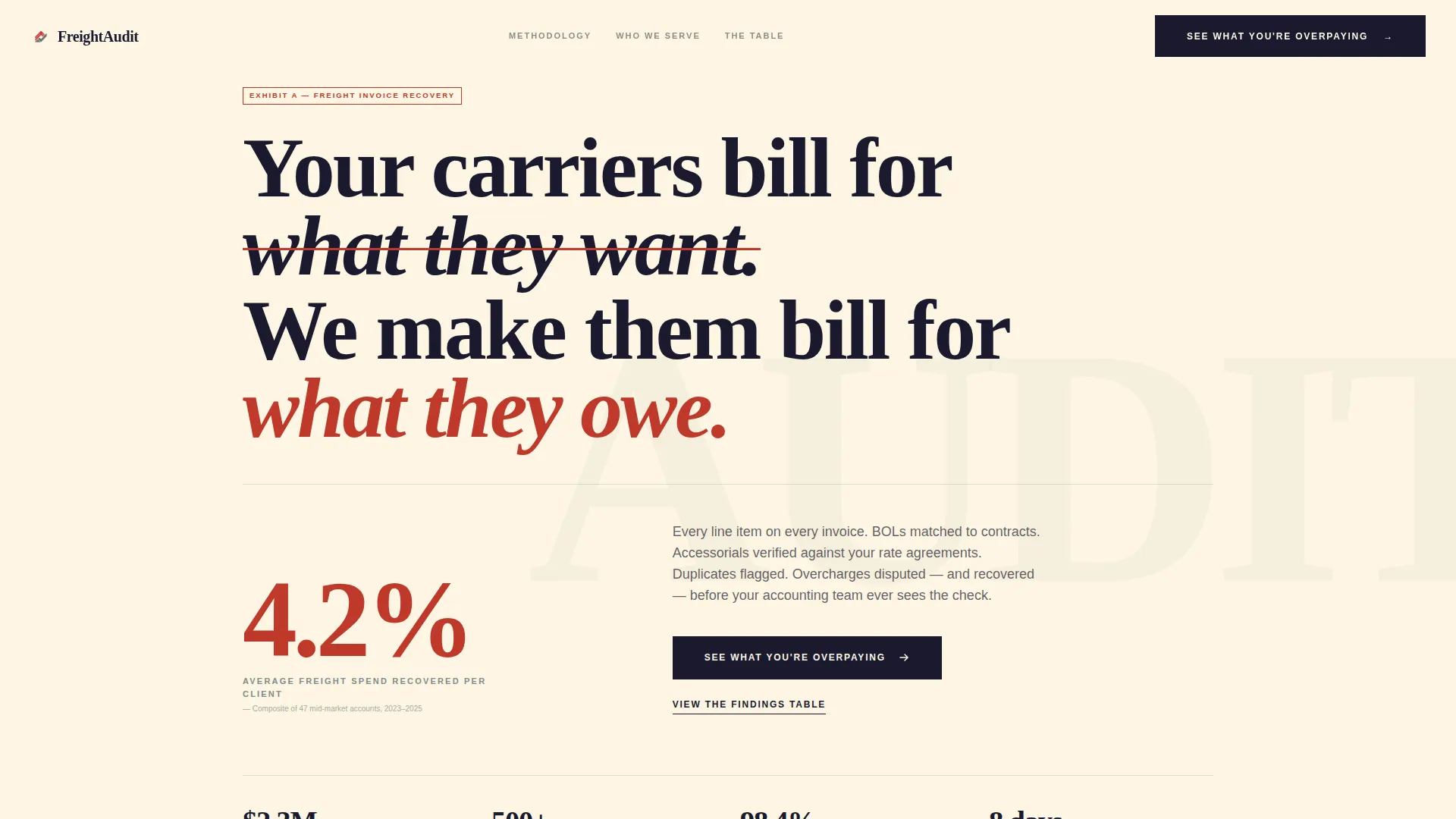
- A manifesto-style header section with an oversized serif headline and a single recovery statistic highlighted in redline red
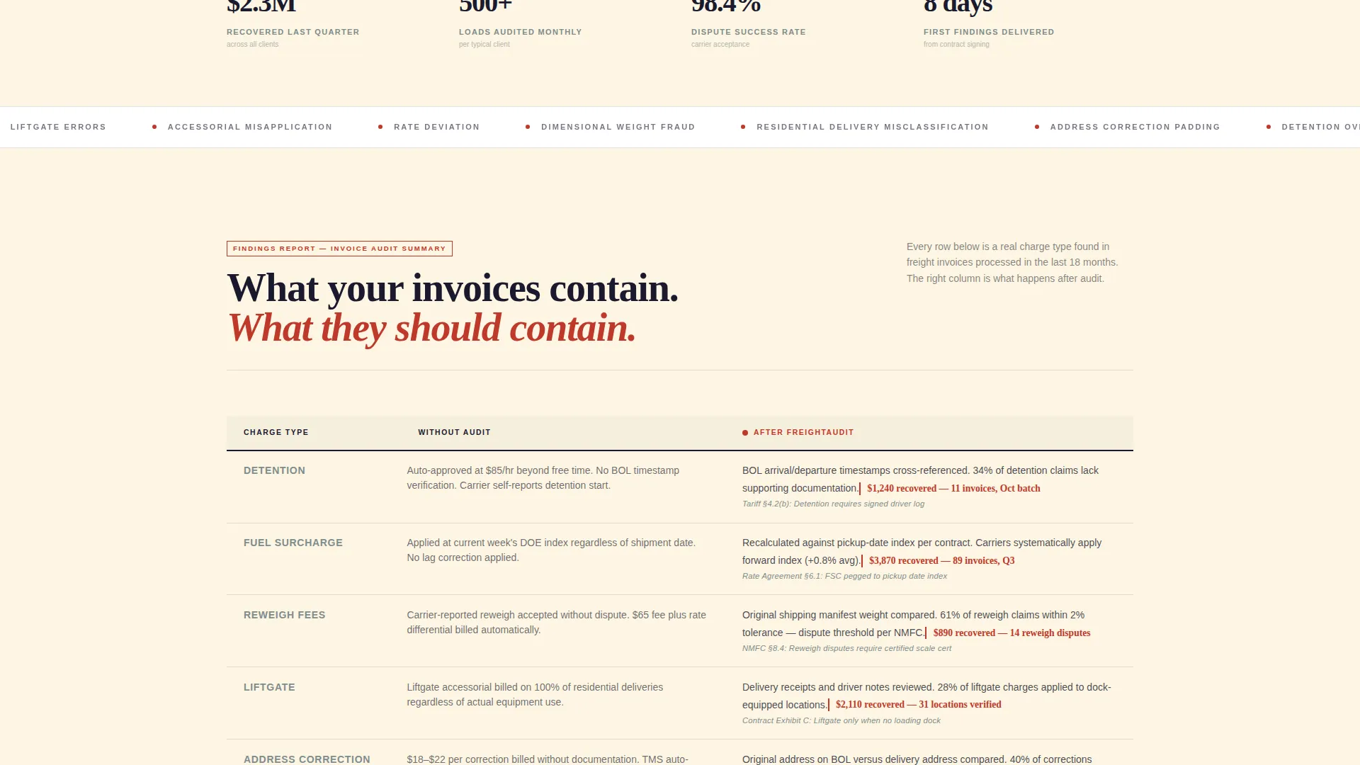
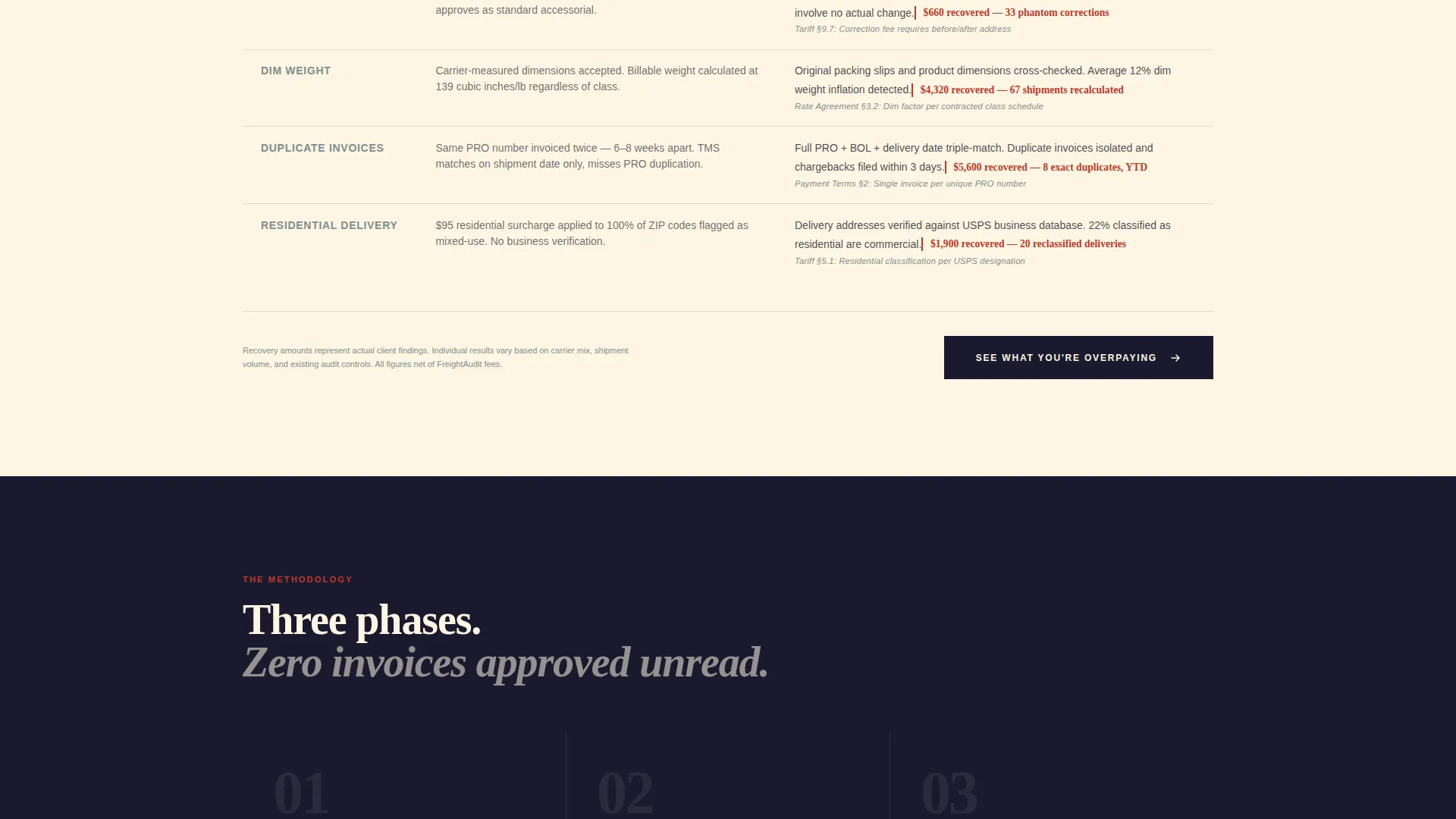
- A central comparison table showing line-by-line charge types (detention, fuel surcharge, reweigh fees, liftgate, and more) with unaudited outcomes on the left and recovered outcomes on the right
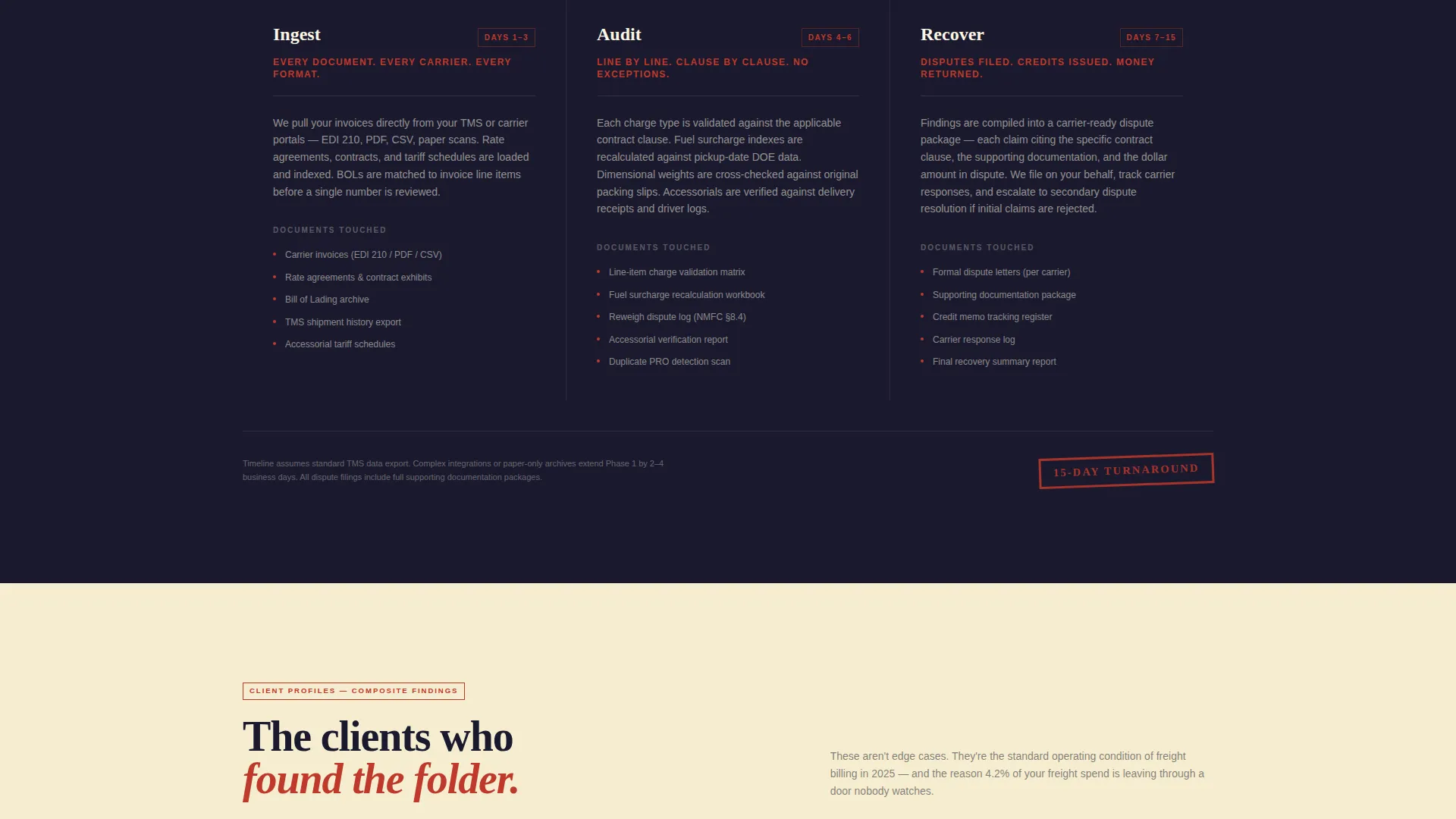
- A three-phase audit process section covering ingest, audit, and recover, each described with specific documents touched and business-day timelines
Feature list
This template is built around specific, functional components that work together to make the cost of inaction impossible to ignore.
Manifesto Header Section
The header opens with an oversized serif headline set against a legal-pad cream background. No images or animations compete with the copy. A single recovery statistic appears beneath the headline in redline red, cited like a court exhibit and impossible to skim past.
Side-by-Side Comparison Table
The comparison table is the core of the page. The left column shows what happens when freight invoices go unaudited: auto-approved charges, duplicate payments, misapplied accessorials, and rate deviations buried in data files. The right column shows post-audit outcomes for each charge type, with dollar amounts recovered and contract clauses cited.
Three-Phase Audit Process Section
After the comparison table, the page walks through the exact audit methodology in three named phases: ingest, audit, and recover. Each phase names the specific documents involved and states the timeline in business days, making the process feel concrete and verifiable.
Tripled Call-to-Action Placement
The primary call to action, "See What You're Overpaying," appears three times: directly beneath the manifesto, pinned after the comparison table, and again at the page bottom. This placement reinforces urgency at every decision point without relying on a form on this page.
Legal Shield Visual Theme
The entire page follows a Legal Shield design theme. Typography carries authority the way a legal brief commands attention. Color usage is disciplined: cream for background, black for primary type, red only where money or action is involved, and gray for structural elements like table borders and secondary text.
Click-Through Consultation Flow
This page contains no intake form. Every call to action links to a separate short intake page that asks for monthly shipment volume, carrier mix, and current audit method. This keeps the landing page focused and removes friction from the initial decision to engage.
Page sections overview
| Section | Purpose |
|---|---|
| Manifesto Header | Anchors authority with headline and recovery stat |
| Primary call to action Block | Captures early intent below the manifesto |
| Comparison Table | Shows unaudited versus audited charge outcomes |
| Post-Table call to action | Reinforces urgency after the table lands |
| Audit Process Phases | Details the ingest, audit, and recover methodology |
| Bottom call to action Block | Final push to the consultation booking page |
Design & branding system
The visual identity follows a Legal Shield theme using an Ink and Paper color system. The palette is deliberately restrained and authoritative, evoking a freshly printed audit report placed on a mahogany desk.
- Deep deposition black (#1A1A2E) carries all primary type; legal-pad cream (#FDF6E3) dominates the background; redline markup red (#C0392B) appears only on money figures and action elements; steel-clip gray (#7F8C8D) structures borders, dividers, and secondary text
- Typography is heavy, unhurried serif type set at oversized scale in the header, commanding the viewport the way a legal brief commands a judge's desk
- No decorative images or animations are used anywhere on the page; the typography and color system provide all visual authority
Mobile & speed optimization
The template is structured for clean rendering across device sizes. The lean, content-first layout avoids heavy media assets that slow load times.
- No images or animations are included in the design, keeping the page lightweight by default
- The comparison table and process section are structured for legible reflow on smaller screens
- Typography scale and spacing are set to maintain readability on mobile without requiring horizontal scrolling
How this template helps you convert
Every design and copy decision on this page is calibrated to move a skeptical logistics or finance buyer from curiosity to a booked consultation.
- The comparison table makes the cost of inaction concrete row by row, turning each charge type into a visible dollar amount walking out the door and creating urgency before the call to action even appears.
- The three-phase process section answers the "how does this actually work" objection immediately after the table, replacing skepticism with a clear, document-level audit picture that earns the consultation click.
- Three call-to-action placements at the header, mid-page, and page bottom mean a qualified prospect can convert at their own pace without being forced to scroll to a single buried button.
Other information about this template
This template sits at the intersection of professional services, supply chain and procurement, and the freight audit and payment niche. It is purpose-built for that specific combination.
- The template style is a comparison table landing page, making it well suited for service providers whose value proposition depends on contrast: what the client loses without the service versus what they recover with it
- The creative direction is Transparent Process, meaning the page builds trust by showing the methodology rather than hiding it behind a sales pitch
- The header concept is a Quote and Manifesto format, which works especially well for freight audit buyers who are already skeptical of vendor marketing
- The click-through landing page direction means the page qualifies intent first and collects intake information second, on a separate page, reducing friction at the point of first commitment
- This template can support service providers offering freight bill auditing, invoice recovery, carrier contract compliance review, and related back-office logistics finance services
Theme
Legal Shield
Creative direction
Transparent Process
Color system
Ink & Paper
Style
Comparison Table
Direction
Click-Through
Page Sections
Manifesto Header with Recovery Stat
Side-by-side Comparison Table
Three-phase Audit Process Section
Tripled Call-to-action Placement
Legal Shield Visual Theme
Click-through Consultation Flow
Related questions
Does this template include a contact form?
Can I customize the comparison table rows for different charge types?
Who is this landing page designed for?
How many calls to action does the template include?
Can the recovery statistic in the header be updated?



