Podcast Landing Page Template for Relationship Shows
Frequency is a single-column podcast landing page template built for relationship and dating shows with something real to say. It pairs a full-screen video header, a live countdown timer, and a frictionless two-tier purchase flow to turn curious visitors into paying listeners. The Neo-Retro Electric Indigo design makes every scroll feel like a late-night invitation you can't decline.
by Rocket studio
Quick summary
Frequency is a single-column podcast landing page template designed for relationship and dating shows. It blends Neo-Retro visual drama with a direct-sales conversion flow. Visitors move from a cinematic full-screen video header through an audiogram teaser, guest quotes, and social proof, arriving at a two-tier episode purchase with Apple Pay checkout.
Who this template is for
This template suits podcast hosts who sell episodes or season passes directly to their audience. It works especially well when the show has a strong voice, a loyal community, and a new drop worth building anticipation around.
- Relationship and dating podcast creators launching a new season or debut episode
- Independent hosts who want to sell single episodes or season passes without a third-party storefront
- Content creators in the Media and Entertainment space who want a landing page that feels as premium as the content itself
What problem this template solves
Most podcast pages list an episode and hope for the best. They feel flat, rushed, and forgettable. Frequency solves the problem of low perceived value by wrapping a sales page in the emotional register of the show itself.
- Visitors arrive with low intent and leave without buying because the page never earns their trust
- Audio-first creators struggle to communicate the texture and tone of their show through text alone
- A generic storefront page kills the mood a great podcast spends weeks building
What you get with this template
You get a ready-to-customise single-column landing page with every section required to sell a podcast episode on launch day. The layout moves visitors from curiosity to checkout without friction.
- A full-screen video background header with grain overlay and whispered voiceover treatment
- A live countdown timer, scrubable audiogram teaser, and email-gated free preview clip section
- A two-tier purchase flow (single episode at $3.99 or full season pass at $29) with Apple Pay and card support
Feature list
This template is built around a specific creative and commercial goal: make visitors feel the show before they buy it, then give them the easiest possible path to purchase.
Full-Screen Video Background Header
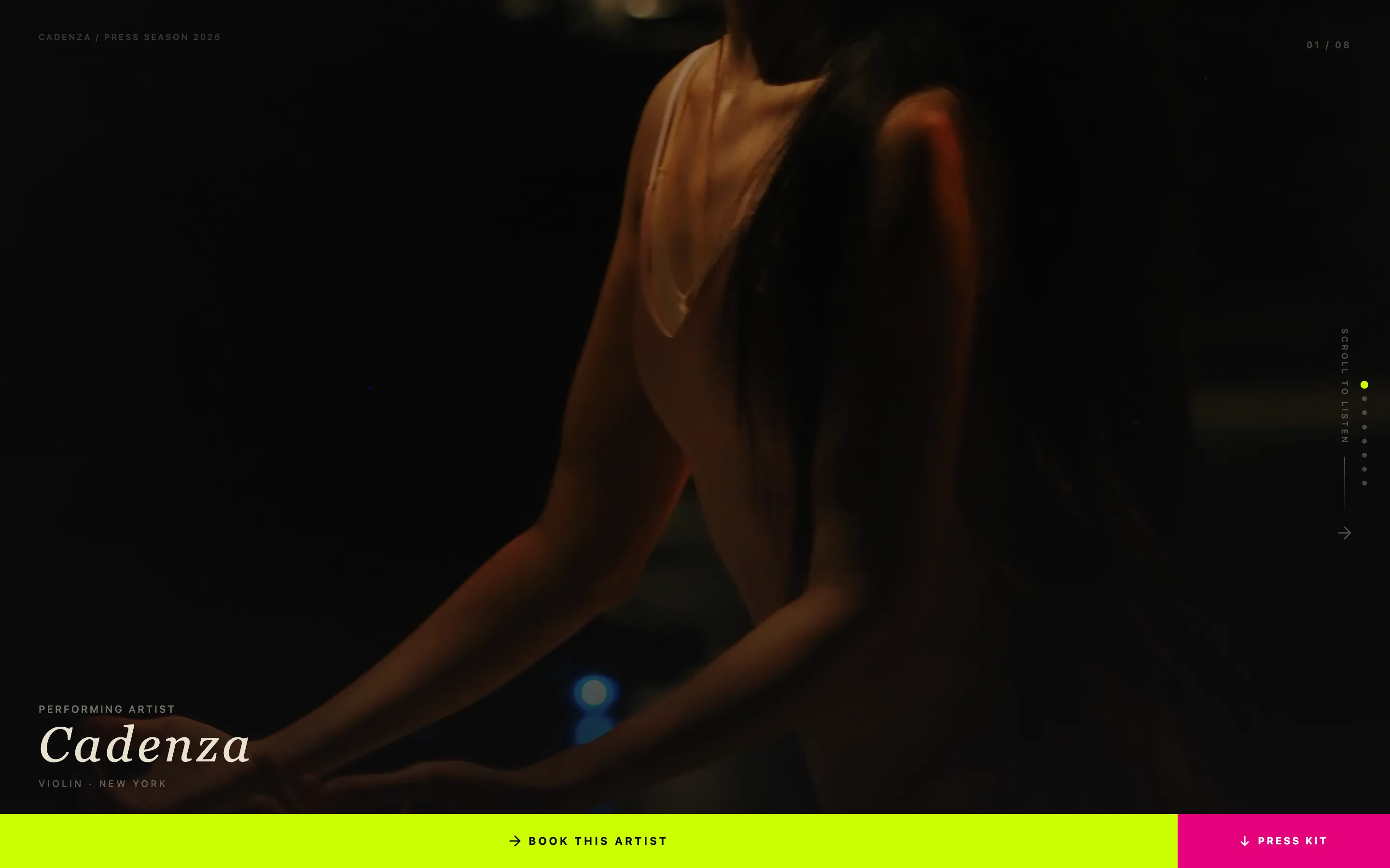
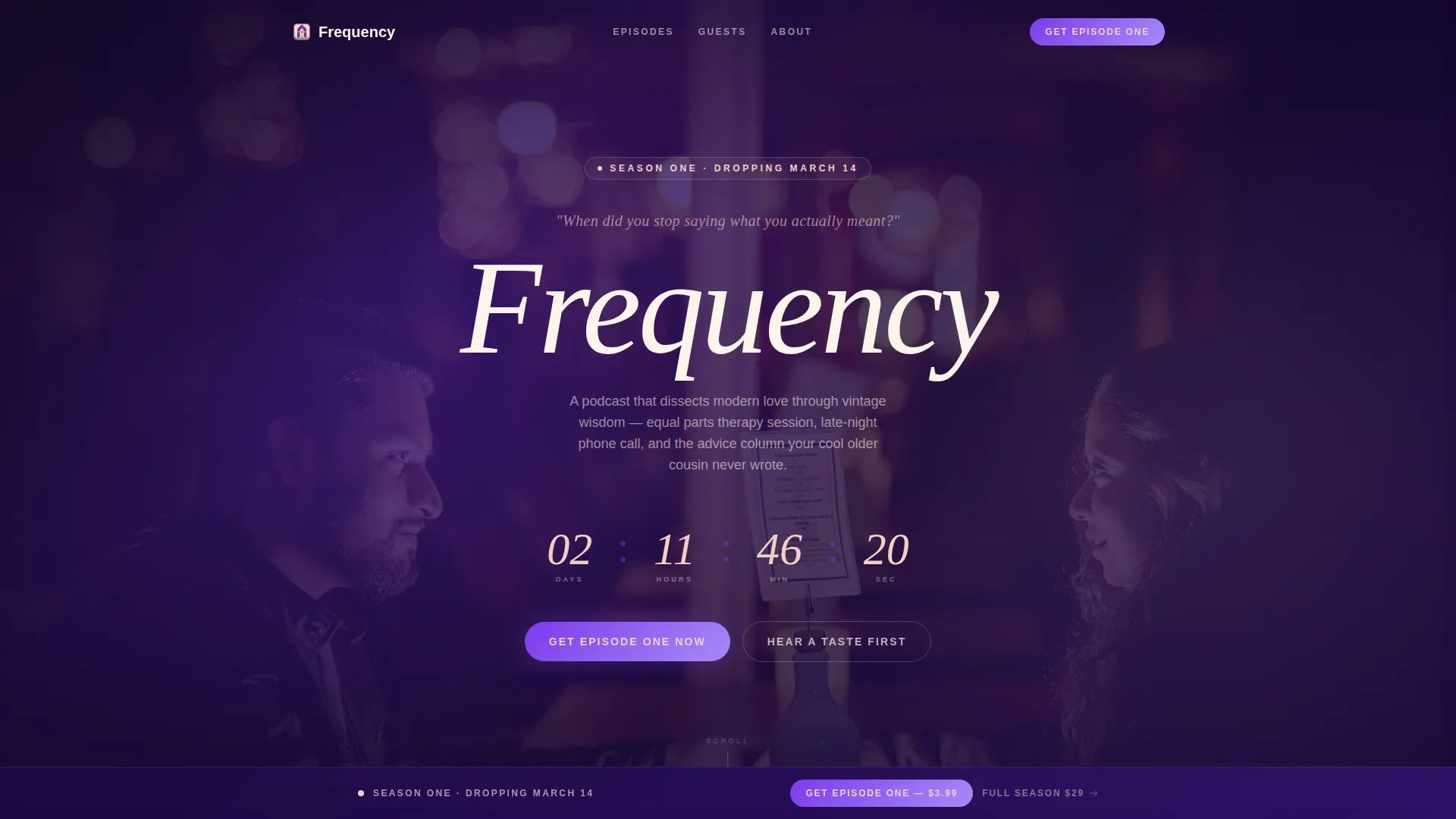
The header fills the entire viewport with a slow-motion montage styled after a 1990s music video. A grain overlay and slightly desaturated colour treatment give the footage an analog film texture. The host's voice plays as a whispered voiceover asking one provocative question with no answer given.
Live Episode Countdown Timer
A bold episode drop date pulses beneath the header with a live countdown timer. The timer creates genuine urgency without manufactured pressure. It signals that this release is an event, not just a post.
Scrubable Audiogram Teaser
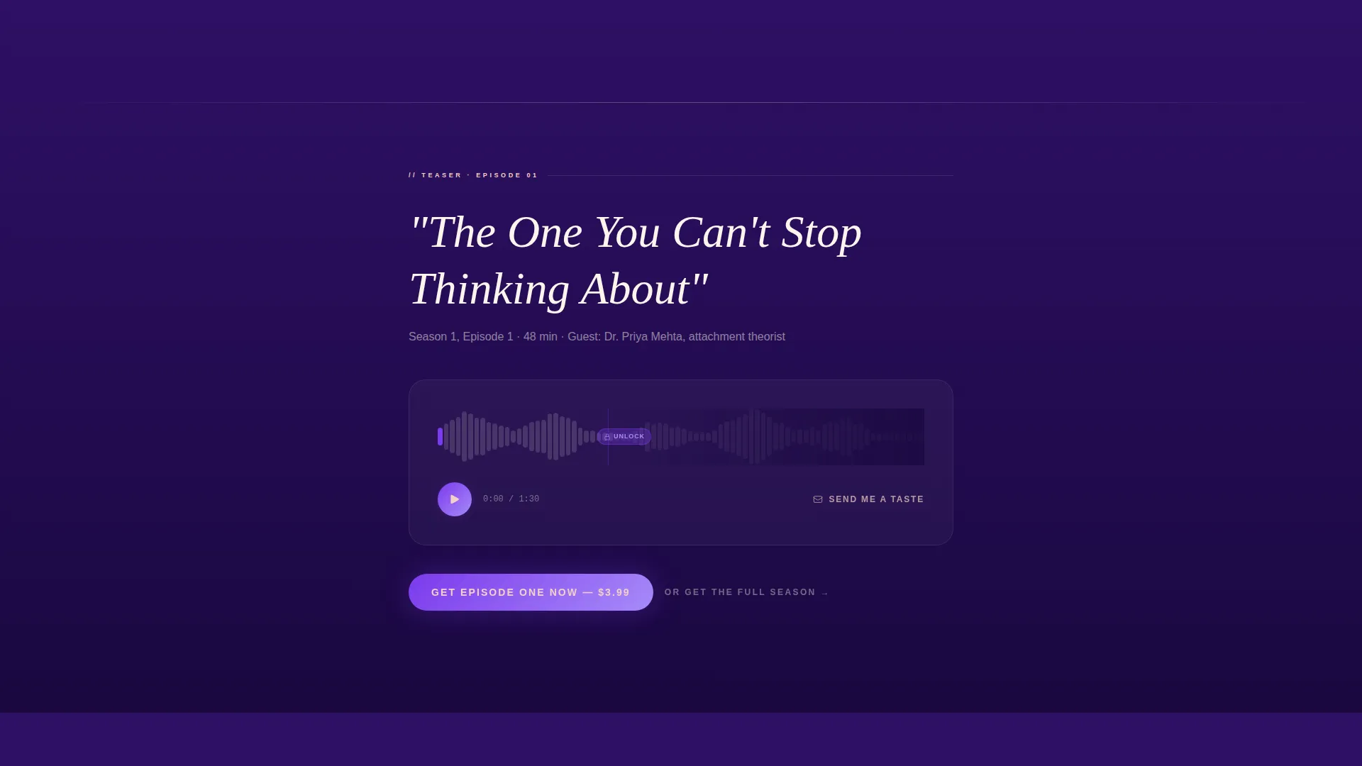
Visitors can interact with a waveform visualiser and scrub through an audio teaser. The clip plays just enough of the host's voice to create connection, then cuts off right when the conversation gets interesting. This is the page's single most persuasive conversion tool.
Two-Tier Frictionless Purchase Flow
The primary call to action, "Get Episode One Now", appears in violet on blush after the audiogram and again in a sticky bottom bar after the page midpoint. Buyers choose between a single episode at $3.99 or a full season pass at $29, then complete the purchase with Apple Pay or a card in seconds.
Email-Gated Free Preview Clip
A secondary conversion path offers a free 90-second preview clip in exchange for an email address. The call to action reads "Send Me a Taste". This captures browsers who are not ready to buy and converts them into subscribers for the next episode drop.
Social Proof Screenshot Section
Listener direct messages are displayed as screenshot-style cards with blurred profile photos. The styling feels raw and unpolished on purpose. Real reactions from real listeners carry more weight than polished testimonials on a show built around honesty.
Page sections overview
| Section | Purpose |
|---|---|
| Video Background Header | Sets tone, plays host voiceover, fades in episode title |
| Episode Countdown Timer | Builds launch-day urgency with live date countdown |
| Audiogram Teaser Player | Lets visitors scrub and hear the host's voice |
| Primary call to action Block | Drives "Get Episode One Now" purchase after teaser |
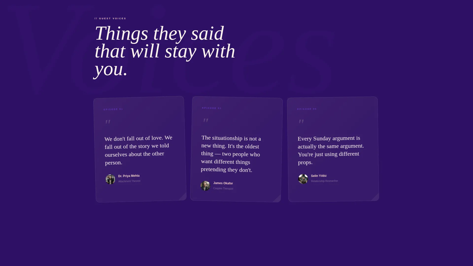
| Guest Quote Napkins | Three pull-quotes styled as handwritten cocktail napkin notes |
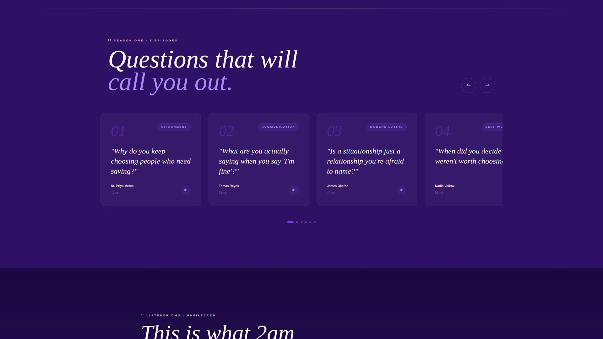
| Episode Title Carousel | Shows episode titles written as personal, provocative questions |
| Listener DM Proof | Screenshot-style social proof with blurred profile photos |
| Free Preview Gate | Email capture offering a 90-second free clip |
| Sticky Purchase Bar | Persistent bottom call to action repeating the buy action after midpoint |
Design & branding system
The Electric Indigo colour system anchors the entire page in a late-night, analog-warm atmosphere. Every colour choice has a deliberate emotional role, from the dominant background to the interactive pulse of each button.
- Deep late-night indigo (#2E1065) as the primary background, covering the scroll like a night sky
- Warm neon violet (#7C3AED) on hover states, pull-quotes, and all interactive elements, pulsing like a quickening heartbeat
- Soft blush (#F5D0C5) used sparingly for accent typography, dividers, and the primary call-to-action button contrast
- Crisp cream (#FDF6EC) for body text, keeping readability clean against the dark background
- A serif typeface borrowed from 1972 magazine-cover aesthetics for the episode title and key headings
Mobile & speed optimization
The single-column flow is inherently suited to mobile viewing. Every element stacks cleanly and the purchase path remains accessible from the first scroll to the sticky bottom bar.
- Single-column layout eliminates horizontal complexity on small screens
- Sticky bottom purchase bar keeps the primary call to action visible throughout the mobile scroll
- Touch-friendly audiogram scrubber and tier-selection buttons designed for thumb-first interaction
How this template helps you convert
The page is engineered around a single principle: let visitors feel the show, then make buying feel obvious. Every section earns the next click.
- The audiogram teaser cuts off at the most compelling moment, creating genuine desire to hear the rest. Placing the primary call to action immediately after this moment captures visitors at peak intent.
- The sticky bottom bar ensures the purchase option is never more than a glance away. Visitors who scroll past the first call to action still see the offer at every subsequent section without the page feeling aggressive.
- The email-gated preview clip turns non-buyers into subscribers. Visitors who want the show but are not ready to purchase still enter the funnel and receive outreach for the next drop.
Other information about this template
Frequency is a Neo-Retro themed template built specifically for the relationship and dating podcast niche within Media and Entertainment. It is part of a broader Content Creator Niches collection designed for independent hosts who want professional, conversion-focused landing pages without custom development.
- Template style: Single Column Flow, ideal for focused sales narratives without sidebar distraction
- Creative direction: Launch Energy, meaning the layout is structured to escalate anticipation across every scroll section
- Header concept: Full-Screen Video Background, requiring a video asset from the host for maximum impact
- The page supports a Direct Sales landing page direction, meaning the primary goal is episode or season pass revenue on launch day
- Customisation scope includes swapping the video asset, updating the episode title and drop date, replacing guest quotes and listener DM screenshots, and editing the two pricing tiers
Theme
Neo-Retro
Creative direction
Launch Energy
Color system
Electric Indigo
Style
Single Column Flow
Direction
Direct Sales
Page Sections
Full-screen Video Background Header
Live Episode Countdown Timer
Scrubable Audiogram Teaser
Two-tier Frictionless Purchase Flow
Email-gated Free Preview Clip
Screenshot-style Social Proof Section
Related questions
What type of podcast works best with this template?
Do I need a video asset to use the header section?
Can I edit the pricing tiers shown in the purchase flow?
What does the email capture section deliver to the visitor?
Is this a multi-page template or a single landing page?