Science Podcast Landing Page Template
Frequency is a single-column landing page template built for science podcasts with a serious editorial identity. It uses a scroll-triggered cinematic hero, a layered origin story flow, an episode catalog styled as magazine covers, and persistent app-download buttons. The design pairs deep obsidian with warm parchment and tarnished gold accents for a scholarly yet inviting feel.
by Rocket studio
Quick summary
Frequency is a science podcast landing page template designed to turn curious visitors into app downloads. It opens with a scroll-triggered video hero, flows through an origin story, a viral episode spotlight, an editorial episode catalog, and community voice memos. Every section is built for commute listeners who want proof before they tap install.
Who this template is for
This template suits science podcast creators who want their page to feel as considered as their content. It works best when you have a distinct editorial voice, a growing episode back-catalog, and an audience that values depth over entertainment.
- Science podcast hosts targeting graduate students, science teachers, and curious generalists
- Independent researchers or academic pairs who publish a weekly show
- Podcast brands looking to grow app downloads without relying on email capture
What problem this template solves
Most podcast landing pages ask for a follow before the visitor has heard a single word. Frequency flips that sequence. It lets the product speak first, placing audio and storytelling front and center before any call to action appears.
- Visitors leave quickly when a page offers no preview of the show's voice or quality
- Generic podcast templates lack the editorial weight needed to attract a research-minded audience
- App download conversion is low when there is no trust-building story between the hero and the button
What you get with this template
You get a complete, single-column landing page structured to guide a first-time visitor from curiosity to a confident app install. Every section is purpose-built and sequenced to match how a science podcast audience naturally evaluates a new show.
- A scroll-triggered cinematic hero with an animated gold SVG waveform and a typewriter headline
- Five content sections covering origin story, viral episode, episode catalog, community proof, and a persistent call-to-action bar
- An editorial design system using Fraunces display serif, DM Sans body type, and IBM Plex Mono for episode numbers
Feature list
This template delivers six distinct built-in features drawn directly from the creative brief.
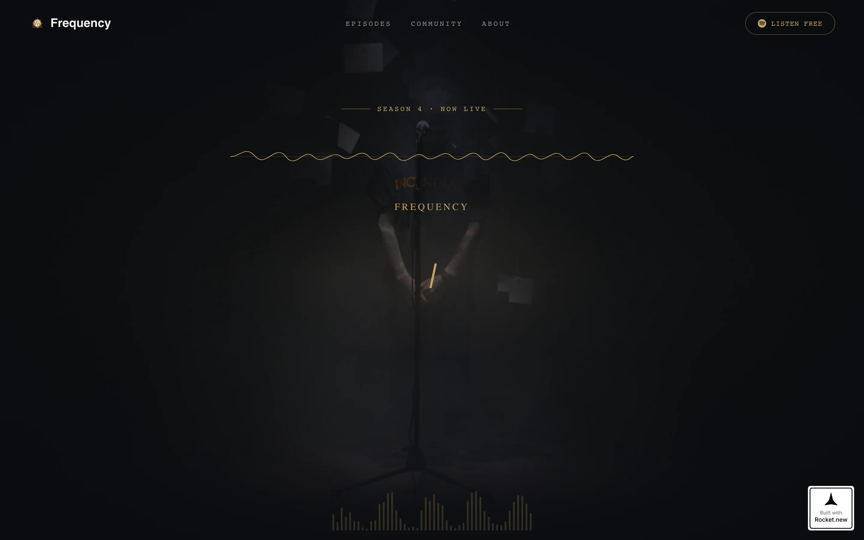
Scroll-Triggered Video Hero
The viewport opens black and silent with a thin gold waveform flatlined at center. As the visitor scrolls, the waveform animates, audio fades in mid-sentence, and the background dissolves into a cinematic microphone close-up surrounded by annotated research papers. A typewriter effect then renders the headline in a sharp serif.
Persistent App Download Bar
After the hero section clears, a slim bar pins to the bottom of the viewport. It holds two platform buttons side by side for continuous, low-friction access to the install action throughout the visitor's entire scroll journey.
Viral Episode Spotlight with Live Counter
A full-width pull-quote section highlights the episode that reached a listener milestone. A count-up number animation ticks the listener figure upward on scroll entry, and a gold call-to-action button deep-links directly into the app's player.
Editorial Episode Catalog
Episodes are displayed as stacked magazine covers, each with an illustration, a title, and a single-line teaser. The vertical archive layout gives the back-catalog the visual weight of a printed editorial run rather than a plain list.
Handwritten Community Proof Section
Listener voice memos are transcribed in handwritten-style type, each tagged with a city and a profession. This section builds social proof through specific human voices rather than anonymous star ratings.
Origin Story Layout
The founding moment section uses an asymmetric 60/40 column split with an embedded pull-quote. It frames the show's beginning as a personal narrative, giving visitors the context they need to trust the hosts before they commit to a download.
Page sections overview
| Section | Purpose |
|---|---|
| Hero Video | Cinematic scroll-triggered opening with waveform animation and typewriter headline |
| Origin Story | Founding moment narrative in an asymmetric layout with a pull-quote |
| Viral Episode | Full-width quote block with live listener count and mid-page gold button |
| Episode Catalog | Stacked magazine-cover archive with illustrations and single-line teasers |
| Community Proof | Handwritten-style voice memo transcriptions tagged by city and profession |
| Persistent call to action Bar | Bottom-pinned platform buttons visible after the hero clears |
| Footer | Logo and tagline on the left, navigation links on the right |
Design & branding system
The visual identity follows an editorial magazine aesthetic that feels like a leather-bound monograph displayed under museum glass. Every color and type choice is intentional, scholarly without being sterile, and luxurious without being loud.
- Obsidian (#0B0C10) dominates full-bleed section backgrounds, warm parchment (#F4F0E8) provides breathing room between them, and tarnished gold (#C5A55A) appears only on interactive elements, episode numbers, and pull-quotes
- Fraunces handles all display and headline type, DM Sans carries body copy, and IBM Plex Mono marks episode numbers with a technical precision that fits the science subject matter
- Gold accents are treated like gilt lettering on a first edition, used sparingly so every instance carries weight
Mobile & speed optimization
The template is built mobile-first, which reflects the reality that its primary audience listens and browses during a commute. Desktop layouts are an enhancement on top of a solid small-screen foundation.
- CSS animations power the SVG waveform, keeping the hero effect smooth without heavy asset dependencies
- IntersectionObserver drives section reveals and the count-up animation, triggering each effect only when the element enters the viewport
- The persistent call-to-action bar is designed for thumb reach on a phone screen, keeping the install action always accessible without covering content
How this template helps you convert
The page is sequenced to earn the tap before asking for it. Each section adds a layer of trust so the final install action feels like a natural conclusion rather than an interruption.
- The scroll-triggered audio preview lets visitors hear the host's voice before any button appears, making the product its own best argument.
- The live listener count and viral episode spotlight provide social proof at the exact moment a visitor is deciding whether the show is worth their time.
- The persistent bottom bar and the mid-page gold deep-link button create two low-friction conversion points without email gates or pop-up forms.
Other information about this template
This template is part of a broader editorial design direction suited to content creators who position their work at the intersection of rigorous research and accessible storytelling.
- The footer follows a split layout with the logo and tagline on the left and navigation links on the right, keeping the close of the page clean and brand-consistent
- Grayscale-to-color hover effects on episode catalog covers add a tactile, editorial-gallery quality to the browsing experience
- The template is structured for English-language, US-centric audiences and does not include currency displays, email capture forms, or subscription paywalls
- All animation techniques referenced (SVG waveform, typewriter effect, scroll-linked parallax, requestAnimationFrame counter) are built into the template's front-end layer


Theme
Editorial Magazine
Creative direction
Origin Story
Color system
Obsidian & Gold
Style
Single Column Flow
Direction
App Download
Page Sections
Scroll-triggered Cinematic Hero
Persistent App Download Bar
Viral Episode Spotlight
Magazine-cover Episode Catalog
Handwritten Community Proof
Asymmetric Origin Story Layout
Related questions
Does this template include audio playback built into the page?
Is email capture included anywhere in this template?
How many episodes do I need before the catalog section looks complete?
Can the platform buttons in the persistent bar be changed to other podcast apps?
Does this template work for podcast genres other than science?


