Relationship & Dating Podcast Production Landing Page
Frequency is a full-width immersive landing page template built for relationship and dating podcast production companies. It pairs a cinematic Northern Lights visual identity with audio-driven scroll interactions, editorial pull-quote testimonials, tiered production package cards, and a sticky conversion bar. The result feels intimate, high-production, and built to turn curious visitors into booked clients.
by Rocket studio
Quick summary
Frequency is a single-page immersive template for a relationship and dating podcast production company. It opens with a cinematic letterbox header, moves through staggered episode artwork and audio-snippet interactions, and closes with a full-bleed waveform visualization. Three tiered production packages with before-and-after audio toggles and individual booking buttons drive direct sales throughout.
Who this template is for
This template is built for audio professionals and content creators who produce relationship and dating podcast content. It speaks directly to people who sell production services rather than just hosting them.
- Dating coaches, therapists, and relationship authors who want a polished production home online
- Couples influencers ready to monetize longer-form audio content beyond short social clips
- Independent podcast production studios offering tiered service packages to content creator clients
What problem this template solves
Most podcast production pages look like plain service brochures. They tell visitors what they do but never let them feel it. Frequency solves the trust gap between "sounds good on paper" and "I need to book this now."
- Visitors cannot evaluate audio quality from words alone, so the template leads with sound
- Generic pricing pages fail to show scope and value clearly at each tier
- Low-friction booking is rare, and most pages lose the lead before a calendar opens
What you get with this template
You get a complete, ready-to-customize single-page layout designed specifically for a relationship and dating podcast production company. Every section serves a clear role in moving a visitor from discovery to booking.
- A cinematic letterbox header with a self-typing headline and animated waveform accent
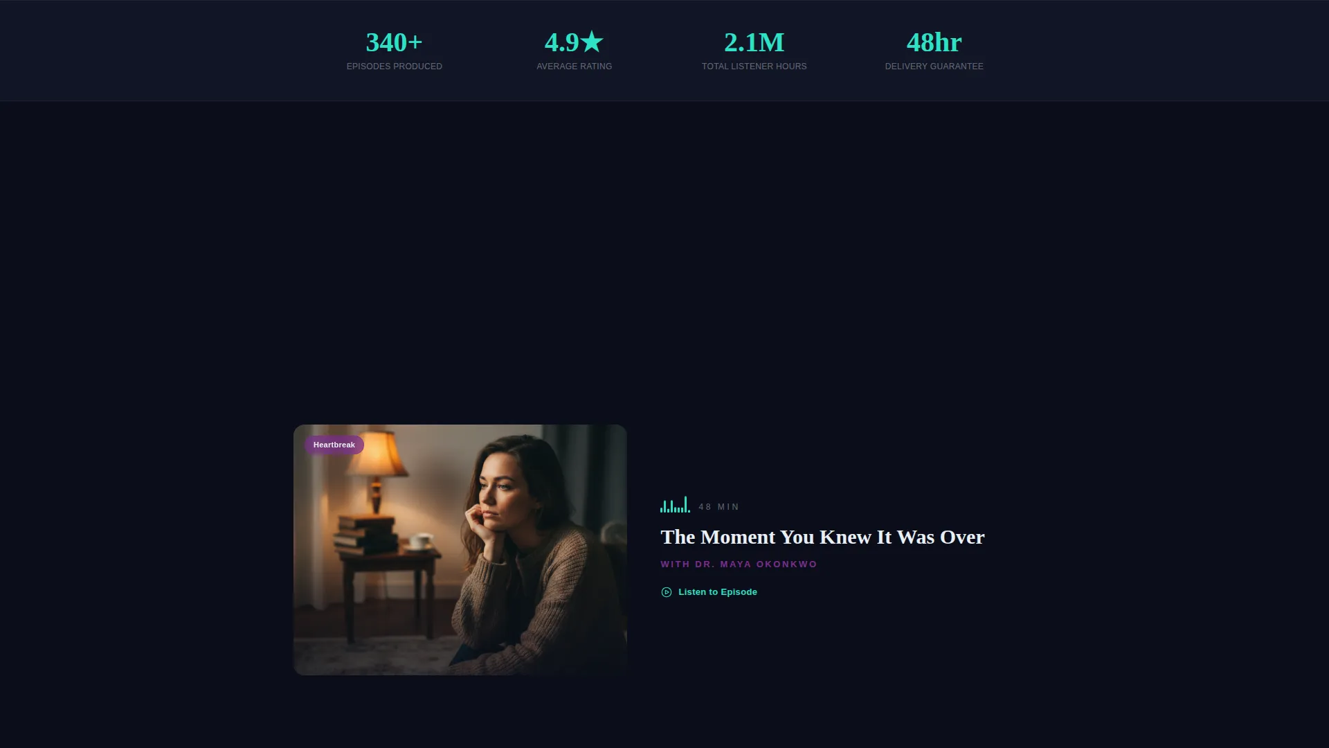
- Staggered episode artwork tiles with hover-triggered two-second audio snippets
- Three editorial production package cards, each with pricing, scope, and a direct booking call to action
- Magazine-style pull-quote testimonial blocks with embedded audio players beneath each quote
- A sticky bottom bar with email capture and Calendly booking flow that appears at the halfway scroll point
- A closing full-bleed waveform visualization section that brings the page to a quiet, confident end
Feature list
This section highlights the core functional and visual capabilities built into the Frequency template.
Cinematic Letterbox Header
The header opens with thick black bars framing a slow-motion studio microphone close-up. A single aurora-violet light catches detail on the pop filter. The headline types itself letter by letter, and the letterbox bars retract slowly to draw the visitor into the full viewport.
Audio Snippet Interactions
Episode artwork tiles load in a staggered left-right-left rhythm as you scroll. Hovering a tile triggers a two-second embedded audio clip. Each clip is a real moment: a laugh, a confession, or a pause that communicates more than a sentence of copy ever could.
Before-and-After Audio Toggle
Every production package card includes a thirty-second audio toggle. Visitors can switch between raw iPhone audio and the broadcast-quality version your studio delivers. Hearing the difference removes doubt faster than any testimonial alone.
Tiered Production Package Cards
Three editorial-styled package cards present your services at clear price points: "First Episode" at entry level, "Season Arc" at mid-tier, and "Full Studio Partnership" at premium. Each card lists scope, price, and its own "Book Your Studio Date" call to action button.
Pull-Quote Testimonial Blocks
Client testimonials appear as oversized serif pull quotes styled like magazine feature callouts. A small embedded audio player sits beneath each quote so visitors hear the actual client voice as they read the words.
Sticky Conversion Bar
After the halfway scroll point, a slim sticky bar slides into view at the bottom of the screen. It displays the entry-level price point, a single email input field, and a trigger for a Calendly booking flow. The entire path from curiosity to booked call is two clicks.
Page sections overview
| Section | Purpose |
|---|---|
| Cinematic Letterbox Header | Opens with a studio close-up, animated waveform, and self-typing headline to set mood |
| Staggered Episode Tiles | Showcases portfolio work with hover-triggered audio clips in a rhythmic scroll layout |
| Production Package Cards | Presents three tiered service offers with pricing, scope, and individual booking buttons |
| Pull-Quote Testimonials | Builds trust with magazine-styled client quotes and embedded voice audio players |
| Rapid-Fire Portfolio Stack | Mid-page section with tightly stacked audio samples to accelerate momentum |
| Sticky Booking Bar | Low-friction email and Calendly trigger that appears after the halfway scroll point |
| Full-Bleed Waveform Close | Closes the page with a breathing waveform visualization for a quiet, confident finish |
Design & branding system
The visual identity uses an Editorial Magazine theme built on the Northern Lights color system. Dark and atmospheric backgrounds make every accent color land with impact.
- Arctic black (#0B0E1A) dominates all section backgrounds, creating depth and intimacy
- Aurora violet (#7B2D8E) marks section transitions and hover states for quiet drama
- Electric teal (#2DE2C6) highlights call to action buttons, waveform accents, and interactive moments
- Frost white (#EAF0F6) keeps body typography crisp and readable against dark backgrounds
- Oversized serif pull-quote type and editorial card layouts reinforce the magazine-feature tone
Mobile & speed optimization
The full-width immersive layout is structured to translate its cinematic feel across screen sizes without sacrificing clarity or interaction quality.
- Section stacking and audio tile layouts reflow cleanly for smaller viewports
- Sticky conversion bar stays accessible at the bottom of the screen on mobile devices
- Typography scaling ensures headline and pull-quote type remains impactful at any size
How this template helps you convert
Frequency is built around a single idea: let visitors hear the work before asking them to pay for it. Every conversion element is sequenced to reduce hesitation and reward curiosity.
- Audio interactions across episode tiles and package cards replace skepticism with sensory proof, so visitors trust the quality before they read a single pricing line
- Three clearly scoped package cards with visible pricing and individual booking buttons remove the need for a back-and-forth discovery call just to learn what something costs
- The sticky bottom bar compresses the final conversion step into one email field and two clicks, catching visitors who are ready but have not yet committed
Other information about this template
Frequency is designed to serve a specific creative niche with a high level of visual and functional intention. A few additional details worth knowing before you decide to use it.
- The template is categorized under Media and Entertainment, Content Creator Niches, making it purpose-built for audio-led service businesses
- The Sound and Rhythm creative direction means pacing is intentional: early sections breathe, mid-page sections accelerate, and the close slows back down
- The Full-Width Immersive template style means it is designed to fill the screen at every breakpoint, with no sidebars or container constraints
- The Direct Sales landing-page direction means every section has a commercial role, not just a storytelling one


Theme
Editorial Magazine
Creative direction
Sound & Rhythm
Color system
Northern Lights
Style
Full-Width Immersive
Direction
Direct Sales
Page Sections
Cinematic Letterbox Header with Self-typing Headline
Hover-triggered Audio Snippet Tiles
Before-and-after Audio Toggle on Package Cards
Three Tiered Editorial Package Cards
Pull-quote Testimonials with Embedded Audio
Sticky Bottom Conversion Bar
Related questions
Who is this template designed for?
Does the template include audio interaction features?
How does the sticky booking bar work?
Can I edit the package names and pricing?
What makes this different from a standard service page template?


