Radiant Laundry Service Landing Page Template
Fresh is a masonry-style landing page template built for a neighborhood laundry pickup and delivery service. It pairs a warm Citrus Burst color system with a scroll-driven Comparison Journey layout to move visitors from recognition to action. Every section leads to one clear call to action: scheduling a first pickup. The design feels personal, radiant, and community-rooted.
by Rocket studio
Quick summary
Fresh is a single-page, click-through landing page template designed for a neighborhood laundry pickup and delivery service. The masonry layout layers comparison cards, lifestyle imagery, and a founder story into one warm, scroll-driven experience. The entire page funnels toward a single booking button. It is built to earn trust before asking for a click.
Who this template is for
This template is made for a local, community-focused laundry service that wants to stand out online without a complicated website. It works especially well for a Black-owned small business ready to turn a landing page into a real customer acquisition tool.
- Laundry pickup and delivery services targeting busy urban neighborhoods
- Black-owned service businesses building a local brand with a personal, story-driven voice
- Small service providers who want a single, polished page that converts visitors into bookings
What problem this template solves
Most local service businesses lose potential customers because their online presence feels cold, cluttered, or generic. A busy nurse or a parent with no time to spare needs to feel the value of a service instantly. This template solves that gap by making the emotional and practical case for outsourcing laundry in one focused scroll.
- Visitors leave before booking because they cannot see what the service actually feels like
- Generic service pages bury the offer under too many options and too little personality
- Local businesses struggle to communicate trust, quality, and community in a single page
What you get with this template
You get a fully structured, ready-to-customize landing page built around a masonry card layout and a single call-to-action flow. Every section is pre-designed to carry visitors from first impression to booking click without friction.
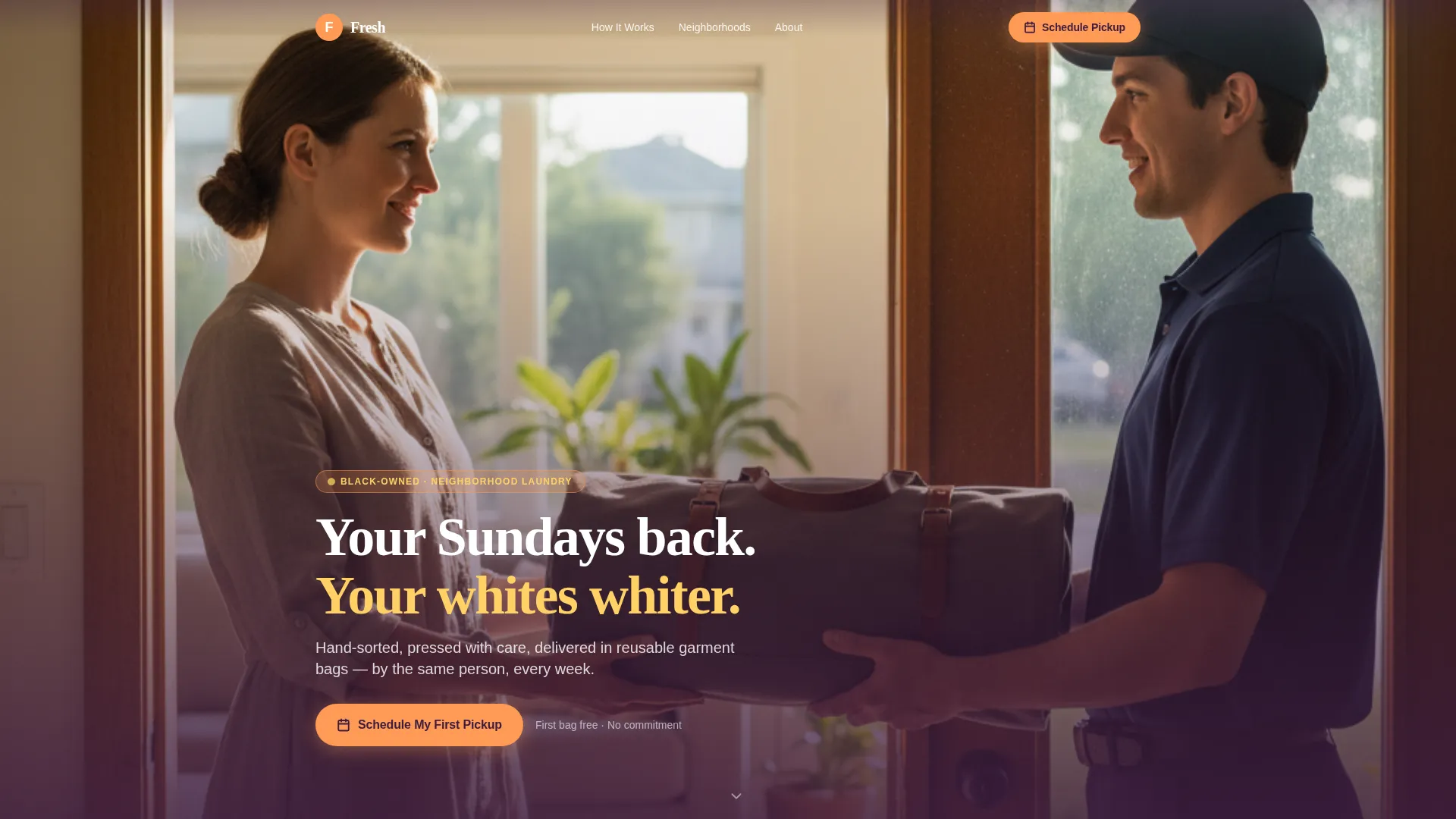
- A lifestyle hero section with a headline overlay and a primary booking button
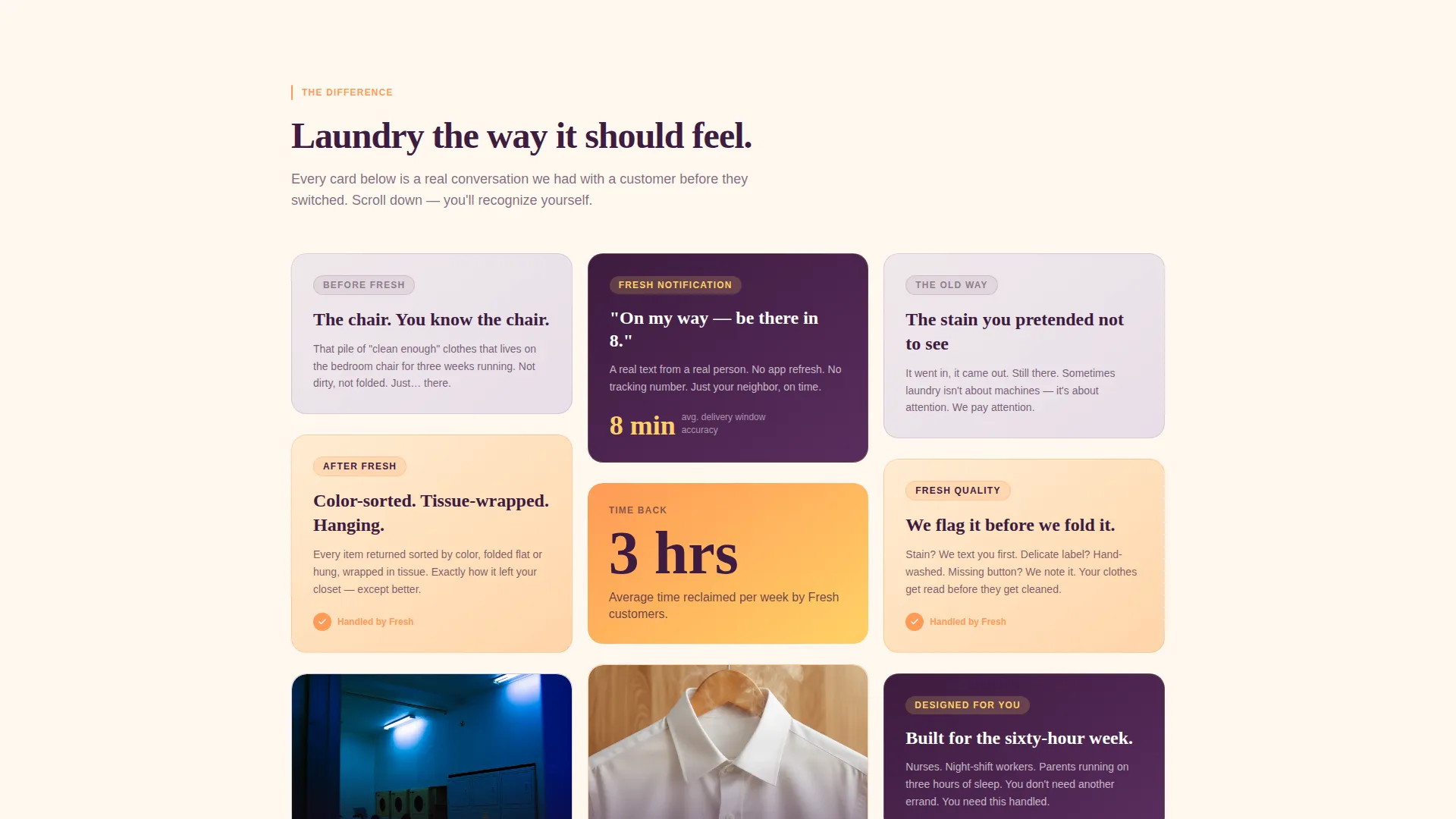
- A staggered Comparison Journey section with cascading masonry cards
- A full-width closing gradient section with a final anchored call-to-action button
Feature list
This template delivers a focused set of design and layout features drawn directly from the source brief. Each feature works together to build a warm, trustworthy, and conversion-ready landing page.
Masonry Comparison Card Layout
The scroll section uses a staggered, Pinterest-style card grid. Each card pairs a familiar laundry frustration with the Fresh alternative. Cards cascade as the visitor scrolls, building a visual argument that escalates from convenience to quality to trust.
Floating Repeat Call-to-Action Button
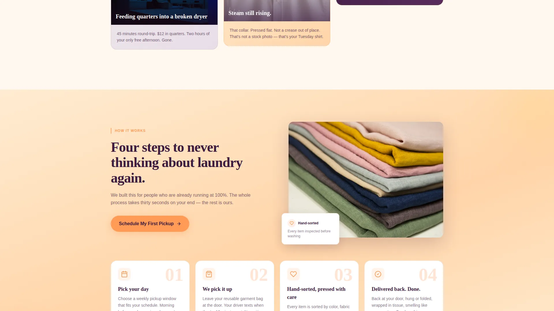
The tangerine "Schedule My First Pickup" button appears beneath the hero, floats back into view after the third comparison card, and anchors the final closing section. This placement keeps the booking action visible throughout the entire page without feeling aggressive.
Lifestyle Hero Section
The header features an intimate, waist-level lifestyle shot of a doorstep garment bag delivery. The headline "Your Sundays back. Your whites whiter." fades in over the lower third of the image. The composition is designed to feel like a real moment, not a stock photo.
Community Mosaic and Founder Story
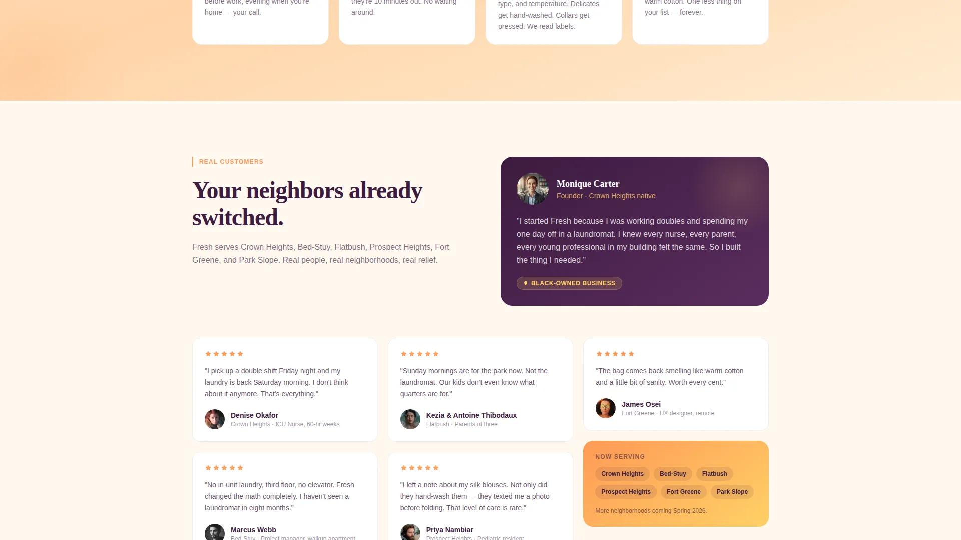
The page closes with a mosaic of real customer photos, named neighborhoods, and a three-sentence founder story. This section shifts the page from a sales pitch to a community introduction, grounding the service in a specific place and a specific person.
Citrus Burst Gradient Backgrounds
Backgrounds drift between soft peach blossom and ripe lemon in gentle gradients. Tangerine activates buttons and hover states. Deep pressed plum anchors every headline. The color system creates a cohesive golden-hour warmth across the entire page.
Full-Width Closing call to action Section
The final section spans the full page width in a gradient wash. It carries three short trust lines and the anchored booking button. The section is designed to give visitors one last, calm moment of reassurance before they click.
Page sections overview
| Section | Purpose |
|---|---|
| Hero Header | Introduce the service with a lifestyle image and headline overlay |
| Primary call to action Button | Route visitors to the booking page immediately below the hero |
| Comparison Journey Cards | Contrast laundry pain points with Fresh service benefits |
| Floating call to action Button | Re-surface the booking action mid-scroll after the third card |
| Community Mosaic | Display real customers, named neighborhoods, and the founder story |
| Closing Gradient Section | Anchor the final call to action with trust lines and the booking button |
Design & branding system
The visual identity uses the Citrus Burst color system built around four core tones. The overall feeling is golden hour pouring through a laundromat window, radiant and unhurried.
- Core palette: sun-warmed tangerine (#FF9A56), ripe Meyer lemon (#FFD166), soft peach blossom (#FFECD2), and deep pressed plum (#3D1C3F)
- Backgrounds use soft peach-to-lemon gradients; tangerine activates interactive elements; plum grounds all headline text
- The Soft Gradient theme keeps transitions gentle and warm, supporting a tone that feels personal and trustworthy rather than clinical
Mobile & speed optimization
The masonry layout and gradient backgrounds are designed to translate cleanly to smaller screens. Cascading cards reflow naturally for single-column mobile reading without losing the scroll-driven narrative.
- Staggered card layout adapts for vertical mobile scroll without breaking the comparison story
- Floating call-to-action button remains accessible at key scroll points on mobile viewports
- Full-width closing section and hero image maintain visual impact across screen sizes
How this template helps you convert
The page is built as a click-through landing page with one job: move the visitor to a booking page. Every design decision supports that single outcome.
- The booking button appears three times across the page scroll, each time at a moment of peak persuasion, making the next step always visible and never buried.
- The Comparison Journey cards build a specific, escalating case for the service, moving from convenience to quality to community trust before the final call to action appears.
Other information about this template
This template is part of the Fresh collection and is designed specifically for the Black-owned business subcategory within the Retail and E-Commerce category. It is built for a direct sales flow where the landing page itself handles all persuasion and the click routes to an external booking page.
- The page includes no on-page form; the click-through model keeps the visitor experience frictionless and the commitment low
- The template style is Masonry and Pinterest-inspired, making it visually distinctive in a market where most service pages use standard single-column layouts
- The intersection match for this template is rated 9 out of 10, reflecting strong alignment between the Soft Gradient theme, Comparison Journey creative direction, and the Black-owned neighborhood service niche
- The "First bag free. Cancel anytime. Your neighbor owns this." closing copy is pre-written into the final section, offering a ready-to-use trust statement
Theme
Soft Gradient
Creative direction
Comparison Journey
Color system
Cloud Canvas
Style
Masonry/Pinterest
Direction
Direct Sales
Page Sections
Masonry Comparison Card Layout
Floating Repeat Call-to-action Button
Lifestyle Hero Section with Headline Overlay
Community Mosaic and Founder Story
Citrus Burst Gradient Color System
Full-width Closing Call to Action Section
Related questions
Does this template include a booking form?
Can I update the colors to fit my own brand?
How many times does the booking button appear on the page?
What is the Comparison Journey layout?
Is this template only for laundry businesses?



